CATEGORY

Basic Identity Applications

LEVEL

Student

RANK

DESIGN CREDITS

Designer

Amber Schmitzer

Instructor

Clinton Carlson


TAGS

, , , ,


LINKS

Amber Schmitzer
University of North Texas

Fuel Coffee by Amber Schmitzer of University of North TexasFuel Coffee by Amber Schmitzer of University of North TexasFuel Coffee by Amber Schmitzer of University of North TexasFuel Coffee by Amber Schmitzer of University of North TexasFuel Coffee by Amber Schmitzer of University of North TexasFuel Coffee by Amber Schmitzer of University of North Texas


CLIENT

An inde­pen­dent cof­fee shop in Seat­tle, WA, focused on pro­vid­ing their cus­tomers with the fuel they need for the rest of the day: cof­fee. They are bring­ing their Seat­tle-local cus­tomers excep­tion­al roast­ed cof­fee, with great ser­vice, and a great atmosphere.


BRIEF

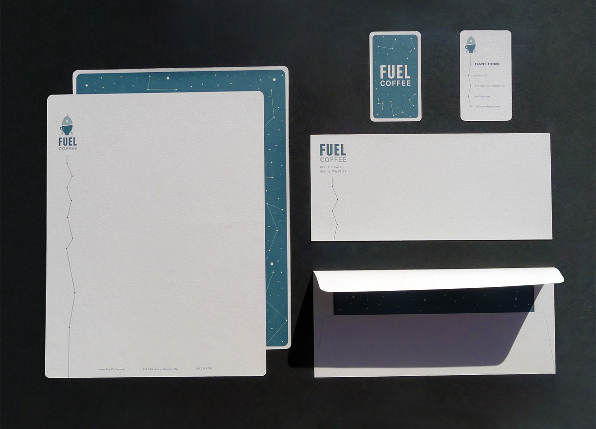
To rebrand an already estab­lished busi­ness and devel­op its new iden­ti­ty. And with that, cre­ate an iden­ti­ty sys­tem that con­sists of busi­ness cards, logo, and sta­tionery. The goal was to cre­ate an iden­ti­ty that con­cep­tu­al­ly con­veys the com­pa­ny in its true light, while high­light­ing its per­son­al­i­ty. The biggest chal­lenge was to cre­ate a mark that was not too sim­ple nor too complex.


APPROACH

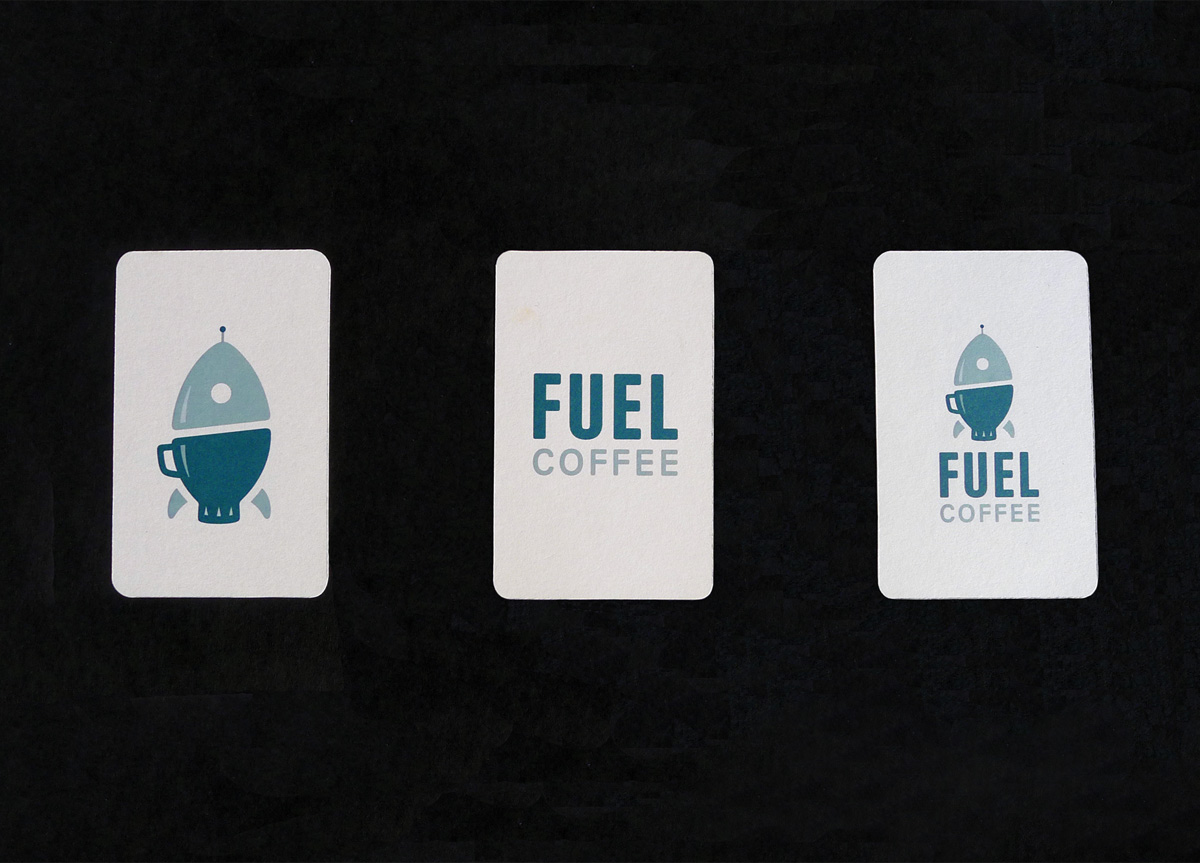
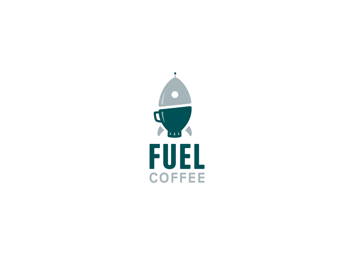
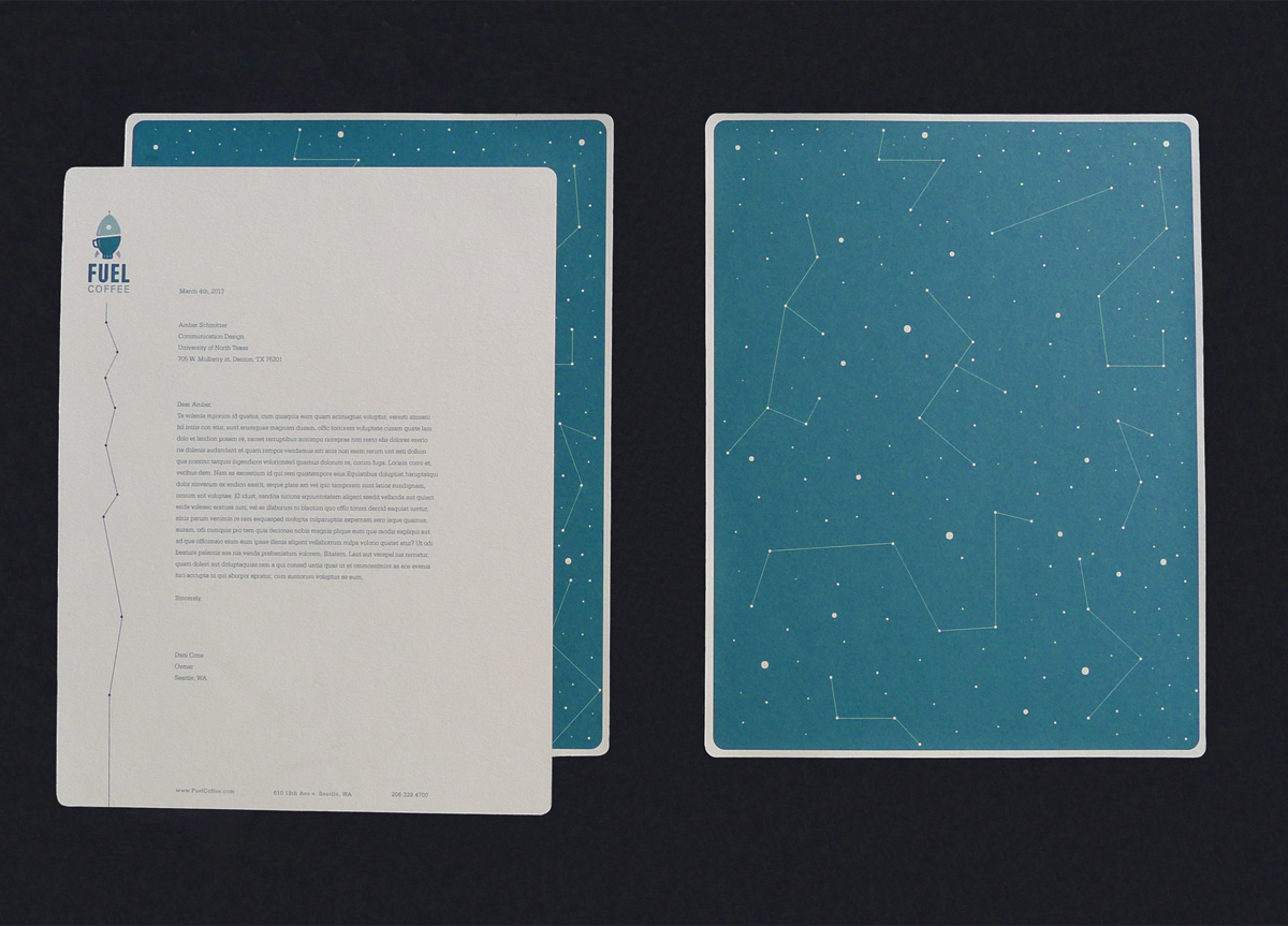
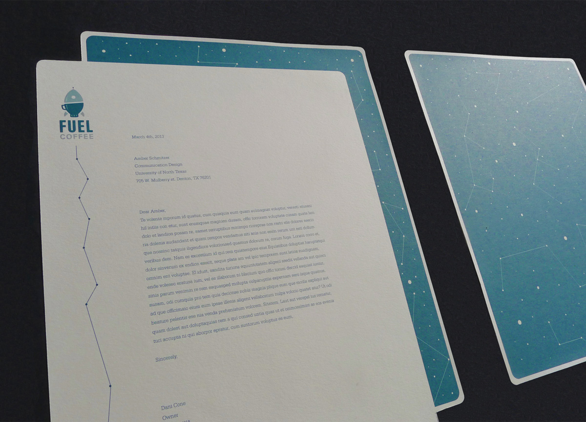
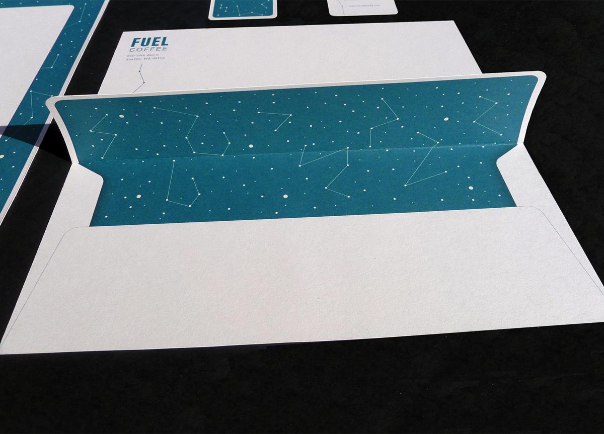
This rebrand­ing is a forced con­nec­tion between a rock­et and a cof­fee cup, sym­bol­iz­ing the fuel behind the cof­fee, and the places it can take you. This idea came from Fuel Cof­fee’s cur­rent aes­thet­ics, which is auto para­pher­na­lia. I felt there need­ed to be a change in what sym­bol­izes fuel, so I chose a rock­et and I made it grey-blue and turquoise. I paired this with an altered ver­sion of the type­face Univers. The sta­tionery I devel­oped uses a col­ored paper stock with round­ed cor­ners to give it even more of a vin­tage, relax­ing qual­i­ty. In the end, my goal was to cre­ate a sys­tem that sym­bol­izes the cof­fee, while show­ing the unique com­pa­ny personality.

In rebranding Fuel Coffee, Amber Schmitzer explored a number of visual metaphors for representing coffee as fuel. Her final solution creates a memorable metaphor that avoids less appetizing images (e.g. gas pumps or cans) and instead connects coffee with adventure, travel, and a bit of history. It’s simple execution, color palette, and typography establish a nice reference to the client’s previous vintage tone while the dark star pattern provides contrast and depth to the overall identity. Amber’s understanding of the client, audience, and context helped create an identity system that was conceptual, memorable, and playful. — Clinton Carlson, Assistant Professor at University of North Texas

Browse entries