CLIENT
This innovative project was initiated by four friends who run marathons together when they couldn’t find a range of cosmetic products that met their needs as sportsmen.
BRIEF
The initial phase was to create a name that reflected a contemporary way of practicing sports that would appeal to sports men and women.
APPROACH
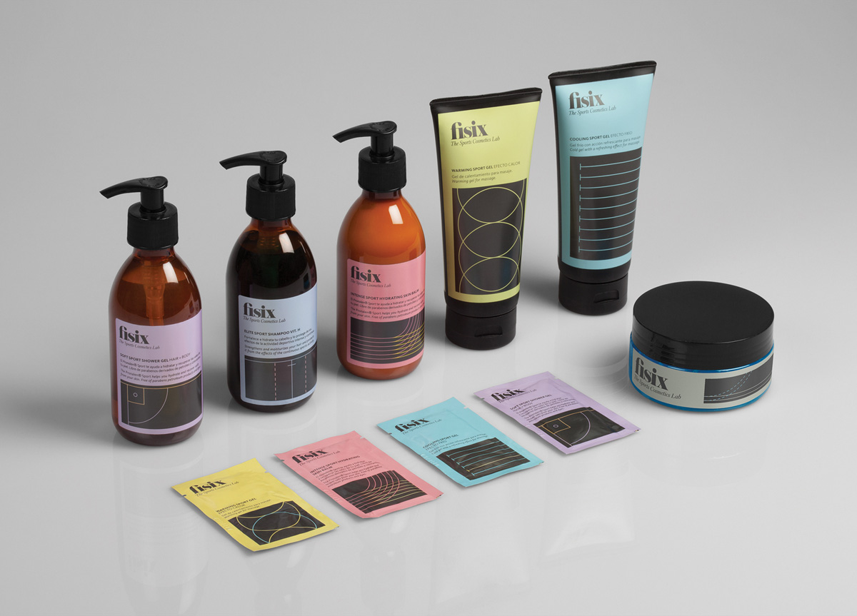
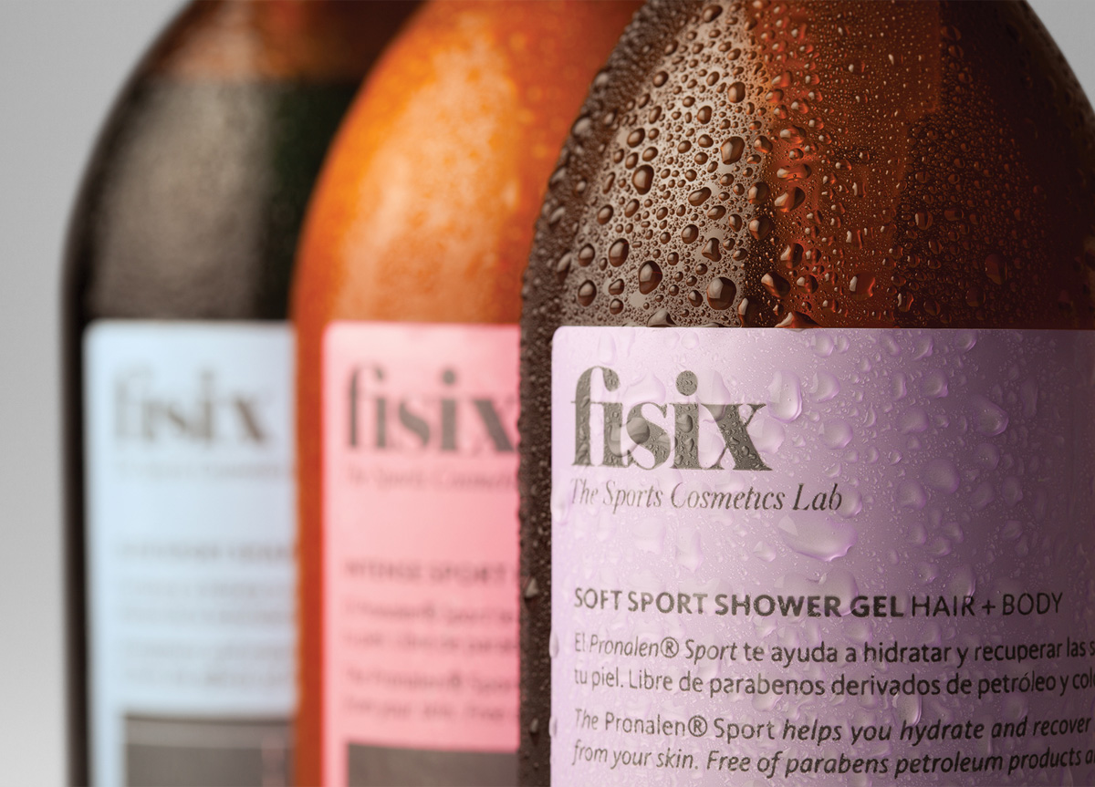
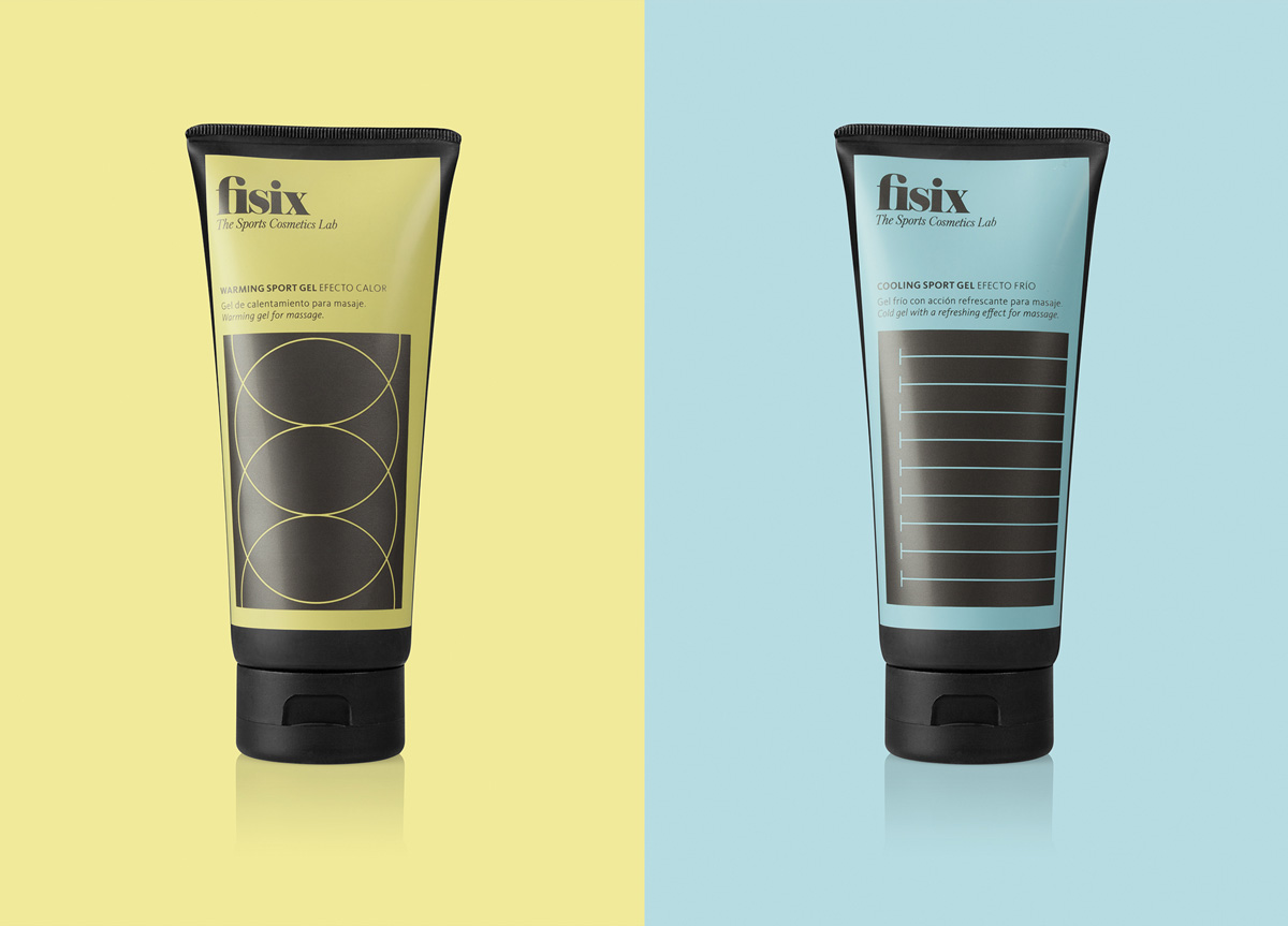
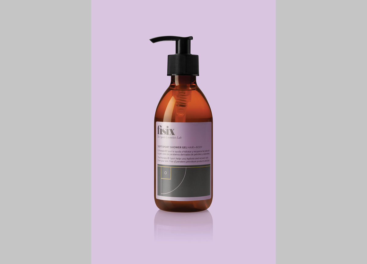
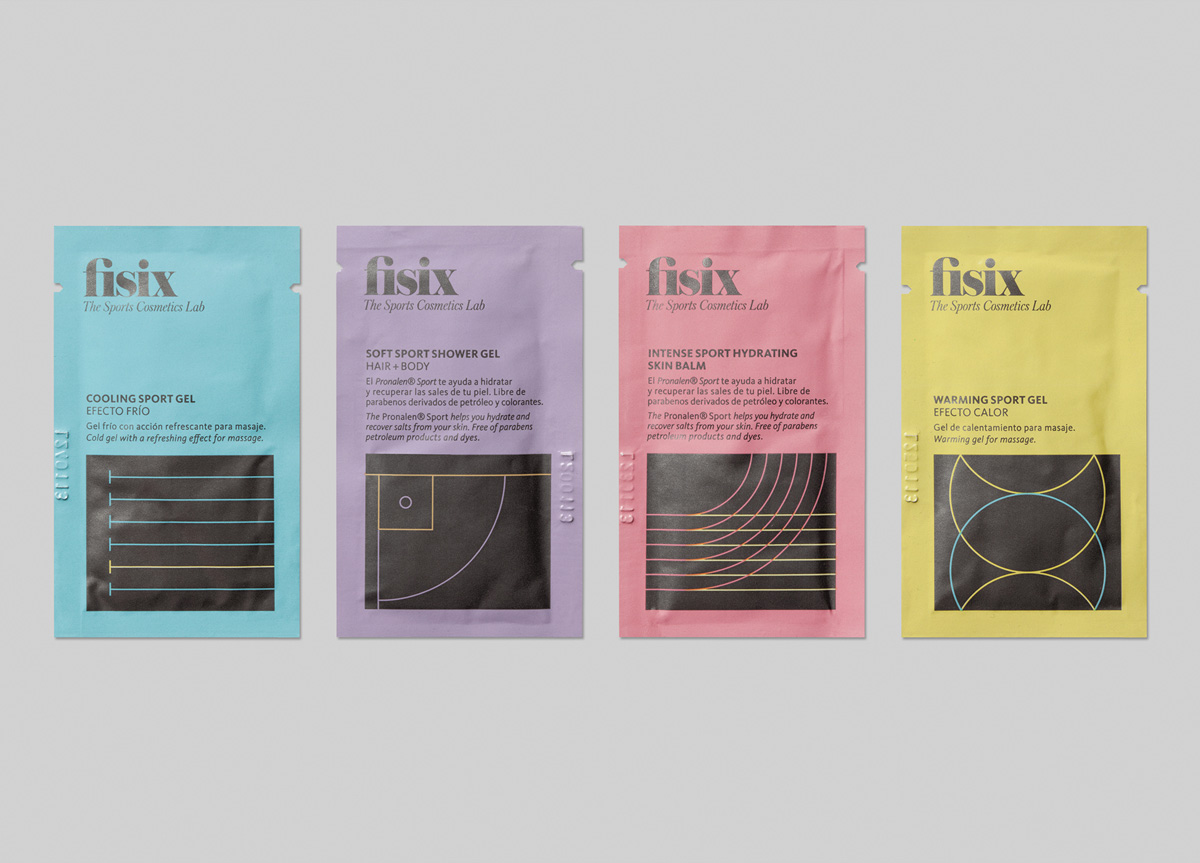
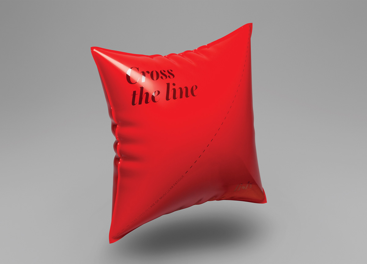
We then generated a visual system that differentiates each product by using the lines that appear in courts or limits of sporting fields. By cropping and reinterpreting these lines we created liberating abstract shapes. We utilized a mixture of pastel colors with a constant dark gray alongside elegant typography in the logo to appeal to both masculine and feminine audiences.
We had several big challenges when we started to create Fisix. We had a great product but no name, no design, and no defined corporate values. Our first goal was to define the company philosophy and values. The Mucho team worked with us on strategy from the very beginning. There was a working dynamic between the Mucho team, our staff, and product developers, all the way through to the CEO of the company. Working in this way allowed Mucho to really understand the personality and needs of our business. We are a start-up so they understood that we had limited resources in which to communicate the brand and didn’t have big budgets to work with. The resulting design for the overall identity and range of products had an immediate impact in the marketplace. It generated a huge amount of publicity and was key to the success of the brand. We believe that Mucho’s philosophy of getting 100% involved in every step of the brand, from the initial meetings until launch was the key to this success. It’s also what makes them a very special design company. — Silvano Guillamet, Marketing Director at Fisix

