CLIENT
A French architectural agency previously named L’atelier undergoing restructuring changes and the addition of a third partner.
BRIEF
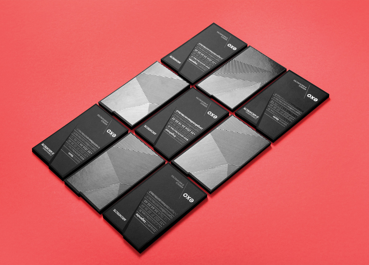
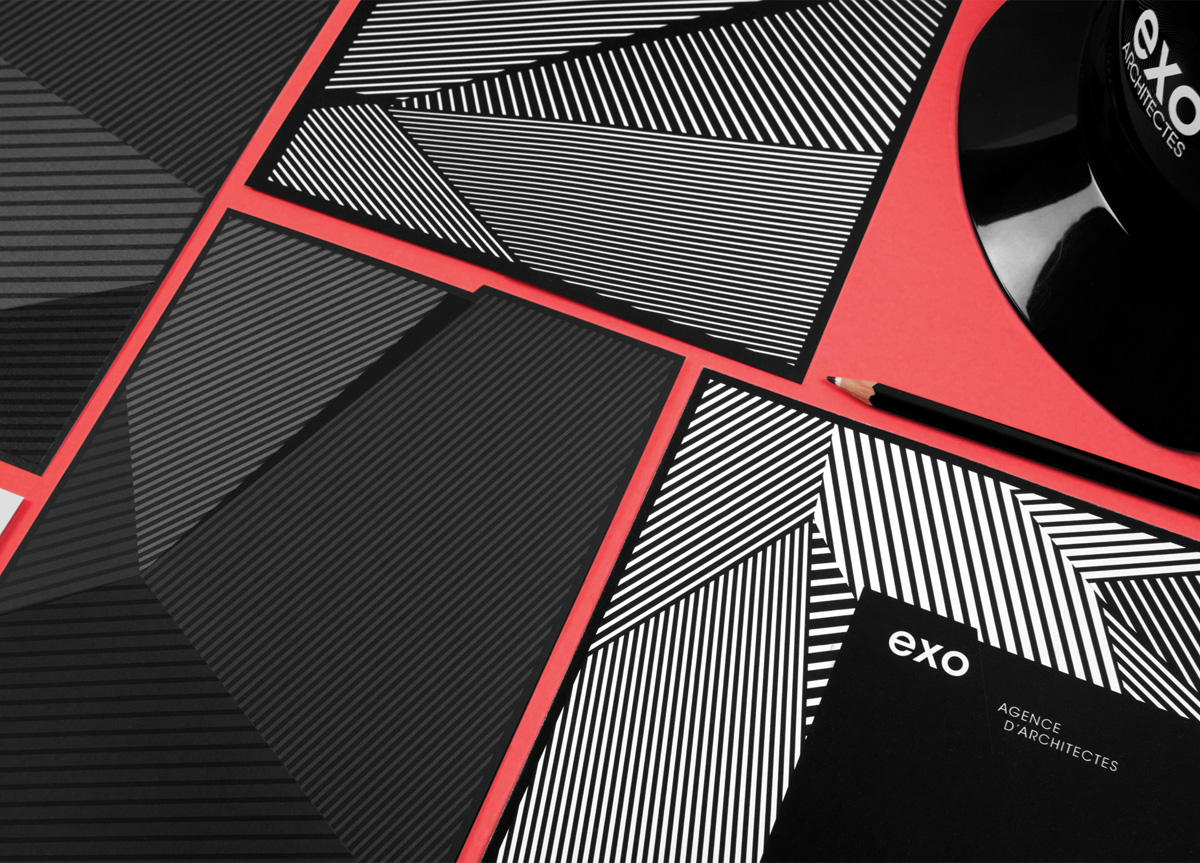
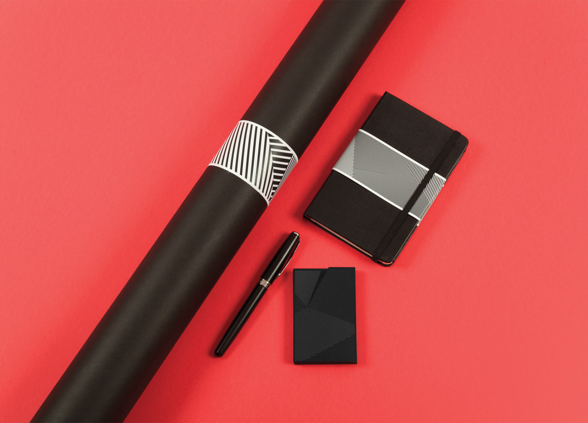
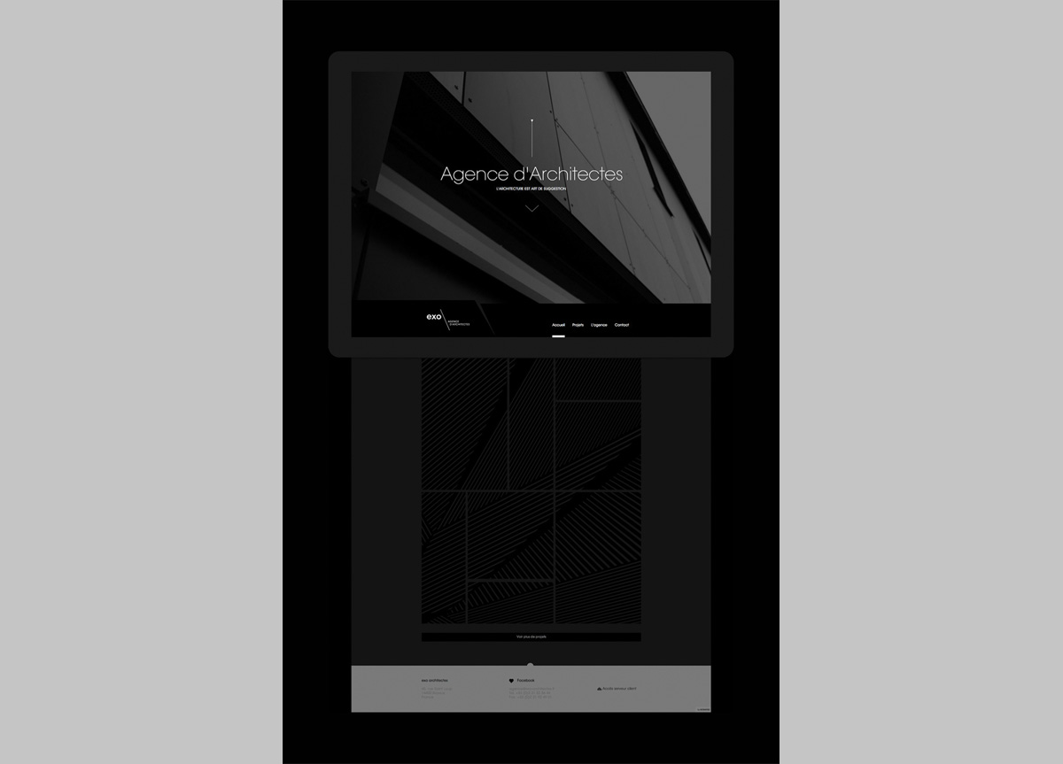
To create a new brand image for the firm upon its restructure and renaming. The name Exo is directly inspired by the concept of exo-skeleton, outer structure, technical elements recurrent in their work. The aim was therefore to orient their brand to that of a small structure, young and creative, while developing a visual identity that reflects the notion of structure, volume, and aesthetics in all of their communication materials.
APPROACH
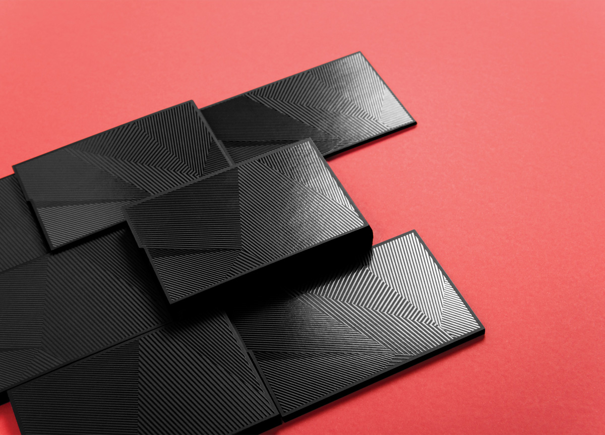
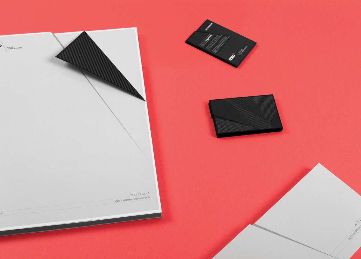
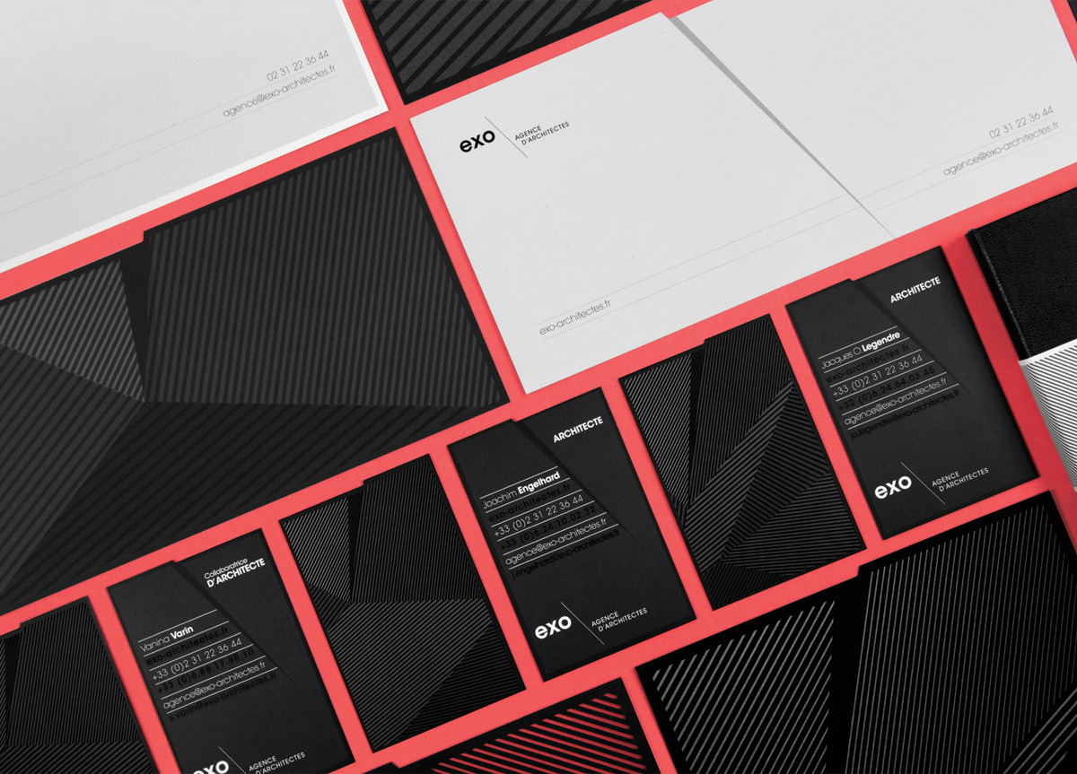
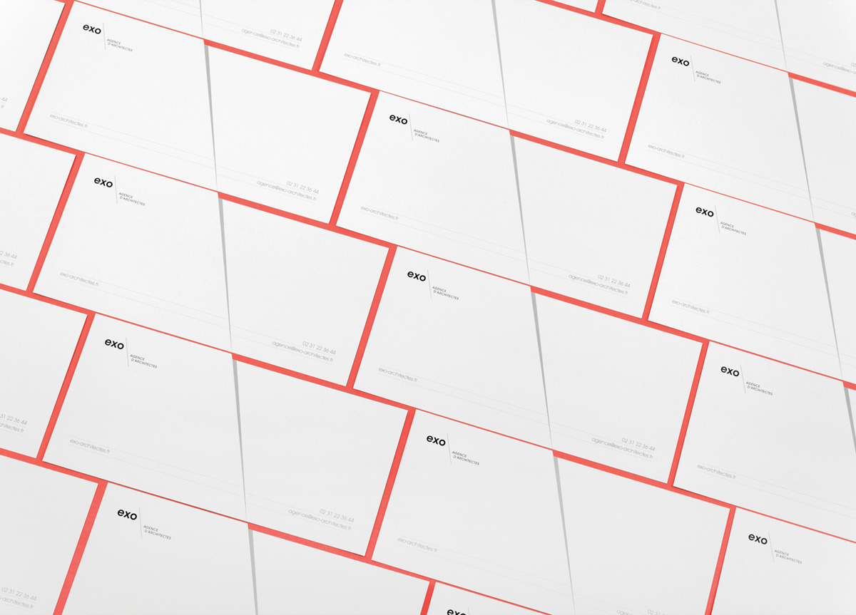
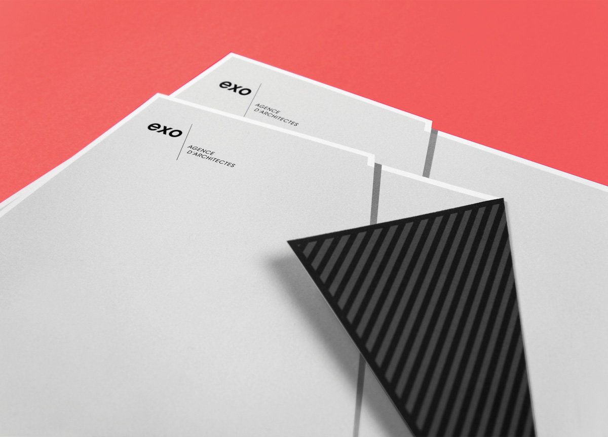
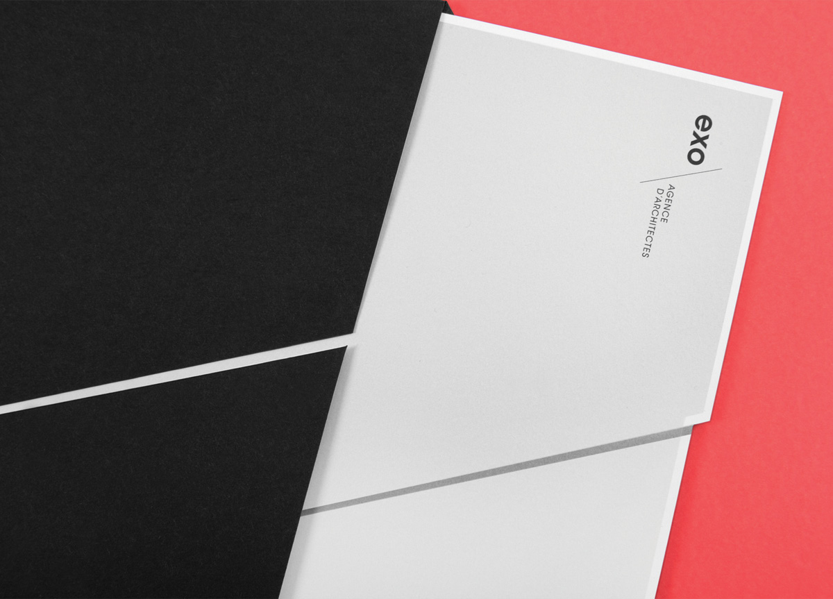
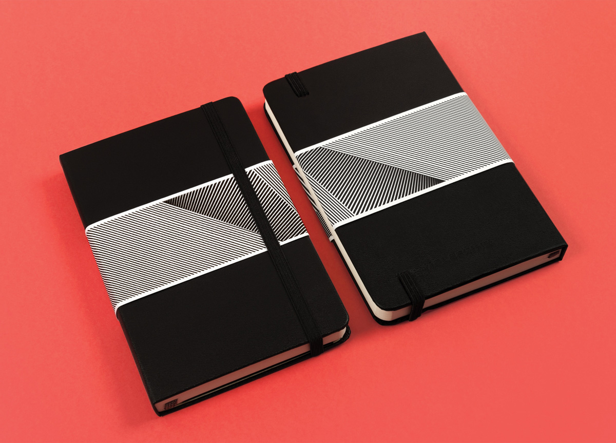
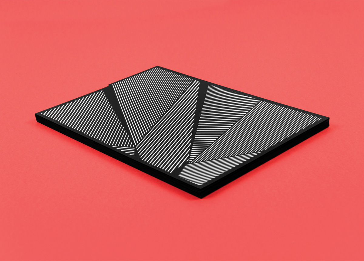
The founding principles of this visual identity lie in the design of volume through light and notions of perspective, of materials, and of fundamental elements. We studied paper as a building material as we sought to give a certain feeling of volume to 2D supports. The elements are cut-through shapes so it reinforces the effect of depth as they bring the necessary discontinuity and become a constituent part of the visual identity.

