CLIENT
A UK-based, sustainable, eco-friendly, fairtrade company that aspires to bring Mongolian yak knitwear to the forefront of the fashion industry. It aims to preserve the Mongolian landscape and support the nomadic herders’ way of life, which is threatened by industrialisation, land degradation, and pollution.
BRIEF
The assignment was to create a identity that captured the spirit of Mongolia with specific relevance to fashion and the Mongolian yak. The set challenges were to retain references to traditional Mongolian culture (without making it too ethnic), while capturing a modern and minimalist feel, and an edgy and luxurious identity. Finally, the design had to enable the company’s identity to be relevant if it expanded beyond knitwear into other areas in the fashion and textile industry.
APPROACH
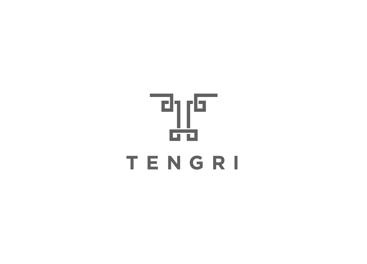
We wanted to create a simple, contemporary-looking logo that conveyed the boldness and strength of Mongolian people and the yak. The process began with researching everything Mongolian, from the inspirational national hero Genghis Khan, to Mongolian warriors, bold fabric patterns, herder families tending yak in the harsh landscape, and local climate. Then followed many sketched iterations of the logo incorporating the letter T (from the name Tengri) and alluding to the shape of a yak’s head. The line is inspired by the Mongolian Ulzii pattern, a symbol of longevity and happiness. This final design ticks all the boxes, uniting multiple elements with bold clarity.


