CATEGORY

Logos

LEVEL

Professional

RANK

DESIGN CREDITS

Art director and Designer

Luca Eusebio


TAGS

, , , ,


LINKS

Studio Eusebio
Nimsai

Nimsai by Studio EusebioNimsai by Studio Eusebio


CLIENT

This Zurich-based label pro­vides mate­r­i­al goods of all kinds, spe­cial­iz­ing in the cre­ation of unique hand-sewn products.


BRIEF

To cre­ate a visu­al iden­ti­ty rep­re­sent­ing the crafts­man­ship of Nim­sai that can then be applied using dif­fer­ent techniques.


APPROACH

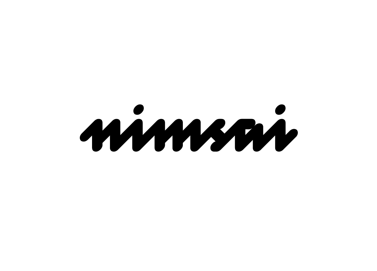
The graph­ic iden­ti­ty we devel­oped for Nim­sai is based on using an ellipse as the core ele­ment to gen­er­ate the logo­type, the mono­gram, and the relat­ed pat­terns. The logo­type is a com­bi­na­tion of geo­met­ric forms and hand­writ­ten char­ac­ters. The appli­ca­tion of the ellipse effec­tive­ly high­lights the arti­san nature of the label.

For my sewing studio I wanted a logo which represents my craftsmanship. The handwritten style of the logotype is ideal for showing off my craft, and at the same time is reminiscent of the zig zag stitch. The monogram is an optimal solution, especially for the use of woven labels. Not only can it be used in very small sizes, but it also has a high recognition value! — Jasmin Fleischmann, Owner of Nimsai

Browse entries