

![]()
![]()
CLIENT
A creative studio obsessed with designing better brands. They create effective and elegant brand design solutions for companies of all sizes, from startups to start-overs. Through personal attention and the highest design standards, they’ll create a tailor-made solution to fit each individual need.
BRIEF
After years of designing better brands for everyone else, we felt it was time to better our own. We wanted an identity which felt simple, clean, polished, established, and that could showcase our creative work in the best possible way.
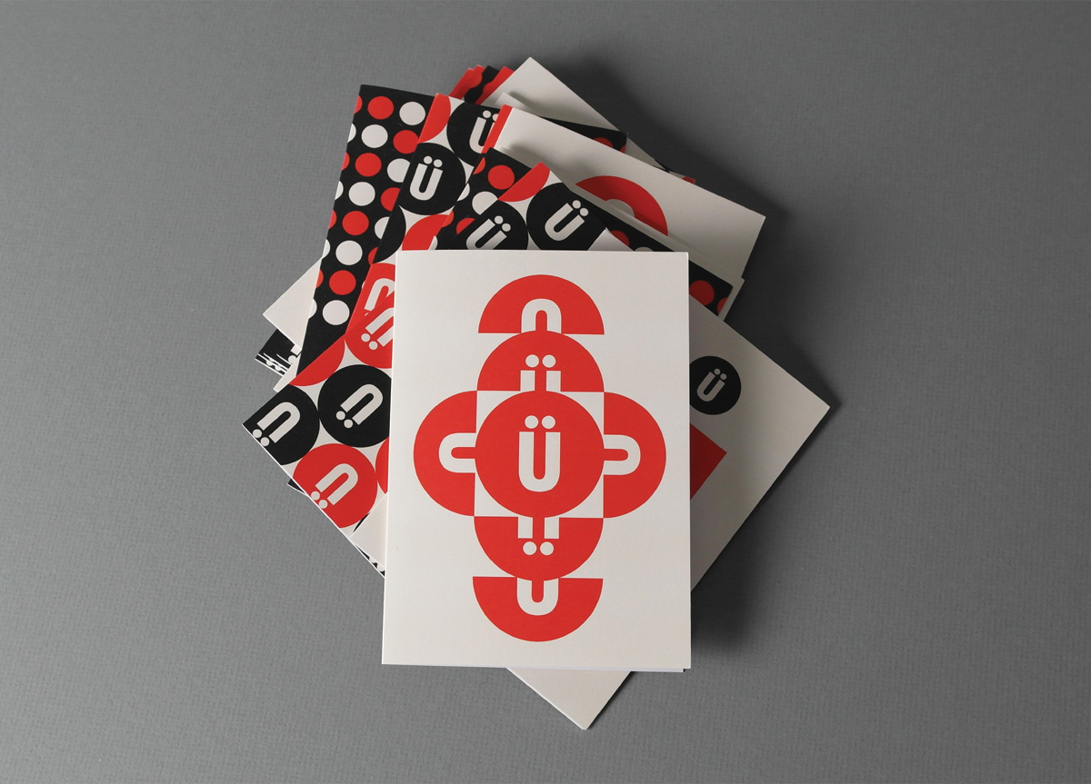
APPROACH
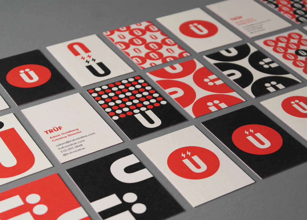
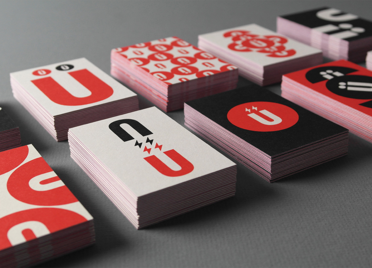
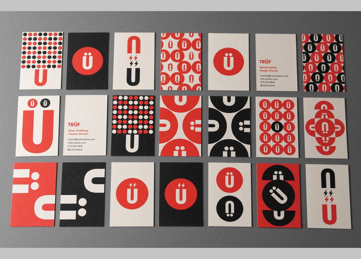
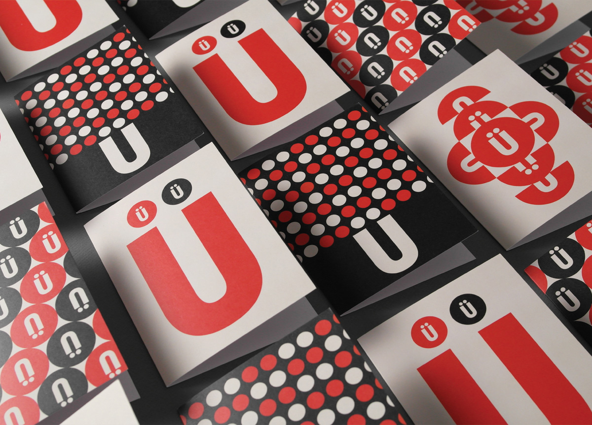
Moving away from the textured, Russian Constructivist look and more towards the Swiss, we distilled our identity down to its purest form: der Umlaut. The clean and simple “Ü” logo animates with bolts to depict our philosophy of “Brand Attraction.” Circles, dots, bolts, and the “Ü” motif reconfigure into interlocking and repeat patterns creating a set of twenty unique business cards that become a conversation piece when handing out. Four unique greeting cards are used to send clients hand-written thank you notes. The full system reflects the idea of “creative flexibility.”


