
![]()
![]()
CLIENT
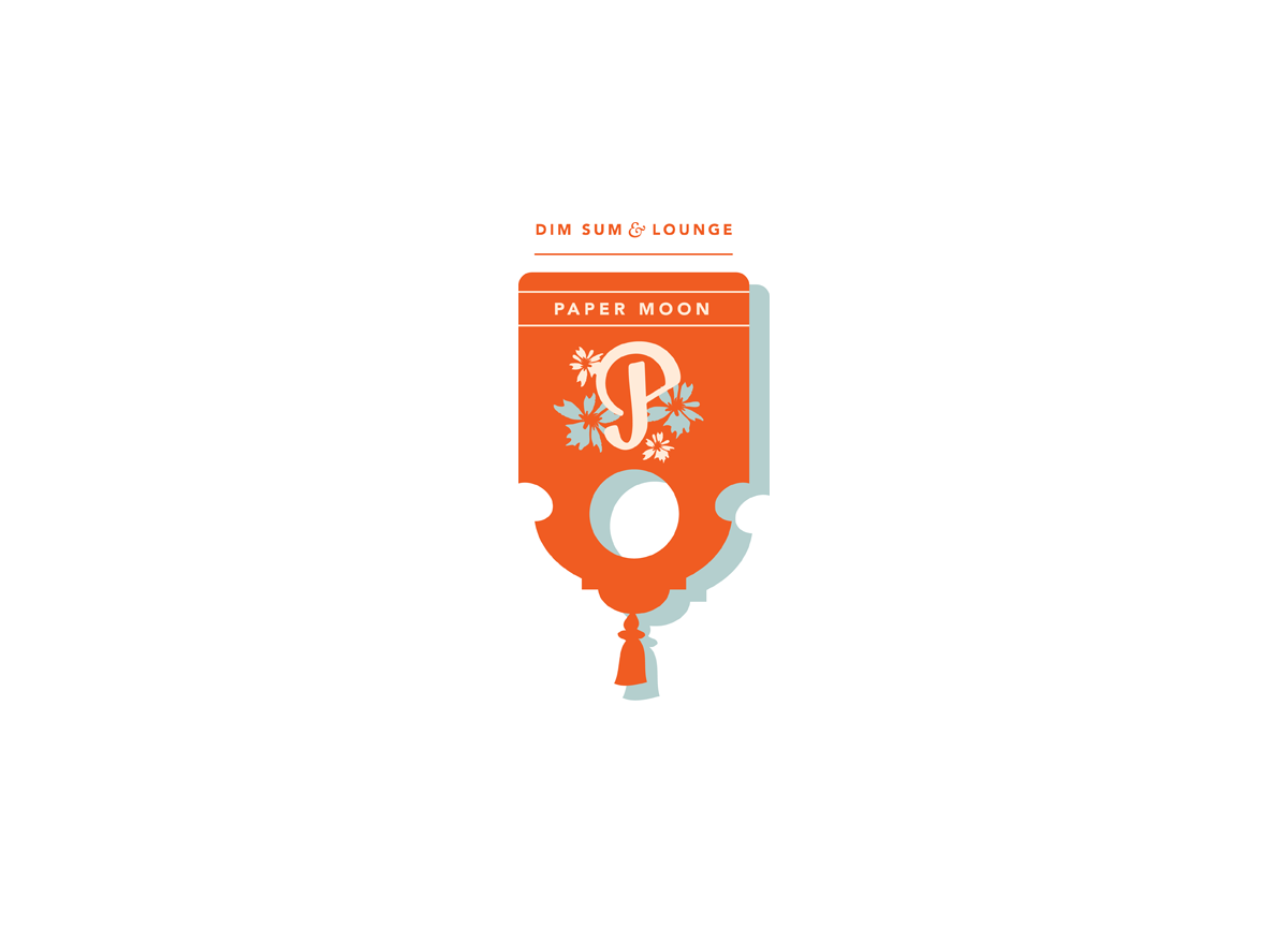
A boutique Chinese restaurant that pays homage to the aesthetics of historical Chinatown and the misconceptions of Chinese culture propagated during the art deco period. By day, the restaurant serves a dim sum lunch service and by night, a blending of American dishes constructed from Chinese ingredients.
BRIEF
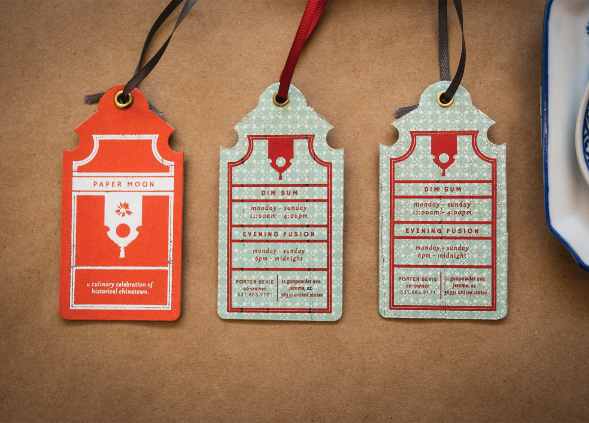
The project involved creating a visually engaging concept restaurant that provided a challenging framework for a full scale identity execution. My response was Paper Moon—the name alone references a classic Harold Arlen song from the time period and the glamorous misconceptions surrounding Chinese culture at the time. Challenges included creating a logo system that successfully married the illustrative and complex visual systems of yesterday with modern tastes. Additionally, it was a challenge to take a range of ornate and vibrant visual elements and make them visually cohesive.
APPROACH
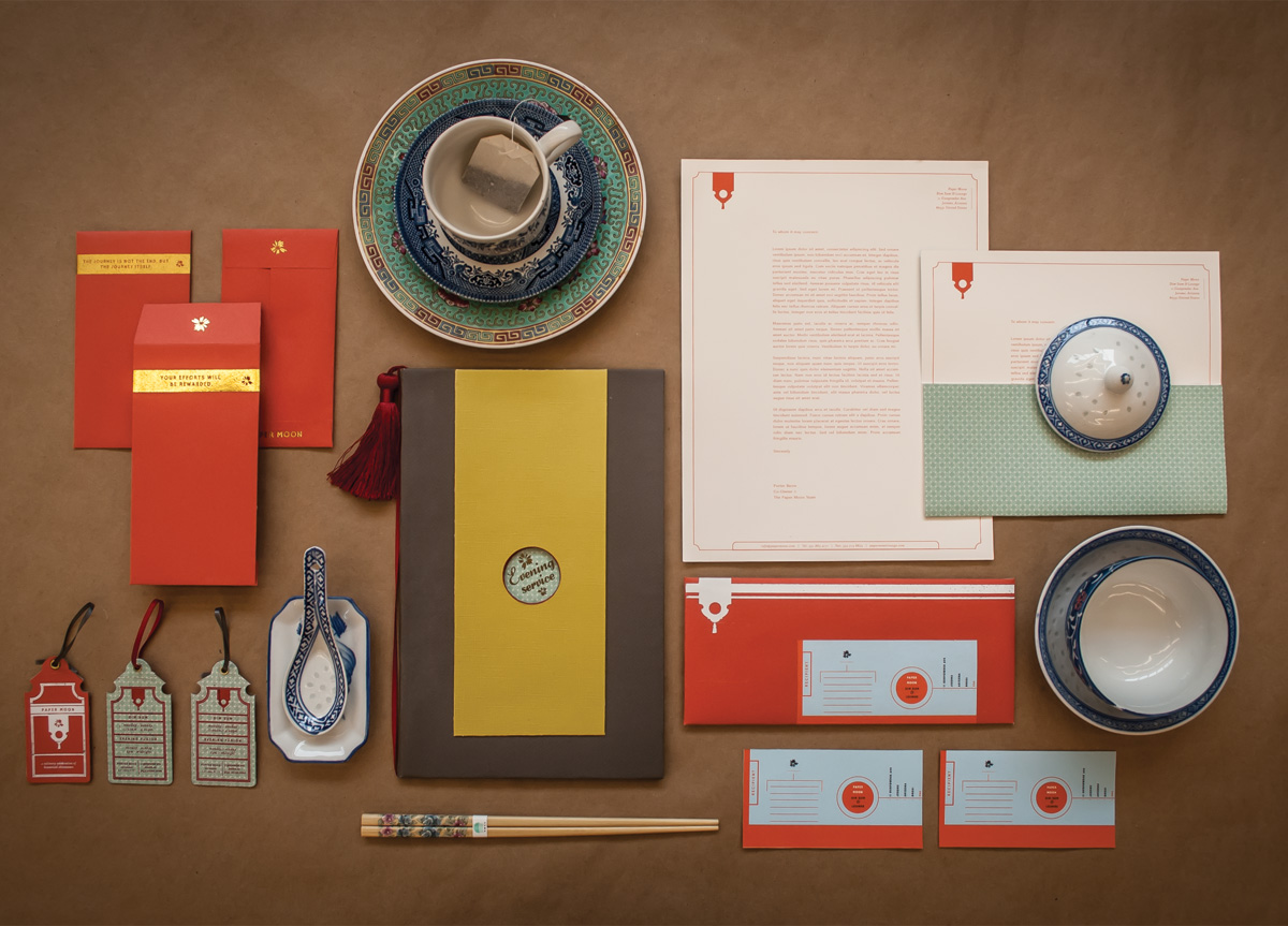
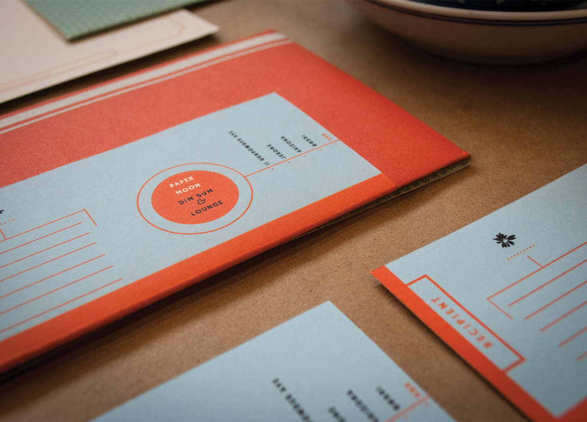
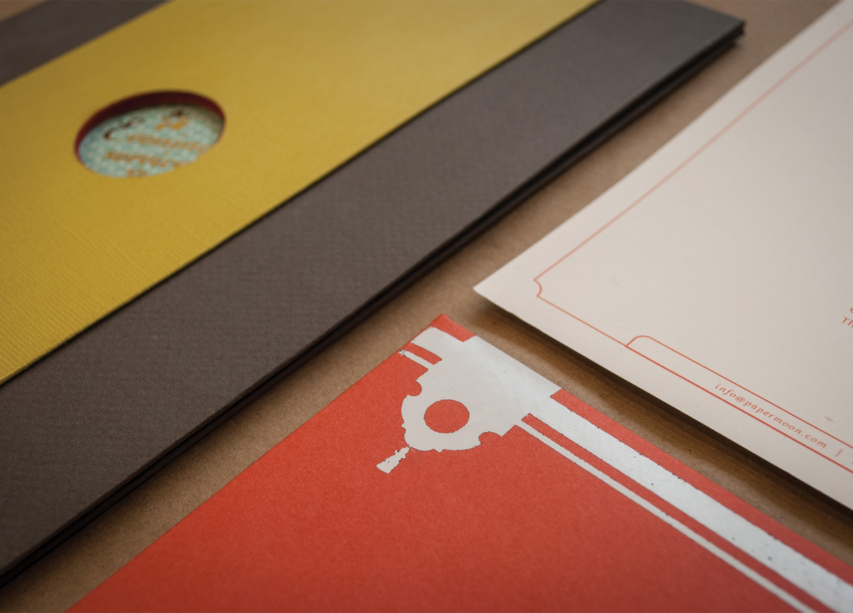
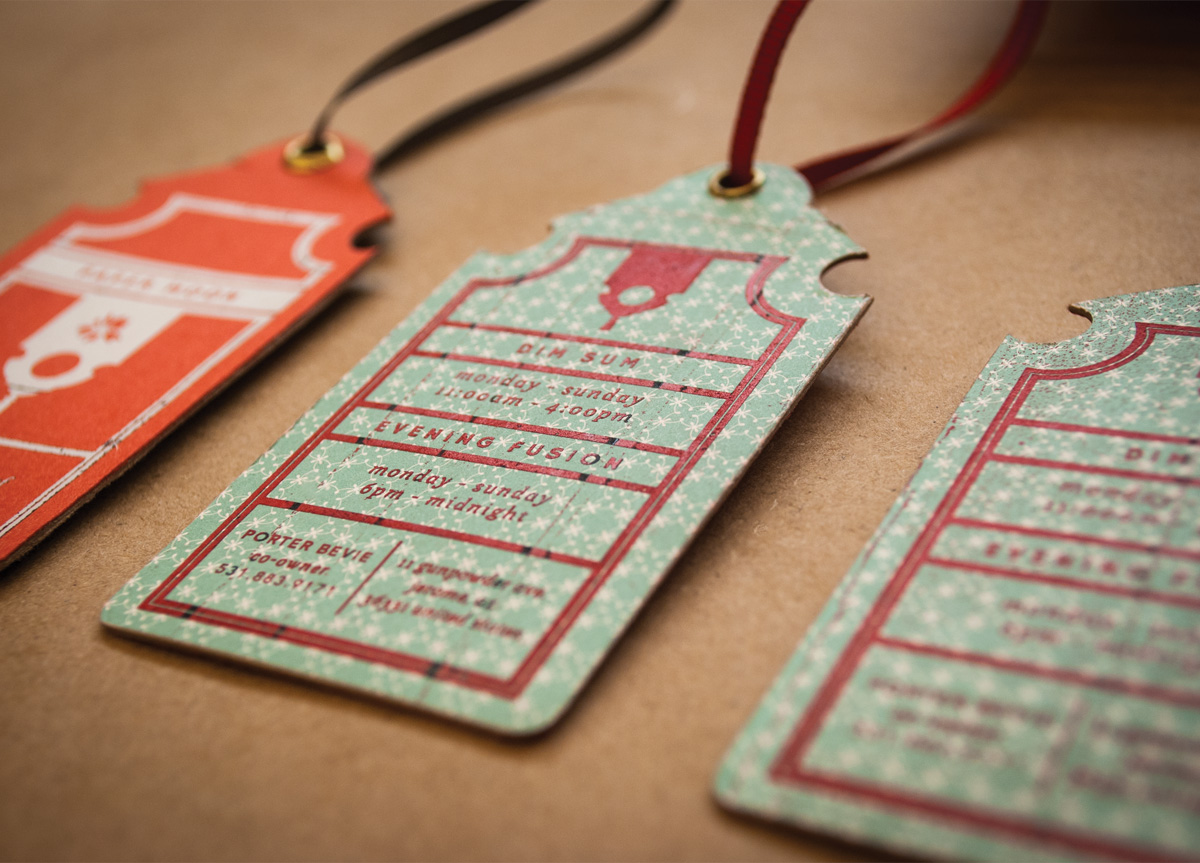
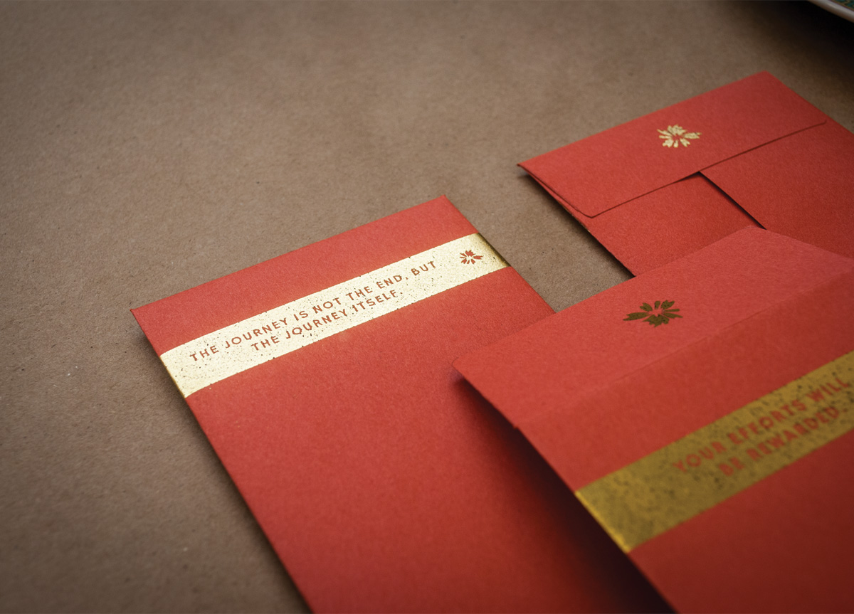
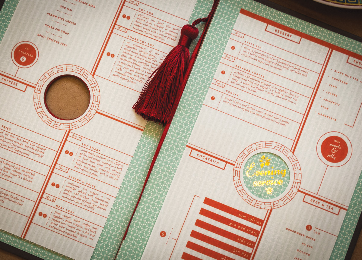
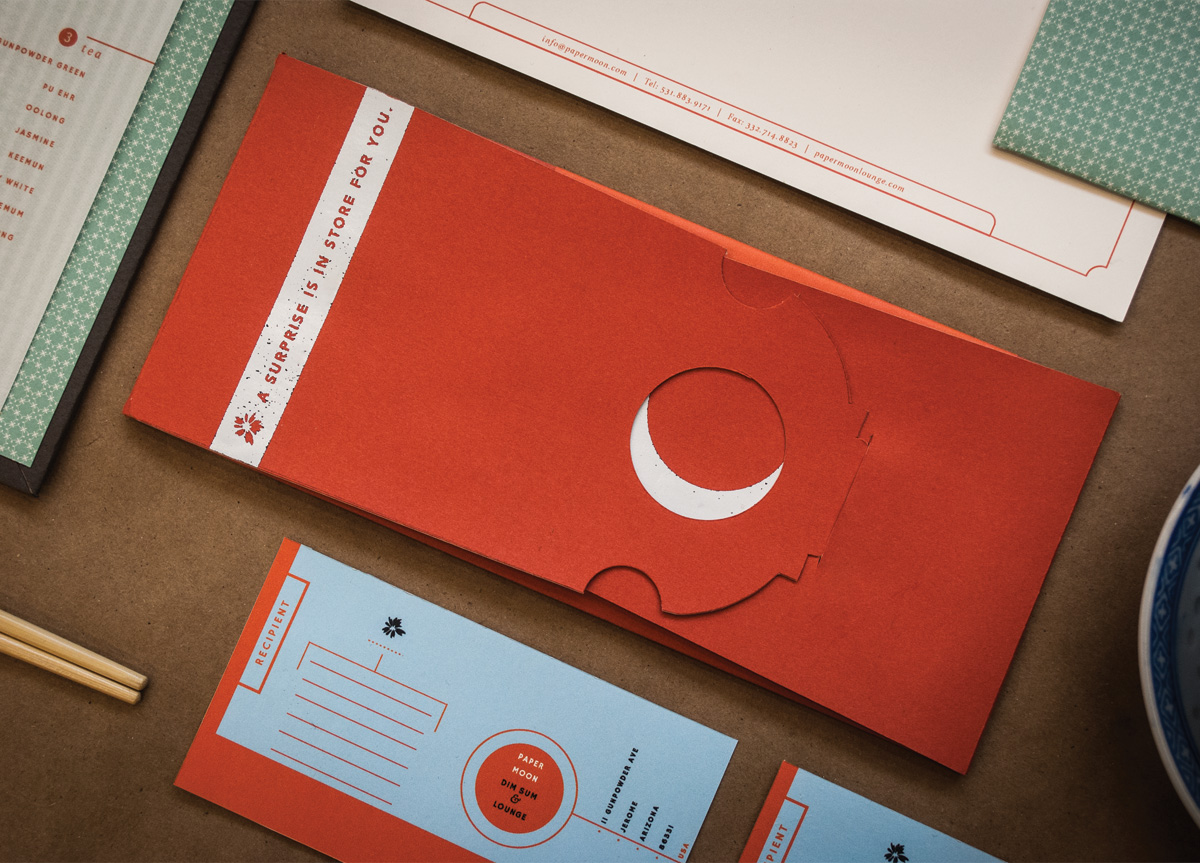
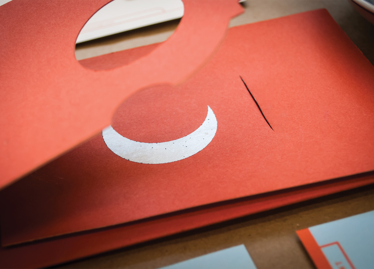
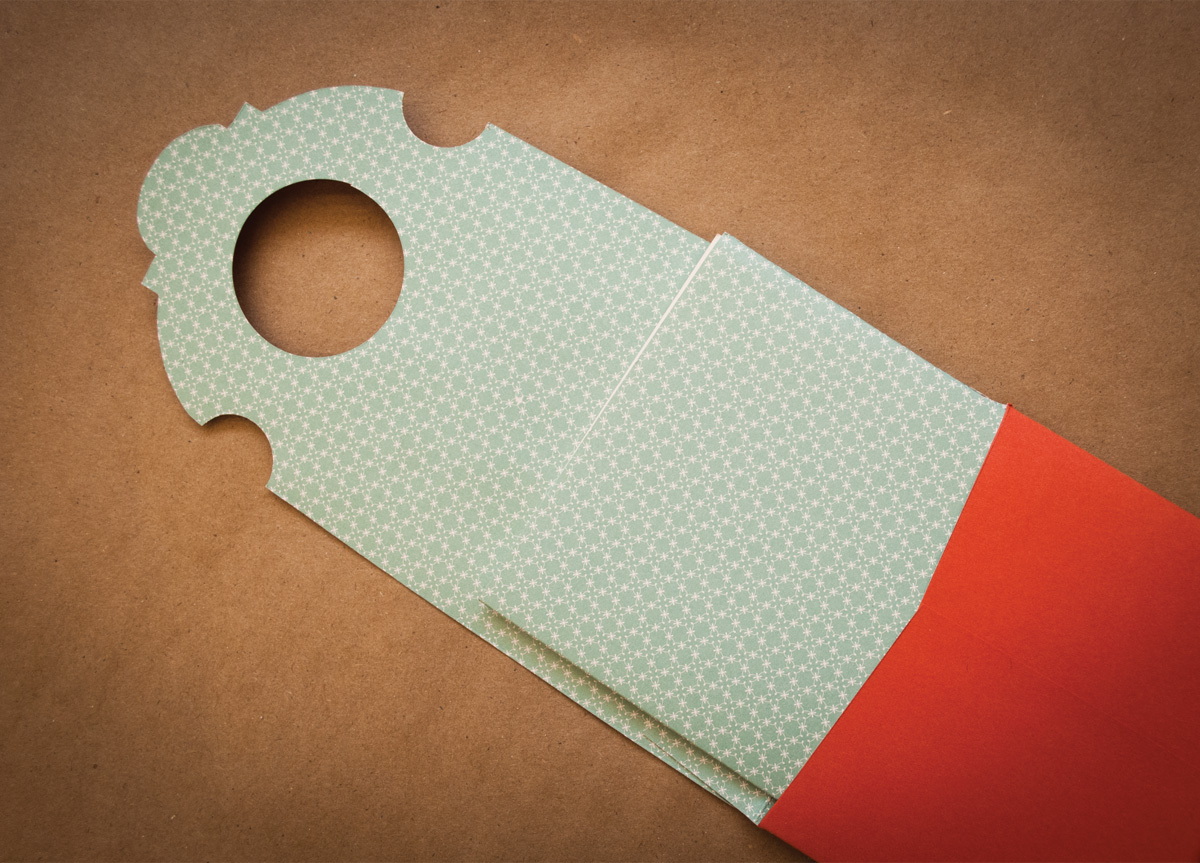
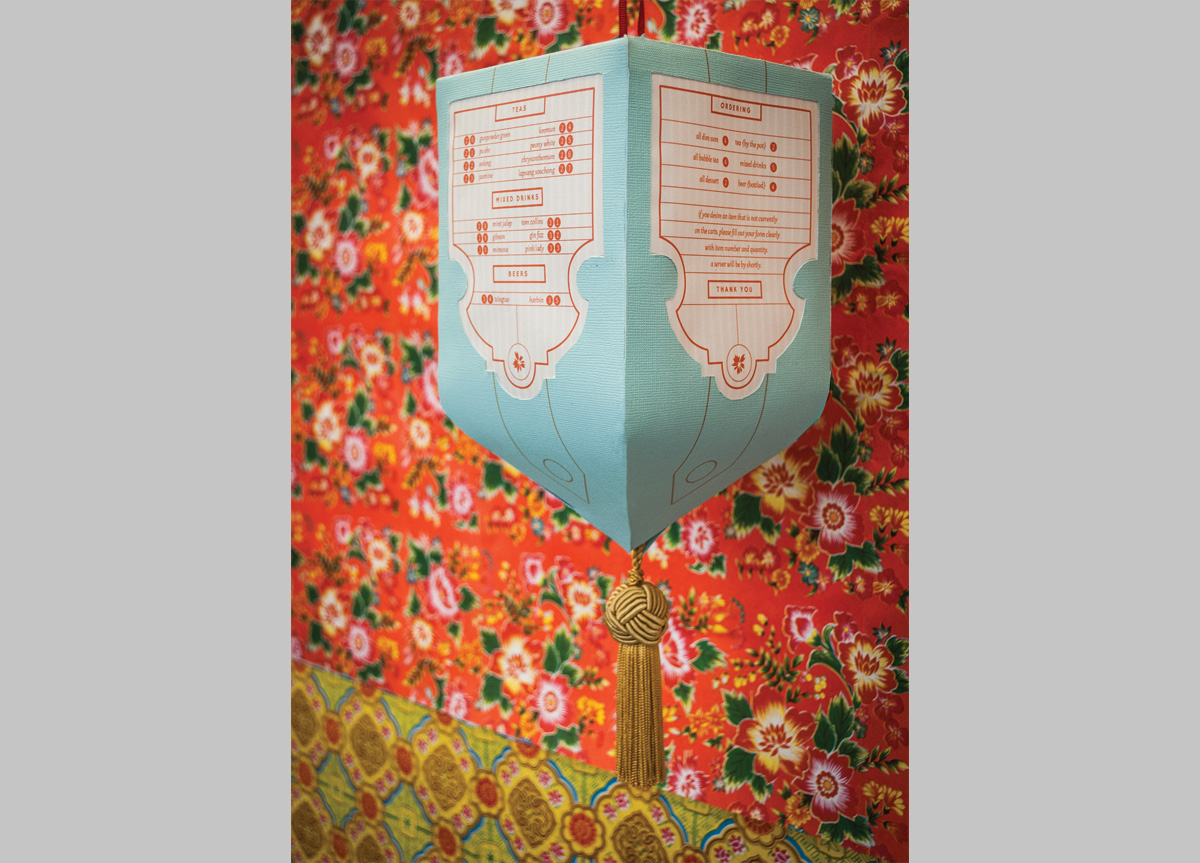
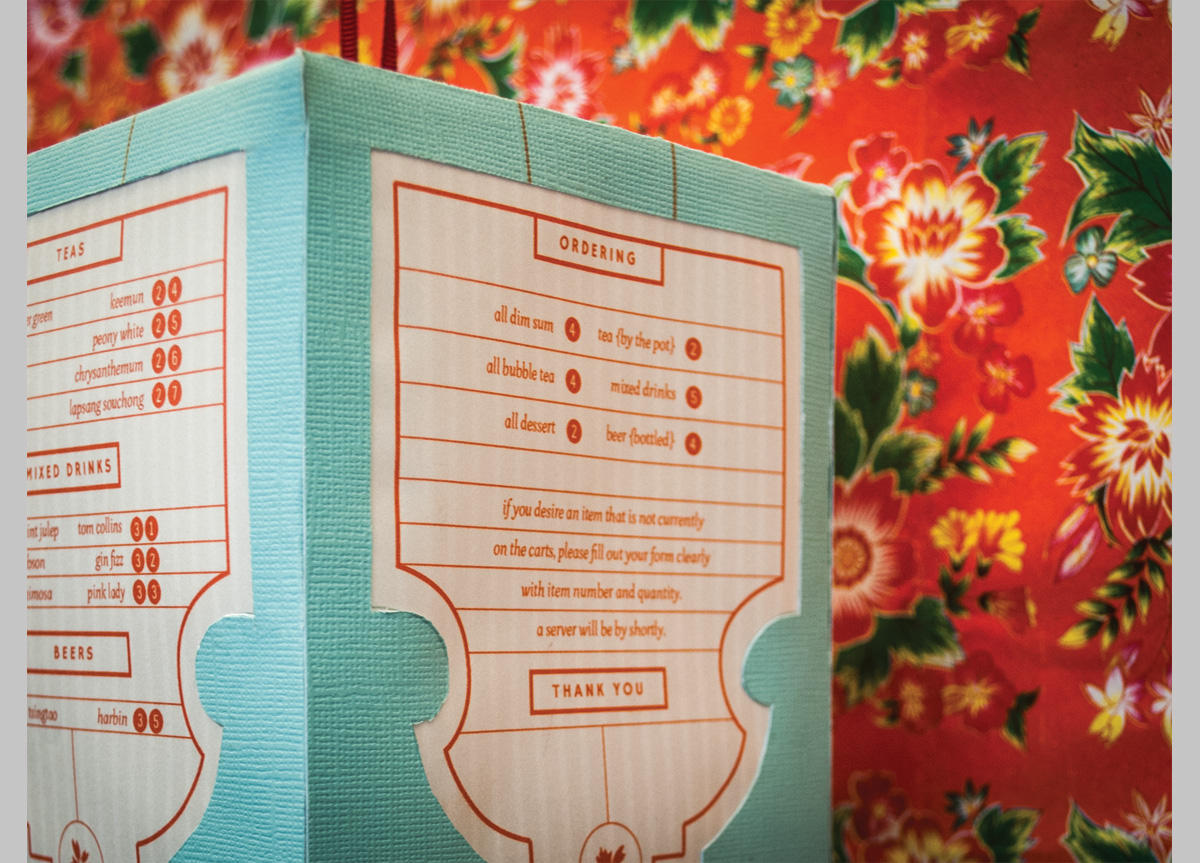
The packaging designs seen in Chinatown today are leftovers from post-war America where Chinese facilities importing goods into the country were no longer able to invest in new designs and have been marketing the same basic packaging for over 70 years. The full logo references a traditional Chinese banner and tassel with a layered look that reveals a crescent moon. I approached the day menu as a tactile hanging lantern to address dim sum as an ordering process, and the evening service menu has a more traditional format with a gold foil seal and tassel. References to stereotypical fortune cookie sayings are seen on the gift envelope and fortune envelope which holds the patron’s bill.


