

![]()
![]()
CLIENT
Australia’s largest and oldest charity is a not-for-profit, non-religious organization. Its mission is to support and advocate for personal and societal change to create a fair society where everybody thrives. The audience consists of the financial partners—those organizations it works with to deliver its mission—and the public.
BRIEF
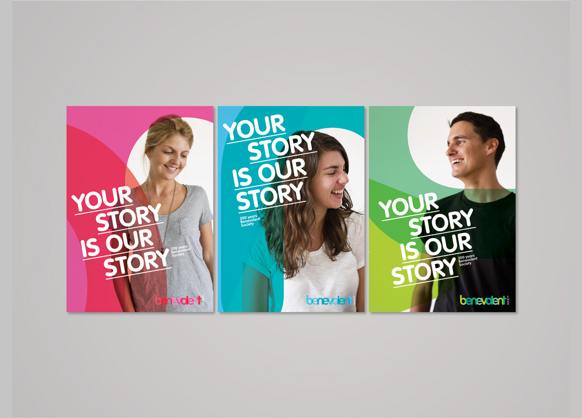
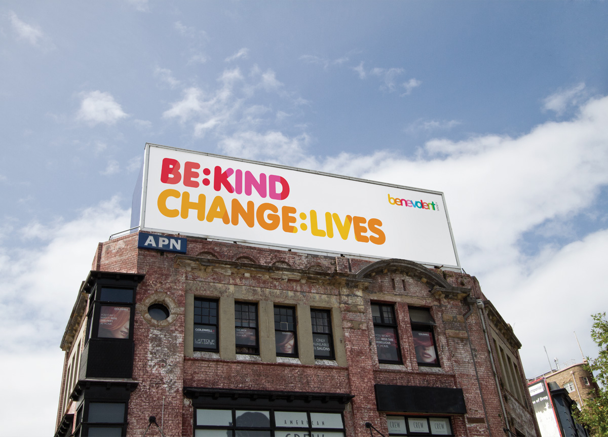
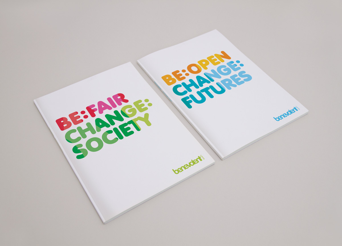
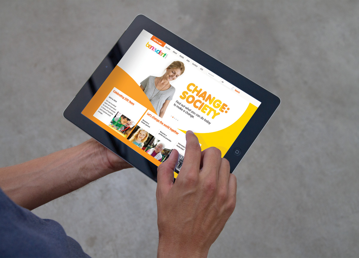
Benevolent Society was turning 200 years old and asked Designworks to make them relevant in today’s market. The challenge was aligning a broad group of stakeholders—each with long and varied Benevolent Society relationships—around one common purpose. And all in a way that modernized the brand. Following an extensive strategic development phase that included workshops, consumer research, online analysis, and stakeholder engagement, the single unifying idea we created was Strong Together.
APPROACH
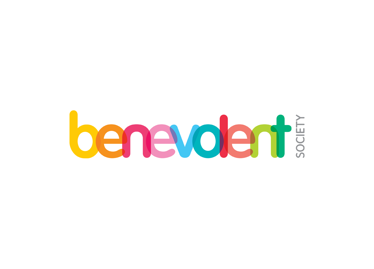
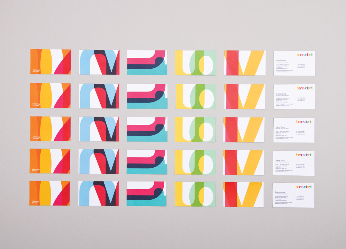
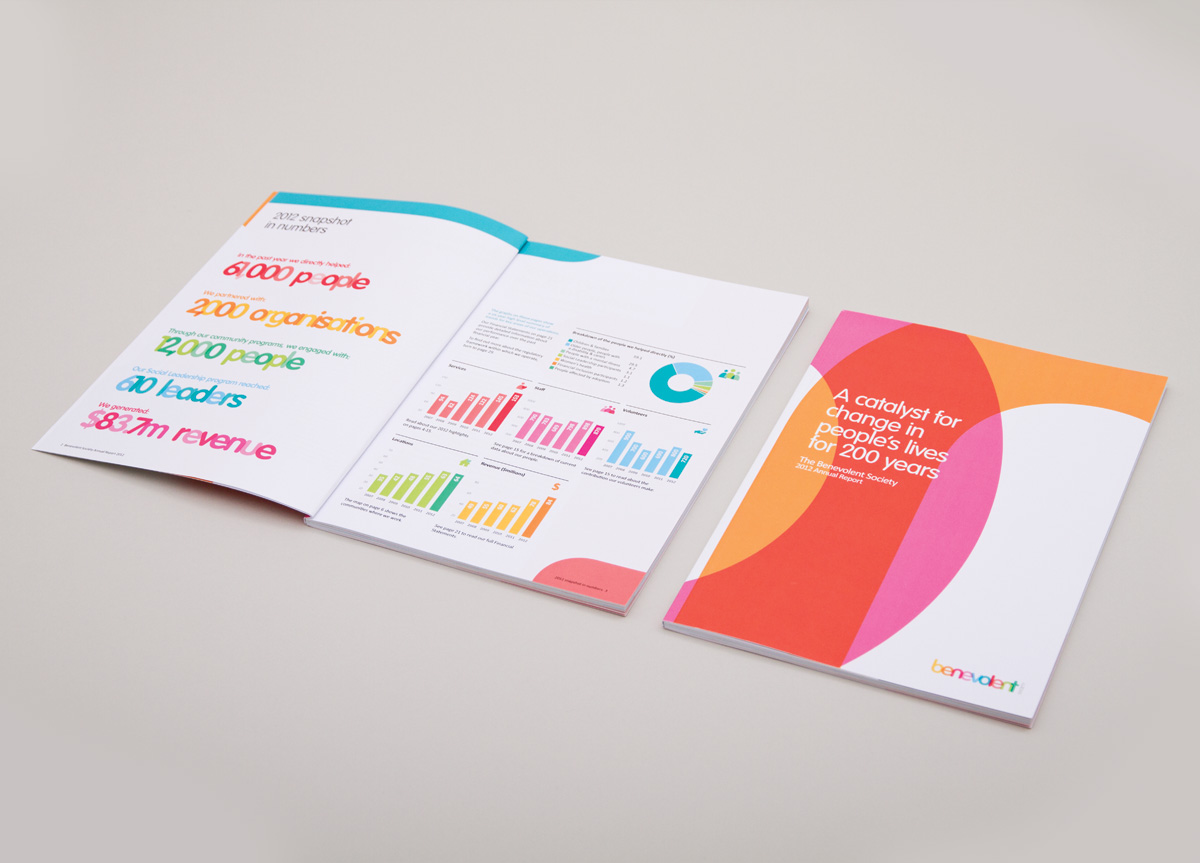
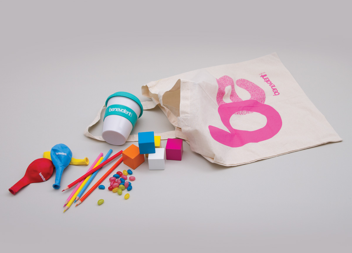
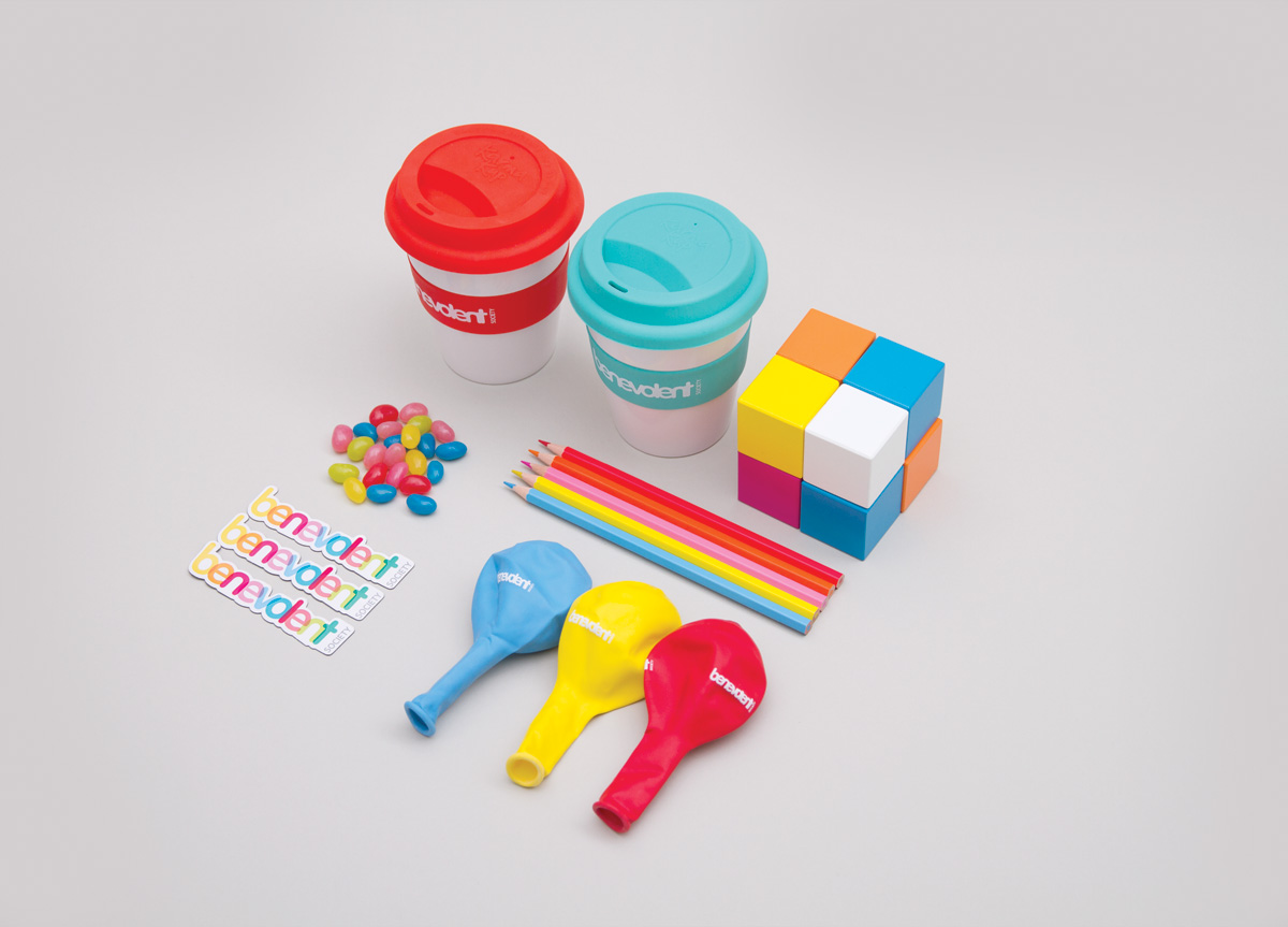
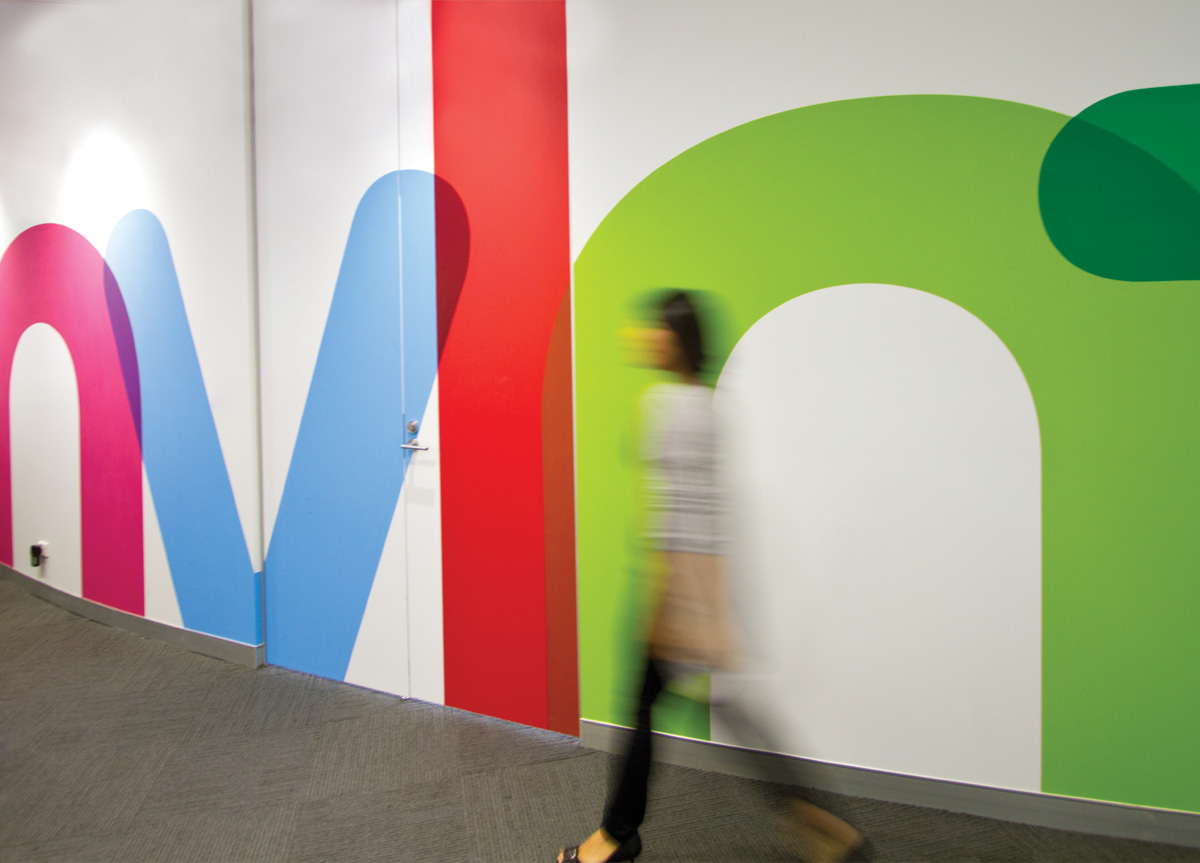
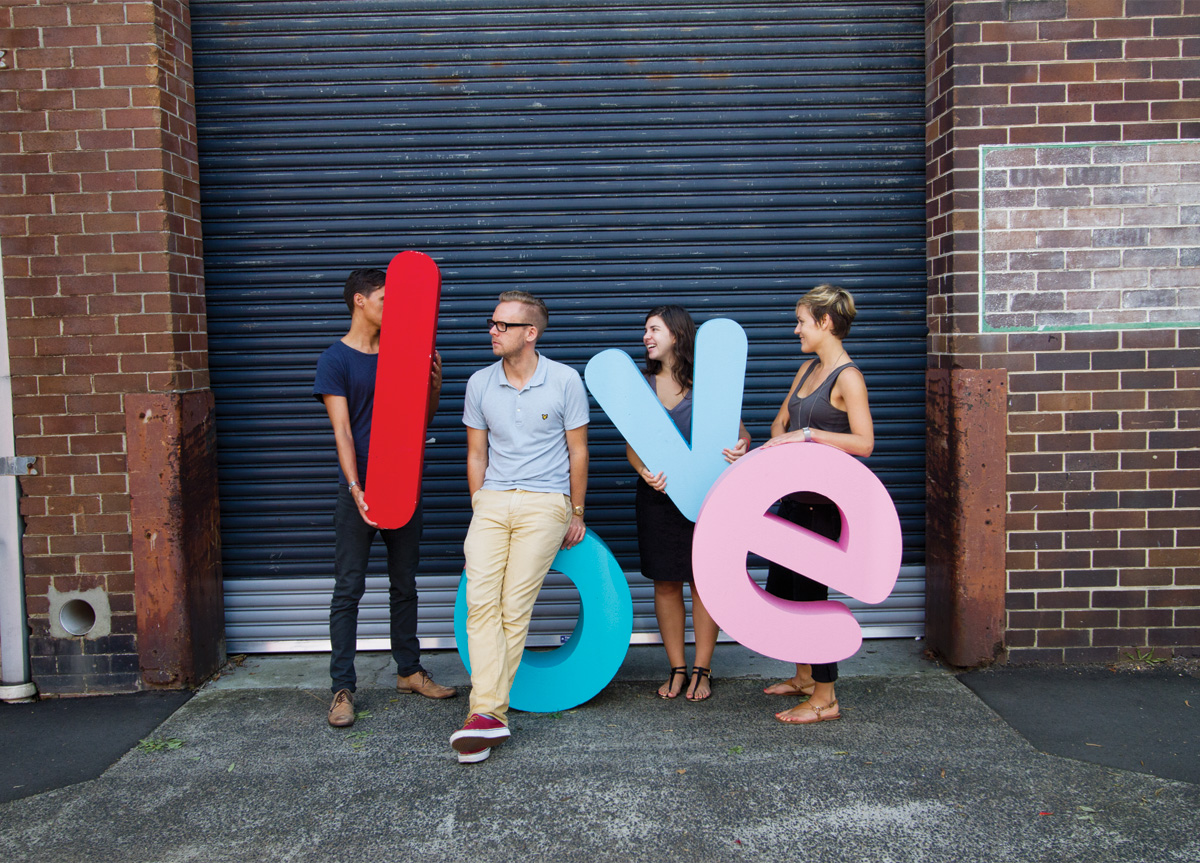
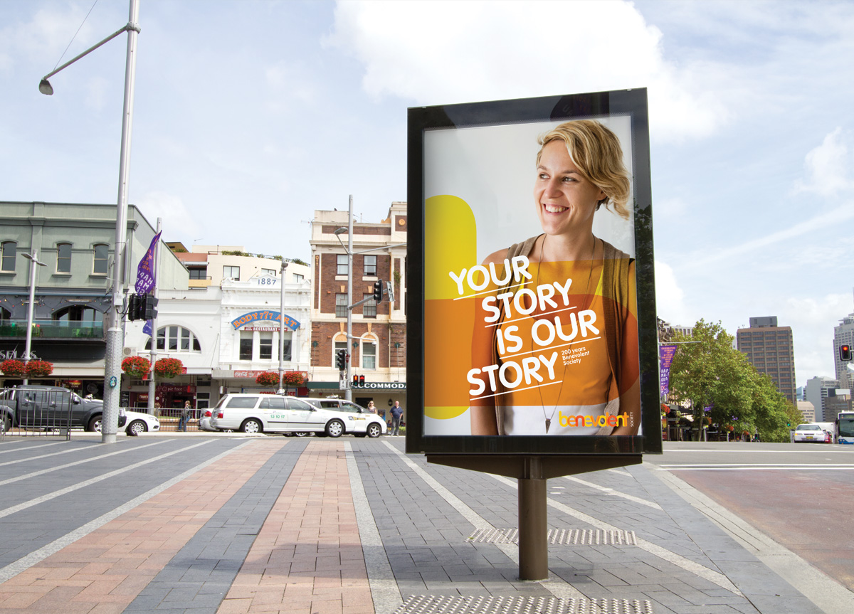
Strong Together was the brief and Strong Together was the solution. The joining letters represent the strength gained by working together, and the intersections point to the change that can occur through this strength. A broad color spectrum was used to represent the underlying brand pillars of hope, strength, love, wisdom, and belonging. These created a bright and positive color expression. Super graphics were created to help carry the color and create a bold, impactful identity. The result was a 200-year-old charity that was relevant again in 2013, as well as it reinvigorated staff and stakeholders.


