
![]()
![]()
CLIENT
An outdoor organization founded in the 1930s and located on the Yale campus. Members of the Yale community (students, faculty, staff, and alumni) are welcome to join the club.
BRIEF
The design of a mark for use on printed materials, the club website, apparel, and event signage. I received a few starter ideas from the Yale Mountaineering Club that all involved climbers in different positions with varying pieces of equipment. However, they were anxious to hear my thoughts and were very open and receptive to new ideas. The main challenge I encountered was an attempt to design a mark that would work across multiple platforms and fit under the Yale umbrella.
APPROACH
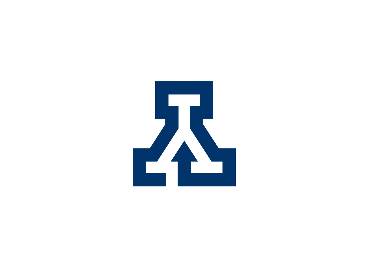
I was drawn to the classic Yale blue “Y” for a number of obvious reasons. Turning the old logo on its head reveals the form of a mountain and speaks about the unnatural positions a climber may encounter. Removing a small portion of the blue outline creates a ‘climbing route’ that extends up and over the mountain. The line culminates in an arrow pointing upwards. The simplicity of the gesture makes the traditional “Y” new and unique to the Yale Mountaineering Club without deviating from the University brand.


