CLIENT
Founded by Tom and Kate Chappell in 1970 in Kennebunk, Maine, Tom’s of Maine makes and sells natural personal care products that would not affect the environment. They are concerned about recycling and using green materials. Their audience is the one who believes in natural products and is a nature lover.
BRIEF
Create a new line and new image to attract a younger group of audience and generation. The design needed to be based on their existing idea, that business can be both profitable and socially and environmentally sensitive.
APPROACH
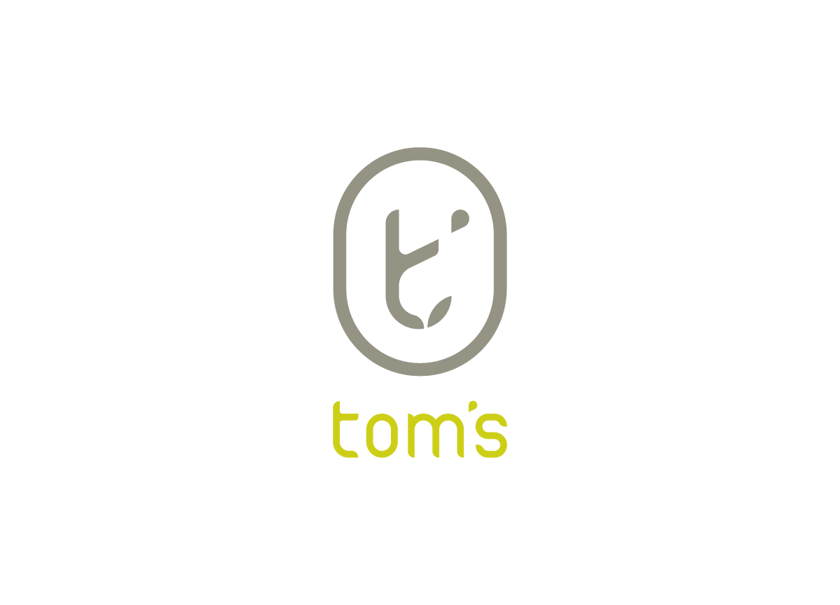
I decided to create a modern, natural, fresh, and cordial image for the new line of Tom’s of Maine in order to attract a younger group of consumers. The name of the new line is simply called “tom’s,” which not only was inherited from the original name but also sounds simple and direct, modern and confident by shortening it. For the logo, I simplified it by using only the “t” and apostrophe inside the logo, and I picked small capital letters for the name in order to create a more friendly and cordial feeling.
The strength of Celia’s rebranding for Tom’s is in the logos not chosen for final development. While everyone gets lucky from time to time with a cute doodle, Celia’s final mark for Tom’s was one of more than a half-dozen A‑quality marks. She took this notion and included a not-often-seen “behind the scenes” approach to the idea of showing the final mark — showing the ones on the cutting-room floor first. This was a brilliant move, as it gives her the chance to show a potential employer that she can think divergently and create more than one excellent final product. She continued by exploring new products, services, and environments for Tom’s that still keep the “grassroots” feel of the brand but update it beyond the current “1980s-natural” look-and-feel. — Hunter Wimmer, instructor at Academy of Art University
Judge’s Comment
The redesign of Tom’s projects the very “green” and nature-related products of the company. It looks friendly. I enjoyed the way the designer re-appropriated the leaf shape in the apostrophe. A memorable mark. — Steff Geissbuhler