
![]()
![]()
CLIENT
A Venice, CA-based digital creative agency.
BRIEF
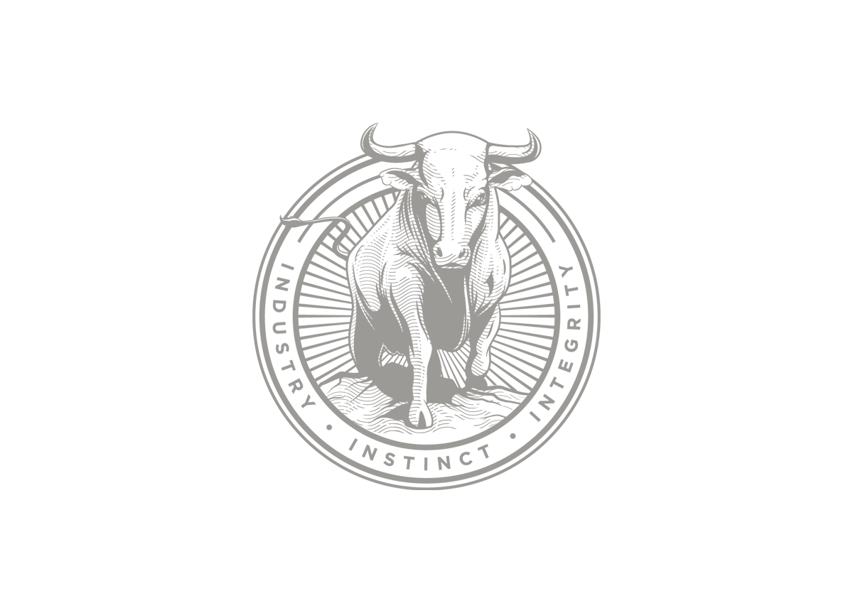
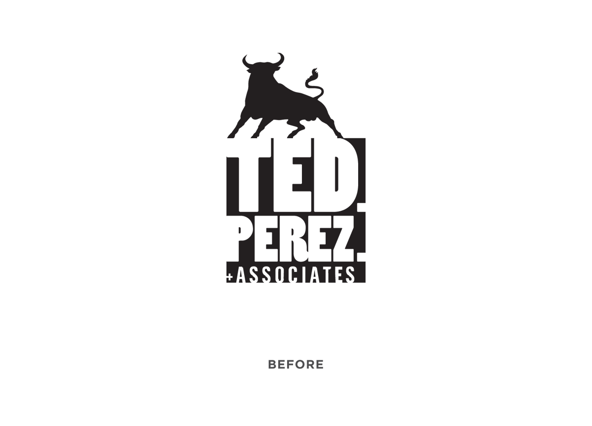
Create a mark that didn’t necessarily throw the company name or nature of the business down your throat. The mark was to be timeless and feel as if it could be for a law firm, government agency or any well respected business. The only element that was to be carried over from the previous logo was “the bull” — the company’s trademark symbol. Rather then incorporate the name “Ted Perez + Associates,” we opted to include the company motto, ”Industry, Instinct, Integrity.”
APPROACH
Old letterheads, logos, seals and crests were used as inspiration. The finished logo borrows the etched, detailed aesthetic of old postage stamps and currency with a more polished approach to provide an updated flare. The bull was redesigned to face forward as he crests the horizon. This positioning is significant as it symbolizes strength and the readiness to take challenges head on, while cresting of the horizon symbolizes “achievement.”


