

NOTE: This is an archived version of the first incarnation of Brand New. All posts have been closed to comments. Please visit underconsideration.com/brandnew for the latest version. If you would like to see this specific post, simply delete _v1 from the URL.
![]()
When I was young and vibrant, the way a 20-year-old is, I had a nice routine for my Saturdays: A basketball game or practice in the morning, some design homework in the afternoon, early dinner, followed by a Saturday movie premiere from Starz and then, to top it all off, night-clubbing until 4:00 a.m.. Certainly things have changed. But I do remember (on the times when I wasn’t too imbibed) those Saturdays fondly. So it’s with a slight zeal of nostalgia that I turn my attention to Starz, with its flagship (at least for me) Saturday premieres that were somewhere between Pay-per-view and HBO — not quite first on TV, but not six months after a movie had been released in theaters. This was ten years ago, when Starz had an exclamation point at the end of it (Starz!) and it had only one channel &mdashl for a comprehensive look at the past identities and exclamation point particulars Wikipedia has a nice round-up. Certainly, things have changed for the Starz as well. It is now a six-channel network with HD and On Demand alternatives — and $25 million allocated for a comprehensive campaign, along with a shiny new logo.
The logo and identity were designed by Darwin (impossible to find a link to them), in partnership with Design and Image Communications. While it must have been tempting, for both client and designer, to go with another star spangled logo I like that they instead opted for an allusion of a star — with a shine coming through the “a” and “r”, let’s call it “The Shining” for now. I also enjoy the customization of the wordmark, with its ultra tight letter spacing and well resolved counterspaces, even if the “z” has a speed racing look to it that the other characters don’t have; it also makes it proprietary and distinctive. It’s a simple logo with a sturdy concept — which comes alive in the on-air idents developed by TV powerhouse Troika. The animations use The Shining to great effect, making it the focal point of the logo, with all sorts of light and supernovas filtering through it. Below are a few stills, but you can see the animations at Troika’s web site.
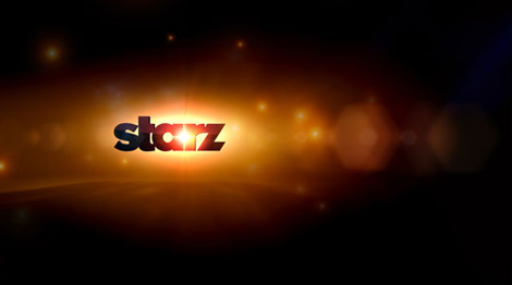


I really like this new identity and on-air package, I like that it is not trying too hard to be clever or hip, and it has a certain authority to it that places it in a more competitive category with HBO or Showtime. The advertising campaign is being developed by kirshenbaum bond + partners, but I haven’t seen any executions. It’s refreshing too, to see a congruent result coming from four separate creative teams — pending on the advertising look, of course. So, today, my Saturday routine involves diaper-changing, laundry-folding, playground-trolling, if I’m lucky, one or two hours of TV, an early bedtime of 10:30, certainly no nightclubbing, which is fine by my actually… but I do miss a good feature presentation. Happy to see Starz is still around.


Jump to Most Recent Comment
Ted Winder’s comment is:
I really love this new identity, especially the on-screen use. Beautiful!
On Apr.06.2008 at 10:31 AM
Josh’s comment is:
The "s" and "a" in the new logo remind me of the same characters in the latest USA Network logo. For the first few moments I was reading this post, I thought that Stars and USA might be related networks and that the similarity might have been an attempt as some awesome identity togetherness, but alas, no such relation. That's neither here nor there... the new look is excellent.
On Apr.06.2008 at 10:39 AM
Samantha Warren’s comment is:
The best thing about this logo is it's versatility. Dropping the stylized star and creating the knockout in the type treatment not only enhances the possibilities of flexible applications, but keeps it independent from any stylized trends. I think pulling that off is "hip and clever".
On Apr.06.2008 at 10:53 AM
Prescott Perez-Fox’s comment is:
1979 called, they want their logo back.
On Apr.06.2008 at 10:54 AM
mog’s comment is:
I reallly like it.
On Apr.06.2008 at 12:11 PM
Audrée Lapierre’s comment is:
i really like this one. Not big on the z though, it could have stayed straight like the other letters.
On Apr.06.2008 at 12:53 PM
lodenmuse’s comment is:
"Dude--we are way over-budget."
"Yeah, okay, let's clip the T and Z and call it a day."
On Apr.06.2008 at 12:55 PM
JZ’s comment is:
Really nice. It's great to see some companies still embracing simple, memorable logos with shines and gloss effects.
I have to disagree with this though:
Not big on the z though, it could have stayed straight like the other letters
While the slant may seem a little odd, it keeps the logo really tight and cohesive. Imagine the odd space between the "r" and "z" if you went with a roman character. The slanted "z" slides right into that space rather nicely.
On Apr.06.2008 at 01:19 PM
Tory’s comment is:
Love the new identity. Reminds me of steel.
On Apr.06.2008 at 01:47 PM
Yotam Hadar’s comment is:
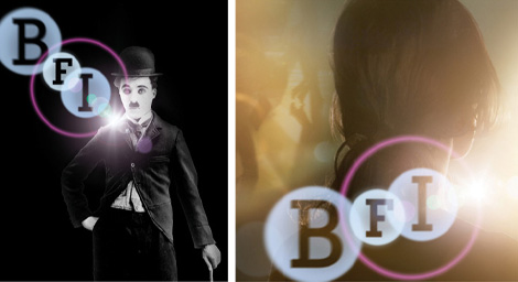
I like it alot, especially the star counter thing. The shining usage reminds me of johnson bank's wonderful lens flair driven BFI identity;
Andrew’s comment is:
At first glance I didn't like the star knockout at all -- felt like it was coming from a 70s space enthusiast club.
I had always felt Starz! was the ghetto movie channel compared to HBO, Cinemax and Showtime but after seeing the on screen presentation I really, really like the new look.
On Apr.06.2008 at 03:51 PM
Jerry Kuyper’s comment is:
My first impression of the top version reversed out of black was not positive. It looked more like a black hole than a star.
The images of the logo with light coming through are more promising.
On Apr.06.2008 at 04:17 PM
Mark’s comment is:
Nice. Well done.
It's about time that they've gotten rid of that drawn star that looked like it came straight out of 1998.
I like how the star-like shape plays with the shapes letter forms.
On Apr.06.2008 at 04:36 PM
Mark’s comment is:
Nice. Well done.
It's about time that they've gotten rid of that drawn star that looked like it came straight out of 1998.
I like how the star-like shape plays with the shapes of the letter forms.
On Apr.06.2008 at 04:37 PM
Matt’s comment is:
Starz is more than just "still around." Their parent company, Liberty Media, now owns DirecTV.
On Apr.06.2008 at 05:01 PM
Goffredo Puccetti’s comment is:
I like it in some way. And well almost anything is better than an hand drawn star.
But I still cannot get Barry Gibb out of my head...
Listen to the ground:
There is movement all around.
There is something goin down
And I can feel it...
G.
On Apr.06.2008 at 06:01 PM
fred autechaud’s comment is:
Playing a bit with the Starz's "s" might have heldped in keeping some of the dynamics when the logo is not in "starfield+backlight+fog+halo" configuration. Nice move then.
On Apr.06.2008 at 06:57 PM
NIck Kask’s comment is:
Not bad. Does seem 70s, but maybe it'll be leading a trend. I think they could have spent some more time ands come up with something a little more...exciting.
However, I think it's beautiful when presented in animations.
But the point of that, I think, is that the animations hide the "star" in the logo. I think it's interesting the motion team seemed to decide to negate that part of the logo by hiding it behind glowing effects. In only one of the above stills can you even tell a "star" is between the A and R.
On Apr.06.2008 at 07:47 PM
markatos’s comment is:
is it just me, or is that "s" about to fall over backwards?
otherwise this is nice work.
On Apr.06.2008 at 08:02 PM
Darrin Crescenzi’s comment is:
I think this is really great. Simple, memorable, well-executed, and the motion graphics are splendid.
I agree with Jerry that when knocked out of black, the counter-form star isn't so "star," in fact quite the opposite, but that seems resolved in the videos where light streams though it. This one is a winner.
On Apr.06.2008 at 08:45 PM
Lester’s comment is:
I think it introduces new legibility issues. The 'a' in particular looks like a new letter yet to be introduced to the latin alphabet. That said, the legibility issue isn't a big enough problem to be offensive, and the design is beautiful. A success.
On Apr.06.2008 at 08:54 PM
t-bone’s comment is:
Solid. Nice.
On Apr.06.2008 at 09:34 PM
marko savic’s comment is:
t/z aside, I rather enjoy it. the application is great.
On Apr.07.2008 at 01:22 AM
dale harris’s comment is:
me likey.
On Apr.07.2008 at 02:39 AM
Romeo’s comment is:
A really good job.
Robust and credible.
An intelligent evolution.
ML’s comment is:
Certainly an improvement.
On Apr.07.2008 at 08:18 AM
JT’s comment is:
Not big on the z though, it could have stayed straight like the other letters.
While the slant may seem a little odd, it keeps the logo really tight and cohesive. Imagine the odd space between the "r" and "z" if you went with a roman character. The slanted "z" slides right into that space rather nicely.
Agree with TZ, but also note that the S has angles that parallel the Z, therefore the unconventional Z can be justified.
On Apr.07.2008 at 08:39 AM
dg3’s comment is:
It looks better on screen with elements shining through. The actual logo as a flat entity doesn't look as cool.
On Apr.07.2008 at 08:46 AM
drew kora’s comment is:
No time to read your review, but at a glance I really love it. Very nice and very versatile.
On Apr.07.2008 at 08:49 AM
Gregg’s comment is:
great graphic design.
On Apr.07.2008 at 09:19 AM
David Sanchez’s comment is:
The star has an overlap with the Steelmark logo, originated by U.S. Steel, Anyway is cute ID for broadcast
On Apr.07.2008 at 10:08 AM
*cg’s comment is:
Great screen execution, I have to agree with Armin on the "z" , I am not crazy about it, either. Can't wait to see what they do with the id.
On Apr.07.2008 at 10:32 AM
Oscar Bjarna’s comment is:
I like it.
The z doesn't bother me. Works nicely with the S.
Would be great to see it in animation tho.
Oscar Bjarna’s comment is:
I like it.
The z doesn't bother me. Works nicely with the S.
Would be great to see it in animation tho.
Romeo’s comment is:
I've just remembered this...

Fabrizio Schiavi’s comment is:
Great job, but put please improve the design of 's' letter.
On Apr.07.2008 at 11:14 AM
dg3’s comment is:
Just for fun:

Tim Chambers’s comment is:
Is Starz a subsidiary of the Atlantic Richfield Company?

ChrisM70’s comment is:
I like this new design a lot better, but I have an issue with it.
It seems kind of odd to create a "hole" for a light flare between the A and the R when you have a perfectly good place for a light flare in the hole of the "A".
Perhaps that would seem too lazy or easy to most designers?
How about this?![]()
Blue Buddha’s comment is:
Well, I must be one of the few who really don't care for this logo. The first thing I think of is 60s-70s guitar-rock album covers.
Only when the logo is used in screen captures is when it comes together for me, which is good, as this is probably where most end users will ever see this logo.
So for me, thumbs up on screen, a big Bart Simpson "meh" on the print version.
On Apr.08.2008 at 01:21 AM
altoption’s comment is:
Saw this on tv last night, as the station id in lower right corner. Not readable at all when made semi-transparent, and you cannot see the hole, either.
On Apr.08.2008 at 09:53 AM
Josh’s comment is:
Maybe i'm losing my ability to discern between good marks and bad ones, but whether it hearkens back to a 70s feel or not, the idea is it memorable and well is it being used effectively.
I don't want to think that my back and forth fighting for concepts with clients has worn me down and made me a pushover, but in the daily scheme of things I have seen plenty of marks that look straight out of the 50s, 60s, 70s being utilized all around the world. Shoot Minneapolis can't escape shadowed type inside of enclosures or using a crest if it wanted to. Shouldn't that be given a thumbs down as well?
Let's all be happy that we can practice what we do, bring our own sensibilities to our clients and live under the guise that were always making the world's best and newest identities. It's what Wolff Olins does well...haha
Beyond some letterform issues there is really no need to get overly intellectual about this and let's just end this with it's better than the Animal Planets new mark.
On Apr.08.2008 at 12:06 PM
adam’s comment is:
i hated the new logotype in the before & after pic, but after seeing the tv animation stills, i really like it.
oh no!!!! does this mean i now like shiny and gradient-ified logos? heh
On Apr.08.2008 at 02:40 PM
Dav, Forma’s comment is:
I really, really like this one. Niiicely done. (The more or less static b/w one, as well as the ones used for on screen showing.)
On Apr.09.2008 at 07:55 AM
Yeison Agudelo’s comment is:
I didnt like it that much when i frist saw it... but wen i saw the screenshots i love it witht he light comming trough the a and the r
On Apr.10.2008 at 09:04 AM
SP’s comment is:
Well done!
Makes me miss the 1994-2005 logo less.
On Apr.10.2008 at 01:50 PM
SP’s comment is:
The CGI is nice, but on-air, they didn't even TRY for individuality among the branded channels. At least during the "hand-drawn star" era, the channels had their own take on the Starz musical signature (which had been in place since 2002), different color schemes for the "wiggling Jell-O" CGI template and the live-action clips for each channel's "Feature Presentation" openers were different, but now they all look like cookie-cutter clones of each other. I only get three Starz channels (Starz, Edge and In Black), but they all look the same. Even though the HBO The Works network logos have some uniformity, at least they look different.
On Apr.12.2008 at 05:13 PM
Paul Rand’s comment is:
An absolute improvement of their logo, probably one of the most successful redesigns on the list.
On Apr.13.2008 at 10:25 AM
Mark’s comment is:
I've thought of the perfect type of feature presentation opening for this logo, with a few tweaks (picture the Starz logo upright pasted over the lying HBO logo), changes (remove HBO from the opening replace with Starz, change the scenery a bit, don't make a duplicate of it), and updates (make it CGI etc.)to this opening, this just might just work!
http://www.youtube.com/watch?v=G371tXKcG1s
On Apr.15.2008 at 01:15 PM
Scott S.’s comment is:
So what you're saying is Darwin has a 'missing link'. Interesting.
On Apr.17.2008 at 03:01 PM
Stephen Loges’s comment is:
I agree with Jerry Kuyper's initial impression that the "star" looks more like a black hole when the logo appears on a dark background. Having only seen the logo in white on a black background, I did not immediately recognize the shape as a star. It's also very reminiscent of the Arco symbol as Tim Chambers points out.
In the animations, light shining through the "star" clarifies that it is a star, but does not help with the logo's legibility. Unfortunately that light also emphasizes another black hole -- the "a" counter to its left.
The italic "z" does not marry well with the rest of the typography and the negative shape it creates between the "r" is another distraction.
Replacing the "a" counter with some sort of a star, as ChrisM70 suggests, may be more predictable but probably makes more sense.
Nice start but I think this logo needs a lot more refinement.
On Apr.18.2008 at 12:28 PM
ilker yoldas design studio’s comment is:
Agreed with ChrisM70.. how do some designers miss the obvious? The same thing happened with Discovery's new logo.
On May.16.2008 at 08:32 PM
Menk’s comment is:
perfection. Really solid and a huge improvement. Love it!
On Dec.11.2008 at 12:38 PM
Comments in Brand New, V1.0 have been closed.


