

NOTE: This is an archived version of the first incarnation of Brand New. All posts have been closed to comments. Please visit underconsideration.com/brandnew for the latest version. If you would like to see this specific post, simply delete _v1 from the URL.
![]()
If you can’t tell the difference between the two logos above, that’s because there isn’t. Pathmark is a 40-year-old supermarket chain with 140+ stores in the states of New Jersey, New York, Pennsylvania and Delaware and is currently the 31st out of the top 75 supermarkets in the nation according to Supermarket News and, earlier this year, it launched a 55,400-square-foot protoype store in Kinnelon, New Jersey to capitalize on its new branding and merchandising initiative, “Go Fresh, Go Local”. So while the logo has stayed the same, the real changes have happened inside.
Working with CBX in New York, Pathmark has completely rethought their store. “The Kinnelon prototype,” says Pathmark’s CEO John Standley, “is the culmination of a comprehensive design process which included incorporating consumer research, merchandising strategies and operational input to develop a compelling retail footprint that can be easily replicated in current and future renovations.” To further enhance the experience and newness of the store, CBX and Pathmark gave overly cute, fictional (and annoying) names to each of the services like “The Original 59th Street Delicatessen”, “Chelsea Baking Company”, “Chesapeake Seafood Company” and my favorite “The Butcher Shoppe” (because nothing says quality like a shop with an extra ol’ “pe”). Then again, I don’t shop at Pathmark (even with one a few dozen blocks away from my house in Brooklyn in the warp hole that is Atlantic Terminal), and I don’t think I’m the target audience. But as you can see from the photos below, the change is pretty startling. That is not to say, however, that it is the best supermarket design program I have ever seen. (If I remember correctly, Publix were beatifully designed). Overall, I appreciate the effort and metamorphosis, but the design obsessive in me can’t cope with the potential to do more sophisticated and less clichéd work — there has to be something more than Copperplate Gothic to communicate fresh, homey and hearty food products. I do find this to be a great example of reviving a brand without having to throw away the equity of an existing identity (even if, in this case, the logo could have used a little pickmeup) and working from the inside out while keeping the customers’ experience and needs at the top of the priority list.
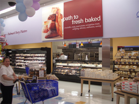
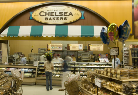
Bakery, before and after.


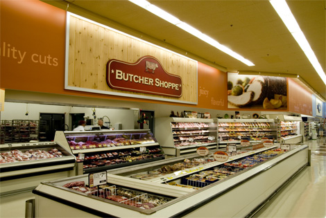
Butcher, before and after.


The Deli/Bistro, before and Deli separated from Bistro after.


Produce, before and after.


Seafood, before and after.

The family of services.


Jump to Most Recent Comment
Garrettttttt’s comment is:
While each entity is pretty strong, I'm having a hard time seeing any unity between the elements. Through this, I think the overall store could really build even a better relationship with its customers rather than individual relationships to each 'department.'
On Dec.01.2007 at 11:20 PM
Talal’s comment is:
One of the chains here (I'm talking to you, Kroger) needs to go to England, copy Sainsbury's or Waitrose's store and packaging designs, and come back and implement them here. Soon. Please.
On Dec.02.2007 at 12:12 AM
John Colucci’s comment is:
Ok. Seriously, those brand logos are cool, why can't they change the primary logo? All of the NJ based supermarket chains have redesigned the inside but kept the logo same.
On Dec.02.2007 at 12:16 AM
jordan’s comment is:
the new branding reminds me of public markets, the seafood part bears a striking resemblance to Pike Place Market (a bit cleaner and has none of the character but still)
if they were going for the public market many stands approach i guess they did it right.
On Dec.02.2007 at 05:47 AM
John’s comment is:
I do find this to be a great example of reviving a brand without having to throw away the equity of an existing identity (even if, in this case, the logo could have used a little pickmeup) and working from the inside out while keeping the customers' experience and needs at the top of the priority list.
Well said, Armin. We forget that the average person is only influenced by design and really isn't wondering why Copperplate Gothic was chosen as the typeface. Ultimately the consumer will have a much happier experience in the store and want to spend more time shopping. I think it's a perfect move.
On Dec.02.2007 at 09:31 AM
John’s comment is:
It's nice, but for a total shopping experience that speaks to a brand, they've got a long way to go hold a candle to the best of the best, that being Publix here in the Southeast. HEB in Texas runs a close second, but Publix has it down cold.
On Dec.02.2007 at 10:44 AM
Dale H.’s comment is:
This collection of "homey" departments strikes me as incredibly "been there, done that." It's basically the Safeway I grew up with in the 70s--filtered thru tired yuppie "classicism."
There's just nothing authentic or original about this sensibility. It's neither convincingly "old" or notably contemporary. Seems to be working a really lazy, unfocused nostalgia. The "Produce Market" sign is especially ersatz...looks like something that fell off the Pepperidge Farms wagon. In short, ugh.
On Dec.02.2007 at 11:51 AM
Ray’s comment is:
I really appreciate what Pathmark has done here—as a born and bred new yorker, having to schlep from home to the local Pathmark in my flip flops to pick up some milk or something, it's nice to see them make such an pleasant change. It reminds me of what I like about the chelsea markets, all these stores in one place that provide really great services. Although the service probably has not changed, they seem like they have. I still think I'll stick to Whole Foods or Trader Joe's though. Man I've become such a snob.
On Dec.02.2007 at 01:11 PM
sukisouk’s comment is:
so after destroying the small stores, they pretend to be them?
to me, it’s disgusting.
Kiel West’s comment is:
I gotta agree with sukisouk's comment. The sappy pretension of calling a major chain's in-store accommodations each by a separately and equally cloying (and not timeless!) trend-name (bistro, etc.) is pretty vile actually. I suppose I do not have a basis for comparison though.
On Dec.02.2007 at 05:29 PM
okey’s comment is:
Unless you go inside the stores there is no indication that something has changed with Pathmark. A new logo would first and foremost introduce the change happening within. Something new and potentially helpful is happening here with Pathmark (albeit a little too late) unfortunately current and new consumers won't recognize that because the company continues to stay with their current flawed logomark.
On Dec.02.2007 at 08:58 PM
Danny Tanner’s comment is:
Sukisouk, I think your on to something.
The more the shopper can feel like they are visiting "the bakery", "the seafood market", etc; psychologically they may feel employees actually care and put effort into their bread, their catch, their beef, etc. I've had many horrible experiences at Pathmark, and it has nothing to do with their design. It's because I still don't know what else Pathmarks stands for other than "giant supermarket," and I don't think Pathmark does either. If I had to guess what they stood for, I'd say "good enough." Get in, maybe get treated like you matter, get your groceries, get out.
While this design maybe good for business, it creates a very false emotional impression on the shopper (not that that doesn't happen all the time). The shopper may begin to feel like they are not in a giant elephant of a supermarket, but at the end of the day, unless Pathmark puts real effort into changing your experience (how employees treat you, checkout issues, etc) this is really just a warm and fuzzy veneer.
I'm reminded of a shopping mall. Different stores with different names, all giving you different experiences, all under one enormous roof.
If Pathmark is really gung hoe about embracing multiple personalities, they really need to play down the Pathmark name, or get rid of it all together, just call themselves "food emporium" or something and house many fake mom and pop stores.
On a side note, from my experiences at Whole Foods, it feels like they care about me. Service is good and while the checkout can sometimes take forever, is organized well. From experiences at my locations, Whole Foods tends to brand each area as themselves, "Whole Foods," and with each visit, I trust the Whole foods name more, not a section like "East Side Bistro Live" more.
Pick n Pay recently began to head in the right direction by trying to bring relevance to the stores rather than specific corners of the stores.
This whole redesign begins to feel like a band-aid for a much larger problem Pathmark has...I wonder when that band-aid will peel off.
On Dec.02.2007 at 09:09 PM
Audree’s comment is:
looks like they did what every supermarket is doing now. Not very original. not sure its even worth an article.
On Dec.02.2007 at 09:54 PM
clobee ’s comment is:
It seems horribly, horribly faux to me. I think shoppers are definitely reverting back towards farmer's market/small specialty store shopping - but it has to be real.
On Dec.02.2007 at 09:58 PM
stock_illustration’s comment is:
I'm with Dale H. The individual department graphics are WEAK. Nothing tying the whole bunch together.
On Dec.02.2007 at 10:19 PM
Dale H.’s comment is:
I trust the Whole foods name more, not a section like "East Side Bistro Live"
Oh god, I never noticed the "Live" part. What the hell does that even mean? Is it a bistro or is it Vegas? What exactly is living inside the bistro?
On Dec.03.2007 at 03:24 AM
MiSc’s comment is:
it's pathmark, not trademark...
On Dec.03.2007 at 03:31 AM
Gary Wales’s comment is:
Ugh. Those individual brand logos are so 'build-your-own' clip art, and as has been said - no uniformity.
The concept is wannabe when other stores are carving out an identity that pays for itself in loyalty.
The names as well...how cringe-inducing!
However - I can't imagine any shoppers will be unappreciative, so hey-ho.
On Dec.03.2007 at 05:23 AM
Blake’s comment is:
They seem to be trying awfully hard. I don't really prefer all the in-store branding. You don't need to seperately brand each section of a grocery store. Overkill. Overthinking?
Personally, I still think Publix has the best brand strategy going. Simple, strict, contained within the Publix brand.
On Dec.03.2007 at 10:02 AM
TheUprock!’s comment is:
Boring.
On Dec.03.2007 at 12:21 PM
TheUprock!’s comment is:
Boring.
On Dec.03.2007 at 12:21 PM
Willis’s comment is:
This trend is neither new or groundbreaking... It's the "mall food court" model. many markets have had sections like this for 5-10 years. It's funny that Pathmark thinks this is some radical prototype.
On Dec.03.2007 at 12:53 PM
Matheus’s comment is:
omg Copperplate Gothic Bold
they can't create their own fonts? for god sake
Gregg’s comment is:
I've always thought Pathmark's colors seemed dull. Everything looks like it was printed 10 years ago and the ink has faded.
On Dec.03.2007 at 05:03 PM
felix’s comment is:
Hmm. Decent but still boring. wouldve been interesting to see what Louise Fili or someone more capable like Duffy would have designed for this. THen again, its Pathmark (where I shop half the time). The lines are long, it smells and its generally an unpleasant shopping experience.
On Dec.03.2007 at 05:32 PM
Chris’s comment is:
Uninspiring. Unoriginal. Unimaginative. If only they had pursued the "path" idea further.
On Dec.03.2007 at 07:18 PM
Von Glitschka’s comment is:
Does Bazooka Bubble Gum own Path Mark?
On Dec.03.2007 at 11:52 PM
C-Lo’s comment is:
All the signs for the cafe, butchery, and all that are overly simplistic, but they do work. I think the look is to seem as if it were many different companies all together on the "path". So a overall tie in I don't think was on their mind. As a pathmark shopper I can easily say that is isn't overdone in the least. Reminds me of overly basic "standards" in graphic design. Now if they can update their own logo.
On Dec.04.2007 at 08:20 AM
Mr Posen’s comment is:
Ye Olde Butcher Shoppe???
How twee.
On Dec.04.2007 at 06:46 PM
craig shully’s comment is:
I agree with all the negatives posted earlier - these signs/logos are lame, but even worse, just plain boring.
But as always the case, the client has the responsibilty to accept and approve what they are shown. I guess they must be happy.
On Dec.10.2007 at 12:39 PM
Blue Buddha’s comment is:
I don't particularly dislike any of the new logo treatments. Most grocers are having to compete with the Wal-Mart Neighborhood Market (which is really a feeble attempt to sound farmers-marketesque) and this is one direction some grocers take.
Personally, I'm a Trader Joe's and Sunflower girl. Not a lot spent on advertising in Sunflower; basically just simple coroplast signs hung from the ceiling. And I really dig Trader Joe's. Really … who doesn't love Pirate-Speak?
On Dec.11.2007 at 11:32 PM
jimc’s comment is:
lets knock off all the crap and put some help back in the stores.perishable departments stink.
If these stores are to survive, they need customer service.
Dan McGorry’s comment is:
The butcher department at Shop Rite is named The Meating Place, which is awesome.
On Dec.27.2007 at 08:34 PM
jazlow’s comment is:
It's interesting to read all of these posts from people who have never actually been INSIDE one of these remodeled Pathmarks. I think if they have, their opinions would be a little more positive. The remarkable thing about these Pathmark remodels is that they have completely changed the entire atmosphere of the stores. Most impressive is the new lighting in the produce department.
Let's face it..Pathmark in never going to be Wegmans or Whole Foods. But this latest remodel effort is putting them light years ahead of where they were. And for all of you that just can't stand it can breath a sigh of relief as A&P (the new owners of Pathmark) have no intention of carry this format to additional locations. They're planning much less expensive remodels which will give you a whole lot more to complain about than bad font choices. Their logo certainly needs an update. It worries me that A&P may make that change as they have done a disastourous job "updating" their logo.
Can someone please help me with this one... I do not understand all the affection for Publix. I have been in about 10 of their stores in Florida (yes, a very small sampling) and they all have horrible 80's style graphics on the walls. Granted their stores are impeccably clean but horribly dated looking. And I find it so strange that the produce departments are crammed in at the back of the store...as far away from the entrance as they can get them. Maybe I just never stumbled across an updated store, if they even exist.
On Mar.10.2008 at 12:59 PM
max’s comment is:
A&P has been going out of business for years...the recent buyout of Pathmark...is just a way to prop themselves up and buy time for the "executives" at A&P to find new jobs....the whole A&P Pathmark deal wont exist in 10 years...but the store locations might still be viable...
On Mar.17.2008 at 02:12 AM
Bob’s comment is:
I live near two Pathmarks. One is old, and the other has been remodeled. I go to both, but of course, with my luck, the remodeled one is further away. I tend to visit the remodeled onew more often. The logo on Link no longer has a box around it. Check it out:

Bob’s comment is:
I live near two Pathmarks. One is old, and the other has been remodeled. I go to both, but of course, with my luck, the remodeled one is further away. I tend to visit the remodeled onew more often. The logo on Pathmark's Website no longer has a box around it. Check it out:
Comments in Brand New, V1.0 have been closed.


