

NOTE: This is an archived version of the first incarnation of Brand New. All posts have been closed to comments. Please visit underconsideration.com/brandnew for the latest version. If you would like to see this specific post, simply delete _v1 from the URL.
![]()
Whatever you do, whether it’s today or 1994, please do not call Xerox “the copier company”. Actually, don’t call it “The Document Company” anymore either. While you are at it, don’t confuse Fuji with Xerox, or wonder if the two merged. And, finally, please forget about that pixelated X that became one of the best known and widely recognized icons. All that is a thing of the past. Yes, just the past four decades. Poor Xerox, so misunderstood, so verbalized — “Can you xerox this for me? Thanks intern” — so outdated. Yet, if you worked anywhere with one of those multi-tasking, short of coffee-making machines, you know that Xerox can do more (way more) than make black and white copies of your spreadsheets. Yet, apparently, few people realize this. And nothing cures ailments like these better than a rebranding. Unveiled today, the new identity, designed by Interbrand, for Xerox may signal a new era for the company but, as far as we designers are concerned, it merely signals the full embrace of the senseless threedimensionalization of the corporate world.
If you can stomach a little press-releasing, here is some:
The new Xerox logo is now a lowercase treatment of the Xerox name — in a vibrant red — alongside a sphere-shaped symbol sketched with lines that link to form an illustrative “X,” representing Xerox’s connections to its customers, partners, industry and innovation, and designed to be more effectively animated for use in multi-media platforms.
— Official press release
Signaling a clear change and evoking a dramatic shift in the world’s perception of this iconic brand, the visual and verbal identity system for Xerox has undergone a massive redesign. The new signature incorporates a lowercase treatment of the Xerox name — in a vivid red Pantone 1797 — alongside a sphere sketched with lines, called “connectors,” that link to form an “X”, representing the company’s connections to its customers, employees, partners, industry and innovation. The “connectors” are super-graphics that appear as reoccurring design elements.
— Interbrand project description
“The Internet, sponsorships, all kinds of 3D icons — none of that existed when Xerox adopted its old logo,” said Maryann J. Stump, senior director of brand strategy for Interbrand. “And you can do animation with a symbol that you just can’t do with a wordmark.”
— Article on The New York Times
I find it rather humorous — and please excuse me while I get my biggest gripe out of the way — that this logo “animates” better and how it’s a key strength. Yet, the best that could be done (at least at launch) is this? Seriously?
Please excuse the hypnotic looping animation. The original movie is too big and when reduced the controller goes away. You can see the full-size animation here.
Why is that marble not rotating? Or exploding? Or building out of thin air? Heck, morphing into Xerox’s CEO would be more interesting than a pedestrian zoom and shine. Sigh. But I digress. Let’s focus on the evolution of this mark for a little bit:

In 1961 Lippincott designed the original logo for Xerox after the company had dropped its “Haloid” half.

Seven years later, in 1961, Chermayeff & Geismar updated the wordmark.

And it wasn’t until 1994 that the logo changed to red and the digitized X was introduced by Landor.

This is also when “The Document Company” appeared, taking completely over the wordmark — people also answered the phone by saying “The Document Company, Xerox”.

In 2002, the wordmark became the more prominent visual. Later, in 2004, “The Document Company” disappeared.
![]()
And now, we have this.
Contrary to other logos, like AT&T or UPS, the old Xerox wordmark was not necessarily good or looked as a paragon of our profession, so its demise is not mourned. The short-lived digitized X on the other hand was incredibly communicative and expressive of the place that Xerox occupied at the moment — bridging new and old technologies and processes — but at the same time, despite nostalgia, the pixelation effect was probably as clichéd then as these electric bugaloos are today. The Xerox wordmark was in serious need of an update and, letter for letter (except for the “r”), this new wordmark does an amazing job. Those “x”s are to die for. A wise move would have been to simply move forward with the wordmark, placing emphasis and importance on the word Xerox, which has plenty of equity. But instead we had to be graced with the introduction of this furious marble that is downright abominable and meaningless but come to think of it, it does take my mind off of “the copier company”. Just not with good thoughts.
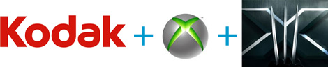
Conspiracy Theory No. 1: Kodak + Xbox 360 + X-MEN III.


Jump to Most Recent Comment
Glenn’s comment is:
Fist thing I saw was the Kodak logo...
On Jan.07.2008 at 11:37 PM
twoeightnine’s comment is:
All I think of is an electronics store. Circuit City or CompUSA.
On Jan.08.2008 at 12:05 AM
Bart O'Dell’s comment is:
Dear lord no.
On Jan.08.2008 at 12:07 AM
JonSel’s comment is:
Wow...I can't for the life of me figure out why they need a symbol. I agree that they need to do some major education concerning their market position, but what does this symbol add? The new wordmark is nice and contemporary. That whole criss-crossing patterning would serve much better as part of a visual language, anchored by the wordmark.
On Jan.08.2008 at 12:08 AM
Dmitriy Yermolov’s comment is:
looks like someone's a wollieolins wannabe outhere)kinda lame attempt to fuse kodak and sony-ericsson, obvious fuckup +1
On Jan.08.2008 at 12:26 AM
K. West’s comment is:
Do they not realize that they have the LETTER X in their name TWICE?! The single most graphics-ready symbol in the alphabet?! If I had that I would lean on it like a wall.
I liked the pixelated X too. I think they should've started with that and updated accordingly.
On Jan.08.2008 at 12:32 AM
Jon Whipple’s comment is:
Wow. I am rendered almost speechless. But I'll try to say:
An X-Men costume! On A cough drop! Cool!
Yeah, when I think Cherry Cough Drops I sure think Xerox. Or is it the other way around?
I'll grant that in the markets in which they compete they're mark will sure stand out. But I doubt it will be in a good way.
On Jan.08.2008 at 12:50 AM
Michael Bierut’s comment is:
I wish I were dead.
On Jan.08.2008 at 01:10 AM
Julio’s comment is:
My gut reaction was, simply: this gives branding a bad name, and drags us all down with it. Given Xerox's high profile, I almost fear that people out there will see this and assume this is what I do for a living when I say I'm a graphic designer that focuses on identity. At least with the recent rebrandings of UPS and AT&T (as much as I disliked them), you could find a thread of logic in their execution: the new marks resembled the old. Sure, the new ones were strange, bubbly badges carrying the unfortunate debris of trendy, marketing-savvy, web 2.0 design aesthetics, but at least some remnants of the previous brand remained. But this? Where does this marble come from? This is what 5,000 interviews and 24 months of work gets you? A completely new, unnecessary, poorly-crafted element that builds on none of the existing strengths of the brand for the sake of asserting itself into the world? Welcome to the time of full embrace of senseless, threedimensional corporate branding, indeed...
On Jan.08.2008 at 01:29 AM
Fernando Lins’s comment is:
I had some hope that the glows and globes and gradients in branding would be left behind with 2007 altogether... big mistake. BIG mistake.
On Jan.08.2008 at 01:59 AM
Unit B’s comment is:
Great word mark, and the X's really grab your attention. In fact, because the name Xerox is bracketed by those X's, the name alone serves as the symbol. The icon looks like it belongs on a really lame superhero comic book. Oh, sorry–I mean graphic novel.
On Jan.08.2008 at 02:06 AM
Adrian’s comment is:
Wow...that looks so cheap! I loved the pixel-X, but perhaps that's just sentimental value (aaah to be an intern, xeroxing away...).
Shame. I notice there's a lot of ugly logos coming out lately, what's up with that?
On Jan.08.2008 at 03:12 AM
Nadia’s comment is:
I understand the lower case treatment but fail to associate with the ball. What does the ball mean? Are they better positioned now?
On Jan.08.2008 at 04:08 AM
Saawan’s comment is:
The conspiracy theory is very thought-provoking and funny at the same time. Xerox has become synonymous to photocopy in India! (I donno about the world). I doubt most of the people here know that there's a company called Xerox!
On Jan.08.2008 at 05:26 AM
TheUprock!’s comment is:
I'm okay with the logotype. I don't necessarily LIKE it, but I can live with it -- it has a look and feel similar to a lot of branding trends right now, and I can somewhat empathize with why Xerox (or is it all-lowercase now, huh?) would want to try to copy after the industry. What I really don't get is the mark. It says nothing to me about what they do, or their vibrant history as a copy, fax, computing company.
I agree with Julio -- this makes a lot of people look bad.
On Jan.08.2008 at 05:26 AM
Saawan’s comment is:
The conspiracy theory is very thought-provoking and funny at the same time. Xerox has become synonymous to photocopy in India! (I donno about the world). I doubt most of the people here know that there's a company called Xerox!
On Jan.08.2008 at 05:26 AM
Damian Cugley’s comment is:
My first thought on seeing the new design is that a red ball with a white X on it has been used by Microsoft to decorate error messages for the last decade or so...
On Jan.08.2008 at 05:45 AM
Von Glitschka’s comment is:

Looks like they fudged on this "Marble Brand."
On Jan.08.2008 at 05:55 AM
Jon’s comment is:
I really liked the old logo. Maybe it could have used and update, but they definitely went in the wrong direction. I think the worst change is the switch to lower case.
The old logo is so clean, and to me just says "This is serious. Let's get down to business." Unless they're planning on focusing on the consumer market in the future, the new one is too friendly and too generic. They needed a little more IBM, and a little less kodak.
On second thought, without the marble it aint that bad.
On Jan.08.2008 at 06:19 AM
Christian Palino’s comment is:
There is no excuse for this – Xerox likely has enough foresight to recognize that their longterm corporate growth is not dependent on flash-in-the-pan trends but rather in well conceived strategies that will provide over the long haul. The blame is likely with Interbrand's keen ability to sell this kind of solution as timeless rather than what it is.
…alongside a sphere sketched with lines, called "connectors," that link to form an "X", representing the company's connections to its customers, employees, partners, industry and innovation. The "connectors" are super-graphics that appear as reoccurring design elements.
Very poor rationale. super-graphics? super-outdated-trendy-nonsense maybe.
On Jan.08.2008 at 07:39 AM
Blake’s comment is:
This really blows. I'm so disappointed in the apparent trend large corporations THINK they have to follow. Complete gradient/3D bs.
On Jan.08.2008 at 07:58 AM
Armin’s comment is:
> Very poor rationale. super-graphics? super-outdated-trendy-nonsense maybe.
Not to defend Interbrand's mumbo jumbo, but "super graphics" is a funny term that is used for anything that is plastered big in a physical space. This is an "artist's rendering" that was posted at BusinessWeek, and those swirly panels is what I think they mean by super-graphics. Either that, or they just think their graphics are, indeed, super.

Christian Palino’s comment is:
Their use of "super-graphics" was clear – mine was just a play on words ;)
I like their use of the flag element!
On Jan.08.2008 at 08:21 AM
Alex Burr’s comment is:
As a former Xerox employee, I gotta say a heartfelt BLEAH. This looks to me like 1. An attempt to mimic Kodak (another six-letter nonsense word, and the other big corporate entity in Rochester) and 2. An attempt to look "hip", something which Xerox will never be.
On Jan.08.2008 at 08:21 AM
Hugh’s comment is:
I think the type is quite nice... But the symbol? >_
On Jan.08.2008 at 08:22 AM
Keith’s comment is:
The symbol looks like a bandage on a really nasty boil. Yuck!
On Jan.08.2008 at 08:57 AM
C-Lo’s comment is:
I enjoy the type MUCH more then that web 2.0 malarkey marble. Imagine Microsoft using their start button as their logo. No way, and that is how the X logo relates to me. I would like to see an uppercase R however. I was never a fan of those half n's. The rest of the letters do show a sense of technological superiority even if its' relying on that aspect like an intern relying on Helvetica to show a sense of sophistication for a logo.
On Jan.08.2008 at 08:58 AM
formsubstance’s comment is:
I did work for corporate HR at Xerox and everything seemed to be stalled waiting for this new rebranding. A year and a half later I had totally forgotten until I saw this. I guess they still haven't figured it out.
On Jan.08.2008 at 09:20 AM
diane zerr’s comment is:
I'm completely confused, after reading the case study on Interbrand's website
"A palette of eight new colors support the brand. A new illustration style using silhouetted graphics, contemporary photography, and the “connectors” against a white background add to the brand’s new look. The illustration style can adapt to the color palette, and the three-dimensional sphere is used across multi-media. The new proprietary font - called Xerox Sans - is a modern style that visually communicates the openness and approachable nature of the company."
So they come up with this 3-D logo and then they are going to incorporate an illustration style, what style is that? And how does that manage to work well with this style logo? If they are referring to the wavy lines used on their website, I hardly call that illustration style.
On Jan.08.2008 at 09:23 AM
Dave Klonke’s comment is:
Citizen Bank + bocce balls. I think the typeface is great! It does look very similar to Kodak, though. This marble trend (great animation, Von!) is wearing thin.
On Jan.08.2008 at 09:23 AM
kenny eicher’s comment is:
So, how much $$ did they pay for this?
On Jan.08.2008 at 09:43 AM
Moriarty’s comment is:
Whilst I always loved the old pixelated 'X' I understand why it was dropped but the type after that was always quite ugly, the new type however is really quite nice (and a nice red) but the marble is bloody horrible. The marble makes it all look really cheap and nasty – and I'm not sure that it's even needed (any mark at all) with the new type treatment…
On Jan.08.2008 at 09:47 AM
Ty’s comment is:
Absolutely pathetic.
On Jan.08.2008 at 09:47 AM
Prescott Perez-Fox’s comment is:
Ditch the ball and the world can rest at ease.
I do, of course, love the word "threedimensionalization", great neologism! Thank you Armin for taking another stab at the great institution that is the Press Release. I'm right behind you.
On Jan.08.2008 at 09:47 AM
Allan’s comment is:
The marble is almost exactly the same as this.
On Jan.08.2008 at 09:59 AM
Willis’s comment is:
The new logo looks like a bocce ball the factory messed up.
It's not helped by the fact that, should that object exist in actual three dimensions, the "super-connector" criss-cross lines would be completely lopsided and awkward-looking.
Is there a two-color version?
The old pixel-X was fantastic - easy to recognize, conveyed rather complex meaning, and easy to represent.
On Jan.08.2008 at 10:02 AM
John McCollum’s comment is:
Oy.
I agree with pretty much everyone else -- the symbol sucks. It almost seems like the wordmark was developed, and then some executive said, "We're paying $XXX,XXX for this rebranding and all we get is the name typed out in Arial?"
A company as big as Xerox should be confident enough to not need shiny baubles and gewgaws.
But If they wanted to do something "cooler" than just a wordmark, they could have tried something clever like an ambigram. Those two Xs are almost begging to be highlighted somehow.
Again, I say, "Oy."
On Jan.08.2008 at 10:08 AM
Matheus’s comment is:
xerox doesnt need branding
the name itself its the biggest brand it will get
"Do me a xerox" says everything
it turned up into a substantive
substantives doesnt need new branding
John McCollum’s comment is:
Oy.
I agree with pretty much everyone else -- the symbol sucks. It almost seems like the wordmark was developed, and then some executive said, "We're paying $XXX,XXX for this rebranding and all we get is the name typed out in Arial?"
A company as big as Xerox should be confident enough to not need shiny baubles and gewgaws.
But If they wanted to do something "cooler" than just a wordmark, they could have tried something clever like an ambigram. Those two Xs are almost begging to be highlighted somehow.
Again, I say, "Oy."
On Jan.08.2008 at 10:10 AM
Revisit’s comment is:
Yeah, I became very concerned when I heard part of the design had to do with animation. The ball does absolutely nothing for me, but agreed, the type is a vast improvement.
On Jan.08.2008 at 10:21 AM
Bjorn Yeo’s comment is:
Some brands need only realignment. Not rebranding. Nike is one of them. 3M as well. And so is Xerox.
On Jan.08.2008 at 10:26 AM
Matt Hunsberger’s comment is:
Wasn't the pixelated X really trendy when it came out in '94? I really like the wordmark, but I wish brands weren't so afraid of capital letters these days...
On Jan.08.2008 at 10:31 AM
Paul Riehle’s comment is:
sure it's a horrible direction, but atleast make the sphere look somewhat appealing if you go in the 3rd dimension. The x is all off balance and just makes it seem like interbrand doesn't know how to draw in perspective.
On Jan.08.2008 at 11:01 AM
Paul Riehle’s comment is:
sure it's a horrible direction, but atleast make the sphere look somewhat appealing if you go in the 3rd dimension. The x is all off balance and just makes it seem like interbrand doesn't know how to draw in perspective.
On Jan.08.2008 at 11:03 AM
Paul Riehle’s comment is:
sure it's a horrible direction, but atleast make the sphere look somewhat appealing if you go in the 3rd dimension. The x is all off balance and just makes it seem like interbrand doesn't know how to draw in perspective.
On Jan.08.2008 at 11:03 AM
Anonymous’s comment is:
I'm really surprised that a company as well respected as Interbrand would come out with a logo as impulsive as this. I may be willing to be convinced otherwise, but ther isn't one post on here in favor of the rebranding.
I'd, however, like to thank Interbrand and the people signing off on creative over at Xerox for giving me something to gripe about first thing this morning.
The logo is weak, off balance, and says nothing about what the company has grown to become.
On Jan.08.2008 at 11:23 AM
Adam’s comment is:
I'm really surprised that a company as well respected as Interbrand would come out with a logo as impulsive as this. I may be willing to be convinced otherwise, but there isn't one post on here in favor of the rebranding.
I'd, however, like to thank Interbrand and the people signing off on creative over at Xerox for giving me something to gripe about first thing this morning.
The logo is weak, off balance, and says nothing about what the company has grown to become.
On Jan.08.2008 at 11:25 AM
todd’s comment is:
I like it. Brings it into the current decade and shows that more work actually went into it.
On Jan.08.2008 at 11:32 AM
David Sanchez’s comment is:
HORRID, InterBrand is fixed with 3D orbs, what a brand rape. Simply pedestrian. They should drop the orb and stay with the lowercase Xerox.
SPIT.
On Jan.08.2008 at 11:35 AM
felix sockwell’s comment is:
I love it.
Just kidding. Urgh. Reminds me of the Staples button; Xerox... that was easy. Lets look at teh bright side. As terrible as it is they needed something new. The newing of it all will convince dinosaurs to play ball.
On Jan.08.2008 at 11:39 AM
DesignMaven’s comment is:
"Just when I think I'm out they pull me back in".
Michael Corleone
THE DOCUMENT COMPANY:
I believe, is the Brainchild of SIR ALAN SIEGEL Founder of Siegel + Gale.
Identity Design today is an after thought in the Mix and has taken Backseat in many instances to Branding which is TACTILE like Advertising and not STRATEGIC.
I can safely surmise, XEROX is one of the few Identities that can stand on the Merit of not needing a Symbol.
The Name Equity alone Surfices. The Symbol only weakens the Identity. There are a Plethora of "X" Identities in the MarketPlace.
XEROX "X" Symbol isn't Original, Memorable, Unique, Core Value Objectives you want associated with a New Identity.
Furthermore,the new XEROX Identity by InterBrand seems too COOKIE CUTTER to me and/or FORMULAIC.
AT&T recently Designed by InterBrand has a 3 D Globe and lower case typeface to make at&t appear more friendly.
Does every Corporation need to appear friendly with lowercase typefaces???!!!
Isn't there another way to Portray a Global and/or Multi-National Corporation(s) as friendly without the COOKIE CUTTER, FORMULAIC approach to Identity Design.
DM
The Hostile Takeover of Corporate Identity
On Jan.08.2008 at 11:40 AM
Joseph Szala’s comment is:
I quit. Seriously. I quit. I'm done with this profession. Interbrand and futurebrand are killing the global brandscape. My inner designer has perished after seeing this. Good lord, why?
On Jan.08.2008 at 11:40 AM
Michael’s comment is:
This has to be proof that a logo is only even as good as the people who commission it. This reeks of a client that wanted something because they saw someone else with it and felt left out. Problem is it's a done idea, and therefore dated already and done badly. Here's hoping they drop the marble real soon.
On Jan.08.2008 at 11:43 AM
ray’s comment is:
they are just another bouncy ball, bandwagon jumper! i'm so sick of 3D orbs.
On Jan.08.2008 at 11:47 AM
damon’s comment is:
I love the wordmark....I haven't read many of the comments but I can already tell what they say. "oh god, no, why, no! gradients! meaningless glyphs, rand is turning in his grave, oh god the humanity..." am I right?
I'm sure I am.
On Jan.08.2008 at 11:48 AM
damon’s comment is:
I love the wordmark....I haven't read many of the comments but I can already tell what they say. "oh god, no, why, no! gradients! meaningless glyphs, rand is turning in his grave, oh god the humanity..." am I right?
I'm sure I am.
On Jan.08.2008 at 11:49 AM
Joseph Szala’s comment is:
Oh wait, this just in:
"Interbrand has announced a strategic partnership with LogoWorks who will be exclusive provider of rip-off logos produced by the agency. 'I see a LogoWorks picking up the torch of the blase tripe Interbrand has become known for in past years.' stated CEO...."
Okay, that's not real, but it should be.
On Jan.08.2008 at 11:50 AM
debbie millman’s comment is:

I am with Felix and Mr. Bierut.
On Jan.08.2008 at 11:52 AM
Joo Chae’s comment is:
It's like a pokemon ball, or if AT&T was branded on Mars.
On Jan.08.2008 at 11:54 AM
DesignMaven’s comment is:
Debbie:
Read the New York Timec today your Partner
Simon Williams says different.
Don't Great Minds think alike.(wink)
New York Times 1-8-08
http://www.nytimes.com/2008/01/08/business/media/08adco.html?ex=1200459600&en=573222eb99f214e0&ei=5070&emc=eta1
DM
The Hostile Takeover of Corporate Identity
On Jan.08.2008 at 12:06 PM
BobSchro’s comment is:
Who in their right mind would take a name and brand that's as strong and recognizable as xerox and dilute it with an abstract globe symbol?
The word xerox by itself is so STRONG. Visually, xerox in type is a beautiful visual pallendrome, it's beautifully balanced and oh so proprietary.
XEROX's strength in in their brilliant name.
The symbol is dead weight. It has got to go. Make it a secondary element or just get rid of it...
On Jan.08.2008 at 12:09 PM
Nubloo’s comment is:
1. Very well written article, made me laugh!
2. Very well flushed brand appearance, made me laugh!
3. I'm still laughing.
debbie millman’s comment is:
Hey DM--
Simon is indeed my beloved partner, but he doesn't run the design group at Sterling. That's my job, and I stand firm by my opinion.
(But thanks for letting me know about the article--I hadn't seen it yet, and I am now off to pick a fight.)
the other DM
On Jan.08.2008 at 12:44 PM
disgruntled designer’s comment is:
"The new proprietary font - called Xerox Sans - is a modern style that visually communicates the openness and approachable nature of the company."
This to me really confuses me when in the Business Week article they have this brilliant quote from the Interbrand Brand Bible: “In fact, an internal document circulated between Interbrand and Xerox describes the new graphic font this way: 'I am FS Albert. I am a modern and approachable font (yes, they referred to it as a FONT). My rounded corners make me more human and less technical.”
So is it Xerox Sans or is it Albert, and why did you send out a press release saying it wasn't proprietary and now it is?
And why is the "X" not truly an "X" in perspective? And why is it on a bouncy ball? I hate this more than 2012 I think. Suck it Interbrand and suck it hard. Suck it with a dropshadow, like you put on most of your other logos, especially the ones you do under the name of BrandWizard. The Wizard of Brands. Then again they aren't exactly known for designing strong symbols so I don't know why people insist on handing over money hand over fist.
Lastly I hope that post really was Bierut because it made me laugh.
On Jan.08.2008 at 12:47 PM
Matt Warburton’s comment is:
I actually like the new logo as it has a real youthful, almost x-box gaming feel to it. The typography sucks (yet another badly drawn sans serif...). There was nothing really distinctive about the old one, other than the digitized X they used for a while, but dropped for some reason.
And it will look a hell of a lot better than the old logo on the new Ducati 1098 that Troy Bayliss will be racing this year in WSBK. Here's what the old logo looked like on last year's 999: link or the top story here: Link
That's really all I care about.
Matt Warburton’s comment is:
I actually like the new logo as it has a real youthful, almost x-box gaming feel to it. The typography sucks (yet another badly drawn sans serif...). There was nothing really distinctive about the old one, other than the digitized X they used for a while, but dropped for some reason.
And it will look a hell of a lot better than the old logo on the new Ducati 1098 that Troy Bayliss will be racing this year in WSBK. Here's what the old logo looked like on last year's 999 (a design abomination in itself!): Link or the top story here: Link
That's really all I care about.
On Jan.08.2008 at 12:50 PM
Ben Leivian’s comment is:
They should have made the symbol bigger.
On Jan.08.2008 at 01:01 PM
DesignMaven’s comment is:
Darling:
I should SAY your are the ORIGINAL, One and Only and the Most Famous (DM).
Love Ya
DM
The Hostile Takeover of Corporate Identity
On Jan.08.2008 at 01:16 PM
DesignMaven’s comment is:
Darling:
I should SAY your are the ORIGINAL, One and Only and the Most Famous (DM).
Love Ya
DM
The Hostile Takeover of Corporate Identity
On Jan.08.2008 at 01:31 PM
Dean’s comment is:
Marble? Bocce Ball? How about a Cricket Ball?
On Jan.08.2008 at 01:32 PM
Fatknuckle’s comment is:
A Case for Capitalization...
Xerox = noun
xerox = verb
From here on out I would expect them to use the lowercase in all correspondence. Every article, press release et al.
While it is certainly the trend to use the lower-case to convey a certain informality, such as at&t, kodak etc...those companies which use it aren't in the same position as Xerox is. Neither one has become synonymous in the vernacular with its core product (Kleenex, Popsicle.)
By using the lower-case in their treatment, they are reinforcing the name as verb, instead of as noun. They may legally own the trademark, they no longer own the meaning.
On Jan.08.2008 at 01:44 PM
lck’s comment is:
what do you think of this? :)

rynot’s comment is:
NYT Headline:
Xerox Hopes Its New Logo Doesn’t Say ‘Copier’
well, unfortunately (and ironically) it says copier in the brand-wise if not service-wise.
On Jan.08.2008 at 01:50 PM
Steve Tucker’s comment is:
Another logo bites the dust...
As with many of these logo updates—its often NOT for the better. Sure it looks pretty on the screen, but out in the real world it will blend-in amongst the rest of its glossy-relatives. Perhaps that's what the assignment was. Mission accomplished.
On Jan.08.2008 at 01:56 PM
Marc Stress’s comment is:
I love BrandNew and all the conversation it brings out about our modern brand-y world.
I can't help but wonder — with one bad logo reveal after another — who's reading this? Does BrandNew ever end up in a CMO's or CEO's browser? Can this discussion actually make a difference and effect a change? Will these mega-corps finally realize that they can't go out of the house dressed like this?
From my perspective there is hope, and the prayer that the good designers of the world don't show anyone any new Illustrator effects.
I'm sure this logo looks great when faxed... or copied...
On Jan.08.2008 at 02:20 PM
Mike’s comment is:
I took a branding seminar that was taught by someone who used to work at interbrand. It's funny, because he was very adamant that the future of branding was about having an animated identity. It must be a internal cultural thing?
On Jan.08.2008 at 03:37 PM
Stephen Coles’s comment is:
We’ll look back at this era in 20 years and talk about how bad it was for identity design. The same way we talk about what the '70s-'80s did to architecture.
On Jan.08.2008 at 04:09 PM
Erik S’s comment is:
Firms like Interbrand aren't concerned with what we think of as graphic design (in the traditional sense of the term). They're marketers. They're good at telling stories tailored for consumption by Fortune 500 CEOs. Most of these CEOs require reams of evidence and research to justify the solutions they're shown. How else are you going to justify those massive fees?
The days of the exquisitely crafted solution that sells itself based on its own inherent qualities are over (at least at the Fortune 500 level). In my experience the powerful identity and branding solutions are happening at the small start up level now. Think small.
On Jan.08.2008 at 04:11 PM
AJ’s comment is:
For a Real Consumer, Logo means nothing. Value and Product Leadership comes through Constant INNOVATION, Superb FUNCTIONS, Excellant RELIABLITY and above all The COST.Perhaps Corporations instead of spending millions in Corporate Identiy Programs, it is better to hire New Talents and Retain Experienced Individuals. This will yield committment and passion from every individual to make the company better everyday and Deliver better Products of value.
On Jan.08.2008 at 04:21 PM
Bendy’s comment is:
Wow... that little marble is inexcusably bad. Someone should be hanged at interbrand for even proposing that.
On Jan.08.2008 at 04:52 PM
Mr Posen’s comment is:
Shame Interbrand Shame!
reason’s comment is:
I'm struck with this thought:
If part of xerox's strategy is to be connecting people, vendors, innovation etc, and part of their solution deals with multi-color solutions, why are they limiting their corp lock-down to just red? Seems simple logic would allow for a broad corporate color scheme vs. a single lock-down (red) plus secondary colors...
Some of the things I've heard the mark called:
The boil
croquet ball
tape call
rubber band ball
bocce ball
yet another F'in globe
Jeff Fisher LogoMotives’s comment is:
Hmmm...lower case text and a croquet ball - just like at&t!
On Jan.08.2008 at 05:22 PM
Erik S’s comment is:
Firms like Interbrand aren't concerned with what we think of as graphic design (in the traditional sense of the term). They're marketers. They're good at selling solutions tailored for consumption by Fortune 500 CEOs. Most of these CEOs require reams of evidence and research to justify the solutions they're shown. How else are you going to justify those massive fees?
The days of the exquisitely crafted solution that sells itself based on its own inherent qualities are over (at least at the Fortune 500 level). In my experience the powerful identity and branding solutions are happening at the small start up level now. Think small.
On Jan.08.2008 at 05:38 PM
BilletHQ’s comment is:
This sucks balls.
On Jan.08.2008 at 05:59 PM
Si’s comment is:
Interesting quote from an anonymous Interbrand minion at Engadget...
"That is interesting that it is compared to the new at&t brandmark. Our company (Interbrand) designed that one too. It is a non-issue that it reminds you of the sony ericsson brandmark, or the 360 brandmark for that matter, since they are two different categories. But it does have the "tech" feel, which is a good thing for xerox. The old one did feel dated. Every new logo that comes out gets dinged by people. Look at the reaction to the new at&t logo http://www.underconsideration.com/speakup/archives/002478.html
One thing to consider though, as I have seen all the concepts of both the at&t logo and the xerox logos that were presented to clients, is that the client will pick what they like, and have you tweak it, combine it with another concept, and tweak it some more. It is just the way the industry is set up. Not much you can do about it. Personally, I think there were better options for both brandmarks, but I'm just a designer, not the client. "
Attitude seems to be good or bad - the logo will get 'dinged' so why bother?
Si Daniels
Lead PM for fonts, Microsoft typography
Jung’s comment is:
just shoot me
On Jan.08.2008 at 06:09 PM
Joachim’s comment is:
Interbrand's laughing their way to the bank.
My biggest gripe is not just seeing at&t the moment I saw this brand, but how they added that stupid marble. It's so much stronger without that ball, and as Bob Schro puts it, the mark is diluted.
"Sure, let's put an X on a ball and say it's reaching out and connecting to photocopiers all around the globe for peace, love and harmony. Next, we'll add 3D effects because it'll look stupid without it in animation."
Hell, it doesn't even look like a sphere. More like a pin button.
On Jan.08.2008 at 06:26 PM
CJ’s comment is:
The type is good, but the symbol just looks out of place. Doesn't seem to have any purpose. And I realize its probably dimensionally correct, but it just looks weird, my eye keeps bouncing around the positive/negative space, and not in a good way!
On Jan.08.2008 at 06:35 PM
Jean C.’s comment is:
Look at a project made by a graphic designer which is more interesting than the actual new brand:
http://costadesign.deviantart.com/art/New-Xerox-68081073
On Jan.08.2008 at 06:47 PM
William Kent’s comment is:
The new bug looks like a ball of yarn. Who is their target audience... knitters? Playful kittens?
On Jan.08.2008 at 07:00 PM
Minh Nguyễn’s comment is:
If they really needed something to use as a favicon, they should’ve gone back to the digitized X.
On Jan.08.2008 at 07:34 PM
Eric Sena’s comment is:
I do like the letterforms.
But the more I look at those x's, the more I get an unsettling sense of...Hobo...
On Jan.08.2008 at 07:37 PM
Eric Strohl’s comment is:
Was a new identity necessary?
Hadn't the old logo reached an iconic status already?
On Jan.08.2008 at 08:16 PM
Joe M. ’s comment is:
Talk about documents: assuming Interbrand didn't nail it on their first try, consider how much waste this irresponsible rebrand has produced and will continue to generate during the rollout. Despicable.
On Jan.08.2008 at 08:20 PM
Jon’s comment is:
in response to twoeightnine...
"All I think of is an electronics store. Circuit City or CompUSA."
And we all know compusa went out of business!
This new mark is atrocious, somebody should be fired!
On Jan.08.2008 at 09:06 PM
Ryan Ford’s comment is:
I saw this new logo on another site and knew you guys would be covering it. The thing is, I'm okay with the type. I'm not jumping for joy or anything, but I'm okay with it. It's modern and sleek, and I think most people can live with it just fine.
As for the mark. Well, the mark leaves much to be desired. It still needs a bit of work on the psuedo-dimensionality aspect. Oddly enough, I was just checking out the Super Smash Bros Brawl website and noticed the logo they've been using for all of their Smash Bros games: that meaningless sphere with the x through it. See below:

Darrin Crescenzi’s comment is:
Does the ball look like it sits ever-so-slightly too low next to the wordmark?
What makes this so dreadful, above and beyond the whole glowing-orb-marble-sphere trend, is just how wildly off-balance and impossibly constructed the symbol is. And the highlights/shadows are completely non-sensical. Say what you will about the X-Box, at&t and Sony Ericsson spheres, but at least they're fun to look at and there is some technical execution backing them, no matter how trite it may be. They beg to be bounced. This one is just completely lacking in redeeming qualities. I don't want to bounce it at all.
:(
On Jan.08.2008 at 11:27 PM
dale harris’s comment is:
wow some sort of double stitched cricketball and the kodak logo...
On Jan.09.2008 at 12:40 AM
dale harris’s comment is:

Ancient compositor’s comment is:
I don't dislike the type. I don't dislike the orb. What I dislike is that they are just plonked down, side by side, with no relationship to each other. Either element alone would have been stronger.
On Jan.09.2008 at 01:09 AM
Thomas Eagle’s comment is:
but... how well will that logo photocopy?
On Jan.09.2008 at 02:06 AM
erik spiekermann’s comment is:
Go to their website and then over to General Electric. Notice the corporate fonts and the colours? We are down to large corporations using soft, rounded typefaces and lovely, wimpish shades. Did anybody move from WolffOlins in NYC to Landor and take some font outlines and a colour palette with them? Or do these trends travel through thin air?
Scary.
Yuliadi’s comment is:
So many critics for not long than a week of announcement. How 'bout let the new logo and typo work for themselves, and see how it goes to their customers.. If one said: " a Rose is a Rose. By any other name would smell as sweet". Perhaps, all the Xerox guys would say: "Xerox is a Xerox. By any other logo and typo would smell as Services".. :)
On Jan.09.2008 at 04:32 AM
bill’s comment is:
vodafone
what a terrible step right into the middle of where everyone else is.
On Jan.09.2008 at 07:49 AM
Nick’s comment is:
THIS LOGO IS WEAK SAUCE!!!
what a sell out there had to be better designs that interbrand would put out
On Jan.09.2008 at 10:03 AM
Fatknuckle’s comment is:
Thats no marble, its a lozenge...
On Jan.09.2008 at 11:29 AM
timf’s comment is:
I can't say that I'm excited about the new look. It looks like there was a whole lot of near-sighted-design-neophyte client input.
On Jan.09.2008 at 04:05 PM
BWJ’s comment is:
Guh. There's nothing left to be said.
On Jan.09.2008 at 05:04 PM
Roby Fitzhenry’s comment is:
How does Interbrand keep getting all these big clients then crapping out identities that make no sense? The 2.0 theme is getting WAY too old ...
On Jan.09.2008 at 07:19 PM
NFB’s comment is:
Sheesh... Xerox is one of those rare brands that really is a true word mark, no need for anything else, its name is its identity and thousands of companies would kill for such clout. So they get persuaded to dilute the brand with a shiny ball? Gack, I wonder how much they paid.
Really liked the cricket ball, BTW. My first thought exactly.
On Jan.09.2008 at 07:45 PM
Mark’s comment is:
My first reaction to this was:
noooooooooooooooooooooooooooooooooooooooooooooooooo!!!!!!!!
What have they done????
Now looking at this logo furthermore I indeed can live with the wordmark itself.
That typeface would certainly look sharp alone on a copier (yeah, I know that's the only thing I could picture).
But that awful X-blob ruins the whole logo for me.
I can't see why the needed to add on to the logo since the previous strategy of using wordmark alone certainly didn't hurt the company.
Besides if they're going to use a 3D-ized shiny symbol in their logo the least they could do is make it look decent.
Because right now it seems I'm looking at two unrelated things desperately trying to relate to each other. one, a smooth well designed red wordmark, and two a red blob with a white X and some gray intersecting lines, that looks like it was put together at the last minute.
.
The could of at least centered the symbol!
On Jan.09.2008 at 07:57 PM
Weakly’s comment is:
So Xerox stopped making copiers and makes bouncy balls now?
On Jan.09.2008 at 08:01 PM
Mark’s comment is:
One more thing, the "X" in the symbol looks like it's facing away from the wordmark which seems to cause more disassociation from the wordmark, preventing any better effect of a unified logo.
On Jan.09.2008 at 08:14 PM
Mauro Mello Jr.’s comment is:
Um, isn't that similar to a cricket ball?
On Jan.09.2008 at 08:51 PM
Silvis’s comment is:
except tiny line inside the x, the ball looks exactly like flag of denmark.
maybe they hope for free coverage in China's olimpics; sports commenter: "1st - Jamaica, 2nd - Great Britain, 3rd.. wait, the 3rd is xerox!"
Marc’s comment is:
This change is like lipstick on a neurotic pig (a pig that wasn't so ugly in the first place).
Xerox should work on making itself a more vibrant company -- not on stupid logos. The former wordmark was just fine.
Honestly, the worst part is that Xerox has messed around with it's mark so much in the past 15 years that it appears to reveal the dysfunction in side its ranks (get it - Rank Xerox).
It is funny how similar it is to the Kodak logo -- them being former neighbors in my hometown of Rochester, NY.
Thank God Xerox is now Connecticut's problem!
On Jan.09.2008 at 10:20 PM
Marc’s comment is:
P.S. I half expected to see a reflective shelf uniting the word mark and the ribbon ball/globe.
On Jan.09.2008 at 10:21 PM
Jeff’s comment is:
PIKACHU!
I CHOOSE YOU!
On Jan.09.2008 at 10:31 PM
Dennison Uy - Graphic Designer’s comment is:
Seriously these web2.0 redesigns need to stop.
On Jan.09.2008 at 10:41 PM
Anth’s comment is:
Does good design really matter?
If good design really matters, then shareholders would watch their bottom-line shrink because of the new Xerox symbol.
Do you think the new symbol, compared to one well-executed or non-existent, will harm their bottom-line?
On Jan.09.2008 at 11:08 PM
Kellie Schroeder’s comment is:
I agree with Mr. Bierut...and that marble analogy. Blecho.
On Jan.09.2008 at 11:30 PM
Keb’s comment is:
AHHHHHH! Web 2.0 again with it's shiny reflective influence! I am getting so BORED with everyone having to be glossy and reflective.
On Jan.10.2008 at 12:58 AM
Andrew Boardman’s comment is:
Oy vey. Everything's coming up 2.0.
I think it's time that the large branding agencies come clean and tell us what they have in mind for us plebians. Oh, they just did.
On Jan.10.2008 at 01:09 AM
robsta’s comment is:
Come on people everyone knows you need big balls in the corporate imaging bsiness

OMG I loaded the wrong logo... bad robsta...
On Jan.10.2008 at 02:35 AM
Oyvind Solstad’s comment is:
I don't see the need for the logo. The name and the new font is strong enough, and excellent done.
The logo looks like bandage on a red marble. Bad bad bad.
On Jan.10.2008 at 05:57 AM
Erica Marks’s comment is:
First impression, I like it. I like the use of a graphic. Yes, maybe a ball, marble, pokemon, error symbol, flag etc. may not be liked by everyone, but I feel too many people are being way too critical. The ball graphic has been used by many well known companies and I don't see anyone tearing them apart? I do think, as humans, we don't like change, especially when it is of something that is familiar to us. STOP being so critical, it will grow on you!
I still like it!!
On Jan.10.2008 at 09:01 AM
Sumaya Sathoo’s comment is:
Despite all the bad comments of the new Xerox logo, personally i think it looks good. It definitely fits in with the new modern logo designs of today. So what if people can't understand the use of the "ball" in the logo? Do you undestand why Minolta, Sony Ericcsson and XBOX uses the "ball"? It looks good and thats all that counts!
On Jan.10.2008 at 09:02 AM
k2’s comment is:
Does anyone else see a jock strap?
On Jan.10.2008 at 09:34 AM
Avon Barksdale’s comment is:
Sumaya Sathoo
"Do you undestand why Minolta, Sony Ericcsson and XBOX uses the "ball"? It looks good and thats all that counts"!
Minolta is not a ball, it is a camera lens shutter opening and closing. Lens shutters encasings are round.
Minolta was designed in 1981 and updated 3 yrs ago to reflect Konica the new partner with type modification.
The highlight and gradient treatments are new elements.
The sphere shape is intended to represent a globe (not a ball) and postiion Minolta as a worldwide company.
On Jan.10.2008 at 10:59 AM
JJ’s comment is:
Wow do I feel like a genius now...I ditched my 10 year old marble logo 3 months ago because I thought it looked dated. Apparently I did it just in time, too! Now I don't have to look like a clueless corporate dork.
On Jan.10.2008 at 02:26 PM
Derrick’s comment is:
I quite like that type, but the marble needs to be ditched post-haste and replaced with the good ole' pixellated "X."
Let's face it, the previous logo was finally showing its age.
On Jan.10.2008 at 07:18 PM
Calvin ’s comment is:
Read this Xerox statement.
The new Xerox logo is now a lowercase treatment of the Xerox name — in a vibrant red — alongside a sphere-shaped symbol sketched with lines that link to form an illustrative "X," representing Xerox's connections to its customers, partners, industry and innovation, and designed to be more effectively animated for use in multi-media platforms.
Sounds like a typical "corporate" talk that puts the spotlight on consumers as their reason to change the brand.
Have they considered that they are Xerox, the company who put copiers on the map? They're as synonomous as Kleenex is to tissue, FedEx as to overnight delivery!
They obviously come off as the followers rather than the leader.
Opportunity missed!
The sphere, marble or whatever you call it is just as formula as the next reality series.
Enough is enough and it's about time that companies start thinking on their own and leading by example.
I'm surprised that Xerox would not think outside of the
"ball":-P!!!
Obviously their not as forward thinking as other companies.
Can you say Apple Inc?
MR’s comment is:
If this logo were a child, I would spank it and send it to bed without dinner.
On Jan.10.2008 at 07:58 PM
JA’s comment is:
Hey K2! Yes, a jock strap! That's the first thing I thought of as well. A thick, strapy, elastic supportive jock strap. Too funny.
On Jan.10.2008 at 08:05 PM
Doug Sovonick’s comment is:
This design has already been beaten to a bloody nub, but I must comment on a few things.
Representing connectivity is the most hackneyed design rationale in our industry and a corporation like Xerox deserves better.
Like many I like most of the letterforms, but the poor craft and the poor visual linkage of the icon indicates to me that someone was permitted to create a Frankenconcept.
Sadly I will be haunted by this icon as I will see it every time I close a window on my Mac.
Ed’s comment is:
I so wanted to show this before they officially launched... but was loomed with "privacy" papers. Both me and my boss were shocked at this logo. The text was fine imo but the logo.. ugh!
What you probably didn't know was that they've been working on this for 3 years. Yes 3 years, which means that when they started this it was about the ideal time would seem very in style.
So sad really.
On Jan.10.2008 at 10:31 PM
Tselentis’s comment is:
New xerox identity? When did Willy Wonka become a logo designer?
On Jan.10.2008 at 11:51 PM
Josh’s comment is:
Mr. Bierut, I laughed out loud at your commment.
You know it's bad when Michael B. can't even bite his tongue.
Man to Interbrand: "It's time old boy."
The man and Interbrand walk out through the knotty pine door as the floor boards creak from the pressure of their feet.
A single shot rings out.
On Jan.11.2008 at 02:34 AM
nlx’s comment is:
No one thought that for a brand's name that is used like a verb everyday, its a bit strange to not use at least one capital in the logo ? i know its tempting and its the trend but, its not like recognising your brand's name is diluted ?
For the rest i think all that 3D logo just emphasis the technologic trend this days : every brands wants to be part of the game. What fit very well for the Xbox brand, is a bit strange for Sony-Ericsson but its ok because they want to be a 'fun' compagny (see adds) become very strange for a name like Xerox. its like every one wants to look like a Game developer compagny, or a some geek web 2.0 stuff.
What is funny is that in the Web 2.0 sphere you don't see much 3D logo, it's more used by old compagny that try to look fresh.
But for me Xerox endorsing this trends is like my old grand father buying a skateboard and deseperetly tryin to look young.
Jonathan Salem Baskin’s comment is:
Xerox has been reinventing its business for the past few years using THE OLD LOGO, so what does branding imagery have to do with business reality? To pay gurus what was probably a load of cash to invent a bunch of generic, feel-good attributes that Xerox will have to pay loads more cash to try to drill into our minds...instead of simply focusing its efforts on creating further products and services that differentiate it...is just, well, branding nonsense. Now the company has a logo that it can't 'own' (lower case font and spheres are not terribly unique, as other posts have pointed out), it has jettisoned any recognition or association anybody had for its logo (being a verb and linked to something tangible like 'copying' wasn't such a bad thing, I'd suggest), and it's going to flush money down the toilet to celebrate this business brilliance. I've written about what Xerox COULD have done in some detail at DIM BULB, if you'd care to check it out: http://dimbulb.typepad.com/my_weblog/2008/01/of-balls-and-ba.html
On Jan.11.2008 at 10:01 AM
Ray ’s comment is:
gradients are the new comic sans
On Jan.11.2008 at 10:51 AM
Oliver Nielsen’s comment is:
I like it. And apparantly it makes you all talk like crazy chickens. So, apparantly it works. Graphics nerds;-)
On Jan.11.2008 at 11:29 AM
Peter Whitley’s comment is:
This is good news for designers everywhere as Xerox will surely be in the market for a facelift in a few years.
(I didn't pay any attention to Xerox before their new logo and I certainly won't pay any attention now. The world is full of marks that don't speak to me. I'm neither surprised nor depressed.)
On Jan.11.2008 at 11:47 AM
Travis Cain’s comment is:
Interbrand is making the movie Idiocracy come true one brand at a time.
On Jan.11.2008 at 11:55 AM
Stardust’s comment is:
Blech! I think they copied off iHop. IHOP's logo has lower case font and a little round stack of pancakes next to it with the syrup dripping off of it in a X formation.
Joe Natoli’s comment is:
I am absolutely, unequivocally SHOCKED that this glossy web 2.0 wannabe trendsetting piece of utter garbage came from Interbrand. What a NON-statement. Major step backward in brand equity and the message of strength and reliability the Xerox brand is synonymous with. Candy-coated bullshit.
On Jan.11.2008 at 12:58 PM
Anonymous’s comment is:
All those others inspirations for the ball don't even come close,THIS is probably where they got the idea from(take a look at the number 3 ball)they were probably playing pool. :P

Mark’s comment is:
All those others inspirations for the ball don't even come close,THIS is probably where they got the idea from(take a look at the number 3 ball)they were probably playing pool. :P
stefano picco’s comment is:
I don't linke the new one, looks like a cheap web 2.0 logo :(
On Jan.11.2008 at 02:15 PM
Paul’s comment is:
The thing that bothers me the most about the new logo is that the perspective of the stripes on this red marble thing is either completely off, or Xerox decided to just throw two stripes on there randomly.
It's obvious the two stripes are not perpendicular, making a perfect X or cross. The lines cannot be straight on the surface of the marble with this perspective. It's like someone designed this '3D' logo by hand in illustrator with absolutely no reference in actual 3D software.
On Jan.11.2008 at 02:32 PM
Jason parry’s comment is:
xerox and kodak have always been in competition. Kodak comes out so xerox comes up with a meaningless 5-letter name that starts and ends with same letter. kodak redoes their brand in red lowercase san serif, xerox does the same.
On Jan.11.2008 at 02:36 PM
Jw’s comment is:
Damn those spheres! Damn them all to hell!
Incidentally, the Michael Bierut attributed comment above (if Designer Observer rules apply here, it really was him) is effing hilarious.
On Jan.11.2008 at 03:24 PM
Tom ’s comment is:
Well here it is! Xerox designers could have told you a YEAR ago this was gonna be a WINNER. We could just tell when the Interbrand people showed up at our office looking like they just rolled up from a 24 hour RAVE in some back alley. It was easy to tell this was a FRONT BURNER project for Interbrand. Xerox paid big bucks for this..they got the money by laying off most of their own design department. I guess we should glad it is not a "swoosh"
On Jan.11.2008 at 11:58 PM
Todd Baer’s comment is:
It's too easy to critique a big target public corprate identity. Its far enough away that we can't get noticed for do so, we have all had contact with the organization and I have proffesional jealousy for not being picked to do the job.
Corporate identity design for large consumer clients is difficult, approval committees and wide cultural acceptance kill the potency of graphics and concepts, the two qualities that make a corporate identity great.
Remember the old AT&T mark by Saul Bass? As I understand it he was paid a lot at the time, showed one final design and that was it. Until it too was diluted into a translucent gel orb, on trucks, TV, uniforms, and print it worked great. It even looked good either in color or black & white. The graphic sphere became the flag for the company's ambition to serve a new digital and yet defined communications frontier.
The redesign of the AT&T's and the new xerox identity have similar liabilities: lack of graphic strength and a soft concept. Can the design process only work if lead by strong point of view from outside the organization's marketing committees and ad hoc "new branding development team"?
On Jan.12.2008 at 12:02 PM
Logoblink’s comment is:
![]()
I think this change is not so bad and it's a very smooth move that they now got 2 figures to play with - the wordmark and the ball. We all can say "I'll do it better", but I bet we won't. I'm just curious to take a look of the variations that Interbrand offered to Xerox. I'm sure there should be some interesting stuff :))
On Jan.13.2008 at 05:50 AM
rdas7’s comment is:
my guess is that this is what the guy who designed to London 2012 Olympics logo went on to do...
On Jan.14.2008 at 08:15 AM
Mark’s comment is:
I saw a Xerox commercial repasted with the new logo.
it was ok not great, but ok.
all the logo did was zoom out to the center starting between the last X and the ball thing and after it settled in the the ball thing flashed, that's it that all it did.
This somehow seems "OMG soooooo fricking awesome and innovative!!!!!!!" to the company somehow.
I expecting at least more like a swooshing effect with the lines creating the "X" of the ball (sort of like how the previous SBC logo formed at the end of their commercials,before they became the new AT&T) and then a separate animation for the red ball following that. At least some type of animation that would illustrate the connections concept they were talking about in the logo, at least something that would make me go "Aha! now I understand what you were talking about! now I get it!" nope. nothing. just a simple zoom and flash was all the offered. :P
On Jan.14.2008 at 11:52 AM
Mark’s comment is:
I saw a Xerox commercial repasted with the new logo.
it was ok not great, but ok.
All the logo did was zoom out to the center starting between the last X and the ball thing and after it settled in, the the ball thing flashed, that's it that all it did.
This somehow seems "OMG soooooo fricking awesome and innovative!!!!!!!" to the company somehow.
I was expecting at least more, like a swooshing effect with the lines creating the "X" of the ball (sort of like how the previous SBC logo formed at the end of their commercials,before they became the new AT&T) and then a separate animation for the red ball following that. At least some type of animation that would illustrate the connections concept they were talking about in the logo, at least something that would make me go "Aha! now I understand what you were talking about! now I get it!" nope. nothing. just a simple zoom and flash was all the offered. :P
On Jan.14.2008 at 11:56 AM
Daren Guillory’s comment is:
Ditto, ehum, xerox Bierut's comment here...
On Jan.14.2008 at 11:57 AM
Daren Guillory’s comment is:
XMEN, marble, croquet ball, jock-strap, cherry cough drop, lozenge, bandage for a boil, beelzebub has a devil put aside for me...
On Jan.14.2008 at 12:24 PM
Dave’s comment is:
This new logo bears a rather striking resemblance to the flag of Kyrgyzstan.Take a look:http://en.wikipedia.org/wiki/Image:Flag_of_Kyrgyzstan.svg
Hmmm.....
On Jan.14.2008 at 07:31 PM
kevin tucker’s comment is:
my eyes! my eyes!!!
mr. bierut, do you have 2 bullets?
Mark’s comment is:
his new logo bears a rather striking resemblance to the flag of Kyrgyzstan.Take a look:http://en.wikipedia.org/wiki/Image:Flag_of_Kyrgyzstan.svg
dang! good find! it almost looks identical! same size, shape even the number of lines is the same! only the color is different!
maybe that was the inspiration...
On Jan.14.2008 at 09:18 PM
Brandy’s comment is:
Wow, this one really tops it. How on earth did we get here? It's almost beyond comment. Yes, the type is "nice" but is that all we have left? What the H has happened to ideas, craft, originality?
I remember when Wolff Olins was pitching against Interbrand for this one (their pitch wiped the floor with what we see here) and when they lost it to I-brand, I knew at that moment that it was going to go this way. I mean what else would it be? It's yet another homogeneous, middle-of-the-road, formulaic, lick 'n stick solution.
I can't help but see a parallel with the sorry state of politics, (and even that is changing!) Rushing towards the middle, chanting about change, running by research (polls) and, ultimately, settling back into same-old, same-old when the race is done.
As citizens, consumers, and yes, even designers, we are starving for smart, savvy, idea-driven, revolutionary "brands" (and leaders) and, instead, we witness endless regurgitating and riffing on old clichés and thinking.
Tell me, is there an Obama equivalent in big-business branding?
I'd sure as heck vote for 'em!
philip bulley’s comment is:
This new logo bears a rather striking resemblance to the flag of Kyrgyzstan.Take a look:http://en.wikipedia.org/wiki/Image:Flag_of_Kyrgyzstan.svg
i'm shocked, poor old Kyrgyzstan, i think xerox should provide the country for free with all A4 paper, copiers and fax machines they need for the duration of the logo's lifetime.
On Jan.15.2008 at 04:57 AM
Scott Lerman’s comment is:
"The Document Company" brand strategy was developed by Siegel & Gale and Jay Doblin & Associates. It was a well reasoned attempt to move XEROX beyond its copier roots. This was years before Landor developed the digital X mark.
On Jan.15.2008 at 11:01 AM
Diego’s comment is:
Too late to go back? Traveler's did...
D
max’s comment is:
Pain.
On Jan.15.2008 at 02:01 PM
Kula bácsi’s comment is:
Looks like a hemorrhoid with bandage.
On Jan.16.2008 at 07:47 AM
Eve’s comment is:
you liked the pixelated "x"? really? liars.
i agree with the comments that the new type is nice and the symbol is possibly unnecessary. however, it's a symbol that stands up against other contemporary marks. while we as snobby designers might not like this shift toward the shiny and 3D, there it is.
On Jan.16.2008 at 09:40 AM
Joe Moran’s comment is:
Looks like Wrigley is eating this up! Literally. Wrigley 2.0, here we go.
Ho!
VR/
On Jan.16.2008 at 09:52 PM
Donald’s comment is:
The designer didn't test this in Australia, England, India, New Zealand, Pakistan, South Africa or the West Indies.
It's quite clearly a cricket ball!
On Jan.17.2008 at 06:27 AM
catherine’s comment is:
first at&t now xerox, marbellous!
On Jan.19.2008 at 10:01 PM
oisín’s comment is:
Panic Button? But Xeroxed!
On Jan.21.2008 at 05:53 PM
Tom’s comment is:
Looks like it came straight out of Logoworks... can't get more generic than that.
On Jan.22.2008 at 12:50 PM
Brian Maloney’s comment is:
Like they couldn't just animate the pixelation on the X?
Artspeak and Adspeak (and apparently Brandspeak) can justify anything after the fact.
As for the marble - the word cliché comes to mind.
Why is it that Board Room Execs - who are generally not hip - will buy into a "Design Company" description of what is hip? Talk about fleeting moments and passing Fashion Trends . . .
Phil Belair’s comment is:
I'm sad. Look what AT&T- I mean at&t started.
To me, it's all about MBA's hopping on the latest trend to reach the short term business goals. Recently Johnson Controls just lost control and switched to an ambiguous globe as well. I doubt if either logomark will have half of the staying power as the ones that preceded them. These are very similar solutions to sphere and globe icons found on those $50 overnight logo websites. The only true point of distinction is found in typographic relationships in wordmarks or type-based logos. Geez. Do we really have to draw a circle to say that we are global? (and have it in motion- (whoowhee!) Ever hear of Motion Typography?
Amber Cordova’s comment is:
Quite well stated Phil.
The semi-translucent orb depicts how the brand was injured repeatedly and now must be encircled in ace bandages while "xerox" bounces it around, hoping more people will find it friendly and want to play with it. The, "Look at the shiny new object my branding company can give you" approach apparently flys with the powers that be. What really impresses me is xerox paid a lot for this.
justification for a design, in research and numbers does not = success. It = large fees and a feeling of security for the non-creatives that approve it.
Goffredo Puccetti’s comment is:
Cheap pedestrian web 2.0 icon. Inexcusable poor design. It is one of the worst redesign I have ever seen.
And the press release explaining it is mumbo jumbo!
Shame. Shame. Shame.
Al Hood’s comment is:
Design is Dead...
On Jan.29.2008 at 02:57 PM
Phil Belair’s comment is:
It might be attractive to squirrels and misguided crows that like shiny objects.
On Jan.30.2008 at 10:30 AM
LadyN’s comment is:
Marc Stress’s said: I'm sure this logo looks great when faxed... or copied...
AAaaahahahahahahahahahahahahhHAHAHaahaha!!!
*breathes* LOVE. IT.
Dan’s comment is:

From another blog:
"No, it's not a joke. The are two possibilities now – the proud country of Kyrgyzstan will send the best lawyers on camels to file a lawsuit against Xerox for copyright and negligence and will be fighting it in courts ? Or Xerox can go one step further and pay the proud country of Kyrgyzstan an 'unspecified' amount to add Xerox name to the flag, thus becoming the 1st company to officially sponsor the country’s flag and saving lots of money on Olympic advertising – see every 2 years Xerox/Kyrgyz’s flag would be proudly displayed at the Winter / Summer Olympic games BTW – I accidentally came across this flag picture in a break-out area and at 1st thought it was a joke – but in reality it’s true." Igor – the friend of Kyrgyz people by association to former U.S.S.R.
On Jan.30.2008 at 11:28 PM
Stephen’s comment is:
Xerox 2.0, did they come up with a new W3C spec sheet with that? I'm also surprised that the official press release doesn't believe in full stops.
On Jan.31.2008 at 08:32 AM
brandy’s comment is:
Excerpt from Wolff Olins' site…
Beware the wolves in sheep’s clothing
With the launch this week of the new Xerox brand, we’re seeing the continuing trend of a B2B brand of stature borrowing the trappings of a B2C cousin, much like AT&T before it. And why not? Consumer brands are cool, dynamic, fun, and the really good ones create the kind of emotional attachment to their customers that’s really hard to compete against.
It’s a little unfortunate, then, that these B2B brands seem hell-bent on borrowing the wrong things. A friendly logo, a curvaceous typeface, the use of friendly language, and a library full of as many images of smiling friendly people as possible have become the oh-so-predictable signs of a formerly staid corporation undertaking a ‘transformation in customer-centricity’.
On Jan.31.2008 at 01:48 PM
Noah Venezia’s comment is:
There are some things on which one can not improve.
On Feb.06.2008 at 04:31 PM
S. Cullen’s comment is:
Dead-on comment award I think goes to twoeightnine (electronics store...circuit city..compusa) and jon whipple (cherry cough drops).
On Feb.07.2008 at 11:24 PM
Rulf’s comment is:
The problem is Interbrand. These guys are as ignorant as they are arrogant. I remember an article in the Wall Street Journal where an Interbrand consultant pontificated about automotive logos. He didn't get a single information right about the logos' semantic or historic background. Regarding Xerox, they may have talked to 5,000 people (principally to shore up the time sheet), but they either didn't listen or didn't grasp what was said.
On Feb.15.2008 at 04:26 AM
Webdesign’s comment is:
I'll stick with the consipiracy theory
On Feb.16.2008 at 02:02 PM
Luisfer’s comment is:
Realmente si es cierto que han necesitado dos años para lanzar este logo , demuestran que son nefastos gestores y quizas esta sea la principal razón por el que la competencia les esta comiendo el mercado . Por otro lado no deja de ser una copia del logo de at^t , Xbox , Sarenet , a quien tratan de engañar , desde luego atacan a la inteligencia de los Clientes si piensan que éstos se van a dejar influenciar tan solo por este cambio , si éste no va acompañado de un verdadero giro en la gestión que realmente les tenga en cuenta .Señores las Empresas necesitan productos y servicios que esten respaldados por una marca que les escuche , de respuesta a sus requerimientos , y apoye adecuadamente la implantación de las soluciones contratadas , es decir que disponga de capital humano perfectamente integrado en esta filosofía ,cosa que desde hace al menos tres años se estan encargando de eliminar , la realidad es que el numero de empleados se ha reducido en un 50 % a nivel mundial . Por favor revisen sus estrategias si quieren perdurar.
Saludos
Luisfer
Bilbao-España
EnergonCube’s comment is:
The name is the problem. Not the logo. If xerox doesn't want us to think of them as the "copier company" or "the document company" they're fighting a losing battle. There's simply too much equity behind the name. In essence, they've painted themselves into a corner.
Could Kleenex change their logo to have us think of them as something other than facial tissue? Could Coke or McDonald's change theirs?
Nope.
On Feb.20.2008 at 06:01 PM
Paul Rand’s comment is:
The Xerox logo was created with shareware software that creates 3D gel icons. Here is the company that designed the new logo: http://iconbase.com
On Feb.21.2008 at 02:27 AM
Xerox’s comment is:
It's change we can believe in.
On Feb.23.2008 at 01:22 PM
Ed Phelps’s comment is:
This is what happens when thinking and problem solving are overcome by video game sensibilities.
The good news? Start lining up your pitch to redesign the next iteration. I give this 3 years tops.
On Feb.25.2008 at 02:22 PM
Borat’s comment is:
Very nice. I like.
On Feb.26.2008 at 09:49 AM
fabyoolus’s comment is:
I don't know whether to feel bad or surprised. Bad because this is the first thing I thought of, or surprised that nobody else has done it yet. Quick and dirty:

Michael Gioia’s comment is:
Adobe or somebody, I just need half a million to finish up on this morning's work.
![]()
Del Shephard’s comment is:
Why not go the whole hog and change the company name? the logo stinks
On Mar.13.2008 at 06:31 PM
Anonymous’s comment is:
find it here it's the same logo
On Mar.24.2008 at 11:34 AM
Taylor’s comment is:
Reminds me alot of SR Technic's logo
Taylor’s comment is:
forgot SR's logo
http://www.srtechnics.com/datas/images/img_mediacenter_logos_2c300_gr.jpg
anonymous’s comment is:
Our logo was first.
![]()
pat Taylor’s comment is:
Come on...GET REAL!
Jared’s comment is:
Oh to be a fly on the wall when decisions like these are being made. Too many years in the asylum has dulled their senses.
On Nov.21.2008 at 12:49 PM
UnReal’s comment is:
Whoooooops!!
Look at MSX International logo.....who copyrighted or cheated first??
On Dec.11.2008 at 02:15 PM
Anonymous’s comment is:
ok. For starters, everything has already been done. So, they couldn't have gone off and created something completely unique. I agree the word could have been just enough for the logo, but the sphere really does bring it up to date for all that they can do. The company does more than it used to and the sphere reflects that. The bolder red is great too.
On Dec.19.2008 at 01:45 PM
Emmaline’s comment is:
Hi all! The babes are here! This is my best site to visit. I make sure I am alone in case I get too hot. Post your favorite link here.
On Mar.31.2009 at 09:59 PM
Mark’s comment is:
At least they didn't go completely stupid and go with Zyrox. ;)
this logo isn't that compared to some pretty bad logos, it could've been worse, MUCH worse.
On Mar.31.2009 at 10:28 PM
Alvaro’s comment is:
I miss the old identity.
On May.15.2009 at 11:40 AM
Comments in Brand New, V1.0 have been closed.


