

NOTE: This is an archived version of the first incarnation of Brand New. All posts have been closed to comments. Please visit underconsideration.com/brandnew for the latest version. If you would like to see this specific post, simply delete _v1 from the URL.

A large percentage of mass consumer packaging has embraced the More is More approach when it comes to packaging design: More starbursts, more swooshes, more information, more graphics, more, more, and more in hopes of getting your attention. Besides fragrances and perfumes, one of the few categories that has amazingly maintained a level of graphic sophistication and restraint is cigarette packaging. From the underrated simplicity of Marlboro, to the indefatigable Lucky Strike, to the sophisticated Gauloises, cigarette packs are remarkably simple — a feat all the more impressive given that most cigarette packs are only seen through heavy armorage behind counters, and next to Tylenol and Alka-Seltzer mini packs. Some cigarette brands haven’t even changed their design in ages, including Camel, whose design has remained mostly consistent since its introduction in 1913. Until this past month when the R.J. Reynolds Tobacco company updated its Camel packaging line as well as updated its blend (here is an article about Camel not running print ads anymore, where you can see a teaser for the new pack and blend) — I am not a smoker, so I can’t vouch for the quality of the new formula.
The new design maintains the most iconic element of the pack: The camel stoically walking through the desert with an oasis and pyramids in the background. These elements come from Camel’s use of Turkish tobacco, so somehow that translated into a camel and Egyptian pyramids — if I am mistaken and these kind of pyramids exist in Turkey do let me know and I will admonish my own unworldly knowledge. This source may only be as reliable as the internet allows, but it explains where the actual image of the camel comes from. “When ‘Old Joe,’ a camel traveling with the Barnum and Bailey circus, came to town, [Richard Joshua Reynolds (as in R.J. Reynolds] dispatched an employee to get a picture of the dromedary for an advertising campaign.” True or not, Camel’s camel is instantly recognizable and it is interesting to see it evolve almost 95 years later within the context of a twenty-first century package redesign. The camel itself looks untouched, but the pyramids and oasis are slightly bigger in the new design, and the desert floor looks to be a little bit more shiny — you can thank Apple’s iTunes and the OSX Dock for that. The surrounding design and visual elements is what really takes Camel into new, interesting territory that I think makes for a very handsome line of packaging that nicely exploits a soft, layered feel.
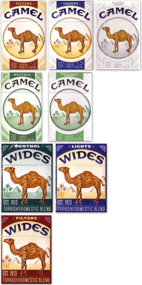
Full line of new Camel packs. Taken from camelcollector.com.
The framing circle helps focus attention on the camel, while also allowing the rest of the information to be quickly and easily graspable and the decorative elements that ripple outward into the shelves are a welcome addition that provide the exotic feeling that Camel stands for, and it does so without being distracting. The typography also experienced a nice improvement, starting with the tightening of the Camel wordmark that takes emphasis away from the heavy stroke of the previous version, and the dark color adds a touch of elegance. The most interesting part is the vertical and horizontal type treatments of the information, giving it a fresh broadside feel that ties back (maybe) to the Barnum and Baily lore mentioned above. The color palette works well in separating the different options. The Wides versions, however, do not seem as well resolved: The camel steps out from the desert and onto the pack, the flourishes on the corners are too evident and the supporting typography starts to feel more like automotive oil packaging — it succeeds in separating Wides from regulars, but perhaps this is not a compliment.


One of our readers, Lester Nelson, did us the awesome favor of flattening two packs of Camels and scanning them for us. You can see bigger versions on his Flickr page, here and here.
While the new packs for Camel actually opt for the More is More approach, they managed to do it in an elegant fashion that creates a unique design for the brand. And for a brand operating in one of the harshest industries, this design leap is pretty remarkable. Kids: Don’t smoke.


Jump to Most Recent Comment
Nick’s comment is:
Desert! Desert desert desert!
It's odd to me how the desert design falls outside of the retaining dark circle, most notably with the pyramid at right. The circle motif should help it pop at little more, though.
On Mar.12.2008 at 01:05 PM
dave’s comment is:
dessert != desert
Stevie K’s comment is:
Damn the influence of well designed packaging! This article is making me want to smoke just so I can get the packet.
Don't worry Armin, I absolve you of any blame and put this down to my own impressionability towards design.
Now if I can just stop myself buying women's perfume.
On Mar.12.2008 at 01:28 PM
Peter Whitley’s comment is:
I'm not convinced. For me, cigarettes are a lifestyle product just like my heavy machinist frames, black turtlenecks, and square-toed shoe-boots. Add sundry Mac products, a demitasse of something too intense for the ordinary civilian, and the image snaps into focus.
It's the image of a box of cigarettes (never a soft pack) on the table at the bar or coffeeshop...increasingly outdoors...speaks volumes of the individual. This new Camel package may be a nice, improved design but it lacks the established history of the venerable solution.
The old design was good enough to kill countless thousands of RJ Reynold's most dedicated customers...why would they feel like anything needed fixing?
(I smoke American Spirit Lights which is admittedly the ugliest and most culturally insensitive premium cigarette packaging a person can find.)
Armin’s comment is:
> Desert! Desert desert desert!
> dessert != desert
Wow. I'm sorry. That's embarrassing. Just goes to show where my mind's at right before lunch.
On Mar.12.2008 at 02:02 PM
Stringer Bell’s comment is:
I smoke Camel Lights. I'm used to the old box. The new one is distracting. What's even more distracting is the changed blend, and how you can't get any information on what they did unless you register on their website (which, in turn, will probably raise my life insurance premiums - and, honestly, I don't even have life insurance, but one day I might want it).
The oddest and most distracting thing of all is the addition of a blue ring and a blue camel on the actual cigarette itself. It feels like a totally different cigarette, and it might just all be psychosomatic (spelling?), but for the past few weeks, whenever I've been in a store to to get smokes I've been asking if they had any of the old packages. I'm actually considering quitting instead of changing brands. So this may not be such a bad thing after all.
On Mar.12.2008 at 02:14 PM
sukisouk’s comment is:
haha, design.
it looks nice to me,
but don’t forget this additions (in so many countries):
http://content.answers.com/main/content/wp/en/thumb/f/f9/200px-The_original_camel_packet.jpg
sukisouk’s comment is:
haha, design.
it looks nice to me,
but don’t forget this additions (in so many countries):

nice old camel package pictures here:
http://www.answers.com/topic/camel-cigarette?cat=entertainment
sorry for double post
Michael Holdren’s comment is:
As a former smoker, and of Camels no less, I love the new design. Even though I'm completely clean and have no urges to smoke again, I'm pretty tempted to pick up a few of these packs just to look at them.
I also love that they keep the nekkid guy in the camel.
On Mar.12.2008 at 03:26 PM
Darrel’s comment is:
On the one hand, I agree with Peter...why 'fix' something that ain't broke.
That said, it's really nice to see a 'upgrade' that doesn't throw the baby out with the bathwater. This is a classy updated.
I just hope Lucky Strike isn't going to rebrand.
On Mar.12.2008 at 03:28 PM
damon’s comment is:
still have the little naked man with the boner blended into the camel fur....jokes.
the packaging is kinda nice, not going to start smoking again or anything....but they look good. The wide nowhere near as much as the regular.
On Mar.12.2008 at 03:31 PM
marko savic’s comment is:
Where do they put the diseased lung and fetus?
(Canadian cigarette packaging stanards)
On Mar.12.2008 at 03:32 PM
Mr Posen’s comment is:
And in Australia. (Yes, this is actually packaging, on shelves, for sale)

Casey’s comment is:
These new pack almost make me want to start smoking...
I love this site. Thanks Armin & Friends!
On Mar.12.2008 at 04:19 PM
Jean C.’s comment is:
In Canada, half of the package is used by this addition:
T-Bone’s comment is:
nice work. maybe a bit too polished though, the original flat colour one looks more timeless.
those aussie marlboro packs are hilarious! i haven't checked, but i think those are out/coming out in NZ too.
On Mar.12.2008 at 05:12 PM
Michael P’s comment is:
I'm not a regular smoker but bought a pack of Camel lights last night and noticed the new package at once. Definitely eye catching and a nice update to something that I don't think necessarily needed updating. I was wondering when I might see the new design picked apart on here.
On Mar.12.2008 at 05:50 PM
Von Glitschka’s comment is:
They could have also updated the camel art itself. It still looks like a sculpted turd. Hire an illustrator to create new art that retains enough of the original equity and get rid of the historically craptacular one.

Lester’s comment is:
I'm a smoker, and normally smoke Kamel Reds, but being a sucker for good design, have switched to Camel Filters now, which are much friendlier to my wallet.
I like the new design a lot, but I'd like to see if it would be improved if they'd lighten up on the gradients a bit (especially in the logo).
It always bothered me, on the old Camel packs, that the columns went up on the side of the packaging. They just looked like they'd be more at home on the front. The new packaging doesn't feel 'flawed' like the old ones did. Just a good quality, solid update.
On Mar.12.2008 at 06:10 PM
Darrin Crescenzi’s comment is:
An old professor of mine, who has since moved to Qatar to head the University of Doha's graphic design program, once told me that if I ever went to work for a cigarette company she would fly back, find me, and commit unspeakable acts of violence.
I believed her, too, so I'm actually afraid to make any sort of comment on this update.
On Mar.12.2008 at 07:24 PM
NICELOGO.COM’s comment is:
I'm out of breath just reading this post.
On Mar.12.2008 at 10:10 PM
DG3’s comment is:
VERY nicely done. Those tobacco companies are devious.
On Mar.12.2008 at 11:21 PM
Jeff’s comment is:
LOVE THIS!
On Mar.13.2008 at 07:55 AM
Bridgett’s comment is:
I may hate smoking, but this design is gorgeous. The vertical stripe reminds me of much earlier designs-- with the "since 1913" so prominent, it's clearly intentional.
On Mar.13.2008 at 09:14 AM
Kurt Cruse’s comment is:
Personally I wish that all cigarette packaging was as horrible as what they do to you (and those you smoke around). I was very surprised to see this type of re-design featured on here. I'm a little disappointed.
On Mar.13.2008 at 09:53 AM
NICELOGO.COM’s comment is:
I agree with Kurt C. We really should not glorify the evil side of our business. We have the gifts, the knowledge and the power to persuade so use it for good! I was also disappointed to see this dirty part of our design business - good or bad, selling addition and death still stinks.
On Mar.13.2008 at 11:23 AM
Eli’s comment is:
I think the new pack is a great redesign - a reminder of the time before everyone knew these things would kill you, perhaps?
I agree that the wides, however, are an abysmal failure. All of the vintage look that comes with the isolated elements in the regular packs is all screwed up in the wides. Where exactly is the camel supposed to be standing? And making the camel wide to reflect the size of the cigarettes seems like a awful idea - sort of like advertising super size fries by showing a super size guy eating them.
On Mar.13.2008 at 12:07 PM
Dave O’s comment is:
if I am mistaken and these kind of pyramids exist in Turkey do let me know and I will admonish my own unworldly knowledge.
Egypt was actually at one point part of the Ottoman Empire also know as The Turkish Empire.
On Mar.13.2008 at 01:32 PM
Von Glitschka’s comment is:
Let's leave the "Nanny State" minded comments for the political blogs. We're all adults here and can make up our own minds as to what free will choices we make good, bad or otherwise and that includes appreciating well crafted design no matter what context it appears within.
On Mar.13.2008 at 02:17 PM
jim’s comment is:
oh how I miss smoking, quit 2 years ago, preferred marlboro lights, but camel lights were always my 2nd choice. I'm sure children will find the updated design attractive.
On Mar.13.2008 at 02:31 PM
Danny Tanner’s comment is:
Von-I really gotta disagree with you here.
If a logo design were for a 'home abortion
kit' or 'latest assault rifle' I would
expect dissenting comments as well.
Design is only as good/ethical as the
product/service it supports. I smoke,
but I would never give a teenager a
cigarette. Creating packaging that
is more appealing to specific markets,
specifically young/hip markets, for
me personally, equates to that very
Same thing. Creating desire for a
product which serves no purpose except
for fostering addiction and death
isn't up my ally. Maybe it is for some,
And they can have that.
Design that is for a client is never
just design. That design serves a
purpose and communicates a message.
That design can create illusions
of personality/safety/fun/hipness.
Are those illusions true or false?
Are those illusions truish or
just flat out lies.
I'd never like to view my job as clients
paying me to lie to the masses on their behalf.
Design for the sake of design is
called art.
Armin’s comment is:
> I was very surprised to see this type of re-design featured on here. I'm a little disappointed.
> I was also disappointed to see this dirty part of our design business
I'm actually surprised it took more than 18 hours for this objection to come up. Look, you can avert your eyes the other way and act as if these packages get designed by the spawn of the devil or that they don't even exist at all, or you can acknowledge that they exist and that someone, somewhere in the world is designing them to the best of their abilities. To say that it's disappointing to see cigarette packaging on this blog only manages to say that you stand against doing design for cigarette companies, which is fine, it's your decision, but that doesn't mean the design can't be talked about.
Smoking is a choice. So is designing a package for cigarettes. And so is talking about it on a branding blog. The latter, being the least offensive, I would offer.
On Mar.13.2008 at 03:45 PM
Danny Tanner’s comment is:
Armin- Agreed.
And to clarify, that's not what my prior statement was meant to suggest. Someone, somewhere, has to design cigarette packages--that's a given--and its not my intention here to vilify them or champion them. I know designers who very enthusiastically take on that challenge and enjoy it. I'm just saying it would not be my choice and why.
I don't think anyone can criticize BrandNew for talking about topics others might not agree with. I don't get aggravated when the New York Times writes about topics I disagree with. Don't shoot the messenger.
All you people upset with this site, suck it up. This is the real world. Just because you don't like something, doesn't mean you should pretend like it doesn't exist or hide from it. This is THE forum to discuss THESE opinions. So GIVE OPINIONS, REAL OPINIONS, but give backing behind those opinions--don't just bitch and moan. If all we discussed were puppies and sunshine, this blog would be very dull.
On Mar.13.2008 at 06:29 PM
Joe M. ’s comment is:
For almost two years I worked for a mammoth branding consultancy that designed packaging for vice-based products. (I was fortunate to avoid working on this stuff.)
I recall that the designers on these projects masked any closeted-resentment over their role in these cumulatively lethal pieces of communication with ambivalence along the lines of, "eh, you do what ya gotta do..."
In a publicly-held corporation, freedom of speech is often left outside the company gates; and thereby "morals" are a limiting factor for designers who wish to further their career. Resistance or any negativity can result in one losing their job; and some employees absolutely require these jobs to survive or to maintain a foreign Visa.
Regardless, I have always felt that none of those designers who I worked with were immoral or ambivalent to the degree that they would elect to work on a Cigarette Packaging in preference to, say, Theater Posters.
As Armin mentions above, the ongoing reticience of our profession to engage in a dialogue over the aesthetics of these packages limits our ability to both change the appearance of these artifacts or empower the role of our profession in their creation. Discussing the aesthetics and their impact (for better and worse) is the least offensive role can play.
On Mar.13.2008 at 06:46 PM
Von Glitschka’s comment is:
Danny said: "If a logo design were for a 'home abortion kit' or 'latest assault rifle' I would expect dissenting comments as well."
Well I am glad you're not going to the extreme with your examples.
So where do you draw the line Dan? Who makes the decision at what point a product or service warrants prohibition?
Should "Brand New" not showcase new wine logos and label designs because some might drink too much and become addicts? What about fast food packaging? Processed food etc. all can and have been abused to some degree so should be embrace a nanny state to protect us from evil corporations?
Whose moral compass do we follow? It's a slippery slope when you try to govern a moral personal choice.
Don't get me wrong, I think a designer should have personal convictions that they live and design by but it's not a one size fits all approach nor will it ever be.
I thought Milton Glaser did a good job discussing this topic in his article "The Road to Hell." I don't agree with all of his opinions but I can appreciate his conviction to hold to them as a designer.
On Mar.13.2008 at 08:04 PM
felix sockwell’s comment is:
Now this was a great Camel packaging job.
On Mar.13.2008 at 08:49 PM
DG3’s comment is:
I don't smoke, but the last time I checked, cigarettes are a legal product.And as such, Camel has every right to redesign their product to draw the attention of smokers.
On Mar.13.2008 at 09:03 PM
Joe Moran’s comment is:
I smoke. Don't hate me.
Check this out. Hidden images in the Camel. Old news, but fun.
Still sticking to Winston. Best designed pack out there… other than the Player's Navy Cut packs. Not easy to find though.
Smoke up. Ha!!!
VR/
On Mar.13.2008 at 11:23 PM
Danny Tanner’s comment is:
Von states-
So where do you draw the line Dan? Who makes the decision at what point a product or service warrants prohibition?t
I state-
I never asserted any product or service warrents prohibition.
Von states-
Should "Brand New" not showcase new wine logos and label designs because some might drink too much and become addicts? What about fast food packaging? Processed food etc. all can and have been abused to some degree so should be embrace a nanny state to protect us from evil corporations?
To quote myself from above-
I don't think anyone can criticize BrandNew for talking about topics others might not agree with. I don't get aggravated when the New York Times writes about topics I disagree with. Don't shoot the messenger.
All you people upset with this site, suck it up. This is the real world. Just because you don't like something, doesn't mean you should pretend like it doesn't exist or hide from it. This is THE forum to discuss THESE opinions. So GIVE OPINIONS, REAL OPINIONS, but give backing behind those opinions--don't just bitch and moan. If all we discussed were puppies and sunshine, this blog would be very dull.
Von states-
Whose moral compass do we follow? It's a slippery slope when you try to govern a moral personal choice.
To quote myself from above-
Someone, somewhere, has to design cigarette packages--that's a given--and its not my intention here to vilify them or champion them. I know designers who very enthusiastically take on that challenge and enjoy it. I'm just saying it would not be my choice and why.
Please read my comments before attacking me on them
On Mar.13.2008 at 11:45 PM
Lester’s comment is:
You think people think my puppies and sunshine blog is dull?
On Mar.14.2008 at 02:05 AM
C-Lo’s comment is:
I don't smoke ( and I don't hate those who do ) but I absolutely love Camel's "old world" look. They have done it before with some ads, and now the packs follow suit. I Also a nice tie in to fade out the colors with the light flavors
On Mar.14.2008 at 09:17 AM
Dave O’s comment is:
A while ago I signed up for mailings from Camel just to see their direct mail work. They put a lot of money in DM (because they dont have many other options). It's usually some of the most interesting DM stuff out there, and is never in annuals or books or anything (the same can be said of their packaging). So I think it's great that it's up here because most people don't get a chance to look at it otherwise and after all it is out there.
On Mar.14.2008 at 10:19 AM
adam’s comment is:
i was really digging the camel tattoo artwork packs and ads.


i do, however, like the new packs BUT i think they should make the background all white and get rid of all those screened back flourish effects on the corners. just have the "ribbon" at the top and bottom, the circle in the center, and the camel logotype. that mould lokk much more sophisticated and clean (and yes, i do see the irony with the phrase "clean")
On Mar.14.2008 at 03:47 PM
ZedZedEye’s comment is:
Joe Moran,
Good call on the hidden imagery.
I have always enjoyed showing people the guy in the camels front legs. He stands with his arm on his hip, and appears to be taking a piss.
Interesting how they did not touch anything on the camel in the redesign.
I believe the guy peeing can be seen on that original photograph taken of the camel.
Darrel’s comment is:
"We really should not glorify the evil side of our business."
'selling crap' is pretty much what we do. ;o)
On Mar.17.2008 at 11:40 AM
Mark’s comment is:
good,okay,not really exceptionally great.
STILL, I'm not going to start smoking, does too much nasty stuff to your body,yuck.
On Mar.18.2008 at 10:43 AM
K*B’s comment is:
this is an awesome new design and i find it super classy- but very feminine. my father and i both smoke camel filters and i cannot imagine him sticking with this brand for very much longer, since the packaging looks so girlie.
also, they have changed the blend of their cigarettes and they taste very strange.
i've been considering switching brands because i am certain that most other camel smokers to not welcome this change either and do the same, and when RJ Renyolds realizes how much money they are losing, they'll change their blend back.
however, i should probably just quit.
**
chenryhen’s comment is:
I liked the old pack and I dig the new one as well. I do agree that it might be a tad busy, but I like the reference to the old corner elements.
I'm surprised that once they changed the perspective of the pyramids, it really calls attention to how on the old package they do look like they're facing the wrong way.
On Mar.21.2008 at 09:32 AM
frank’s comment is:
I'm Extremely disappointed in the new face of Camel. If they want to change the design, they should take it all the way, redo the Camel...
But they changed the blend! THAT F=ing Sucks! They taste like marlboro reds. Which are good cigarettes, but the iconic turkish flavor is gone. Damnit!
Back to the Turkish line i guess.
:(
On Mar.24.2008 at 09:45 PM
marc english’s comment is:
i think the new stuff is crap. learned long ago that once you confine an image/photo to a given space you have effectively boxed it in. whereas an image that bleeds allows the mind to effectively travel outside the frame or edge of the page.
the old packaging allowed for thoughts of expansive desert and what may be around the corner. the new stuff, with the circles and corner dingbats and cropped pyramids and camel feet that leave the frame to stand in a different color?
am not a smoker, but would agree with KB's dad: not girlie, but WEAK. the old pack was iconic, and 'fixing' is not what it needed. had i smoked, i'd be a camel guy, t.e. lawrence and i lighting a fag over a campfire, but you'd never see these packs around a campfire, unless it was gas-lit.
dug that hand-lettered TURKISH & DOMESTIC BLEND. and if NOT hand-lettered, it sure looked it. and than that neat old school illustration on the back, is rendered as essentially clip art. ugh.
nasty.
On Mar.25.2008 at 05:35 PM
mohard’s comment is:
and I quote:
"Someone, somewhere, has to design cigarette packages--that's a given"
umm, not exactly. If we all refused to do design work for companies that kill (with no other benefits), maybe we would actually see some changes made, instead of taking the easy way out (i.e. "somebody's" gotta do it.) Lame excuse.
it's very simple: DON'T be that somebody, and the world can become a better place. seriously.
On Mar.28.2008 at 12:55 PM
bluretina’s comment is:
in my opinion the new design is too much cluttered with oriental "cliparts". specially the back of the package. also using more than 3 different font types is a noob mistake. I would understand simplifying the design to give it a fresher look but this is just the opposite and not doing any good at all. this is called "too much designing". also there is no elements in the design that stands for Turkey anyway. The whole concept just looks more "Arabic" on the new package. and what's up with the illustration crossing over around the circle? I really don't understand that. and the sand turned into butter... anyway, the circle just cuts off and kills the desert and all the "cool" lonely feeling.
from now on, smoking camels won't make you cooler kids.
if you enjoy circles, switch to luckies.
cantomagica’s comment is:
I have some thoughts on the new Camel Lights. Personally, I'm okay either way with the box, although I prefer the old style. The problem I do have is with the cigarettes. I don't know what they did to my Camel Lights, but they taste funny...almost like dirt. Also, I don't know if anyone else has noticed, but they are hard to keep lit! I think they must have put some fire retardant chemical in them...hence the bad taste?
I have been considering changing brands, which I haven't done in 25 years. :-( I'm seriously bummed about the new CamelLights.
THEOTHR1’s comment is:
i've smoked camel filter for 12 years and they were the only brand/model that i would ever smoke; if the store(s) was (were) out, i just wouldn't smoke.....whenever anyone such as my folks would ask "when're you gonna quit smoking?" my reply was "when they stop making the smokes i smoke".... i regret that now....these new camels are downright terrible!!!!!!....i'd rather smoke the hair of the camel than this sorry excuse for a new and improved look/taste...i live in buffalo, ny and am in the process of mapping out every convenient store, gas station, super-market and any other merchant peddling the old gems and will eventually buy them all out (which i have done to 2 mobil gas stations thusly)...seriously, though, it looks as if the end is near....which, in the grand scheme of the long run, is probably for the best considering how healthy we all know these damned coffin nails really are!!!!!!!
On May.11.2008 at 12:21 AM
Anonymous’s comment is:
kiangel
well, i used to smoke since im 15 y/o, i never quit with this, till now that im 20...
For me, its not upto the new packaging as long as you are a smoker...
Vicki Klein’s comment is:
Haven't smoked in over 30 yrs. Camel Filters were always my 1st choice. Today at work one of the younger staff had his camel filter pack on the counter, I picked it up and was looking at it, and smelling them, he asked me if I wanted one..of course I don't even ever want to smoke again, I did not have a hard time quitting, I just got over cigarettes...but that pack still caught my eye !! I remember something about the woreds on the back of the pack, and holding it up to a mirror, but I can remember what it was...I pointed ot the'little boy' to him...when I left he waqs very intensely studying the Camel package....it was funny !!!
On Sep.08.2008 at 06:12 PM
Armin’s comment is:
Due to spam, this thread has been closed to comments.
On Sep.30.2008 at 05:41 AM
Comments in Brand New, V1.0 have been closed.


