

NOTE: This is an archived version of the first incarnation of Brand New. All posts have been closed to comments. Please visit underconsideration.com/brandnew for the latest version. If you would like to see this specific post, simply delete _v1 from the URL.
![]()
Many companies dream of an organic, adaptable and changing identity to avoid looking static, stoic and stale. Most companies, too, flail at the thought of managing a constantly fluctuating identity, commonly opting for one logo lockup… two, if they are feeling saucy. MTV has made a living out of changing logo looks faster than Madonna, and VH1 has adopted a similar mentality; Fossil may have one official logo, but its look is as diverse as the retro look can be milked; and companies like GE, Motorola and BASF find comfort in extensive color palettes to render their logo in. These are few and far in between and the exception rather than the rule. Saks Fifth Avenue’s embrace of a changing identity — changeable in 100 googol ways no less — designed by Pentagram (Michael Bierut, to be specific) is a feat all the more impressive considering the stagnant state of retail identity, specially in this category (Nordstrom, Bloomingdale’s, etc.).
[This may be a good time to read Michael’s comprehensive explanation of the project on the Pentagram Blog]
I have watched this identity develop at the office over the past 20 months, and it had started a good 12 months before I joined Michael Bierut’s team. Early on I was this close to working on the project… I secretly thank fate for not being the one involved, as I just couldn’t comprehend how this could be implemented on a massive scale (40 different packages, anyone?) much less how this could be style-guided. I’m no stranger to guidelines and I pride in my ability to make them air tight, but this just seemed like a lost cause. Specifying how one or two logos are used in an identity system is hard enough, now imagine specifying how 64 logos are used in an identity system.
![]()
This identity proposal also survived a good two years of being presented to different stakeholders and interested parties at Saks Fifth Avenue, getting stronger and tighter with each session of scrutiny and questioning. The result is not only a pretty nice identity but one that can reflect the quickly changing world of fashion and morph through the next decade(s) with an endless array of possibilities… note that this first rollout is only black and white, introducing color might just be as mind blowing as dropping LSD.


Jump to Most Recent Comment
DC1974’s comment is:
Retail identities are stagnant by design. Especially in the high end category. I like this identity a lot, but it seems indicative of Saks' falling and flailing in the marketplace. They are the FoMoCo of retail -- each year (season?) they seem to have a new "way forward" and a new idea of what they are and who their market is. Meanwhile, the fashionistas or just merely well off that want to pretend are flocking to Nieman's and Bloomingdale's. We'll see if this actually does anything for Saks as an entity. Or if it just further confuses the consumer.
On Jan.05.2007 at 10:03 AM
Acedro Todd’s comment is:
I saw this on the pentagram blog and it's an absolutely amazing identity.
On Jan.05.2007 at 10:11 AM
Nick Z.’s comment is:
Excellent.
I love the variation on the "lets make a pattern out of our logo" school of thought.
On Jan.05.2007 at 11:05 AM
fatknuckle’s comment is:
Armin-
The interesting in that it expands the definition of identity to include the subsequent implementation as integral to its success (or failure.)
We tend to think of an identity solely as one mark, locked down and immutable, applied to various materials in different ways, with consideration always given to the original marks visual integrity.
This pretty much blows that established theory right out of the water. The only drawback is that it dilutes the "foundation" mark itself (which in this case is a rehash of the '73,) reducing its pieces to merely decorative elements of that unknown whole.
While a bold move indeed, the success (or failure) of this will lie in Saks' ability to fully embrace the elemental nature of the identity as a whole and give it enough time to succeed in breaking the traditional thought of what an identity is or should be.
On Jan.05.2007 at 11:06 AM
Greg Scraper’s comment is:
I think it's a great step forward. The old logo always bothered me, in that the "fifth" always seemed to command the most attention, probably because of the lack of strong ups and downs at the ends of the words "saks" and "avenue." Justifying left and right with varying type sizes only works if you have similar letterforms at the ends to justify with. But I digress.
I like the script usage as well. When it's sliced it gives a real festive element to the bag/box/package. Color will be interesting when it's applied—I just hope they'll stay away from more than one or two colors (and no neon pinks). There's "festive" and then there's "techno rave acid trip." The black keeps it classy. Darker colors, or metallic grayscale could be interesting.
It will be interesting to see how this identity will be incorporated into the stores. One of the main features of Saks (at least where I live) is the very open feel to the store, and the one good thing I'll say about the old logo is that it complimented that modern, open feel. With this much busier identity, it might be difficult to avoid making the store look cluttered.
On Jan.05.2007 at 11:09 AM
Orangetiki’s comment is:
It’s so simple it’s brilliant. Sure not a lot of people will realize what it is, but the end result is well thoguht of and well executed. Also it looks great. Maybe if they didn’t cut it into 64 different squares but less. That would keep lines more connected and therefore get rid of some of the static lines that end for no other reason. But other then that this works well
On Jan.05.2007 at 11:19 AM
ryko’s comment is:
fabulous.
On Jan.05.2007 at 11:22 AM
felix’s comment is:
Very beautiful job, Micheal & Joe.
Now that Ann Skalski & Rhonda left the Saks Bldg (Rhon upgraded to Victoria Scretions! note to self: Idiot, call Rhonda!!) it will be interesting to see how this gets adapted. I have to agree on the stale, "stagnant" nature of retail and perhaps recieve some of that finger-wagging (my Saks, Nieman Marcus illustrations were, by most standards, lame).
This new identity is both functional and beautiful. On a critical note I have to wag a pinky finger at Pentagram's PR chieftan. Stating Joe Fino's credential as simply a "font designer" is akin to Paula Scher being a "poster designer".
Now that Pentagram has 15 magazine designer principles it would be refreshing to see them recruit someone "under the hood" if not "behind the curtain".
On Jan.05.2007 at 11:43 AM
andrewmartin’s comment is:
World-class design from the best in the business -- beautiful. Not bad for one-color printing, either.
On Jan.05.2007 at 12:03 PM
stock_illustration’s comment is:
Absolutely gorgeous and timeless.
On Jan.05.2007 at 12:11 PM
Darrel’s comment is:
Reading the description of the solution on the Pentagram blog, I couldn't think 'wow, what a hokey line of BS that was...'.
But then you scroll down and see the packaging and go 'Wow, it really does work. Brilliant!'
On Jan.05.2007 at 12:12 PM
Von Glitschka’s comment is:
Very Tim Girvinish. Beautiful and elegant.
On Jan.05.2007 at 01:43 PM
Jason L.’s comment is:
A wonderfully paradoxical solution. Magically complex but painfully simple. And while almost all descriptions of design solutions initially sound like BS, Beirut shows yet again he's one of the smartest in the business. I will now quit because I see no point in carrying on.
On Jan.05.2007 at 01:46 PM
Kabari’s comment is:
I like how they brought the 50's style back. It's especially sick how he chopped it to make the box wrappings etc.
On Jan.05.2007 at 02:32 PM
fatknuckle’s comment is:
Out of clarifications sake is the mark itself the whole or is it the pieces? I'm still confused the more I look at it and reading the commentary.
If it's never applied in its whole form, then I get it (elegant but far from groundbreaking.) If its used only as pieces, never seeing it in its whole form then I get it (now thats balls.)
But, if it's applied as both then isn't a redux of the '73 mark as a whole and then as a decorative application when pieced in that manner for packaging and such?
In looking at the packaging it seems to be applied as both, which would lead me to believe this isn't as revolutionary as implied. But its simply a decorative treatment of the mark.
Or am I completely missing the point?
On Jan.05.2007 at 02:46 PM
Armin’s comment is:
FatK, the logo is the complete mark, no slices. The identity is the complete mark plus the pieces.
On Jan.05.2007 at 02:51 PM
hyun’s comment is:
One of those "damn, i wish i thought of that."
On Jan.05.2007 at 03:19 PM
fatknuckle’s comment is:
Armin-
That is what I figured. But in your review you write
"Specifying how one or two logos are used in an identity system is hard enough, now imagine specifying how 64 logos are used in an identity system."
So then it isn't really 64 logo's but one that's applied throughout the identity system as 64 different decorative elements, right?
This type of semantic confusion really throws my head askew. To this day I cant watch Back To the Future without my head being jacked up for days (and dont get me started on Memento...)
On Jan.05.2007 at 03:19 PM
Paul Riehle’s comment is:
Amazing application. If only variable printing was at the level of print quality/size/etc every single bag, box, etc could have a different pattern. There are 100 googol possibilities, right? =)
It makes me want to go spend money at SAKS just to get a bag.
On Jan.05.2007 at 03:39 PM
Alex ’s comment is:
Basel meets 5th Ave! Sweeeeet!
On Jan.05.2007 at 09:23 PM
Mark’s comment is:
yechhh....
Not original, so predictable.
It's just a thinned down version of the 1973 logo in a black square.
and taking sections of the logo and randomly arranging them SORRY to "burst your bubble" but anyone can do that! ;P
The 1973 logo looks better than this!!
On Jan.05.2007 at 09:36 PM
Jeff’s comment is:
Jeez, Mark, your comments falls into the "So easy for anyone who knows what they're doing" category.
Virtually any execution of an identity will remind some designer somewhere of something they have done or seen someone else have done. It's the nature of the beast. It's easy in hindsight to say that it was an obvious execution, but the fct that no other retailer in their market has done anything remotely like it shows it is unconventional and therefore groundbreaking.
On Jan.05.2007 at 10:41 PM
maria’s comment is:
awesome! elegant, playfull, familiar, sexy....
On Jan.05.2007 at 11:20 PM
rickyaustin’s comment is:
I love black and white - so this appeals to me immensely.
I was wondering when this would be uploaded, I remember seeing it a little while ago.
I think it is a spectacular use of a classic mark, then a modern twist applied to it. The large cutouts are elegant, sophisticated and modern looking.
Two thumbs up!
On Jan.06.2007 at 12:00 AM
tarpitizen’s comment is:
Oh, c'mon people: this identity is not so fabulous. Certainly not as fabulous as that 1955 casual script version, and not as fabulous as Max Huber's La Rinacente identity of which this is a pale shadow. It will last a while, because it doesnt' really mean anything, which is just what a big retailer wants. And because it's 2007, it's got to be broken up and abstracted, which only adds to the meaninglessness. I guess the real art of design here is the art of Pentagram's p.r. machine...oh, wait a minute, I forgot, Armin works there!
On Jan.06.2007 at 12:17 AM
dee’s comment is:
I think it definitely works for their high-end market. The black and white communicates that "ritzy" feel very well.
As far as the pattern...it also works perfectly. Think of all the other high-end apparel companies that have used logo-patterns in their goods (Coach, Louis Vuitton, Gucci, Dooney & Bourke, etc).
I'm not so sure if this design is innovative, but it will definitely work for them.
On Jan.06.2007 at 01:29 AM
Mark’s comment is:
snore...............
please this is far from groundbreaking.
But whatever praise it all you want.
On Jan.06.2007 at 01:55 AM
Mark’s comment is:
white on black cut up shapes is probably expected NOW if it was black on white cut up shapes THAT would have interesting.
The black takes to much away from the white letters when they're sliced up.
Theres also too much plain black squares that take away from the forms in the white letters when they're sliced up.
When the square slices are at a large size it works, but when they are smaller and far away they get lost and overwhelmed by the black background and it becomes "static"
It's a shame because those letters do create great negative space and have excellent forms.
On Jan.06.2007 at 02:10 AM
Mark’s comment is:
the best represtation of the design IMHO.
http://blog.pentagram.com/archives/Saks_Bags.jpg
I like seeing the side of the bag in this picture.
When it's large it looks pretty cool (kind of 80's I'm old school) when it's small it sort of loses the striking forms unfortunately.
I am not saying this design is a failure, it just has a few drawbacks.
"yecch" was a basic intial reaction without any thought.
On Jan.06.2007 at 02:25 AM
Mark’s comment is:
Another silver lining is that this new logo seems to have so much motion going on with it that the previous logo looks so stagnant!!!
Macy's must be envious ;)
On Jan.06.2007 at 02:41 AM
diane witman’s comment is:
The elements on the packaging are beautiful! I love the look that it gives to the packaging.
Although, I question the overall look when I see the sides of the bag, what happened there? An all white (I believe they are called gutters?) side with the logo in the center? Why was so much attention placed on the front and back of the bag but not on the sides? When trying to display the "identity" I feel the sides are just as important and possibly even a place for something special. I know the front and backs are busy enough so this is almost a calming area but it seems like it was forgotten. I also like that they were able to put the logo in it's entirety but couldn't it have been done in a more interesting manner?
I love the new look but those sides are killing me.
On Jan.06.2007 at 10:33 AM
Shahla’s comment is:
The advantage of the program, deployed in black and white like the store’s holiday “snowflake” packaging, is that it creates recognizable consistency without sameness.
I would like to know who had designed their ‘snowflakes’ packaging— a year or two years ago?
On Jan.07.2007 at 03:06 AM
Mark.S.’s comment is:
Love at first sight!
On Jan.07.2007 at 06:59 AM
Achhtentachtig’s comment is:
One of those "damn, i wish i thought of that."
Indeed, especially when you're working on a retail fashion identity at the moment...
On Jan.07.2007 at 10:59 AM
// Maria’s comment is:
Deconstruction of the familiar is always good!
This one was well achieved.
On Jan.07.2007 at 01:40 PM
DesignMaven’s comment is:
DON'T I GET A FRICKEN HEADS UP on these Identities anymore???!!!
GEZZZ!!!
Mark
In Reference to Saks Color System. There is a Color Scheme Implemented other than the Monochromatic Black and White. According to Privileged 411 Management opted to only Launch and Roll Out the Blk & Wh. Color Scheme.
--------------------------------------------------
Commentary:
I've been Praising this Identity since 12-15-06 when I first learned about the Redesign; discussing it amongst friends offline.
Thanks to Uncle Bill Gardner for Breaking the News at Logo Lounge.
Rarely will you ever hear or read me say these words. I like an Identity, goes against everything I was trained. Ultimately, an Identity need to be appropriate and measured against Corporate Objectives (The Brief) and these Design Objectives below.
1. Originality
2. Memorability
3. Usability
4. Livability
5. Propriety
6. Uniqueness
7. Visual Impact
8. Imagination
--------------------------------------------------
Big Bro:
I absolutely LOVE this Identity. Many thanks for bringing back the Spencerian Identity I grew up Marveling when I was a child and had fond memories shopping with my Mom at Saks and Carrying her shopping bags.
Never understood why Saks replaced the Calligraphic Identity by Massimo Vignelli with the Sans Identity. Don't get me wrong, I love Sans Serif typefaces, my Swiss Allegiance.
The 1997 Sans Typeface for Saks was to Corporate, Cold, Distant and Impersonal.
Nothing says Upscale and Elegance like a well Drawn Calligraphic Logotype.
We don't see enough of them now-a-days.
Any Remembrance of the Days of Herb Lubalin and Tom Carnase in my Book is Monumental.
GOD BLESS, The Gifted Hands of Joe Phemon Finocchiro.
Neiman Marcus, Lloyd & Taylor, and H&M (others) have remained Steadfast with their Script Identities.
What I would like to see is the Animation of the History of the Identity evolving into the Applications of Identity on Packaging in a Television Commercial.
The New Identity is Poetry in Motion.
Well Done is an Understatement.
The Saks Identity in Application is Pure Genius.
In over twenty (20) years of being an Identity Designer, this is the Most Radical, Brilliant and Aggressive Application of an Identity in the History of Visual Communication.
Perhaps a close Rival in Application Aggression was Espirit. Developed and Designed by
Tamotsu Yagi and John Casado.
Michael, you're Running on all Eight Cylinders of Identity Design Objectives.
Alan Fletcher was Correct. You are a Genius!!!!!!!
DM
Magnus’s comment is:
This is very good work.
On Jan.08.2007 at 07:22 AM
Shahla’s comment is:
I'll ask again, with great faith that the community of designer bloggers— those who have ‘insider’ information– will give me the name of the designer who thought of using water crystals (snowflakes) for the packaging awhile back though still using the ‘97 logo. Assuming it wasn‘t his own earlier work, this unnamed person is the one who should be acknowledged along with Michael Bierut.
On Jan.08.2007 at 02:41 PM
Michael B.’s comment is:
Shahla, the snowflake identity was designed by the Saks in-house design department.
On Jan.08.2007 at 08:35 PM
felix’s comment is:
their creative director (until 8/06) was Ann Skalski. She may have had something to do with whatever it is you're talking about.
On Jan.08.2007 at 09:13 PM
Mark’s comment is:
I wonder what other colors they are planning to use.
I hope it's not red (that colors too intense and it's too cliche) and I hope it's not blue either(that colors used way too much and it cheapens the retail image)
A nice dark green,dark maroon,navy blue and perhaps gold might go well with this pattern.
maybe a dark silver,that would look nice.
They would have to avoid bright colors though that would ruin the upscale image.
Is this perhaps one of the first brand revitalizations that finally doesn't aim towards the 'tween' or 'youth' market and instead more towards the 'mature' crowd?
If it is, it's definately refreshing compared to all those other web 2.0 logos.
On Jan.09.2007 at 05:20 PM
Jerry Kuyper’s comment is:
Diane
To my eye, the single logo on the sides of the page contrasts wonderfully with the visual activity on the front. I think the restraint in scale and placement is perfect.
One might imagine the client insisting on their full logo being used but my guess is that this was the recommendation.
On Jan.09.2007 at 09:16 PM
Jerry Kuyper’s comment is:
I meant "the sides of the bag"
On Jan.09.2007 at 10:22 PM
Shahla’s comment is:
Now that Ann Skalski & Rhonda last name? left the Saks Bldg…
Thanks Felix and Michael. Upon closer reading I found their names upthread. I hope at least one of the two get a chance to read-up here and add their comments.
What I’m talking about is the inspiration the water crystals were to Michael. I used the same photographs of water crystals in a Visual Communications II class and had a captive audience commenting favorably on my 2 different solutions in paired projects restricted to using the same imagery. So, I know what Rhonda or Ann (if it was either of them) felt while working with those particular organic, breathtaking views of water.
Though the different permutations the new SFA logo could make are in the googols like crystalline patterns of water molecules, Michael’s design makes ‘Saks Fifth Avenue’ the water we crave all year round —not just when it’s freezing.
On the other hand, the sans serif of ‘97, for me, was a welcome departure from all the script logotypes, I'd seen before. Who drew that –or was it type off the rack?
And speaking of (almost) sans serif faces, something about the chopping and rag of the name and the square cartouche of the Pentagram redesign has a whiff of ‘the Getty’ logo.
On Jan.10.2007 at 12:08 AM
Shahla’s comment is:
Disregard that last bit about the rag. I just noticed it’s the same as ’73 —the oldest one I had seen in use, in case I was sounding ancient : )
On Jan.10.2007 at 12:21 AM
Keivn M. Scarbrough’s comment is:
This reminds me of when I was a kid. Sometimes, I'd watch a channel that wasn't coming in (the snow ones, not the naughty bits) for the random patterns. Sometimes your mind plays tricks on you, trying to make sense of the chaos, and you think you see something that isn't there.
I love it. I absolutely love it. I think what really seals it for me is the sheer number of possibilities -- every Saks customer to ever live, could, in theory, have their own bag design for each purchase. Thats pretty damn cool.
On Jan.10.2007 at 07:27 AM
Shahla’s comment is:
Critical of my own use of the word ‘rag’ –“‘stacking’ of the name” is more accurate.
<joke>A nod to Vignelli, then you chop him into 64 pieces.</joke>
On Jan.10.2007 at 02:27 PM
erik spiekermann’s comment is:
We tend to think of an identity solely as one mark, locked down and immutable, applied to various materials in different ways, with consideration always given to the original marks visual integrity
Who is We? How can one sole mark identify a company, an institution, a brand? What happens when you open a book and there is no logo for a few hundred pages? Will every door in the headquarter building have the logo on it? How many logos can you put onto or into products?
Corporate design lives by its execution, not by the good intention of its "creator". We designes get judged by the effect of our work, not by what we wrote in the presentation. Whenever I have been involved in a project, we have strived to make the logo superfluous. When you look at anything from the company and can tell who made it, then you have a successful visual brand identity. That's why we not only designed the typography for all the instrument panels for Audi, but every single little hidden sticker and stamp; under the hood, under the carpet, in the trunk.
And that is why Saks rules. In the future, when you see black and white and Script on anything retail, you'll think Saks. Once you've learnt that new language, of course.
On Jan.13.2007 at 02:51 AM
ege’s comment is:
This is brilliant! I love the mark and the packaging. It feels elegant, and has a great sense of type. I only wish we saw more marks as well thought out as this one was.
On Jan.15.2007 at 01:14 PM
Richard’s comment is:
Lovely solution. It wil be interesting to see the progress of implimentation.
I can see why Saks would crave an identity with longevity since they coexist with well established luxury brands. However, many luxury brands have the luxury of a focused creative point of view as the core of who they are. Saks' desire for longterm focus seems a bit at odds with what they are.
A brand with longevity, in addition to good design, requires that you don't change it. I just always find the irony in this type of project amusing.
On Jan.26.2007 at 04:44 PM
Lou Smith’s comment is:
Come on! It's Saks! I think that it looks great! What else could I think? It's saks!
Lou Smith
www.rogermag.blogspot.com
www.rogermagazine.com
Michel Jansen’s comment is:
I always wonder what the real identity is for companies who quite easily change their visual identity. I also prefer the new look and feel, but it is quite a revolutionary change in (visual) identity. I wonder what, if and how they've changed the store and if consumers still will feel it as their Saks...
Michel
j’s comment is:
Oh, c'mon people: this identity is not so fabulous.
oh c'mon. ye olde "if you don't agree with me you're fucking crazy" attitude?
i love this blog. comments...not so much sometimes.
On Jan.30.2007 at 01:37 PM
mlandry’s comment is:
What is compelling about the solution is it's restraint. I'm sure it was a tempting opportunity for Beirut to produce a result that had more of his own fingerprints on it. I could imagine many consultants suggesting the company truncate the expression to SAKS—making proclaimations through the Holy Book of PowerPoint that the brand needs to be appeal to a more youthful audience. Or the creative suggestion that SAKS adopt an "ownable" color, á la Tiffany.
I agree that there is nothing groundbreaking here. The clever slicing and scaling of the identity is reminiscent of a Hoffman exercise given to students at Basel. And if you think about the retail space, many companies use pattern as part of their identity (e.g. Target, Louis Vuitton). Having said that, I think the program for Saks Fifth Avenue is wonderfully fresh and appropriate. Pentagram has done what we should all endeavor to do—provide an experience that casts our client's business in a way that is meaningful and compelling.
Kudos to you Michael.
On Jan.30.2007 at 03:54 PM
Inkblot Robot’s comment is:
Gotta tell ya, I am really digging this new identity. Classic, fresh, and refined all at one time!
On Feb.01.2007 at 05:34 PM
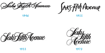
Theodore Bouloukos II’s comment is:
The logo introduced in the '60s and used until 1972, with the tagline "Very," as in "Very Saks Fifth Avenue" was another script entirely than the one Massimo Vignelli designed and introduced in 1973 (from which the newest logo takes its cue), as is misattributed above as stemming from 1955. The script logo succeeding the one introduced in 1955 was a scipt of similar proportions, written in title case; ergo, Saks, rather than SAKS. Somehow all of the blogs and editorials about the new (old) Saks logo have missed this one. But open any issue of the Times from the '60s on microfiche and you can see this logo emblazoned on all of their advertising. It was, to be sure, wholly inelegant, uninspired and dated, even by '60s standards though it lingered until 1972, when BATUS bought Saks from Gimbel's and gave it a new look. That classic Vignelli script was always mutable, used in either linear or stacked fashion, depending on the space needs of the store's shopping bag designs or its respective advertising campaigns. The Vignelli script was always complemented with an Optima sans-serif face for body copy and mandatory lines, i.e., hours and branch locations. It doesn't appear they'll be reverting to Optima as a secondary font this time around, insisting on boxing the logo just as they did its dreadful predecessor, which was introduced in 1992 on a dismal February Sunday. Shocked, as if punched in the gut, I couldn't believe the new owners would abandon that classic script so endemic to their sense of style, e.g., their red and/or green Christmas shopping bags (chocolate brown and beige logo, succeeded by black bags and a red logo the rest of the year), or the famous Christmas gift calendar that would signify their holiday advertising. The abandonment of that script in 1992 was so jolting to me, I fled my Columbia dorm room and marched right down to Rock Center, demanding to know what was going on. The poor little waif staffing the info booth that Sunday gave me some lame excuse about the logo having been redesigned to accommodate their foreign customers, who'd found the cursive logo difficult to read. Imagine! I caused a bit of a scene that day and was escorted out by a security guard. I haven't shopped there since. They should have just restored the Vignelli logo with its thicker strokes and serifs. I do like the patchwork jumble they've chosen as a decorative branding device, but Vignelli's original design would have been far more luscious when deployed against the grid and then detonated into graphic schrapnel. This new version is simply too airy, and, Lord Almighty, would someone please convince them to think outside of the box!
On Feb.06.2007 at 12:50 PM
David E.’s comment is:
The thing I like the most about it is the lettering. Armin, was this done at Pentagram or by a lettering artist? It's beautifully rendered. Is it always used cropped in a box like that, or is that just to show how it's sliced?
I like the pattern made from slicing it. It looks great and I'm looking forward to seeing it in color. It's really not 100 different versions though. It's one logo and one pattern, right? No matter what size you make the tiles or how you rotate them, it's still the same pattern.
On Feb.15.2007 at 02:18 PM
DesignMaven’s comment is:
David:
Arm may have missed this...
I'm an Authorized Agent for Arm.
The Lettering by was Commenced by The Legendary Joe Phenom.
www.joefino.com
From Pentagram's website. In the words of BIG BRO.
"We took the cursive logo, redrew it with the help of font designer Joe Finocchiaro, and placed it in a black square. Then, we subdivided that square into a grid of 64 smaller squares".
DM
The Hostile Takeover of Corporate Identity
On Feb.20.2007 at 06:27 PM
danielle’s comment is:
Mellifluous. I liked it before but this is fantastic. Love that it was kept black and white. Keeps it looking clean and classic, and proves zero reliance on color.
On Jun.27.2007 at 01:42 AM
catherine’s comment is:
What is the big deal!!!
i like the application on the packaging but the logo byitself is not so original. A brand should be reclines just by the logo. it is old and out of fashion
catherine’s comment is:
What is the big deal!!!
i like the application on the packaging but the logo byitself is not so original. A brand should be reclines just by the logo. it is old and out of fashion
catherine’s comment is:
What is the big deal!!!
i like the application on the packaging but the logo byitself is not so original. A brand should be reclines just by the logo. it is old and out of fashion
Shahla’s comment is:
While spring cleaning, I caught sight of the previous Saks 'holiday' shopping bag which has a bright red interior, and felt fully descriptive details needed to be posted here. Centered in the red, in white, is an all caps quote:
"UNDER THE MICROSCOPE, I FOUND THAT SNOWFLAKES WERE MIRACLES OF BEAUTY, AND IT SEEMED A SHAME THAT THIS BEAUTY SHOULD NOT BE SEEN AND APPRECIATED BY OTHERS. EVERY CRYSTAL WAS A MASTERPIECE OF DESIGN AND NO ONE DESIGN WAS EVER REPEATED. WHEN A SNOWFLAKE MELTED, THAT DESIGN WAS FOREVER LOST. JUST THAT MUCH BEAUTY WAS GONE, WITHOUT LEAVING ANY RECORD BEHIND."
—WILSON "SNOWFLAKE" BENTLEY
PHOTOGRAPHER, 1925
and along the top inside fold, the words, reversed out of black, JOY PEACE LOVE GLORY HARMONY BELIEVE GRACE MERCY GIVE HOPE, are peppered with a SAKS (in red to distinguish it from the white) –4 to 1.
On Feb.06.2008 at 05:57 PM
Fleur205’s comment is:
The new Saks is a horrible mistake.
As a New Yorker, I feel that Pentagram did a very poor job of preserving the legend that used to be Saks Fifth Avenue. In the name of doing "something cool, new and modern", the creative minds behind this rebrand failed to bring new life to the iconic Saks Fifth Avenue. The logo is not luxurious enough, not prestigious enough, and certainly not a good representation of what Saks Fifth Avenue is or should be in the 21st century.
Don't get me wrong...its a nice looking logo..but its not Saks Fifth Avenue. This new look makes Saks fifth avenue feel like a more expensive version of Bloomingdales. No longer can saks compete with the likes of Bendel, Barneys and Bergdorffs.
I grew up going to Saks on the weekends with my family, and it was such a treat to get a Saks box with a treasure inside for Christmas...why did they need to mess with a good thing?
If Saks needed a new boost..the problem was not with their logo!!! It was their store, the products and shopping experience...why not start there next time?
On Mar.01.2009 at 06:14 PM
Comments in Brand New, V1.0 have been closed.


