

NOTE: This is an archived version of the first incarnation of Brand New. All posts have been closed to comments. Please visit underconsideration.com/brandnew for the latest version. If you would like to see this specific post, simply delete _v1 from the URL.
![]()
A year ago, almost to the date, I wrote a heartfelt and disparaging review of the redesign of the Payless Shoesource identity on Speak Up — Brand New’s “mom” as I like to call it. Since the launch of this blog, the most requested logo review and/or tip has been for Payless. More than a dozen times. I always point our readers to the link above and explain that we try to keep our reviews as current as possible and prefer not to discuss older work. Until now I had refrained on bringing up Payless again, but the recurring requests are perhaps an indication (or is it vindication?) of my original feelings… That the old Payless identity, in all of its Cooper Black glory, had too much equity that could have been evolved instead of being replaced by an unnervingly meaningless icon and subjectively boring typography.
Receiving e-mails titled “New Payless Logo” [emphasis mine] many months after the new Payless logo was actually introduced was a bit disorienting: Why, after a year in the market, has the new identity not made a dent in people’s perception of the brand? Not even designers’. Even when Payless ran a TV ad campaign with plenty of airtime right after the redesign, it seems that it’s the old Cooper logo that people still think about when they think about Payless. I know I do. Of course, as with any major identity roll-out, specially one that involves more than 4,600 stores, the introduction is slow, specially in smaller markets and I think it’s the new stores that trigger most distinctions of change, rather than the logo. Having seen one of the new stores here in New York, I can attest to their improvement and enhanced appeal. Brighter and more colorful. Certainly, this is where the improvement was desperately needed, as going into a Payless store was one of the most depressing retail experiences.
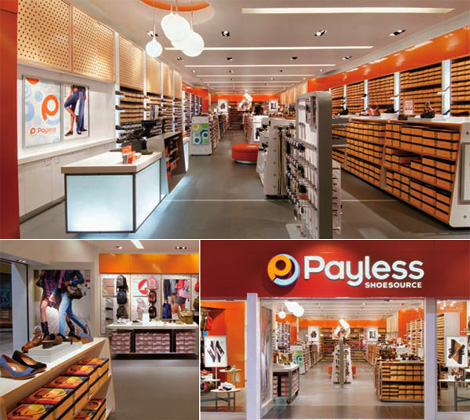
Images from Payless’ 2006 Annual Report
However, the logo change — designed by dg* Desgrippes Gobe — is still in my mind one of the worst design, strategic and visual decisions made by both parties as it adds nothing to the brand and it does less in establishing any sort of personality. Unless bubbly vapidity counts as personality. Over the course of five years now, I have reviewed tons of identities, and every now and then I look back on some to see if I have changed my mind. With Payless, I’m happy to report that, indeed, I still find it a failure one year later.


Jump to Most Recent Comment
Colin’s comment is:
Where exactly is the failure of this logo beyond the fact that you personally don't like it? And why is it any surprise that people still don't recognize the new mark? It's only been a year compared to however many decades the other one existed in our minds.
Their target audience is not 30-year old graphics designers, so who cares if it's yet to break their perception? 14-year old girls out shopping wouldn't be caught dead in the old Payless, and I think that problem might be alleviated by this new image.
On Jul.11.2007 at 12:31 PM
Neven’s comment is:
Wow - talk about completely missing the image of your own brand. True, the new logo is completely ridiculous even if you didn't know what Payless was. The best I could tell would be, they sell horns... or embryos... or cheap shared hosting.
I love how the designer used an element they're completely ignorant of - that smaller, pulled-in "shoesource", the way other grown up logos say "consulting specialists" or "children's hospital" or "homeowner's insurance". Oh it's the Payless SHOESOURCE, I see. Well, that's where I'll take my shoesourcing business then.
If you live outside the US, here's how we Yanks see Payless: it's a discount shoe seller, seen in slightly crummy strip malls across the nation. They specialize in buy-one-get-one-half-off deals on shoes you wouldn't normally buy, and also in giving you a blank stare when you ask for any sort of shoe-related assistance.
The Cooper identity had an earnestness to it, a deep-fried simplicity that reassured you that, hey, you weren't going to find your favorite shoes here, but they were going to be about $20 and you wouldn't be pestered by any actual salespeople. Do they really think that this update will make them the sweetheart of... what, Target shoppers? overworked moms with style? Yuppies? Certainly not hipsters or high school kids - they'll see through the laughable "modernization" easily.
On Jul.11.2007 at 12:32 PM
C-LO’s comment is:
At least it looks like your not walking into a dollar store anymore. I was one that didn't see it on speak up, and so it came here.
Honestly i don't mind the lettering. Now don't get me wrong I am a big fan of retro graphics (in this case typography), cut out by x-acto's from Rubylith, but at least this way with shoe source in one line instead of two (and understated) I think the words flow better. Just having show source tucked away and shrunk helps the overall look.
Now the PL is another Kettle of Fish althgether. it ONLY works when it is small and used as a pattern. Alone it does very little other then be a logo for logo's sake, but when used over and over repeated in a window or display ( look at the picture up top, and see the ad behind the counter ). It works great as a pattern, blending in noot being the center of attention. And then "Payless' being big. Maybe it was meant to do so? Who knows
All in all, i think it's an upgrade. Guaranted it won't get any awards or turn heads, but I think it's an upgrade no matter how much people say it's a web 2.0 graphic. And for what it is, it works well.
On Jul.11.2007 at 12:39 PM
C-LO’s comment is:
Colin's second paragraph says it best. You go Colin, You go!!!
On Jul.11.2007 at 12:43 PM
Derek’s comment is:
This new logo looks like it belongs on some snazzy who-cares-what-they're-selling web 2.0 website with shiny reflective bits and shwooshy logos that have nothing to add to the product or company. So it'll probably look good on the payless website.
For me it reads as a consumer tech store logo... radioshack or the source. The fact that the logo mark is a letter 'p' and it's sitting beside another 'p' kinda bothers me. It seems a little redundant.
I'd have to disagree and agree with Colin's second paragraph. I agree that the target audience is not 30 year old designers who have a typography fetish. But I don't think that type appeals to 14 year old girls. I think it appeals to the 30+ techno nerd.
On Jul.11.2007 at 01:02 PM
Colin’s comment is:
"At least it looks like your not walking into a dollar store anymore."
Good line, C-lo. Right back at you.
We should pitch in and get a huge banner of the old Cooper logo for Armin and Nevin to hang in their living rooms :)
On Jul.11.2007 at 01:05 PM
Keenan's’s comment is:
As someone married to a 'non-designer', I can tell you that my wife didn't even recognize the store when she was looking for it. And when she did find it, she commented on the bad re-design, without even knowing what typeface they used! If beauty is a universal language, so is ugly. If you can't tell that it's Payless anymore, how will the barefooted masses find financially sound refuge?
But I can't say that they entirely missed the marks. Hat's off to the cleaner, mre organized interior. And the line drawing of shoes and reorginization of information on the she box exteriors makes finding a hefty pair of size 13 steel toed boots much more enjoyable.
On Jul.11.2007 at 01:15 PM
Colin’s comment is:
"But I don't think that type appeals to 14 year old girls. I think it appeals to the 30+ techno nerd." And I don't think the logo has to appeal to them, it just has to not repel them like the old logo did.
On Jul.11.2007 at 01:18 PM
Keenan's’s comment is:
I realize I might be contradicting myself, as the old logo is also quite 'ugly'(see my earlier comment about the universal language of ugly). But let me point to the older segment of the population; they usually aren't getting by on thier looks (sorry Grandma). It's familarity that keeps 'em in our hearts. So while some might recommend plastic surgery, I say there is 'equity' in those droopy cheeks and wrinkled eyes.
On Jul.11.2007 at 01:22 PM
JonSel’s comment is:
But let me point to the older segment of the population; they usually aren't getting by on thier looks (sorry Grandma). It's familarity that keeps 'em in our hearts. So while some might recommend plastic surgery, I say there is 'equity' in those droopy cheeks and wrinkled eyes.
Allow me to continue this analogy: familiarity in our hearts is one thing, but we don't ask those older members of society to be nearly as productive as the younger ones. Brands need to rejuvenate and keep themselves relevant for their audience. Payless is pushing for a more fashion-oriented demo now, so the old dollar-store identity wasn't going to cut it.
The majority of commenters on this board may not "like" the graphics, but they do feel appropriate for the brand now. It's very hard to get personal likes and dislikes out of the equation when developing brand identities, and I'm no role model in that regard either. The challenge for any designer is melding their subjective opinions with a strategically-based creative brief and designing something that appeals to a wide audience and is beneficial for the client.
As for Armin's declaration of it as a failure, I'd have to see actual sales and research numbers to truly evaluate whether it has failed for Payless' customers.
On Jul.11.2007 at 02:09 PM
L.Vazquez’s comment is:
All the locations I've seen in my area were never updated. Wierd. Maybe they read your review?
L.
On Jul.11.2007 at 02:15 PM
Armin’s comment is:
> Where exactly is the failure of this logo beyond the fact that you personally don't like it?
Colin, isn't my subjective and personally biased opinion of what retail identity should be, enough to decree something a failure?
Sarcasm aside... I think I explained this better a year ago or at least in my mind it made sense that this was a bad redesign. I'll try to elaborate so that it doesn't seem like I'm just badmouthing because I have nothing else better to do. To me, this redesign is a failure because it ignores decades of equity built upon those chubby letterforms and in exchange it resulted in a meaningless icon that, besides meaning nothing (and in this case, looking like a "p" is not much to brag about), it is rather forgettable as mnemonic like Adidas' or Nike's, which is I'm sure what they were going after. My main gripe is that this could have been a wonderful evolution, using some of the curvature found in Cooper Black that could have been turned into a visual system applicable to all surfaces. Instead, you end up with some poppy, flairy mark that creates a completely new interpretation of what Payless is. And even with a redesigned store, Payless is still cheap, knock-off shoes. Instead of signaling that this is a whole new shoe shopping experience, I believe Payless could have said "Look, we sell less than stellar footwear, we've done this for a while, and our stores show their age, how about we take a nice bath, groom, and get some new clothes? It will still be the same Payless, but nicer, trust us". With a new identity there is nothing to build trust on.
And to finish these thoughts I have to say that in the end, subjectively and in my opinion, this identity is extremely bland and I hate the icon and I hate the type choice.
> And why is it any surprise that people still don't recognize the new mark?
When you have a national TV campaign that signs off with the old Cooper Black being whisked away by a flurry of new icons and you can't build brand recognition, it's a surprise.
> Their target audience is not 30-year old graphics designers, so who cares if it's yet to break their perception?
Because we are still members of many "audiences". I brought up the fact that even designers haven't recognized the change because, in theory, we are supposed to be more aware of things like these than other folks. I bet there are 30-year-old designers that buy at Payless, or take their kids to Payless.
On Jul.11.2007 at 02:20 PM
Keenan's's's’s comment is:
I agree on that point JonSel. The brand did need an update, and they definately lacked that Target-esqu charm that makes us say "inexpensive" instead of "cheap". I just think they coud've held on to some of the old visual cues; there has got to be somewhere between these two logos that could be more elegant and classic and at the same time, feel fresh. And it may not be a complete failure in the sense that they lose business, but I don't see this new brand boosting numbers much either.
On Jul.11.2007 at 02:21 PM
Tulse’s comment is:
I'm not clear on why the original logo is so good. Sure, Cooper Black is recognizable, but it's also recognizably old-fashioned, which generally isn't the image a company like Payless wants to project. And what the heck do those orange circles have to do with shoes, anyway?
The new logo looks "new" -- yes, it's a bit Web 2.0-y, and yes the graphic doesn't relate much to the product, but it feels much fresher and more upscale than the earlier version. It may not be brilliant, but it's a definite improvement.
On Jul.11.2007 at 03:10 PM
C-LO’s comment is:
I'm there Colin. You bring the ladder, and I'll bring the rathcets and masks. Meet me at midnight. (just kidding of course).
Well my question is " would a new logo truly have an impact on a company that has been such a staple for over 30 years?" If wal mart changed their logo to something snazzy i'd still avoid it like the plague because i know when I walk in it smells like manure and dog food.
On Jul.11.2007 at 03:15 PM
Keenan's's's's’s comment is:
" would a new logo truly have an impact on a company that has been such a staple for over 30 years?"
No, a new logo wouldn't but a re-branding would. When I was growing up, (which I admit wasn't much long ago, and many argue still needs to happen) Target was just a cheap place for sheap clothes and churros. (who decided people need buttered popcorn while they shop?) But a comprehensive re-brand put it ahead of the rest, and today, it's growing like mad.
This is where my hat is off to Payless for some of the re-working of the shoe boxes and overall orginization. But the reason the logo is so important is because it is the first touchpoint for most. It is what they see on that glowing plastic sign floating above the street at night. II think the main point here is that they could do a lot better.
But no worries, I'm not to snobby to shop at a place just because the logo isn't awesome. I will still be rugularly purchasing a heavy pair of tan boots, which in itself discounts any of my opinions on aethetics.
On Jul.11.2007 at 03:50 PM
Rachel’s comment is:
Love the incorporation of orange into the shops-it says hip and young, but inexpensive. For a color that, at its purest, highest saturation, generally screams, "I'm cheap and made of plastic!" it sure has taken off in the marketplace. Home Depot, the now-defunct Cingular Wireless, Orange, etc... Let's just hope we don't over-use it to death like we did the last time this hue cycled through in the 70's.
On Jul.11.2007 at 05:25 PM
Bart’s comment is:
Armin, it seems like you're still saying that you don't like the logo just because they didn't hold onto Cooper Black like you would have wanted them to. That doesn't seem very objective. Personally, the only way the old logo is appealing to me is the same way old packaging from the 70s or 80s is appealing... the aesthetic was appropriate and fun for the time period (though I'm not sure about that even... those circles are really distracting), but why would someone want a logo to look like that today? The new one isn't especially unique or original, but it at least brings the company into this century and makes their stores more approachable.
On Jul.11.2007 at 05:56 PM
stock_illustration’s comment is:
Seeing the logo in the context of the store photos, and the obvious storewide overhaul of color, logo, etc., I'd have to say I like it...in context. The logo by itself is everything everyone has been critical of, but in terms of a branding...if the stores all end up looking like the photos, it's a huge improvement. Target was mentioned, and its history, and frankly I remember when it was a huge red target graphic competing with a chain of Venture stores with a b/w diagonal striped square logo, competing with Kmart and Walmart...but they took the same target graphic and along with a great many changes to the brand and stores and products, and created the powerhouse Target is today. Not with a logo, but with everything else about the brand. Could Payless have done the same...I think so. The original logo could have been updated, IMO, and used in patterns, POP, ect. But the fact that they appear to have done all that with the new logo, I've got to say it's an improvement.
On Jul.11.2007 at 06:22 PM
Anonymous’s comment is:
I always thought the old logo was terribly non-functionable. The new logo is far more applicable than the old one. It fits bette rin a design environment the the cooper black lettering of the old.
Not that it's great, but were I asked which logo I could be more creative with it would be the latter. Though it is apperant that the new logo lacks any sort of meaning and I can't stop trying to make an "L" out of the gray portion of the circle.
Also the new logo looks so much better on the store front than the flat .jpg of it. It just seems to me like the new logo is more usable and that may have been the focus. Now, after the logo becomes more recognizable, they can just put up the "p" as the logo as opposed to that hideous black/brown box.
On Jul.11.2007 at 08:51 PM
Danny Tanner’s comment is:
To address this from an analytical prospective-The intent of having symbol, separate from the wordmark, makes sense if shoes are branded as payless and require some sort of symbol to show that on the shoe (like nike, reebok, new balance, etc.)
If this is not the intent then there is no need for a symbol, and it becomes irrelevant. All a symbol does is represent a name, and if it does not serve a real purpose on its own, then it will never be relevant or gain awareness.
As for the type-It is fairly forgettable, especially with that single-story "a" looks more like "Poyless." It is far too stylized, and competes with the symbol. It tries to be something like a corporate identity lock-up when it has no real reason to. It feels trendy and consumeresque - which might be the right thing - but having a symbol and wordmark feels forced, immature, and ignorant.
I don't feel that the cooper-black logo was the right way to stay, but I do feel it was far more appropriate to have a logo that was purely a distinctive wordmark.
If we are going to frame this in comparison to Target, I recommend we discuss the relevance of what Target does. Target produces this that are well designed, well made, original, and affordable. Does Payless? If they do, great. As far as logo-Target has a symbol, but they use it as a solo element to brand many, many things. It has purpose, reason.
If we do choose to compare payless personality' to a Target's personality I would say it feels forced, fake, and, well, a copy cat. Trying to jump on a wagon that they are just not meant to be on.
On Jul.11.2007 at 10:25 PM
Von Glitschka’s comment is:
Old Mark: Lame
New Mark: Polished Lame
Did anyone see this 'Behind the Typeface' movie about 'Cooperplate Black?
On Jul.12.2007 at 05:53 AM
eric’s comment is:
Before I even read the entry, I took one look at this redesign and thought to myself "Wow that is a mistake, even if it looks dated it is still something you remember seeing as you pass it on the road." Very few brands really stick, I don't think there is a redesign in the world that could replace the equity this one has establish, does Payless even have the time or funds to replace that?
The re-designed logo is really unremarkable. It feels forced, the icon is nondescript and takes a moment to mentally put together - not good. The colors are current but overused. The typeface is alright, I like the lowercase in particular. The overall feeling I get from this logo is that Payless is some type of eCommerce venture or a type of drugstore that carries everything from beach umbrellas to face cream. The "Shoe" aspect just gets lost.
On Jul.12.2007 at 09:14 AM
Adam_Y’s comment is:
Not a brand I am familiar with (don't think it exists in the UK, certainly not in the north), but all I can say is that the logo doesn't say shoes – OK, so it does say shoesource, but you know it looks like the logo of a generic mobile phone store or even what I think Americans call a thrift shop (over here pound stores... infact If I remember there is one with virtually an identical logo in my town).
On Jul.12.2007 at 09:18 AM
C-LO’s comment is:
You got a point keenan. Good one at that. Well it is our profession to catapult rebranding and what not. That whole "Grater then the sum of it's parts" walk-the-earth-kung-fu mantra does do its part here. From what i see with the pictures inside the store yes it's def an improvement. And if they only changed the logo itself it would be back to that whole wal mart example I used earlier. So maybe you think the logo is poop or whatever, but does it work in the enviornment? We def. can't have a great logo and a sloppy interior.
And now I got to dig up that movie on cooperplate
On Jul.12.2007 at 09:26 AM
felix’s comment is:
the new mark, whether Armin likes it or not, is better than the old dusty sentimental logo. Period. I echo what an experienced branding expert (Jonsel) wisely states;
As for Armin's declaration of its failure, I'd have to see actual sales and research numbers to truly evaluate whether it has failed for Payless' customers.
On Jul.12.2007 at 10:35 AM
Jerlyn’s comment is:
Two weeks ago, I went to one in NYC and I must say, I prefer the new look. Looks better than the last one and everyone has their opinion on it but even if it doesn't scream "shoe store" it is trendy and updated. In a way, it is truly forgettable as a logo but as I said, looks better.
On Jul.12.2007 at 10:53 AM
Tom’s comment is:
From looking at the Corporate Payless site, which mentions this:
New logo. Payless launched a new logo in June of 2006, the first redesign of the Payless logo in about 20 years. The logo communicates a "new and improved" Payless -- a brand that is contemporary, fun, friendly and, above all, stylish.
If you go here, you will see that they are trying to perhaps pull off what Target has done so well; Good Design, Low Cost. They are definitely trying to enhance the store experience, and bring in relevant brands.
I don't neccesarily have a problem with the type, but the icon seems to lack a relevant uniqueness and I can agree that with all that equity it would seem prudent to retain at least some smidgen recognition, since their target seems to be the "family".
On Jul.12.2007 at 11:24 AM
Tom’s comment is:
Oh, and their net earnings almost doubled the year they introduced the new logo! Sorry Armin.
On Jul.12.2007 at 11:30 AM
Joseph’s comment is:
One point that I'm not sure has been made:
My whole life, the store has been referred to as "Payless," not "Payless Shoe Source." In that respect, I'm thrilled they decided to emphasize the name it's always been called anyway. I think there's equity in the name that will still be there, new logo or not. I don't love the new one, but anything is an improvement over that dated monstrosity they used before. It just ALWAYS looked cheap, and not in the good way.
On Jul.12.2007 at 01:47 PM
Corey Buckner’s comment is:
I have read a lot of comments that say;
1. It's not memorable
2. It breaks from their old image
IMO, the only reason the old logo is memorable is because we have seen it for 20 years. Otherwise it's just words with seamless basketballs crammed into the "o"s. So to say the new log is not memorable only says that you haven't had 20 years go by to remember it. Furthermore, as an adult I avoid the store that served to stigmatize any child seen in there during my childhood. I owned one pair of XJ 900s and never lived it down.
As for point two: I think it was their INTENT to break from their previous identity. As adults, we avoid the store for the reason I previously stated. So it was on PURPOSE they didn't retain any of the old elements. They need a new crop because my generation has run as far from them and their ugly black, orange, and yellow logo.
Now they have a mark that can be applied in many different mediums and ways. The new logo is nothing special but it is better and more durable.
On Jul.12.2007 at 02:18 PM
tonepoems’s comment is:
I'm really disappointed by the "well at least its better" arguments. Just because "its better", doesn't make it "good."
On Jul.12.2007 at 04:47 PM
Ryan’s comment is:
While I dislike the new identity, I can see its aim and I think it suits its purpose well enough.
The company wanted a fresher look, and they got it. But it came mostly through the application of the identity, and not through the logo itself.
The mark is, basically, some amalgamation of a P and an L. It looks like the type of work I see trendy young ignorant designers do, and in a way that makes sense. The design fits with the demographic they seem to be aiming at.
Hopefully the brand gets carried out more readily. There is a Payless not far from my house, and they have posters up with the old logo (and accompanying design treatments) as well as ones with the new logo.
As an aside, I'm not sure why Payless wants to keep "shoesource" in their name. I feel that the "Payless" name is recognizable enough on its own. People don't say "let's go to Payless Shoesource." They simply say "let's go to Payless." They could've dropped it down to just "Payless Shoes" and nobody would've batted and eyelash.
On Jul.12.2007 at 06:59 PM
Sketchee’s comment is:
I didn't even know there WAS a new payless logo until I read this.
On Jul.12.2007 at 07:35 PM
Jeff’s comment is:
Eh...for some this this is the only true Payless anyway.
On Jul.12.2007 at 08:20 PM
Leanne Johnson’s comment is:
There's just nothing about it that says 'shoes' or 'fashion' or even 'value'. It's bland and generic and could be a logo for a stationery cupboard for all the consumer knows. The new retail interiors are nice, but hardly groundbreaking. And I don't see why they had to have such a change from the old logo...it's gone from bad to worse.
On Jul.13.2007 at 09:07 AM
Joe’s comment is:
Congrats to all designers, individuals and corporations who have taken new steps towards destroying/defining the visual environment. Cheers to all who created and contributed to these shapes, and beleive/enforce The Payless Brand Promise. Also, kudos to those in this forum who have obliged to defend this logo's relevence as good execution! You've succeeded in furthering the pseudo-sensual, low-expectation $4.99 aesthetic of our mall landscape just a little more.
At least the brand objectives were met, and the market understands what these shapes mean; (per the facts) Clearly some of the extreme-leftists in this forum do not understand the cash that these vectors create; and heck if they don't, they'll learn. Those patterns will teach everyone a lesson about Payless Shoe Source.
One can only hope that this new style catches on and everything looks this bland and quick.
On Jul.13.2007 at 10:04 AM
KS’s comment is:
I can't believe this is still a big topic. Isn't there something more offensive to tear apart? Here's why this topic is so tiresome:
Love it or hate it, Payless has transformed itself and experienced unprecedented success. There have been tons of articles in the last year describing this. Their CEO was named retailer of the year. They've acquired several new name brands, they're partnering w/ high end shoe designers and they're reinventing their own category.
Designers should know better than anyone that a logo is only one part of an identity system. This doesn't excuse bad design, but the new logo is hardly offensive enough to warrant all of this ire. The full system is optimistic, fun and uplifting (just a few brand personality attributes that it does hit home).
Perhaps this cynical, jaded, irony-steeped outlook makes you blind to the fact that the old logo (and cooper black) to a mainstream audience looks cheap and dated applied anywhere other than a faux vintage Urban Outfitters t-shirt. Chances are, the old logo made even "loyal" Payless shoppers feel bad about their purchases and the financial constraints that forced them to shop there.
Like it or not, their transformation is a smash hit. They definitely have the last laugh.
On Jul.13.2007 at 11:57 AM
ed’s comment is:
I agree with KS, their net earnings may have increased but their were much more factors involved then a logo redesign, they changed their image overall and enjoyed great success because of it. Perhaps this post is just about the execution of good design, I for one believe it is poor but good marketing will establish, good or bad.
onward and upwards, time to tear apart something more offensive.
On Jul.13.2007 at 12:47 PM
Eric’s comment is:
I agree with KS, their net earnings may have increased but there were many more factors involved then a logo redesign, they changed their image overall and enjoyed great success because of it. Perhaps this post should have been just about the execution of good design as intended, I for one believe it is a poorly executed re-design but good marketing will establish it regardless if it is good or bad.
onward and upwards, time to tear apart something more offensive.
On Jul.13.2007 at 12:50 PM
bee’s comment is:
I'm not sure if any of you are qualified to judge, if this was a good strategic decision or not. How do you know what the company's strategy for the future is? Maybe Payless doesn't want to look specifically like a shoestore anymore, going forward, so they can expand to sell anything they like?
On Jul.13.2007 at 01:53 PM
exigent’s comment is:
I applaud KS in his commentary.
Any change would be better than what they previously used. I remember as a young kid in Junior High, I would be forced to get shoes from this horror of a store and feel the shame that would soon overwhelm me. All I know is that I would be damned to ever force my child to shop there, just so they would never know the ridicule and the sense of dread upon entering that musty dollar shoe store.
This new logo is trying to completely eradicate those of us who begrudgingly had to shop there as adolescents. It has most definately done just that. All I could think of when I saw the new commercials were, "Wow! That looks fresh"... not who are you trying to fool into coming into shop in that dank hole you call a store.
Granted the logo is lacking and says nothing when it comes to shoes... But truly now, does Addidas? If you were new to the world and new nothing of Addidas and just saw the logo icon and typography whould you know it was a shoe company? Hell no!
The company is in flux, trying to rid itself of it's dire past and in doing so they are rebranding. The logo may be a bit of a fad image, but it is an improvement nonetheless.
I find it hillarious what you all will bash and what you will praise, because the elements you despise in one will be the same you applaud in the next.
Profits are profits and that is what the new logo has been a part of. Weather the "Brand New" storm Payless
On Jul.13.2007 at 03:22 PM
Von Glitschka’s comment is:
Tom’s said:
"Oh, and their net earnings almost doubled the year they introduced the new logo! Sorry Armin."
Improved marketing overall is responsible for the net earnings. You can't lay that success at the feet of a lame logo design. Any business will improve their bottom line with effective marketing and follow through on service regardless of what the logo looks like. (Think Google) But a well designed logo will only improve that potential for success.
I may be wrong but I think Armin was addressing the context of the mark in and of itself and the fact it doesn't help the bigger picture like a well designed mark should. It may be better then the previous but it's hardly the best it could have been.
On Jul.13.2007 at 04:02 PM
Mark’s comment is:
While I will indeed miss the old logo, it's not that bad, the only thing that really bothers me is that weird "P" thing, I'm confused what it supposed to mean and how it improves the logo, other than adding color and adding something else to look at.
Within a few year I predict that "P" symbol will be gone.
I sorta like looking at the "P" symbol, it's quirky, it's just the blue swoosh ruins it.
But that new store design looks stunning, it'll brighten up the stores, gray image.
Blue Buddha’s comment is:
The overall defining merit of this logo is not weather it is good or bad, but simply the fact that it is so polarizing that we are still discussing it a year after its redesign. Love it ... hate it ... at least is has people talking.
On Jul.14.2007 at 04:02 AM
Tom’s comment is:
Hey Von - I was trying to say in a nice way that in SPITE of a lame, unspecial new logo, that should have retained a resemblance of the former, whether through the type, or colors or something... that the revenue had grown. I was making that comment b/c I know Armin, being the design snob that he is, and his obscene affection for Cooper Black, would be devestated to hear of the Payless success. : )
But I do agree with you. A well designed mark would have produced greater success. My thinking is, if the new mark was recognizable by former customers(whatever the age), as the NEW Payless rather than a disconnect like many have mentioned, then people would have made a quicker association that - 'hey, this is the place with cheap shoes, and it don't look that bad now.' Like I said, similar to what Target has accomplished.
On Jul.14.2007 at 12:22 PM
Calvin Ross Carl’s comment is:
Really, the old logo had just as much thought put into it as the new logo, which seems to be very little. Everyone just got comfortable with the old logo. So both are equally trite and worthless. I hope we can all agree on that. However, the new stores do look much nicer, which is really where their whole new brand starts to shine.
On Jul.14.2007 at 05:31 PM
Joseph’s comment is:
You can do a lot to get people talking, that is not to say it would be a good idea. See "Hitler's Cross" restaurant in India. Got people talking, bad move.
Design is meant to communicate, last time I checked. This logo does not say "shoes" or "discount footwear." It does not hit the mark. It is a poorly designed logo.
If we're talking art for art's sake. It's cute isn't it?
Regarding the bottom line, they may have increased revenue, but compare that to the amount of media spend increase during that launch year and use the ratio as a measure of success. You can't simply look at increased earnings as a measure of success. If they spend more than they made, it's an even bigger bomb.
On Jul.15.2007 at 03:18 PM
Mark’s comment is:
I just noticed in the old mark "Shoesource" was given more emphasis to it than the "Payless" name itself.
I find that odd, why put more emphasis on the second part of your name?
Everybody remembers the old logo because those orange circles, if they weren't there it would be forgettable.
Hense, orange circles=Payless---->orange=Payless which is what lead them to the current color scheme.
However yellow cooper black lettering was also part of Payless for 20 years, and since the new identity shelved that their customers and people familiar with them no doubt will be shaken a little. Since it is a complete change.
This is probably exactly what their goal was.
Hense, "this isn't your grandfather's Payless anymore"
Where did they fail again?
On Jul.15.2007 at 05:53 PM
Daren Guillory’s comment is:
The icon looks like a big 'ol toe nail...
How's that for some non-subjective perceptive feedback, aye?
On Jul.18.2007 at 03:15 PM
Donny Randolf’s comment is:
When I see the new Payless logo, the first thing I think of is a cheap website. Same color choice, type style, and design focus as what you would find on a cheap, web 2.0 focused e-commerce or blog site.
Nothing about the rebrand says "fashion", "style" or even "clothing" - I think they are trying too hard to adapt Apple's brand approach to their own. They were moving in the right direction, but got a little too carried away and ended up totally blowing it...
I will say, the new stores/site are a huge improvement, and they score points for that.
On Jul.18.2007 at 03:34 PM
Patrick Sheldon’s comment is:
I don't know what everyone else sees in the icon, but I see...
Payless
DEATHSTARSOURCE
Tselentis’s comment is:
I still won't buy shoes at that f***ing place.
On Aug.08.2007 at 04:51 PM
Oswaldo Madrid’s comment is:
It´s easy to create something totally new, some people like it, some people don´t; but the challenge is to create something BETTER.
I like the store new look, not the logo.
And what is that of "swirl of a kaleidoscope", it means something for people?
"Payless is one of the world’s largest specialty retailers. For decades the brand was only associated with value pricing. As a result, it became a place people had to shop, rather than a place they wanted to shop. A new brand positioning, coupled with significant product evolution, transformed Payless into a brand about fun, fashion possibilities. Desgrippes Gobé created an identity that embodies this idea. The icon is based on the swirl of a kaleidoscope, and it as an embedded "P" to reference the brand name."
On Aug.22.2007 at 07:17 PM
Jenny’s comment is:
the meaningless payless logomark would be better suited as the new photoshop mark, with its embedded "p" and a nod to the "eye" photoshop logo of old.
On Sep.27.2007 at 07:38 PM
ArchMedia’s comment is:
At first, this really reminds me of the planet hollywood logo. I just don't see how it would get me to think of shoes.. sadly..
On Nov.14.2007 at 05:35 PM
Robert Smith’s comment is:
My thoughts being a store manager for Payless...
It is fresh, updated, and our customers love it.
It also helps obtaining the brands we now carry. Although it really dosen't scream out payless the store it does seem to represent the new direction of the brand. Corporate is still too slow to change out signs on the outdated stores and is focusing on metro,new, and relos first. Still it has been too long.
Still no matter what logo we use our success seems more directly related to our merchandise levels and customer service levels through the new service model we use.
On Jan.02.2008 at 04:24 PM
OBSERVER’s comment is:
YOU ALL SEE THE VARIANT OF THE ISLAMIC CRESCENT IN WHITE, WITHIN THE ORANGE AND BLUE? HMMM... I WONDER ABOUT THIS...
On Jan.07.2008 at 06:04 AM
Taylor Snyder’s comment is:
I am surprise to read people defending the payless logo. To me it appears to have befallen the horrific trend that Brian Collins has pointed out in a few of his lectures, "Going through the spin machine." So many new logos from UPS to Dairy Queen, to Dr. Pepper to Payless have tried to make their logo feel "fresh" by giving it a circular or "spinning" feel. I love the wankiness of the old logo (which may just be me). The new logo barely even reads as p and l and most people I know see it as looking more like a fish eye. Although the store redesign is improving and Martin Williams is slowly but steadily improving the advertising and brand attributes. This logo MUST BE TRASHED and a new one referencing the wanky old one must be established. Or there will be little to nothing between this store and other shoe retailers such as Famous Footwear or DSW.
On Oct.25.2008 at 01:04 PM
Menk’s comment is:
I think its great. Just like that, granny's musty old store for wise deals on patent leather and support hose turns into a hip, sassy boutique for suburban girls to buy their kicks and dish about boys. Its a perfect redesign from that depressingly 70's vibe that would be right at home in the mall in the original Dawn of the Dead.
The new logo looks nice, and works well as a pattern element.
Old news, i know, but I saw one of these for the first time in years and was impressed. The sullen brace-faced 16 year old girl at the counter couldn't tell me what typeface they used. What's wrong with kids these days?
On Dec.12.2008 at 08:08 PM
Comments in Brand New, V1.0 have been closed.


