

NOTE: This is an archived version of the first incarnation of Brand New. All posts have been closed to comments. Please visit underconsideration.com/brandnew for the latest version. If you would like to see this specific post, simply delete _v1 from the URL.
![]()
Poor Wolff Olins. Can’t get a break no matter how hard they try — and lord knows that if anyone tries hard, maybe a little too hard, it’s Wolff Olins. We all know (and most, not me) hate the London 2012 identity and pretty much everyone is baffled by the Wacom color thingie, but it’s perhaps the new New York City taxi logo that everybody, at least in the (212) area code, has hated the most. And with good reason. But, for a change, it’s not Wolff Olins’ fault.

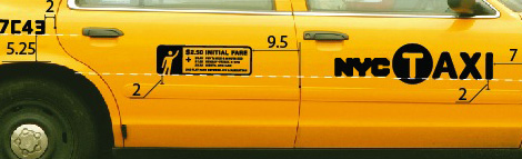
The new NYC Taxi graphic package, including fare panel, the NYCTAXI sticker, the medallion number and a checker stripe decal.
By now you must know the story and read the überhyper-linked series in the City Room section of The New York Times whose sole focus was to ridicule the new logo. In it, the genesis of the logo is explained; here, briefly: Smart Design has been working with the Design Trust for Public Space to rethink the taxi, and earlier this year at the New York International Auto Show in April, they showcased their work. Part of this included the redesign of the exterior of the taxi which, in the original presentation, did not include the NYC lettering, nor the T in a circle. The latter was introduced first, after city officials wanted something more flashy, resulting in an icon reminiscent of the subway icons even if the Taxi and Limousine Commission have nothing to do with the Metropolitan Transportation Authority, other than in getting people from one place to another — but so do pedicabs and they don’t sport a P in a circle. The fatal move for the taxi graphics came when NYC & Company, the official tourism organization for the city, asked that the logo they had recently unveiled to market our fair city — and here’s where Wolff Olins enters the tomato throwing festivities — should be included in the Taxi. And this is how the logo came to be: An unfortunate mishmash of city politics, disparate ideas and a severe case of mixing oil and water.
The logo has been called all sorts of pejoratives and has been belittled to no end, and for the most part, the blame has fallen on Wolff Olins and their “clunky” logo. When in reality it should fall on Smart Design who, even if their work was done pro-bono, failed in wrangling their clients into a cohesive solution. Smart Design was responsible for the horrible, horrible lock-up of the circle in a T with the remaining AXI and the eventual lock-up of these two elements with Wolff Olins’ NYC — which people neglect to note was done under a separate brief, with a different client and instead were happy to pinpoint as the devil incarnate. It’s a shame really, because this NYC logo might be the best thing to (graphically) happen to New York City, since everyone else declared their love for it.
![]()
The NYC logo on a grid, for added flexibility
The NYC logo was designed for NYC & Company, the result of a blending of three organizations (NYC & Company, NYC Big Events and NYC Marketing) under the tutelage of our Mayor, Michael Bloomberg. As has been discussed here, every city needs a logo, so how in the world would you brand New York City? An eclectic, loud, diverse, affluent, changing city where every five blocks are different from the next five ad infinitum. Would a sans serif do the trick? A custom script? A (gasp!) icon? Probably any of these solutions could work, but none would be as memorable or as inclusive of the flavor, smell and texture of New York as this logo promises to be.

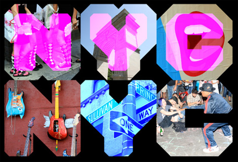
An endless range of variations for the NYC letters
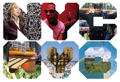
And as an endorser of our city, I can’t think of a bolder statement that could have been made. These are posters and ads for an ad campaign devoted to driving tourism to the city — 50 million visitors annually by 2015, (good thing I’m in Brooklyn). And if you needed further convincing, you can see a nice promotional video here.
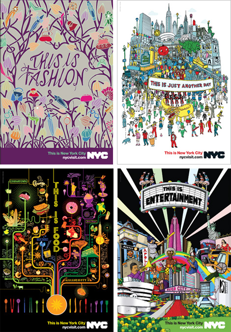
NYC “This is New York City” campaign by BBH.
But I digress. Pretty illustrations aside, this logo is representative of New York in more ways than one: In its adherence to the grid it reflects that of the city (if you can count, you can find your way around here); in its bulkiness it’s allusive to the power of New York as a center of culture, arts, politics and sports; in its shoulder-to-shoulder tightness it is a painful reminder of how little space there is here, but how much we enjoy and thrive in our proximity to each other; and in its openness, where anything can be framed or drawn inside it, it evokes the ability that everyone here has to make their own story, in their own way. So even if one of its drawbacks is that it doesn’t look good against mediocre graphics designed by someone else, this logo for NYC should give Wolff Olins a break. They deserve it.
[This post has not been paid for by Wolff Olins, nor am I seeking employment there. It’s an honest opinion of a misunderstood logo.]


Jump to Most Recent Comment
joe j’s comment is:
when i lived in nyc i never took the "T" or the axi
On Nov.07.2007 at 02:34 PM
Ryan’s comment is:
I don't hate it as much as some, but I certainly don't love it. To me it's just another graphic I'll probably ignore.
On Nov.07.2007 at 02:37 PM
Ty’s comment is:
At first, I thought it was very pedestrian, but after seeing all of the uses and permutations, I find myself warming to it. Reminds me of the Casa da Musica identity in its many applications.
On Nov.07.2007 at 02:59 PM
JonSel’s comment is:
While this post isn't about the NYC Taxi logo, I actually find it to be a perfect representation of the city - disparate elements being forced together through bureaucratic shortsightedness and individual priorities. Really, the thought of a perfectly letterspaced wordmark for the taxi would just be weird.
I also love the NYC mark, and the applications shown in this review are really beautiful. Unfortunately, in the rush to slap it on taxis, NYC&Co. is really going to lose ownership of the mark. The taxis are now the primary application. If only they'd found a way to keep it separate from the taxi logo. Otherwise, love the type, love the boldness and in your face-ness of it all.
On Nov.07.2007 at 03:01 PM
Prescott Perez-Fox’s comment is:
This is a great post — I have never seen any of those posters, etc., so it's nice to see the logo in action. In this case, the whole seems to be more than the sum of the parts, but that logo by itself — hmmm, still can't shake the awkwardness. It feels like a pixel font mated with my old varsity jacket, and those letters are the unholy triplets. Not what I think of when I think of my City. Still got hte love for Wolff Olins, though.
On Nov.07.2007 at 03:10 PM
darrel’s comment is:
Logo aside, that last paragraph of yours, Armin, was brilliant.
On Nov.07.2007 at 03:20 PM
Joe M. ’s comment is:
All of my personal love for this logo and its creators aside;
I think Wolff created a monster only they can control.
Third parties/ad firms/whomever will miss the opportunity to use the logo as a supergraphic in all its glory and either stick it below another message in the corner (BBH) or smash it next to their message (Taxi).
Better controls should have been put around this pretty little logo so that it works well teensy and next to other shapes.
On Nov.07.2007 at 03:59 PM
Anonymous’s comment is:
Will people be confused when the T (2nd avenue subway) is up and running? Will tourists hav the impression their wee yellow subway car is going to disappear underground as soon as they embark?
On Nov.07.2007 at 04:04 PM
Ben’s comment is:
You the NYC mark is terrible when it can't stand on it's own and needs crazy illustrations to boost it's image
On Nov.07.2007 at 04:28 PM
felix’s comment is:
too klunky. lacks history. therefore not good.
wolf olins... you're dead to me.
On Nov.07.2007 at 04:44 PM
Guillaume’s comment is:
Type a bit too bold to my taste, but I love the Wim Crouwel-like feeling it has.
I would not like to be in their position today though. The way the the press (and blogosphere) is abusing them is saddening.
On Nov.07.2007 at 05:05 PM
BWJ’s comment is:
NYC logo = outstanding.
When you have other cities like Broken Arrow branding themselves with Papyrus, a logo like this really separates the varying levels of quality among designers.
NYC is klunky. It is crowded, dirty, loud, bold, crazy...as well as electic, beautiful, and diverse (all of which are shown in the various ways the logo is being used).
Wolff Olins has succeeded again.
On Nov.07.2007 at 05:13 PM
altoption’s comment is:
The NYC logo on its own is terrific, both jarring and provocative. The (T)AXI logo, and the checker stripe is an offense. And the fact that it's one of the most ubiquitous graphic elements in the city only makes matters worse.
On Nov.07.2007 at 06:14 PM
Von Glitschka’s comment is:
Logo: Lame. Looks like someone is still using amberlith to get those nice sharp edges.
Brand environment it appears in: Pretty cool. The illustrative aspects are nice and reflect the diverse nature of the big apple. And maybe that is the problem with the logo, it lacks personality, originality and is visually mute which is a contradiction to the city it represents.
All though the taxi incarnation is pretty ho-hum.
On Nov.07.2007 at 06:45 PM
JonSel’s comment is:
lacks personality, originality and is visually mute
Really? I think it's pretty bold, somewhat aggressive and in your face. And, for a city logo, I think it's more original than many of the wasted opportunities out there. Plus, it serves exceedingly well as a vessel to be filled with additional imagery and associations.
On Nov.07.2007 at 08:41 PM
Armin’s comment is:
Thanks Darrel! A little brand poetry every now and then does the mind good.
On Nov.07.2007 at 08:48 PM
Mark’s comment is:
I like it.
the logo that is.
On Nov.07.2007 at 08:59 PM
Frank’s comment is:
Felix-
I am confused by a point you made; how can a mark that is brand new "lack history?"
John’s comment is:
I agree with JonSel. Just take a look at what I get to see everyday (and apparently the tagline is now being revised):
(My apologies for the size)

Jon Dascola’s comment is:
I like the NYC logo.
What makes Wolff Olins great is their foresight and conceptual vision of the marks they develop. Frequently, logos are designed too myopically. Brands are constantly growing and their execution needs to reflect the myriad of different applications they face. Which then becomes increasingly more difficult.
I find them innovative.
And for what its worth, their Product (Red) branding is brilliant.
On Nov.07.2007 at 10:42 PM
Kristoff’s comment is:
Well said!
On Nov.08.2007 at 05:07 AM
Christian Palino’s comment is:
While I fully agree with the framing of this post, to clarify where responsibility lies in the application of the Wolff Olins’ NYC logo, I don't completely agree with the rationale about the quality and appropriateness of the NYC logo.
this logo is representative of New York in more ways than one: In its adherence to the grid it reflects that of the city (if you can count, you can find your way around here); in its bulkiness it's allusive to the power of New York as a center of culture, arts, politics and sports; in its shoulder-to-shoulder tightness it is a painful reminder of how little space there is here, but how much we enjoy and thrive in our proximity to each other; and in its openness, where anything can be framed or drawn inside it, it evokes the ability that everyone here has to make their own story, in their own way.
Considering that New York City is such a "melting pot" (of people, ideas, things, etc.) you could rationalize how representative a logo is in the same manner as much of the rationale above, but for the exact opposite qualities.
The city is on a grid / The city is chaotic
The city has very little space / The city is large
The city is open to self definition / The city is defined by the masses
This is not a critique of Armin's choice of rationale, as it is certainly accurate, but rather to question whether the logo is overly open to interpretation. Perhaps a defining quality of New York City is how open to interpretation it is?
I'm rather undecided on this issue of how to, and the importance of, interpreting the meaning/significance of this particular logo, and in being so, I turn again to the visual quality/language of the logo itself.
I find the letter forms clunky in their drawing and a bit inconsistent. Also unnecessarily jammed together from the start. However, the examples of applications shows promise for the concept. They seem like rather trendy applications (some of which I hadn't yet seen – thanks Armin) which would become quickly dated. But then again, maybe thats not a bad thing, if the logo could have the ability to be exploited in trendy ways and survive the death of the trend – much like a successful city. It would be great to see a comparative study of applications of this NYC logo in various visual trends of the last century.
However, all of this discussion about the NYC logo may be a moot point if we recall that Milton Glaser gave the city – whether he chose to or not – its true unofficial logo.

helloMuller’s comment is:
To be honest, I'm no fan of the London 2012 logo, but that doesn't mean that Wolff Olins are hacks. They're the biggest for a reason and the NYC logo is proof of that. Great concept beautifully executed.
On Nov.08.2007 at 08:51 AM
Joe M. ’s comment is:
Let's not get misty-eyed yet.
This NYC mark will never supplant the defacto
city logo: the 'I Heart NY' slogan.
The Milton Glaser mark was part of a campaign
to promote tourism in New York State.
The State is still adament that the heart is theirs...and it
will represent all the animals and waterfalls upstate.
See how the Official New York State Tourism
website pairs it with wonderful photos of mountains
and manifest-destiny miscellaney north of Poughkeepsie.
There is clearly a move to disassociate 'I heart NY'
with all the renegade tchochkes in Times Square:
shot glasses, t-shirts and lighters.
The state's subsequent liscensing battles with
other institutions and geographies using the 'I heart'
expression has probably encouraged tighter
controls around the mark. It will be an uphill battle,
but over time, I can imagine the Wolff mark printed nicely
on shot glasses, trash bags, and dry-cleaner hangers too.
Paul Corrigan’s comment is:
I have to agree with Jon. There's nothing about New York City that matches up. So why should the taxi decals? That said, the Wolff Olins work here is in a league of its own. Bold. Unapologetic. Surprisingly stylish and modern. Like New York.
On Nov.08.2007 at 09:11 AM
C-Lo’s comment is:
The letters by itself don't hold water, but the way it's used works well. (esp. the one where it's a picture of people, and the C is a cop). It puts a face and character with each letter. Maybe a face and character with each different person in NYC? Eh I digress for sake of not sounding sappy.
Again as someone said earlier, it's crowded, unapologetic, in-your-face, and still holds a sense of fashion and style. Just as the letters is the city. Albeit not everyone likes the style, but it has some none the less. I think the letters itself aren't meant to be by themselves. Hence the taxis looking flaky. It needs color, character, all that. A small set up fee ( poor letters that fall apart by themselves ) for a blank canvas for a nicely done advertising program (See the ads)
On Nov.08.2007 at 02:45 PM
Guillaume’s comment is:
Just noticed there's a fake Madonna and a fake Jay-z amongst the pictures that spell NYC. Weird choice. Maybe it should have spelled Las Vegas instead. And picture a fake Elvis.
On Nov.08.2007 at 02:52 PM
eric j’s comment is:
"In its adherence to the grid it reflects that of the city" Is this a joke? Pull up a map of SLC sometime.
On Nov.08.2007 at 02:59 PM
Keenan Cummings / BYU’s comment is:
I like the new logo quite a bit. I would say that few logos rally do much until they are applied, stretched, extended. There are always those genius marks that really impress, (Fuchs and Sockwell's work for the Holocaust Museum... gives me chills) but it is how that works into the whole brand system that makes them great.
The "NYC" type is nice— I might even say 'hip'. (can you say that on this blog?) But it is what they have done to it that sets it back and shows NYC for what it is. If New York is so unique that it resists simplified graphic interpretation, make a simple logo, turn it into a frame or texture, and show NYC for what (or who) it really is.
simple, but smart. Hi fives all around.
PS- not much 'a say 'bout the Taxi logo. They have done something wrong—I will let their conscience punish them.
On Nov.08.2007 at 03:08 PM
Keenan Cummings / BYU’s comment is:
"'In its adherence to the grid it reflects that of the city.' Is this a joke? Pull up a map of SLC sometime."
Haha. Maybe you should come visit SLC Armin.
NYC's checkered past includes a intriguing relationship with the grid system and city planning. Until the Commissioner's Plan of 1811, the whole city was a walled in colony of New Amsterdam (hence Wall Street). The plan proposed a gridded development of the farmland north of the city. Anything North of 14th street is organized according to that early plan. ANything south—well, good luck finding anything.
Maybe the logo should have he top three quarters in geometric type, and the bottom quarter in an interesting but confusing mess. Any font suggestions?
On Nov.08.2007 at 03:23 PM
damon’s comment is:
I dunno, I'm personally not feelin' the NYC logo that much. Forget about what they've done with the taxi cabs.
I guess I find it too basic, too uninspired for such a vibrant and exciting city. I do appreciate how you're able to liken the closeness of the kerning to the tight knit nature of the town blah blah, but in the end it's just a blocky pseudo sports-jersey looking typeface to me....it's too basic, lacks any flare or style or charisma that I associate with new york on its worst day.
I also find the letter forms very awkward, as well as the url line under it.
I like the london 2012 better than this, and that's not saying much.
Anonymous’s comment is:
For some reason, I love looking at this ad. Maybe it's the colors.
damon’s comment is:
like doesn't it bother any of you that the bevels on the C are about 100% larger than those of the N?
that logo is junk man....like, serious junk.
On Nov.08.2007 at 05:26 PM
Darrin Crescenzi’s comment is:
Damon, I tend to agree. While the rationale behind the NYC logo seems sound enough, the small inconsistencies in the rendering of each character are like nails on a chalkboard to me.
Either embrace the system set up in the grid, or abandon it completely and utilize the chaos to speak to the nature of the city. As is, it just looks like a mistake.
On Nov.08.2007 at 11:56 PM
carlo’s comment is:
This wolff should be put down. They suck, theres nothing more to it. They can't see past their cloud of smug to reality.
On Nov.09.2007 at 01:00 AM
C-Lo’s comment is:
Damon, I think the C has to have more bevel because of legibility.
On Nov.09.2007 at 03:04 PM
BWJ’s comment is:
I agree with you C-Lo...and even with the larger bevel, it still falls on the grid.
It's like all about legibility Damon, like for real.
On Nov.09.2007 at 04:52 PM
Asen Tsvyatkov’s comment is:
Hmm. Even though I so much like a lot of the Wolff-Olins work and what I consider one of their obvious influences - Studio Dumbar, I can't help but feel a bit underwhelmed.
Branding New York would be a task of such formidable complexity that simplicity would be the only route I would ever go - rid the identity of associations, let the context do the work...
I don't mean another Helvetica wank - I just think Mr. Glaser has said all that needs to be said, for better or for worse. Creating a new one from scratch would be just crazy...
I like the applications of the ident - they are bright, innovative and absolutely gorgeous, but they just do not belong...
Kudos for the brave approach - I will always stand by the work Wolff-Olins does (even though they rejected my internship application.)
They do reasonably well though-out, great creative leaps, often to a good, and sometimes to worse effect, but I suppose that is their problem, rather than mine.
Much to the displeasure of recent Meta converts, and bitter, aging illustrators, Wolff-Olins is writing graphic design history and making some good cash out of it, which I find, is just about right.
On Nov.09.2007 at 07:34 PM
Matheus’s comment is:
Wolff Olins needs a design school, hes one of the worst designers I've ever seen.
Instead of making a good and a catchy brand... no! They just get you naked in the the street with your ass all paited yellow.
Wolff has no talent for branding, just for CALLING ATTENTION;
On Nov.09.2007 at 08:28 PM
Nicole’s comment is:
I live in Boston, so the "T" in the circle just makes me think of the subway system here, which is very confusing when thinking about New York.
On Nov.09.2007 at 09:58 PM
stevenfordesign’s comment is:
I like it, It's clean and functional, very German (DOH!) There is much worst shit around! However NYC needs fun, and for god's sake taking a taxi neeeds a lighter touch. They should have hired Peter Max, (or even Jeff Coontz! those guys could do a TAXIMETERCABERNET). The taxi's are so important, why not get Milti Glazer the NY Godfather of graphix?
On Nov.12.2007 at 11:01 AM
stevenfordesign’s comment is:
PS. Frank, The comment by Felix is actually right to the heart of the matter. Another word for history...would be equities, yes, NYC, and for that matter the Taxi system does not lack for equities. A new mark may disregard the mark that preceeded it, but it may not disregard the "equitiy" of the "entity" that is the problem with the Wacom mark, it has no relevance to Wacom product what-so-ever.
This mark is really a play on "Blocking the box" I like it!
EBrackett’s comment is:
Either embrace the system set up in the grid, or abandon it completely...
I agree with the comments on the inconsistencies of the C. I'm holding a straight edge up the logo on the grid paper, and the C is just doing it's own thing. Besides the insconsistent corners, the inside cut-out doesn't line up with anything either. I would think it would align with the inset of the Y and N.
If you you're going to go grid, it's gotta be more consistent.
On Nov.12.2007 at 01:11 PM
disgruntled designer’s comment is:
I just can't understand why NYC+Co. would contract with Smart Design to even do this type application. They are a product/id/technology firm, and not necessary in a position to speak about the validity of visual graphics. And I have to confess that I have hated the NYC logo since NYC+Co. introduced it on their site. I especially hate when they fill the letters with pictures and think it looks amateur at best.
But why couldn't they have just put NYC TAXI using the same clunky letterforms they created? Why did it need a mark or a bug? Oh, that's right, because an ID firm did it.
On Nov.12.2007 at 02:48 PM
Danny Tanner’s comment is:
New York is a rapidly and constantly changing urban landscape.
Virtuously, this identity allows the image of NYC to continuously change and grow.
By incorporating any and all visual recordings, representations, and interpretations
of the city, it can never become dated, and always on the cusp of what NYC truly is, not was.
In form, the logo is fat, dull, clunky, and stands out like a sore thumb (difficult to do
in NYC, but it does). It's an unidealized graphic interpretation of the city. Ugly,
but honest. In application, its loud, vibrant, bright, slick and shiny. Flash and beauty.
It balances the underbelly with the veneer.
Stylistically, the identity seems to tip its hat to the realm of historical tourism postcards/promotion.
The use of photographs in letterforms date back to the days before city's had tourism logos.
Folks around the world know what New York offers in a historical/landmark context.
Its no secret. Its refreshing to see a NYC logo absent of the usual suspects (statue
of liberty, empire state building, subways, etc). To the world, the real secret of NYC isn't
any physical thing the city has to offer. The lure, the desire to visit is the experience of the city,
something this mark captures well.
As for the taxis, they are a logo in themselves. Identifued by their giant yellow car-ness, they also stand out in the city. A logo on their door does not aid in their identification.
On Nov.18.2007 at 10:45 PM
C-Lo’s comment is:
I take back some of the Kudos I gave this project earlier. I saw an ad for it in the local paper, and it looked like a drunken Peter Max drawing.
On Nov.19.2007 at 10:43 AM
Lanny Heidbreder’s comment is:
(Disclaimer: I'm no designer, though I'm probably in the 99th percentile of design-consciousness among non-designers.)
I first saw the NYC logo during the taxi-panning, and immediately thought it looked like crap, even by itself. Just a chunky illegible blob.
I next saw the NYC logo at the the top of this page, randomly rearranged on a grid. I somewhat realized those were just test arrangements, but I still immediately associated the logo with useless arbitrary randomness. Strike two.
I next saw it in the colorfully masked and tinted images below that. I thought those were minorly neat, although you could do the same things with any other distinctive shape.
Then I saw it in the posters. Something about reversing the logo out of a colorful background really makes it work. That's probably just related to the whole "chunkier is better" phenomenon of reversed text, but I still really like it.
Still, though, I hope no one ever wants to print it in black and have it looked at from more than five feet away.
On Nov.21.2007 at 08:34 PM
Lanny Heidbreder’s comment is:
Oh, and I wanted to mention the bevel on the C.
Here's how it looks with the same bevel as the other letters:

Looking at it, I think maybe it wasn't a legibility issue; I think maybe they didn't use the same bevel because it makes the C look a little too bold.
Regardless of the rationale, I think the different bevels are forgivable, because they're so deliberate about it. Check out this spot:

Right up against each other. That makes it deliberate inconsistency, which makes it more pleasing. To me.
On Nov.21.2007 at 10:20 PM
Lanny Heidbreder’s comment is:
Last comment.
Upon further staring at my own freakin' image, I concur that it is in fact a legibility issue.
On Nov.21.2007 at 10:24 PM
Char Alfonzo’s comment is:
A New York resident here, proud of this logo.
Once again, NYC sets the standards in this country. We're the number one city in this country, we're The City.
This logo shows everything about NYC, I agree... shows the many faces of the city.
JTPuck’s comment is:
I really dig the NYC logotype, and seeing it in action in a number of ways really knocks off the grid! Love it.
On Dec.04.2007 at 02:01 PM
exigent’s comment is:
Wow. This is absolute crap. This is the most unfriendly design for a city I recall seeing in a very long while. It is a chunky typestyle that I used to draw when I was a child. This type of logo belongs in the circular file along with most of the pertaining designs. It just seems uninspired, sluggish and lazy... none of which makes me think: New York City.
What a mess.
On Dec.04.2007 at 05:00 PM
David Carvalho’s comment is:
I really dont understand all this big argue about the NYC stuff, to be honest it looks good and works fine. At the same time i understand 2012 logo looks different and in my personal opinion he took the risk to reach a 2012 graphic, maybe in 2012 it looks wonderfull...
On Dec.26.2007 at 11:12 AM
BF Krueger’s comment is:
No matter how long I look at it, the NYC (& Company) Logo is fat, bloated and bourgeois. It should die the day Bloomie exits for other pastures.
On Jan.18.2008 at 09:43 AM
bill’s comment is:
Lanny Heidbreder,
I don't think it has anything to do with bevels. the letter C is a rounded letter, therefor it looks as it does.
ciao
On Mar.13.2008 at 05:31 PM
lucy’s comment is:
when i think of New York i think of the 'i heart NY' image by milton glaser. nothing will replace it!!
On Jun.15.2008 at 10:15 AM
Goffredo Puccetti’s comment is:
Splendid post. Thank you, BN!
An extremely well executed logo in my opinion.
Until they will not make it official that the Milton Glaser Logo is actually the true NYC logo - nobody associates it with the New York State :-) - this will do it very very well!
G.
On Jun.17.2008 at 11:11 AM
Amanda’s comment is:
I really don't like it in black. I don't like it on the cabs either. When I first saw it on the street, I was really truly surprised.
I like some of the implementations though. Especially the colorful examples seen above.
It's not terrible, but I don't think this is the best NY could have done.
On Jul.14.2008 at 10:47 AM
paddy’s comment is:
Being a taxi company owner, I think the graphic is wonderfull yet simple,
look forward to seeing this same logo being used in the atl
We are bringing nyc to the atl!!
Mark’s comment is:
maybe it's me but when I look closely at the negative space I can see shapes that allude to skylines, skyscrapers, and views of skyscrapers looking up from the street. It's not specific enough to knock you over the head with it, but noticeable enough that once you find it, you never look at it the same again. It could be accidental or could be on purpose, but either way it's brilliant.
On Sep.05.2008 at 02:51 PM
Paul’s comment is:
I'm a native New Yorker and advertising professional and I really dislike this logo. It feels as if the weight of the logo is trying say NYC is tough, hard, strong, etc. New York has always had this image of being a tough city (which I feel it is no longer like that). But it never needed to be express so viscerally. It was understood. The logo seems liked it's projecting too much.
From the technical point of view, the logo seems to not take into account how civil servants with no matter how many style guide, will apply the logo haphazardly. This logo basically only works if apply strictly by the regulations of the style guide and through design implementation which given the chaotic nature of city government, it's going to be a disaster. Not really thought out.
On Oct.05.2008 at 07:17 AM
Rob’s comment is:
I must say, this logo does not get much across. I would have done something with the Empire State Bulding in the background and 'NYC' in front. Anyway, here is the new logo for Toronto, if you want to compare. You must know that many people call Toronto 'TO':

As well, I must say to John here on the forum, I LOVE Atlanta's logo, it is dynamic and smart!
Anthony’s comment is:
I am not sure why people are making such a huge deal about this. I like this logo. Bold, bossy, kind-of obnoxious and yet respectable...kind of like a New Yorker ( I can say that, I am one:-).
On Mar.23.2009 at 11:40 PM
liz’s comment is:
This logo dismayed at the first sighting and continues to do so. I've lived in NYC for 20 years, and this logo doesn't look or feel like NYC to me, and I imagine it will fail to inspire potential visitors. All those in-depth grid illustrations are pointless if the final mark fails to convey the ideas behind it and, HELLO, aspects such as Grid, Shoulder-to-Shoulder Crowds and a Lack of Space should be the LAST things invoked for attracting visitors to any city. Why would a designer choose those as the facets to incorporate into a mark?
While it's always fun and interesting (for designers) to get the backstory of how a mark was arrived at, it should never be required for appreciation of the final. Let's face it, most people don't care. It ought to be effective despite the indifference of the audience.
To me, the only way this mark conveys anything about the city is that it looks like a poorly executed sharpie™ tag that one might see on a bathroom wall. It's clunky, has *zero* elegance, and, I'm sorry, but the "evoking the grid" idea does't come through anyway, because in most day-to-day applications (that is– small, in the bottom corner of a larger piece) it just looks like inconsistent, rounded-corner type. I think it does a disservice to the city, its visitors, and its inhabitants. No passing grade on this one.
On May.03.2009 at 12:57 PM
daho’s comment is:
The more this logo is in use, the more I like it. (Especially after seeing logos from other cities displayed here. Those are awful).
It's a bold showcasing of the NYC acronym, which is the only takeaway needed. And black covers every spectrum - the result of all colors mixed together. Is there really any one color that signifies New York?
I didn't like the original Taxi branding, but now welcome it as part of this city's landscape. (And for those who don't know, the enclosed circle is how the subway lines are labeled, and there is no "T" line. So it's a clever homage to that transportation system.
Unlike the other city logos shown here, I give kudos to whatever city bureaucrat approved this unconventional logo.
On Jun.22.2009 at 05:52 PM
Comments in Brand New, V1.0 have been closed.


