

NOTE: This is an archived version of the first incarnation of Brand New. All posts have been closed to comments. Please visit underconsideration.com/brandnew for the latest version. If you would like to see this specific post, simply delete _v1 from the URL.
![]()
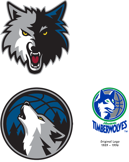
While it was the LA Lakers that lost to the Boston Celtics in this year’s NBA Finals, perhaps the most devastated losers were the Minnesota Timberwolves that traded their 10-time All-Star for a handful of younger players: It was like watching your ex boyfriend or girlfriend break up with you, then seeing him or her marry the greatest catch, have kids, and live in a white picket fence house with a golden labrador retriever. So, maybe unrelated, a little facelift was in order for the Timberwolves, who unveiled a refreshed primary logo during last week’s NBA Draft. It’s a fun game of spot the differences, and there are some nice tweaks like the highlight in the wolf’s face, and the lettering is less fangy.
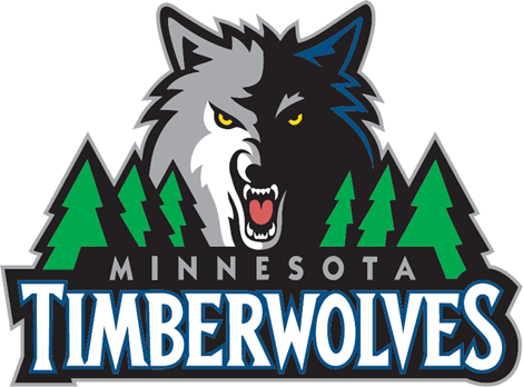
Along with the revisions to the primary logo, the Timberwolves introduced two alternate logos. The first is just the wolf from the primary logo, and the second is an integration of the wolf with a basketball — it’s interesting that, for the last dozen years, the Timberwolves were one of the few teams without a basketball in their primary or alternate logos. The second alternate is also a nod to the team’s original logo. Designed by Adidas, the new logos are a nice update and extension from the original without reinventing the wheel. Hopefully, in the search for a new Garnett, the Timberwolves won’t settle for a — bad pun alert! — rebound relationship.
Thanks to Sara Ronald for the tip.


Jump to Most Recent Comment
Luke Andrews’s comment is:
The subtle touches are nice. I like the way they've opened up the space around "MINNESOTA" more and cropped the trees at angles that match the slants of the M and A. The trees themselves are less fussy, and the Timberwolves lettering really grabs your attention way better.
On Jul.02.2008 at 06:57 AM
Jeff’s comment is:
Well. Not a huge rebrand, but each of the changes made lead to increased legibility. I like what they did with the "Minnesota" background shape, although I feel like it should fit more snugly against the S of TimberwolveS.
On Jul.02.2008 at 07:09 AM
elstob’s comment is:
Like: the general direction.
Hate: the forced "hidden tree" in the wolf's fur in the secondary logo.
On Jul.02.2008 at 07:44 AM
Paul D.’s comment is:
I was going to say that I like the hidden tree in the basketball logo.
In general, I'm rather a big fun of "big league" style sports logos, and the Timberwolves' has always been one of my favourites.
On Jul.02.2008 at 07:49 AM
Holly’s comment is:
On the alternative basketball logo, I'm wondering why the wolf is facing the left side and not the right.
On Jul.02.2008 at 07:52 AM
jj’s comment is:
Overall, the news versions are much nicer. Sharper lines in place of weak curves. The type is less cartoony (?) and yet still retains the same personallity somehow - even though the stroke on the timberwolves seems a bit amateurish. The only real problem that I have is concerning the trees. The new ones look terrible; more like traffic cones than trees. I think the old trees wouldl have been better in the new logo, with a few minor path changes. Almost a perfect update.
On Jul.02.2008 at 08:08 AM
jj’s comment is:
(I'm giving up typing by the way. I'll hold out for a good speech-to-text software so I don't misspell more words. ha.)
On Jul.02.2008 at 08:09 AM
Steve’s comment is:
I like the new lettering, much tighter and less novel IMO. Really like the secondary logo. I'm suprised they haven't made anything of the moon/basketball relatiionship before. Would like to see this as their main logo.
It's hard to keep up with basketball news in England, it's consigned to 2 in the morning on channel 5. Never knew Garnett was traded!
On Jul.02.2008 at 08:19 AM
John Mindiola III’s comment is:
the new logo update is okay. i was hoping they'd get rid of those frikken trees. seriously, has any other sports logo clung so tightly to the BACKGROUND elements of its logo? the Mets cityscape looks great in the baseball-as-snow-globe. but other than that, most logos are, and should be, independent of any background context. it's like, okay, we're in the midwest, there are trees here. so what, do i want a frikken forest in my logo? NO! should i just put a frikken desert in the background of the phoenix suns logo? does anyone else see how ridiculous this is? lose the trees, and take the type out of that frikken stroke-box! aaarrgghh!
On Jul.02.2008 at 09:10 AM
xeophin’s comment is:
Uhm ... that secondary logo reminds me almost a bit too much of that ... or does it?
On Jul.02.2008 at 09:11 AM
Bart O'Dell’s comment is:
I honestly have to admit I am not a fan of the update as a whole. The secondary mark of the wolf alone is strong enough to carry the branding of the team. I agree that the trees are a bit much for a sports team in my opinion.
The wolf and ball mark to me looks very much like the Dallas Mavericks horse and ball combo. This could be the reasoning behind the wolf not facing right.

The subtle updates are ok but who ever designed this one missed and opportunity to really develop this further.
On Jul.02.2008 at 09:21 AM
Josh B’s comment is:
I'll tell you what I don't get... why does the solo wolf head have a different hair cut, a darker tongue, and a lighter weight black stroke around it?
And in general I find this logo, and the previous version, to be pretty off-putting. To my eyes, that wolf doesn't look aggressive or fierce, he just looks heartless and evil.
On Jul.02.2008 at 09:53 AM
Eric’s comment is:
Frustrating. It's an sophisticated, well thought out, and understated update to what is still, in the end, a really godawful logo, even by sports teams standards.
On Jul.02.2008 at 10:15 AM
twoeightnine’s comment is:
Love the simplification of the logo, hate the new trees. They make me seasick. On the far left the black stays the same thickness, on the right it gets thicker. I know they just copied the left side trees over to the right but I don't like it.
On Jul.02.2008 at 10:26 AM
Brandon’s comment is:
I think you've been too kind. It is better, but still a poster boy for all the things that went wrong with sports logo in the last 20 years. The howling wolf in the basketball is pretty nice though.
On Jul.02.2008 at 11:42 AM
Jacob’s comment is:
If I have to see another "fierce cartoon animal" sports logo ... ugh.
Actually, this wolf is a little less snarly and a little more sneery. Maybe a little yawn-y, too.
All that said, a nice refresh from before.
On Jul.02.2008 at 11:55 AM
Davekos’s comment is:
this proves that the less-decorated a typeface is the more effective it looks.
but overall the logo still feels a lil bit old. maybe u got to depart entirely from the old concept.
Gandu’s comment is:
Also, notice the upside-down "T" in the secondary logo
On Jul.02.2008 at 12:16 PM
claes’s comment is:
Not bad, but why doesn't the black background behind Minnesota extend to where the S starts in Timberwolves like it does with the T? And there's more whitespace (or blackspace, really) to the left of the M in Minnesota than to the right of the A.
On Jul.02.2008 at 12:31 PM
Ritz’s comment is:
Simpler, stronger, and more contrast. Personal preferences aside - I think it's a great job of updating the logo.
I'd totally use the round icon as a mouse-pad! Which says a lot, because I hate mouse pads. :)
On Jul.02.2008 at 12:47 PM
Nick’s comment is:
not bad...I mean it is a sports logo...but four different colored boarders around a dynamic shape and call it a day
The timberwolves did have one of the best draft days for the nba draft 2008...unlike the charlotte bobcats (who I am some what loyal to) They, however, have the worst logo in the NBA!
On Jul.02.2008 at 01:45 PM
eighthave’s comment is:
It's ok, I get more of an impression (outside of the recognizable name, of course) that's it's the T-wolf, a hot new ride at the Six Flags park near you...where they are decorating for Christmas with perfectly symmetrical rows of trees. Put a fun santa hat on Rex there and enjoy the light displays throughout the park.
The trees are much less menacing looking than before. I liked that aspect to some degree.
Not saying it's a deliberate rip-off at all, but the secondary looks kinda familiar...

Darrin Crescenzi’s comment is:
I remember when the T-Wolves first rebranded and had the treeline trim on their uniforms – godawful but rad.
For me, there is just too much difference between the primary and secondary logos. I like both renderings, but just can't see these working coherently together. My gut is to ditch the secondary (even though I like it better) because it reminds me too much of the horse-in-a-ball Mavericks logo, which is not helped by the similarities in their color scheme and the fact that they are in the same conference.
The inversion of the trapezoid containing-shape around "Minnesota" in the primary mark is a nice touch – it now follows the overall form of the entire mark instead of fighting it.
On Jul.02.2008 at 02:55 PM
Morgan Smail’s comment is:
what they really needed was a complete revamp... not some touch ups to an inferior logo. even the the alternative with the basketball/moon in the background is better.
I hate to say it, but it looks more like a children's book cover than a professional basketball team.
On Jul.02.2008 at 05:11 PM
Wünderwoman’s comment is:
I think the update is much more legible.
C'mon...you guys are way too harsh. It's a nice job. The refinements are spot on and the design is well crafted. Someone spent a lot of time refining this mark to a very high level.
Sometimes you gotta work with what you got. When you do, you have to embrace it and make it as great as it can be...which they did.
On Jul.02.2008 at 05:30 PM
Hibryd’s comment is:
I agree with Wunderwoman. Given the fact that someone had to work with a giant wolf head and tree logo, and they had to clean it up while keeping the same elements and the same profile, well, I think they did a *really* nice job. The artist simplified in the right places (I like the new trees; old ones were too jagged and drew too much attention to themselves) and adding detail in the right places (the white on the left side of the wolf's face is great). It's a really good update of a typical sports logo.
On Jul.02.2008 at 05:40 PM
howard2112’s comment is:
All of you that constantly look for similarities to other logos, crack me up. Any image of a howling wolf will look like another image of a howling wolf.
Overall it's a nice clean up. Most would not even have noticed. which is a good thing.
On Jul.02.2008 at 06:38 PM
Prescott Perez-Fox’s comment is:
Better. Although I prefer the original trees.
If you stare at this logo long enough, it appears like some kind of mini golf obstacle — just knock it through the wolf's mouth.
On Jul.02.2008 at 08:27 PM
ZedZedEye’s comment is:
What is it with minnesota and those cheezy xmas trees? A lot of similarities between the hockey team logo, like all the hidden items in the animals head.

Chris’s comment is:
There seems to a lot of focus on the new trees, I feel that it is not their shape that is an issue, but perhaps their colour. If they were darker green like the original they would be more subtle and not compete so much with the other elements, therefore looking better.
I like it. I concur with many of the other comments about working with what you have, and it is a great job.
On Jul.03.2008 at 03:06 AM
dg3’s comment is:
Me likely.
On Jul.03.2008 at 04:09 AM
XK9’s comment is:
I like it- a lot. This is a ballsy, in your face, fierce beast, rendered beautifully. It's so dead on for the chest thumping, screaming bravado of the NBA.
The update eliminated the cheese factor of some really bad typography and the overdone tapered curves with points designed to impale you.
These things (that is, sports logos) are designed primarily for merchandise. This revised logo beast will sell a lot of gear. It also allows for a whole other revenue stream of retro gear with the bygone logos. It's about the cash.
BUT-- the secondary b-ball logo makes little sense. The wolf has none of the intensity of the head on rendering. I disagree with "hater" Elstob's aversion to the hidden tree- it's the one thing in this logo that I like. I think they could have put the stand alone head on illustration on a graphic roundball and created a nice arm patch version. Although, on a baseball cap, I'd prefer just the snarly wolf head.
If you want to complain about something, let's complain that after an eliipsis, Microsoft insists on capitalizing the next letter. No... no... no.
On Jul.03.2008 at 01:00 PM
Mongoose’s comment is:
Much nicer. The lettering is a big improvement; the wolf's face a modest one, the trees.. enh, a push. But a solid rebrand that doens't change the core logo much at all, but refines it.
A- for stubby trees.
On Jul.03.2008 at 02:41 PM
Stereo Radiation’s comment is:
Amarok, anyone?
![]()
Miha Medvedsek’s comment is:
Much better.

Matheus’s comment is:
amarok's got an alien wolf
I like the logotype evolution even if you use hidden trees...jaja
On Jul.05.2008 at 04:17 PM
darrel’s comment is:
It's an improvement--and still a nice illustration, but it also pushes it that much closer to the default generic pro-sports logo illustration style of today.
On Jul.07.2008 at 03:32 PM
Ben’s comment is:
Amarok, anyone?
Because nobody ever thought of putting a wolf howling at the moon on a logo before. Come on.
On Jul.08.2008 at 05:52 PM
SP’s comment is:
That secondary logo rocks. I, however, think the primary (both versions) is very bulky. I'm not a fan of bulky sports logos.
On Jul.08.2008 at 07:28 PM
Gentleman Agitator’s comment is:
Another '90s revamp to the bad, badass, mean as violent as possible and get away with it logos. The trim seems to be little more than a font change. Yeah, for the better though. The wolf got a nip and tuck rather than a full makeover, which is a shame. A lot of teams need to learn that they should concentrate more on winning that sells tickets than selling more shirts that sell agression in our society.
MEMO TO: Timberwolves Front Office
You have now acquired a good secondary logo. Please dump your primary and go with the secondary one. It is definitely the best since the original, which was just fine to begin with. The real good news for you guys is that the Minnesota Wild still have the worst disaster of a logo in Minnesota sports history.
On Jul.12.2008 at 04:34 PM
online marketing and advertising’s comment is:
Very nice graphic in this article with nice font size and style.
On Jan.06.2009 at 03:27 PM
Anonymous’s comment is:
I like the original logo is te BEST of NBA
On Apr.22.2009 at 12:57 PM
Comments in Brand New, V1.0 have been closed.


