

NOTE: This is an archived version of the first incarnation of Brand New. All posts have been closed to comments. Please visit underconsideration.com/brandnew for the latest version. If you would like to see this specific post, simply delete _v1 from the URL.
![]()
After redesigning the identity for The Metropolitan Opera in 2006, Pentagram’s Paula Scher tackles the New York City Ballet, another resident organizations of the Lincoln Center.
From Pentagram’s blog:
Working with Peter Martins, marketing director Tom Michel and general manager Ken Tabachnick, Scher has created an identity that links the company’s legacy and location to a contemporary and dramatic new aesthetic. Set in the font DIN, the logotype appears stacked and layered, like buildings staggered in the skyline, with a degree of transparency that echoes the visual texture of the cityscape. The palette is composed of black, white and silvery grays, in the way that the buildings of New York can sometimes appear. The starkness of the identity is softened by its transparency and a subtle gradation of color that will include shades of blue blacks, green blacks and red blacks.
There are a number of visual elements at play here — a veritable kit of parts which is assembled into an overall look-and-feel for the NYCB. The potential with an approach of this kind is that within the right hands any one part could be shifted or changed slightly to inject new energy into the identity and still maintain a consistent brand appearance.

The stark photography of Nick Heavican is beautiful. While black and white photography is no stranger to the world of dance (from classic shots of Martha Graham to those of Mikhail Baryshnikov or the early work of Alvin Ailey) Heavican’s work is crisp and arresting in the way it captures the human form and forces us to read the subtle harmonies of black, white and grey.
Another of the identity’s main elements is the use of the typeface DIN. With its roots as the German industrial standard for technology, traffic, administration and business, DIN has more recently seen widespread usage in corporate identities and collateral material. In this fine arts/city context DIN is mechanical and cold enough to draw on its own history calling to mind city architecture, which is furthered by the way it’s handled in the wordmark.
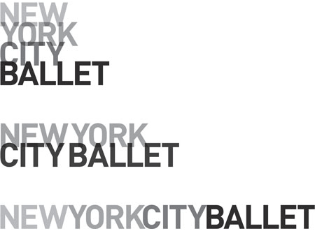
Which brings us to the wordmark itself which we see in three lock-ups: stacked vertically (word for word), partially stacked (two words at a time) and a single-line version. To its advantage these different lock-ups offer some flexibility in respect to implementation, however the partially stacked version seems to be caught in a kind of visual purgatory. Where the vertically stacked version and single line version succeed in cramming words together (in a city-esque way) to give a sense of vertical or horizontal tightness respectively, the partially stacked version tries to do a little of both and not enough of either.

This identity has visual impact with its stark palette and asymmetrical compositions (especially when seen in context in the streets), it’s flexible enough to be applied to everything from environments to annual reports and it definitely is rather beautiful. So why does the result seem so conservative and un-energetic? Where is the ”contemporary and dramatic new aesthetic“ they’re talking about?
Is it the lack of manipulation or visual play in the typography? Is it the amount of white space being used? Is it the interplay between the image and the typography? Maybe it’s just the DIN letterforms or the overall compositions? Whatever the culprit, or combination of culprits is, the resulting identity lacks a contemporary vision and appears to emphasize the fixed and motionless aspects of the city more than the energy and movement of dance. The only sense of contemporary and dramatically new is in respect to the previous identity which will quickly become an irrelevant context as it is forgotten in the wake of its own revision. I’m reminded of the more than 40 year old poster work of Armin Hofmann — given the similar design elements (palette, typography and the human form) and performance subject matter — which seems more contemporary and energetic today than these new NYCB visuals.

Certainly Lincoln Center is a conservative institution and ballet has at its root a certain amount of tradition, conservation and reverence for its classical form. However does this mean that the identity needs to be less visually dynamic than for an organization like the San Francisco Ballet or Sydney Dance Company or even the Walker Art Center? I’m not contending that these other identities are better or worse than the NYCB, but they do seem less visually conservative. One could argue that the typography in the wordmark for the NYCB is anything but conservative, handled irreverently by being set tightly and overlaying itself — and they would be correct — though somehow the typography and its composition is still restrained enough to feel rather traditional and static, which seems far from the world of ballet (the stationary system, which does not feature any photography, is an especially strong example of this distance from the subject matter).
No one can argue that Pentagram has a distinguished track record and that Scher is a masterful designer, and while I truly admire the Hofmann-like restraint and avoidance of excess, this identity feels rather underdeveloped. That’s not to say that it’s not well executed, but it does seem to lack the inspiration of its inspired art form.


Jump to Most Recent Comment
Haik Avanian’s comment is:
This gives off a 'big city in the winter' feel to me... Very structured and cold, and the overlap/transparency make me think of smog/smoke. So I guess the NYC aspect of it is captured pretty well, although with more negative connotations, but the ballet/dance aspect of it seems to be missing. The single-line treatment feels awkward for some reason too..
On Jan.23.2008 at 09:27 AM
Bryan Byczek’s comment is:
couldn't agree more - the positioning statement said it all - this was a misguided direction, one that emphasized too much of "New York" and not enough "Ballet", and the letterforms are chunky and stiff, giving no allusions to the grace and fluidity you find at the ballet.
On Jan.23.2008 at 09:35 AM
John Mindiola III’s comment is:
hey, with an overheated visual landscape like ours, these cold posters are attention-grabbing with their dedication to the wonderful world of grayscale. let's face it, billboards and posters that go unnoticed are useless. plus, ballet fits into the world of high art. although i love the walker's visual identity (i see it everyday, i live in mpls), i don't think a rainbow of neon colors would well suit the ballet. and, this won't just go on billboard, it'll be online, invitation, announcements, VIP collateral, and in-theatre posters. the ballet has to create an identity that resonates with its current and potential customer base: folks with cash who enjoy the high art of ballet. guess what, most of them aren't iPod-toting hipsters. they're baby-boomers. well done, Pentagram. if the masses want more dynamics, they'll have to buy tickets.
On Jan.23.2008 at 09:46 AM
JonSel’s comment is:
I'll admit straight off that ballet interests me about as much as a colonoscopy. But that doesn't mean I can't make a judgement on an identity! And this one just bores me. An earlier post said this focused too much on "New York" and not enough on "ballet". I agree somewhat, although the uniqueness of this troop is NY. "Ballet" is common to all dance groups. I just miss any sense of the rhythm of the city. And the photos somehow make this look like the most static ballet ever. The overlapping type completely falls apart in the one-line solution. Maybe they won't use that very often, but it still disappoints.
Compared with Scher's older identity and visuals for another NY ballet, Ballet Tech, this just falls flat on the floor.

ChrisM70’s comment is:
The type is well done, and very classy, but I have to agree with some of the other commenters - this type seems too static.
I know that the ballet crowd aren't "iPod-toting hipsters", but how is your art going to propagate unless you can lure in people that are younger?
Dance is active. It seems like they could have made something with a little bit more action, or that conveys motion.
I think it goes without saying, but this new logo is still MUCH better than the old one.
On Jan.23.2008 at 10:10 AM
Inaudible Nonsense’s comment is:
I think some of the commenters above have mistaken ballet for modern dance. Not that the two aren't related, but ballet is rooted in a tradition of very specific moves. It is rather static actually, its beautiful and graceful. But it's also cold and calculating. Modern dance was and is a reaction to the classicism (and classism) of ballet. Now there are 100 different caveats here. And of course the genres do blend and bleed in the modern marketplace of ideas and influences, but this ident seems to root the New York City Ballet squarely in the world of tradition while still seeming modern. High modern, sure, but that's that the direct descendent of high classicism as opposed to the expressionist energy of the street and vernacular dance that comes through in the Ballet Tech poster.
The NYC Ballet has positioned themselves directly to that which defines their work, one assumes. Not promising something it won't or doesn't want to deliver.
On Jan.23.2008 at 10:19 AM
NYdesign’s comment is:
Gimme a break. This is lackluster at best. Much like most of Paula's work. Stick to painting.
On Jan.23.2008 at 10:21 AM
Prescott Perez-Fox’s comment is:
I think this one is rock solid because it's done to create an overall visual style, rather than a beautiful single mark. The NYCB now has a distinct and powerful look and feel, and I reckon New York will welcome it.
Plus, dancers are perhaps the only group that wear more black than designers. Monochrome is ok where the arts are concerned. Ironic, but true.
But seriously, the cropped photo freaks me about a bit because that bloke's arm comes shooting in and at first glance looks like her arm, but somehow turned the wrong way. They couldn't have shot any dancers solo?
On Jan.23.2008 at 10:32 AM
nicelogo.com’s comment is:
I do see the movement in the trendy (oh God, not again!) vignette. It is fashionable entertainment so a logo in this genre may not last all that long anyway. It's not officially the death of all logos, but damn close. A better headline on PLAYBILL?
On Jan.23.2008 at 10:33 AM
Jerry Seinfeld’s comment is:
Yawn. I wish I were dead
On Jan.23.2008 at 10:44 AM
John McCollum’s comment is:
This emperor is naked. And freezing to death.
All I get from this is "aloof." There's no sense of place, no sense of motion.
There's nothing particularly wrong with the execution of the ads, but it's just so damn cold. Communicates only the negative attributes of NYC and none of the drama or flair.
Brr.
On Jan.23.2008 at 11:03 AM
John McCollum’s comment is:
And even the dancers look bored, borderline disdainful.
On Jan.23.2008 at 11:05 AM
Tom Lewek’s comment is:
I disagree, this identity is extremely sophisticated and in no way underdeveloped. It exemplifies to me a sense of class and beauty.
The photography is gorgeous and the cool gray tones are a calming relief from so much of the in-your-face advertising we see every day, while still getting the public's attention.
On Jan.23.2008 at 11:14 AM
Doug’s comment is:
The mark itself just doesn't communicate ballet. Once the photography is added, it looks very clean, but alone, it's just not very interesting.
New York designers seem obsessed with blocky wordmarks that can be shifted around. I'm all about flexibility, but many of these efforts are just uninspired.
On Jan.23.2008 at 11:33 AM
rynot’s comment is:
the system will be flexible and work for a long time and hopefully develop some more personality organically. it's very new york to me. theres an attitudinal stance taken through the type choice and all caps that gets 'balleted' through the gimmicky opacities.
the KC coupling in the one-line iteration troubles me.
Ross’s comment is:
It's pretty stiff, but I think they could have gone with the same logo and got mediocre at least results with some color. A good color can pop nicely off black and white photos.
On Jan.23.2008 at 11:43 AM
Bjorn Yeo’s comment is:
For me, the gentle, receding aspect of this identity is also its most endearing. Too many identities have been developed to take over entire designs, with its endless "Supergraphics" and "Sign offs" and grids and whatnots.
What this identity succeeds in is being able to take a back seat, and let beautiful b&w photography of graceful ballet dancers take centre stage. A far cry from the gimmicky implementations that seems to be the trend these days.
A breath of fresh air really, although ironic in the context of new york. :P
The follow-up to these initial implementations would be interesting to watch out for, to see if the identity would be able to stand on its own in the "real" world, or would it simply trip and fall.
On Jan.23.2008 at 11:49 AM
Dennis Moran’s comment is:
Cool, sophisticated, contemporary, minimalist, memorable, great!
On Jan.23.2008 at 12:16 PM
Rachel’s comment is:
I actually love it. Sure, it's a little chilly, but it "feels ballet" to me - which actually does feel a little cold. It's slender and angular, a little aloof, like a dancer - at least in my mind's eye.
If anything, it's heads and tails better than the ridiculous "before" mark - what in the world were they thinking??
On Jan.23.2008 at 12:25 PM
Joachim’s comment is:
It works fairly well with the context of black and white photography, which appropriately look like theatre posters. Personally though, I think there could've been a handful of better solutions instead of DIN. Like Haik mentioned, not enough ballet, too much New York.
On Jan.23.2008 at 12:35 PM
J Zsa’s comment is:
"This emperor is naked. And freezing to death."
Yes. Absolutely. Hands down.
This is art for art's sake. It's pompous and not even attention-grabbing enough to be annoying.
If a student came to a prof with this tripe, they'd fail. Just because you're a respected designer doesn't mean you can skimp on a job and call it "good design."
Instead of making it bigger, maybe should focus on making it better.
On Jan.23.2008 at 01:18 PM
diogo’s comment is:
I disagree.
I admit i'm a great Paula Scher fan, and maybe i don't have a completely impartial view.
But i like it!
It's simple, it's efficient, it's soft, and it's good looking.
I think the logo doesn't need to be more dynamic, you don't it when you have people dancing all over.
I like it a lot!
On Jan.23.2008 at 01:45 PM
exigent’s comment is:
I do not care for it. This is truly something that any, and I mean ANY run-of-the-mill, lowly designer could come up with. Very very dissappointing.
The main ballet girl image used on posters is hillarious. I love how she has one womanly caucasian arm and one masculan african american arm. What the hell are they thinking... this entire branding is a joke.
On Jan.23.2008 at 01:54 PM
BWJ’s comment is:
Props Paula.
On Jan.23.2008 at 03:18 PM
Jonathan Hoefler’s comment is:
Curiously enough, I was at the New York City Ballet last night. That I expected to enjoy the Balanchine and Robbins pieces but not the two by Wheeldon and Martins speaks to my own prejudices, certainly, but the transition from old to new is certainly one of the more polarizing aspects of the New York City Ballet in 2008. Incidentally I enjoyed the Wheeldon piece the most.
Whether or not you like the new identity (I do, but whatever), it's worth acknowledging that it's actually AN IDENTITY. What the Ballet had before was not: it was a mark, and it was applied somewhat indifferently to what should have been a coherent program of information design -- made especially challenging by the material it needs to represent. It's hard to imagine a visual language that suits both Balanchine's arrangement of Strauss Waltzes and Christopher Wheeldon's work to Arvo Part -- let alone the one thing most New Yorkers know about the ballet, which is the Nutcracker -- and I think the new typography does a really good job. (I think someone took the typographic theme a little too far with the "Buy Tickets" button on the website, which looks more like a logo than an actual call to action, but whatever.)
Knowing what's happening with the institution right now, I can only imagine what kinds of conversations Paula must have been part of. The NYCB has its arch-conservative supporters, as well as those who are fully-fledged members of the avant garde, and it also faces a receding membership and a dicey future. This can't have been an easy project; it's not the same as designing a logo for an ice cream sandwich or a startup.
BTW, say what you want about the work, but please don't be cruel to the designer. It's a big turn off.
On Jan.23.2008 at 03:22 PM
Bendy’s comment is:
I like it. New, unexpected face for ballet... that's why I dig it.
Ballet is fluid, yet very structured. This brand allows the organization and precision to contrast against the feminism and flow of Ballet.
Yes, any mediocre designer could have designed this, but it takes a daring designer to see the need for simplicity and minimalism.
I personally hate ballet, and feel the branding is too often colorful, robust, and flowery. Ballet is an artform, and the design has not reflected it or respected it properly. The logo doesn't have to explain anything... that's what the photo does.
The superstar is... surprise! The dancer. How it should be.
On Jan.23.2008 at 03:28 PM
Marcello’s comment is:
I second Dennis Moran: "Cool, sophisticated, contemporary, minimalist, memorable, great!"
I'd agree that the semi-stacked and single-line versions are a little awkward. But I loved the stacked version as soon as I saw it, and it looks like that will be the most commonly-featured version. It's one of the few logos that seems to enhance a photograph rather than detract from it.
It's refreshingly clean and straightforward, and memorable for that very reason.
On Jan.23.2008 at 03:34 PM
Mr Posen’s comment is:
In situ, the posters look quite calming.
Jonathan likes the ballet’s comment is:
Thanks for sharing your knowledge of the ballet with all of us Jonathan. We're not worthy of your ballet prowess.
I'm personally diggin' the new brand. It makes much more sense and looks much better after seeing it paired with the photography.
But how long will this incarnation of the brand last before it gets tired? The site's very boring to look at. I think the whole brand needs a signature color.
I'm in favor of this being this season's 'theme' but I don't think it will last as a brand more than 3 years.
It's just plain too unemotional and uninspiring.
Also, I don't think Scher's design will appeal to the younger generation. It's imperative to speak to this crowd if they (the ballet) plan on being sustainable through the next 5,10,15 years.
On Jan.23.2008 at 05:26 PM
Jonathan Hoefler’s comment is:
I got no prowess here! I'd never really developed a taste for dance in general, but after thoroughly enjoying Alvin Ailey's "Revelations" a few years ago, my wife and I decided to give the ballet a whirl. We've really been enjoying it, much more than I ever expected -- it reminds me of coming to enjoy abstract expressionist paintings when I was in high school, after years of paying them absolutely no attention.
Saw this two weeks ago, which was incredibly funny -- it's essentially a send-up of ballet altogether. Imagine Swan Lake performed by Monty Python. Check it out!
On Jan.23.2008 at 06:10 PM
Jonathan Hoefler’s comment is:
hm, I think I screwed up that link. Try this:
http://www.nycballet.com/company/rep.html?rep=47
On Jan.23.2008 at 06:11 PM
Juggling man’s comment is:
CK?
On Jan.23.2008 at 06:59 PM
Von Glitschka’s comment is:
Seems like Paula's pre-fab stock templates have gone prime time?
Beautiful photography but the logo itself is rather anemic and mediocre.
On Jan.23.2008 at 07:16 PM
Danny Tanner’s comment is:
Jonathan Hoefler--I fully agree...
In the back of my mind, I'm reminded of:


and these posters make me happy.
On Jan.23.2008 at 08:27 PM
miles57’s comment is:
I would agree that simplicity and minimalism can be a welcome solution in these days of overly-complex trendiness (photoshop crutches) in lieu of concept and execution.
That being said, I'd have to agree that this solution is pretty run-of-the-mill when coming from a design "superstar"... I always liked her "Ballet-Tech" stuff a lot.
Kinda makes you wonder if she had the junior designer working on it while she went out for a long lunch...
On Jan.24.2008 at 12:13 AM
Adrian’s comment is:
Mh. No. No, no, no.
Ballet is supposed to be about life, dynamics and movement. This feels cold, stark and even depressing - not unlike the German Autobahn for which DIN was developed. Use something that conveys passion, people!
I usually love Pentagram's work, but this looks like a miss.
On Jan.24.2008 at 03:39 AM
Gm’s comment is:
After seeing the Logotype, it is an overwhelming let down to see the identity as a whole. Do the building forms of the logotype OFFSET the organic Mapplethorp-esque figures, or compliment? Or sit next to? I don't get it?
And I posted this a little while ago when this identity was mentioned in passing, but hopefully you don't find it overly repetitive if I post again:
Logotypographically it reminds me very much of the Asia Pacific Screen Awards With the difference being that NYCB doesn't make any sense...
On Jan.24.2008 at 04:25 AM
danny’s comment is:
I think it's terrible. Not even worth the discussion.
On Jan.24.2008 at 10:38 AM
Danny Tanner’s comment is:
To expand on my previous comment,
Its pointless to evaluate an identity
(especially this one) in terms of just
the signature. If we were using that
same rational, Bierut's BAM identity
would be considered bland, when in
actuality, THE FULL IDENTITY (the only
thing that really matters) is great.
This strikes me as a logo that's almost
always seen in context. That context
being print material. The simplicity and
rigid form of the signature offsets
and complements the photography,
allowing the photography to play a
champion role in visually expressing
the elegance, richness, beauty, honesty,
and human qualities of the ballet and
the ballet experience better than any
do-dad logo could.
Do I love DIN? Not really, but that's
a moot discussion. The argument that grey
buildings identify New York, as opposed
to say,Chicago, is a tough sell. However,
DIN is very mechanical, and ballet isn't just
about fluidity, its also about technique,
mechanics, and structure, and stature.
Stick those qualities in the signature and
Communicate others in the photography,
and then you got a full bodied identity.
je’s comment is:
I think it's great, but does make me think of Calvin Klein a bit.
On Jan.24.2008 at 01:34 PM
MADPHILL’s comment is:
Von, I totally agree. In fact, I had already copied the link to her templates before I even read your post.
Well-executed? Yes.
Attractive? Yes.
Effective? Eh.
It's extremely cold and furthermore, masculine. While this could be an important aspect that complements the marketing plan behind the rebrand it seems like such a calculated approach actually narrows the impact of the aesthetic to me.
I also find it quite formulaic and trendy in composition and style. I don't think it has what it takes to stand the test of time as a logo void of any icon to accompany it. The typographic treatment alone is not enough to maintain uniqueness over time.
Lastly, I feel like the hard alignment doesn't work. Because of the nature of the "Y" my eye keeps falling into the void of "York" regardless of contrast in the letterforms. It's optical indentation is extremely distracting from the implied line that is 'almost' created on the left.
On Jan.24.2008 at 01:34 PM
Michael J. Young’s comment is:
Overall I like it.
Yes, the mark could have been very different. It could have had more movement, motion, and flair and tried to be the ballet, but that obviously isn't what it's trying to do. I think the new logo will help create consistency across the brand, providing a 'white box' that lets the content be forefront. I hope to see the photography evolve in the coming years and seasons, as people get used to the branding. (think Penguin books)
C-Lo’s comment is:
Effective and overly clean and tidy. A little overused in the sense of graphic design yes, but that is what ballet is. {clean not over used ;)}
On Jan.24.2008 at 01:58 PM
Darrin Crescenzi’s comment is:
Agree 100% with MADPHILL, you just can't have that "Y" in there ruining the entire composition. The only one that works at all is the two-line composition.
On Jan.24.2008 at 03:44 PM
Darrin Crescenzi’s comment is:
Agree 100% with MADPHILL, you just can't have that "Y" in there ruining the entire composition. The only one that works at all is the two-line version.
On Jan.24.2008 at 03:45 PM
Jw’s comment is:
DIN, DIN, DIN.... oy. How much more DIN do we need? After last year, it's feeling a touch overplayed.
I could be biased... I had to use DIN for an architecture school identity for the last 2.5 years. It really brought to my attention how ubiquitous it's become in ads and identity.
On Jan.24.2008 at 05:07 PM
g-sppud’s comment is:
I agree that if a student were to give this solution it would be seen as mediocre at best. Interesting what passes at different levels of the game.
On Jan.24.2008 at 06:33 PM
felix sockwell’s comment is:
love this new mark. Din can do the jig.
what was described as buildings amid the night (on Pentagram's site), to me, appears as some sort of transient weightlessness. an evolution of something.
whatever it is, screw it- it works. and from what I've seen on the street (where this thing goes into action alongside the beautiful photography) it really stands out. its memorable.
On Jan.24.2008 at 08:46 PM
Patrick Curda’s comment is:
I like the story of the type reflecting the cityscape... although i didn't see it til i read the rationale. I guess i'd have to be a New Yorker.... Would be nice to see lifesize type incorporated into the photography... dancing in the city...
On Jan.25.2008 at 12:00 AM
Love the Ballet’s comment is:
I really like this identity. Strong, beautiful, elegant, classic, and the black and white photos are an amazing way to show the form and grace of a dancer.
As a former ballerina and now a practicing designer, I think it embodies everything that the ballet is. Most people view ballet as fluid, but in reality it is VERY structured form of art. Every movement that a dancer does has been practiced and practiced and practiced, and as the viewer you just see the end result of the fluid movement that glides across the stage. I see this logo/identity and immediately relate to it. Instantly I think of NYC and the ballet. I think it is beautiful and simplistic in its own right. The mark is subtle enough to make the strong beautiful black and white photography stand out. Also the organic lines of the dancers form offset the strong ridged lines of the type.
I love the fact that they went in a totally different direction than most companies. Most ballet companies have that fluid, sweeping script type, and it has been so overused. This is a wonderful change and I think it might be what NYCB needs to relate to a new audience.
On Jan.25.2008 at 10:02 AM
ME’s comment is:
Nice gap ads - couldn't add a little color? Maybe if New York City Ballet paid another $40,000 towards the logo they could have added color to the undergraduate mark.
On Jan.25.2008 at 10:26 AM
disgruntled designer’s comment is:
I hate transparencies but I find this logo and the application of it quite attractive and very successful. The stark b/w photography with the stark b/w logo play off each other very well. So I guess I don't hate transparencies in all applications.
On Jan.25.2008 at 10:44 AM
Amanda’s comment is:
I get the whole NEW YORK identity and all -- the smog/building/structure reference, the oh-so-urban b/w-only color scheme -- but to me, this could just as well say "New York City Subway".
I'm interested in the possibility to expand on the color... like maybe for the spring season they'll decide to use color photos? What happens to the logo mark then? It really only works with either black and white photos or else color photos that have a strong contrast value.
On Jan.25.2008 at 10:44 AM
disgruntled designer’s comment is:
I hate transparencies but I find this logo and the application of it quite attractive and very successful. The stark b/w photography with the stark b/w logo play off each other very well. So I guess I don't hate transparencies in all applications.
On Jan.25.2008 at 10:45 AM
cee’s comment is:
I wonder what the comments would have been like if Paula Scher and Pentagram would have been left out of the write up.
On Jan.25.2008 at 01:22 PM
Matthew Taylor’s comment is:
The snottiness of the comments here is mind-boggling. Maybe a rule that forced everyone to wait 24 hours to post a comment might reduce some of the arrogant vitriol.
To read some of the comments here you might think they were coming from designers with amazing work under their belts who have earned the right to give these critiques. Then you click on their names and see their websites.
It's still a person who created this stuff. Give a little bit of respect.
On Jan.25.2008 at 01:43 PM
KGB’s comment is:
@Matthew -- I don't think you have to be a designer to comment on an identity's effectiveness. The general public, who will be the ultimate judge, isn't a group of designers.
On Jan.25.2008 at 01:53 PM
Matthew Taylor’s comment is:
KGB,
I agree, you don't need to be a designer to comment on an identity's effectiveness. That's a helpful caution to make.
My comment is addressing the tone of the comments... the "Gimme a break. This is lackluster at best. Much like most of Paula's work. Stick to painting." kind of comments.
I wouldn't advocate eliminating criticism, I just think some of it comes with such a harsh tone and from people who frankly can't live up to the standards they are using. So helpful criticisms like those in the original post YES (I think Christian Palino did a great job by the way) but trashing the designers behind the designs, NO.
On Jan.25.2008 at 02:14 PM
Prescott Perez-Fox’s comment is:
Matthew,
Sociology 101: Some people are Jerks.
Sociology 102: On the Internet, most people are jerks.
btw, what's your website?
On Jan.25.2008 at 05:37 PM
k4krystal’s comment is:
Stationery, not stationary.
Sorry, couldn't help myself. One of my peeves.
On Jan.25.2008 at 06:25 PM
Gigi F.’s comment is:
Is it possible to both love and hate this? That's how I feel about it.
I think it's beautifully executed and incredibly clean. I absolutely love the photography and how it complements the mark.
HOWEVER, this feels more like a campaign to me than an identity. As someone said earlier, "I'm in favor of this being this season's 'theme' but I don't think it will last as a brand more than 3 years."
It just feels like it will get tired or repetitive after a while. Maybe I'm wrong...Paula is afterall the design genius and I'm only humbly aspiring to become one.
On Jan.25.2008 at 06:56 PM
paula scher’s comment is:
Here are some things you might want to know about the NYCB. It was founded in 1933 by George Ballanchine and defined itself as neo-classical. Their movements were more modern than classical ballet, sometimes even strident. Today, it could be defined as modern, but not contemporary. The NYCB is America's foremost ballet company and probably second in the world only to Bolshoi (and the NYCB would say that no. 2 is debatable). They differ greatly from American Ballet Theater in that they are less romantic. ABT is about Swan Lake and tutus and the NYCB is the home of Jerome Robbins, leotards and street dress costumes. But it is ballet, not modern dance, and it is certainly not Ballettech.
The average subscriber of NYCB is between 65 and 80. Not a great demographic. Their goal was to increase attendance and appeal to a younger audience, though younger in this case, while hopefully not excluding anybody, probably means 40-55.
I am pleased with this design. It' s right for them. It was difficult to get them to move, but the combination of the new Identiy plus better PR has their ticket sales up by a thousand for the new season. Not a bad result.
The NYCB needed to differentiate themselves from ABT and other ballet companies. If you look in the Arts and Leisure pages of the New York Times, you will find that all ballet companies look pretty much the same except for their logos. Some of the logos are scripty or hand drawn, some are Trajanesque (similar to the former NYCB logo) and some of them are just goofy. But the logos are actually irrelevant, The reason the ads look the same is that the dancers are always shown full form against a stagelike background, usually of muddy gray, rendered muddier by the TIMES.
This happens because all of the dance companies are headed by choreographers, and the choreographers NEVER want you to crop a ballet dancer. Check it out in the next Sunday's Times. You'll see I'm right.
Getting Peter Martins (The NYCB director) to accept that a ballet dancer might be entering a frame, and therefore be cropped, and could even be silhouetted, was serious work, and it may be my biggest contribution to the vernacular of ballet promotion,
The logo was designed to be powerful and graceful at the same time. As the ballet's forms are somewhat architectural Din seemed like a good choice, softened by the overlapping and gradating letters. We explored an italic and more motion oriented version, but it fought the photo and rendered it redundant, Instead the straight Din anchored the amorphic photo and gave it stability. If you go up to Lincoln Center and see all the photos used you will have a better idea how it works as a system.
We deliberately selected black and white photography to introduce the program because of the shock value. We assume it will move to color in the next season, perhaps strong color, perhaps pastle for a spring show and the photographers and style can change season by season. I think the identity will have "legs."
I won't execute the identity after this first promotion. It will be done in-house and by other free-lancers and small agencies. It was necessary to design something that others could easily and effectively execute to keep it consistant. If I was going to do it all myself I probably would have integrated the image and typography in a more idiosyncratice manner (assuming I could sell it). I did that with the Public Theater and it wasn't good for the institution on a daily basis, because when I didn't do it it fell to hell.
I suspect the "missing" something in the identity is that lack of personal obsession. The identity is deliberately designed so that almost anyone reasonably competant can execute it, even a student. I suspect that if the execution is consistant the progarm will become a wonderful vehicle for dance photography. But when something is designed to be systematic rather than personal. something is always lost. It is always one of my greatest dilemmas when designing identities for large scale organizations.
I appreciated some of the thoughtful comments here. I think the reviewer is right about the weakness of the two-line logo version. However, I do think it seems a little lazy to write a review or comment about a rebranding of a major institution by using the Pentagram website as a sole source. I know its cold outside, but Lincoln Center isn't that inaccessible.
I
Christian Palino’s comment is:
Paula, thanks for offering your insight into the process of the development of this rebranding – its always enlightening to hear about the design "from the horse’s mouth." Its interesting to know that the "younger" audience that the NYCB speaks about targeting is in fact more middle-aged than youthful in numbers. And also to learn that cropping or silhouetting the imagery was so challenging for the NYCB – I recall that The Hamburg Ballet has been handling some of their photography in similar cropping/compositional ways, though lacking in similar scale – its great to see more of this. And certainly the understanding that the future execution will be handled solely in-house by the client, with expected varying levels of competency in the execution, grants us an understanding of the compromise that was involved in the design.
Regarding that compromise, are you meaning to say that while this result for you is systemic in its design a result like that for the Public Theatre is less systemic? It would seem to me that the Public Theatre identity is much more systemic in nature, affecting the entire identity in a much more holistic way.
I for one hope the campaign stays restrictive in its color use (not necessarily only black and white) – as I mentioned above, the introduction of these photographs into the saturated city and media landscape really forces a kind of photographic reading that I feel is extremely valuable and increasingly lost.
On Jan.26.2008 at 05:14 AM
Johann Peter Werth’s comment is:
Pentagram seems to be very keen on DIN recently. Just have a look at what they did for Deutsche Kinemathek (museum for film and television) at http://pentagram.com/blog/2007/01/new-work-deutsche-kinemathek.php -- it’s DIN, its black-and-white, it has transparency in it.
Maybe it‘s just the leftovers for NYCB?
On Jan.26.2008 at 09:54 AM
Paula Scher’s comment is:
Christian,
The identity I designed for thePublic Theater in 1994 relied on five or six weights of Morgan wood types ( before Hoefler digitized it), that were combined at different scales, in all caps to create emphasis. It was a systmic identity, but took much more skill and talent than the NYCB system to execute properly. There was no grid system or guideline book. It was all attitude. When designers didn't know how to work with it the results were terrible.
The Public's identity became a design style. It became so popular that everyone was doing it, everywhere, on anything, and mostly doing it badly. Just look at theater advertising in the Sunday Times, where it never went away.
Right now, the "BE Gruntled" campaign on phone kiosks all over NYC has done a very good job of resurrecting the style.
On Jan.26.2008 at 09:55 AM
Johann Peter Werth’s comment is:
Pentagram seems to be very keen on DIN recently. Just have a look at what they did for Deutsche Kinemathek (museum for film and television) at
-- it’s DIN, its black-and-white, it has transparency in it.
Maybe it‘s just the leftovers for NYCB?
On Jan.26.2008 at 09:56 AM
Asen Tsvyatkov’s comment is:
Hmm. OK, Johann, we get it - Pentagram love DIN! You are very convincing. If you, however, had any idea how Pentagram works you would probably know that there could never be a 'DIN + TRANSPARENCY=CLIENT' memo and that each Pentagram partner make their own respective and autonomous choices. This is not to defend all Pentagram work - sure, I find the quality of the output of their Austin office below average, but I find the NYC team are amongst the best the firm has seen since Peter Saville, in terms of both talent as well as interdisciplinary incline. So keep it informed and constructive for the sake of us all.
On Jan.26.2008 at 10:33 AM
Anonymous’s comment is:
I think it's very New York City. You can only understand NYC if you live here. Black in nyc isn't necessarily a bad thing. This identity is sophisticated, elegant and the gradient itself gives you a sense of movement. We're used to have fonts that deliberately and almost condescendingly gives us movement and fluidity. This is honest.
I like it.
Loren’s comment is:
Thanks Paula Scher! So nice to have you put perspective on all the negative comments above.
I had some iffy feelings about this when I first looked at it. It's true the identity alone isn't much to talk about, but the full ads are pretty eye-catching and beautiful. I think this is mainly due to the photography.
I don't think it's bad, but it's also not great, and I understand now how difficult it must be to create a dynamic visual identity that has to be carried out by others.
On Jan.26.2008 at 05:58 PM
rickyaustin’s comment is:
I think focusing on NYC and a little less on ballet (as many here have scolded this program for doing) is a good thing.
To non-ballet aficionados (myself included), ballet is ballet. Ms. Scher touched on this with their research, everything looked the same in their research... because so many 'looks' were created the same way: make something showcasing ballet.
What makes NYCB unique is that it is in NYC. It even has New York City in the name. Rock on - I think it works great.
I have a special place in my heart for monochromatic things too, so that's probably another reason I like this :)
I look forward to looking at this in a year or two and see where the identity goes once color is introduced and it grows its legs.
On Jan.26.2008 at 07:22 PM
Joey Pfeifer’s comment is:
I don't have much to add, but all I can say is that I love the new mark. Everything just works.
On Jan.26.2008 at 08:42 PM
Robbiefa’s comment is:
Din baggins... I love Din but its turning into the new helvetica... and i love helvetica!
On Jan.27.2008 at 07:29 AM
Robbiefa’s comment is:
Din baggins... I love Din but its turning into the new Helvetica... and i love Helvetica!
On Jan.27.2008 at 07:36 AM
tony’s comment is:
After just visiting NYC this past weekend, I can say that I only remember one advert and it was this. Though I agree with the nay-sayers that it's cold, bleak, etc, it works very well as an identity that stands out. The use of negative space (read: white) works well to capture my eye. While the wordmark is sparce, it offers an airyness in a time of gluttonous, overstimulating, widgets.
On Jan.28.2008 at 12:40 AM
Darrel’s comment is:
"I wonder what the comments would have been like if Paula Scher and Pentagram would have been left out of the write up."
Probably something along the lines of 'That sure looks like Paula's work!'
On Jan.28.2008 at 10:11 AM
Madphill’s comment is:
It is extremely refreshing to have the designer speak up on here. Makes a huge difference in the quality of the analyzing and critique.
So, thank you for doing so Paula!
On Jan.28.2008 at 11:58 AM
Haik Avanian’s comment is:
Agreed with Madphill, doesn't change my overall opinion of it, but its very nice to get an inside as to why things were done the way they were.
On Jan.28.2008 at 02:14 PM
Ana Reinert’s comment is:
I was trained as a dancer I appreciate the sparseness of the visual identity, but the logo looks heavy... the color transition to black make the logo look like its getting heavier, weightier and if there's anything you shouldn't associate with dancers its a sense of heaviness. Dancers defy gravity and the laws of physics and this logo is too weighty. Let there be lightness.
On Jan.28.2008 at 07:06 PM
agrayspace’s comment is:
My only contribution to this discussion would be that I am starting to see a very blurry line between what we are coming to recognize as identity design and what is essentially an advertising campaign.
Paula's work here is impeccable for sure. But is it an identity? Sure it presents a differentiated point of view that would be recognizable in a crowded marketplace. So yes it may be.
But does it have a life beyond this one very constrained aesthetic?
In three years, will this feel stale?
Will it be able to be reborn without being redesigned?
Where you the aesthetics of a campaign and a truely flexible and growable identity begin and end?
Interesting roads we are exploring.
On Jan.30.2008 at 05:21 PM
hcabbos’s comment is:
I'm reading a lot of comments about the identity as a whole but take away the photography (as it's really not the wordmark). What are we left with?
On Feb.02.2008 at 04:24 AM
Jacob Halton’s comment is:
I'm pleased to see Ms. Scher took the time to come here and defend her work. She did a pretty good job of explaining why everything was done this way, so it makes sense to me now.
But I still do get the impression of conservativeness, and that "cold winter in NY" feeling.
It does look like the type was done to take a backstage to the dancer photos, but the photos are kind of uninspiring compared to her other ballet/theatre work...which may be on purpose because of the target audience. Some of the photos look like they were posed, and not even in motion really. The girl's face in that bus stop ad is kind of :|
But maybe want to scare them with all those muscly naked jumping people now.
Even w/ the negative critique, I still kind of like how it looks.
On Feb.06.2008 at 06:02 AM
Frank’s comment is:
My 2 cents:
Seems like while creating the logotype/wordmark too much focus was on the context the logo would interact with, i.e. the photography/ads.
That is why within the context of the ads and posters the logotype works actually pretty well but at the same time fails miserably as a logo in a different, non-advertising or otherwise "hostile" environment.
Taken out of context the "logo" says zilch about ballet, if at all there might be a hint about "NYC" but even that is already stretching it.In a different surrounding, it's just stacked transparent type.
In other words, the logo is not a logo but nothing more than a nice poster/ad type treatment; i have yet to see an "identity" here - what i see is ads and posters that look nice.
But it certainly is not an identity.
Like someone else said earlier (i think in the Dubai thread), designers nowadays seem to more and more forget or ignore some basic principles of design - like it or not, a logo serves a purpose and and is not art by default, no matter how many agencies want you to believe the contrary (think Wolff Olins).
A logo has to work as an identifier in *all sorts* of circumstances and environments which this does not, hence it fails.
On Feb.11.2008 at 11:54 AM
Anonymous’s comment is:
Paula Scher is on Graphic Design books, you guys aren't.
Thanks
chris’s comment is:
I imagine that the constraints of all involved was a major factor in this design. It is elegant, and in that way could be used across all forms of media and in many variations. It is like the simple grammar of ballet, which must be learned in order to achieve true greatness. Elegance is never loud or intrusive, but flexes with any situation; like the body of a dancer.
Cheers.
Paul Rand’s comment is:
Lackluster at Best
I am spinning in my grave, why use DIN and why is the type semi-transparent?
The typeface would of actually looked better on a NYC cab:

Corey’s comment is:
The stacked version is quite nice, and I appreciate the restraint given the subject matter (Edge was appropriate for Public Theater, not ballet). The photography is beautiful, and compliments the interweaving of the logotype.
However, with the use of black & white photography, I believe the logotype would have worked well in color to offset the photo style.
Either way, this new and considered identity system is head and shoulders above the nondescript logo that preceded. It's nice to see another piece of Scher's work on the streets of ny.
On Mar.12.2008 at 12:24 AM
insanity’s comment is:
Same Designer, Same Client, Different Arts Organization, Same Solution. Boring. Safe, Safe Safe, Has Balanchine taught you nothing.
On Apr.15.2008 at 11:14 PM
insanity’s comment is:
Same Designer, Same Client, Different Arts Organization, Same Solution. Boring. Safe, Safe Safe, Has Balanchine taught you nothing.
On Apr.15.2008 at 11:14 PM
proslaviy’s comment is:
Hi, how I can send PM?
On Sep.15.2008 at 09:31 PM
Comments in Brand New, V1.0 have been closed.


