Update / 09.14.07: It has been brought up to everyone’s attention, through the comments, that I used the wrong logo as the “After” image, rendering the rest of the post somewhat moot. I explain how I ended up with the “After” image in the comments. Even though I could change the whole post so that future visitors would not see the mistake, I would rather embrace the actual events and leave as is. The correct logo is in the comments as well. Apologies to our beloved readers for the oversight.

Web 1.0, if you will, left an indelible mark in the field of identity design: Google, eBay, Yahoo, and, of course PayPal. Logos that are more used, seen and interacted with than Nike, Apple and Starbucks’. A world (wide web) without any of these in their current design state would likely cause an implosion of confusion. Yes, I am afraid these logos will never change. PayPal, however has recently tiptoed into a new identity. Not that anyone would notice. According to this “behind the scenes” blog entry, hundreds of designs were reviewed, but ultimately, and after testing with customers, the internal brand team decided to stick with something painfully close to home. And now, with a new logo in place, the hard part begins, as “there are millions of logos that need to be updated”. So as a service to the millions of users out there that have a PayPal logo on their web site, I have put together a handy guide for how to make a smooth transition into the new logo. Experience with horizontal and vertical scaling of type is necessary; please do not attempt if you have never fidgeted with the proportions of a carefully designed typeface.
Continue reading this entry
It’s not everyday Brand New discusses an in-house logo but today is the day. In-house designers, rejoice. Anyone who has worked in-house knows the complicated process projects go through and their lengthy approval. To get a company to buy into a new corporate identity is a big deal, especially when it’s done in-house and not outsourced to a firm.
Continue reading this entry
Flash forward to the year 2015…
Imagine your local Best Buy at 5:30 am on a Saturday morning; late August 2015. Picture a winding line of 300 good Americans—moms, dads, children, teenagers, and husky Ebay speculators. The barbarians at the gate are loaded with lawn chairs, vitamin C, playing cards, fleece blankets, and other middle-class mechanisms of subsistence. All are biding their time in hopes of being one of the first few to get their knuckles around the newest model of the Compaq Presario VXXX series. Compaq is so hot right now—they sponsored the last space shuttle mission.Continue reading this entry

If you take a holiday this summer, consider Pembroke, Bermuda, the legal incorporated home of some exciting de-conglomeration and branding. Tyco International LTD, a global leader in industrial valves and controls, metal conduit, armored electrical cable, and steel fence post tubing. A proprietor of fun brands such as ADT security and fire alarms, as well as niche-hits like Coev Magnetics, and Raychem, Tyco recently announced that it was neatly spinning off into three corporate-level brands, grouped by cateogry. So it goes. The spinoff gives us three consumer/industrial brands: Tyco Electronics, Tyco Healthcare (Covidien), and also Tyco Fire & Security/Engineered Products & Services (TFS/TEPS).
Continue reading this entry
Guest Editorial by John Feldhouse
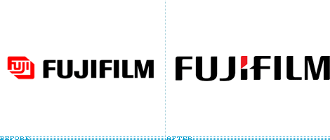
The new Fujifilm identity was released on October 1st and carries a major update from the 1980s Landor design. The highly recognizable “film box” has been replaced with a stark typographic treatment with one minimal element of color. One should ask, “Is less really more?” Fujifim was founded in 1934 as Fuji Photo Film Co., Ltd. From 1962 to 1990 Fujifilm established a number of divisions worldwide. It was in 1960 that Fujifilm updated their logo to the now familiar red and abandoning their original mark. In 1980 Fujifilm again changed their logo to the recognizable film box logo created by Landor. As Fujifilm continued to grow and become a juggernaut in the film industry, they decided to update their logo in 1992 with adding text to the film box. And in 2006, Fujifilm decided to abandon the Fuji Box and go with a pure typographic treatment.
Continue reading this entry
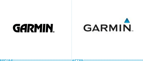
Garmin, the company that makes many of the portable GPS and navigation systems for your car, has been doing pretty well lately. So well that they have recently announced that virtually all of its employees will receive bonuses equivalent to a month of their salary. Garmin has also been spending some branding and marketing dollars as they have just announce a new logo, an ad campaign to air during NFL games and their first ever retail store.
Continue reading this entryPrevious Page |
(Total Number of Pages in Technology: 3)


