This will perhaps come across as the laziest post I have ever written for Brand New. But there is an inherent familiarity and ubiquity with the NFL (and its logo) that I feel does not require any of my typical anecdotal set ups or concise briefings. What I like about this discussion is that it finally comes down to execution. The problem with the old logo is clear: It’s out of date and it’s hard to reproduce. The solution is even simpler: Make it more contemporary and relevant and easier to reproduce. Oh, and, yes, don’t fuck it up. Everything you need to know, and the only things there are to know, about the logo are in the hands of this heavily linked USA Today article. Enjoy!
Thanks to everyone who e-mailed.
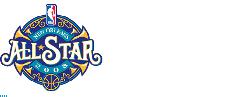
Something I did not expect to see smack in the middle of July — specially when no one is paying any attention to professional basketball, specially after such boring finals — was an unveiling of the 2008 NBA All-Star game logo [bigger view here], to be played in New Orleans a good eight months from now. Even after the devastating effects that the city went through, it is still one of the nation’s most flavorful, with its music roots keeping it afloat and its unique architecture and texture shining through. The All-Star logo — in all of its polished professionalism, typical sports semi-dimensionality and inevitable, expected, city-centric visual cues — manages to convey some personality and add a little spice to the anticlimactic, über family friendly affair that the All-Star game has turned into. The “All-Star” custom typography is quite smooth and has a nice vintage smell to it, nicely complemented by the iron work line art “growing” from the basketball at the bottom. The trumpets (or “brass instruments” as specified in the press release) are not necessarily my cup of tea, but they do add nice tension to the circular logo. The “2008” text is by far the least resolved with way too much letterspacing and, based on the “New Orleans” text in the upper ribbon, what looks like some horizontal scaling, but I want to think it’s the extended version of the typeface. Overall — and in contrast with some past All-Star logos, specifically The Chili Years from 1994 to 1996 — the New Orleans logo stands out nicely and, most beneficial for the city, proudly.
Thanks to Jason Smith for the tip.
The American Major League Soccer Club, Los Angeles Galaxy re-launched their brand last week in time for a new crew member, David Beckham. Originally of the British Football Club Manchester United, Beckham and wife Victoria will bring an atmosphere of skill and spice, respectively, to LA; and certainly a wider audience.
Continue reading this entry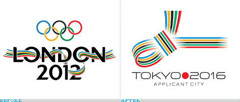
Yes, you are correct, this is not a Before/After scenario strictly speaking. But designerly-humorously-speaking, this is a pretty funny way of looking at these two Olympic bid identities. I was this close to making this a “Noted without Comment” post, but maybe a little context helps:
Tokyo’s bid for the 2016 Olympic Games has unveiled its new representative logo, a Japanese MUSUBI knot that integrates the five colours of the Olympic rings and is used in Japan at times of celebration. [ … ] “This logo, our MUSUBI knot, integrates the values that underpin both the Olympic Movement and Tokyo 2016. It ties together sport and culture, urban and natural environment, Japan and the world, the world and peace” said the bid CEO Dr. Kono. [ … ] Tokyo’s bid logo was selected from among 18 entrants in a national competition of designers and will be used during their bid campaign until June 2008.
The logo is passable as an idea, but the execution is mundane at best. By using gradients to resolve how the knot goes back and forth, the visual loses all the possible tension that could have been achieved with a little more finesse if a few more hours had been spent on the execution. But I have to say that the typography, on its own, is quite fetching — striking a nice balance somewhere between “futureness” and this beauty. If the Messy-London to Organized-Tokyo parallels continue, then there is hope that, if Tokyo wins, they can clean up after this big mess in a few years.
Before we start, let’s get something out of the way. I don’t watch Hockey and I can’t tell who’s who or what’s what. The closest I have come to enjoying Hockey, and knowing anything about it, was when I used to play Electronic Arts’ NHL Live on my Sega Genesis back in the early 90s and my favorite team was Chicago, with its Roenick-Chelis-Belfour trifecta which allowed me to humiliate my fellow high schoolers. Perhaps it’s because I haven’t watched a game in this century and, to this day, I’m still baffled that a Disney movie became a real team, but I have always felt that Hockey (the NHL in particular) was more “Old School” than the NBA or the NFL with their hot cheerleaders, mainstream fans and flashy events. Hockey, on the other hand, seems (to me) like an acquired taste — a rugged taste, best served cold. This feeling was then confirmed when this past week, two teams unveiled new identities — designed in the 21st Century — that are decidedly (with mixed results) Old School.
Continue reading this entry
It seems everyone knows the brand “AstroTurf” but what many might not realize is AstroTurf has not been used in any major U.S. professional surface since 2005. AstroTurf has become as ubiquitous in language and common use as other brands like Kleneex, Band-Aid, or Q-Tip — yet AstroTurf owns no market share in the United States, even as a category creator. AstroTurf hopes their new identity and marketing campaign will put them a step above their competition and cut into the market share, mostly held by FieldTurf.
Continue reading this entry
As was discussed in our recent UCF post, the state, style and aesthetic of sports logo design has changed dramatically. No longer are simple icons like the Chicago Cubs and Bulls or New York Yankees and Mets the desired goal for a new sports identity. Too simple and boring, perhaps. In return we have illustrations that act well enough as logos — as long as you don’t reduce them to less than a couple of inches. But this is not new, sports branding has been steadily changing in the last ten years to the overdeveloped design we know today and has become a niche within identity work. Firms like SME Power Branding and, at the core of this post, Phoenix Design Works have turned beveling and dimensionality into an art form, spread across leagues and sports. This is the way it is. But has it gone too far? And can we ever go back? Late last month the official logo of a new Minor League baseball team, the Northwest Arkansas Naturals, was unveiled. And if ever there was a logo that needed unveiling was this one, with so many elements involved.
Continue reading this entry
First, thank you all who e-mailed in a branding frenzy to let us know about this new identity. As an exception to the rule, this identity has been posted on Speak Up, Brand New’s “mom”, so that we can have a broader discussion with the broader design community. You are all invited to read and comment on: London, How do I Hate Thee? Let me Count the Ways, 1, 2… 2012
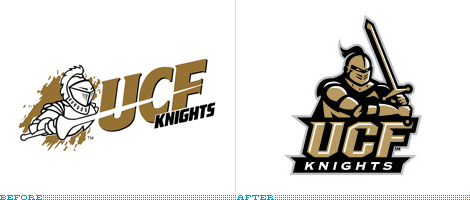
The University of Central Florida (UCF) recently updated their athletics logo with a new stylized knight. This comes at an opportune time for UCF as they are starting to become a major player in Conference USA. Designed by Rickabaugh Graphics, Inc. (consistent purveyors of sports logos), the new identity system is highly functional for all sports.
Continue reading this entry
It seems only yesterday when NYC2012 (and a West Side stadium in New York) seemed like imminent realities before London was awarded hosting duties for the 2012 Olympic Games. Now, Chicago, Ill., led by design-friendly Mayor Daly, unveils its Olympic bid designed by VSA Partners. In sum, as press-released: “The Chicago 2016 logo is styled in the shape of a torch and consists of three distinct visual components. The flame, in the shape of Chicago’s skyline, reflects the international significance of Chicago architecture and speaks to the vitality of a city that rose from the ashes. The body of the torch merges a color palette that represents the blue of Lake Michigan with the vibrant green of the city’s park system—further underscoring Chicago’s commitment to the environment and sustainability.”
Previous Page |(Total Number of Pages in Sports: 3)


