A large percentage of mass consumer packaging has embraced the More is More approach when it comes to packaging design: More starbursts, more swooshes, more information, more graphics, more, more, and more in hopes of getting your attention. Besides fragrances and perfumes, one of the few categories that has amazingly maintained a level of graphic sophistication and restraint is cigarette packaging. From the underrated simplicity of Marlboro, to the indefatigable Lucky Strike, to the sophisticated Gauloises, cigarette packs are remarkably simple — a feat all the more impressive given that most cigarette packs are only seen through heavy armorage behind counters, and next to Tylenol and Alka-Seltzer mini packs. Some cigarette brands haven’t even changed their design in ages, including Camel, whose design has remained mostly consistent since its introduction in 1913. Until this past month when the R.J. Reynolds Tobacco company updated its Camel packaging line as well as updated its blend (here is an article about Camel not running print ads anymore, where you can see a teaser for the new pack and blend) — I am not a smoker, so I can’t vouch for the quality of the new formula.
Continue reading this entry
In a world of streamlining, it seems like a lot of companies have gone to the so-called “web 2.0” look. See: xerox, at&t, Holiday Inn, wacom, etc. However, some identities have stuck to the traditional flat color look. Sodexo, one of the largest food services and facilities management companies in the world, recently updated their name and image and is one of the companies to evolve with a more traditional logo, designed by W & Cie in Paris.
Continue reading this entry
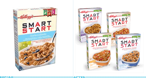
For at least eight years I have regularly eaten Smart Start cereal for breakfast. The first time I tried it, back in my Atlanta days, was simply because I loved the packaging and I thought that anything packaged in such a way could only taste good. It goes without saying that the cereal aisle in a grocery store is simply, and visually, cacophonous. Every color in the rainbow is represented through mascots, beveled typography, and giant spoonfuls of cereal — and the closest thing to white space is the milk dropping from the sky and into the delicious bowl you will enjoy if you decide to pick this, that or the other brand. Smart Start, introduced in 1998 by Kellogg’s, literally stood apart from the competition. Despite the obligatory shot of the product in situ, the box was the whitest thing my cereal-loving eyes had ever seen. Designed by Duffy & Partners, Smart Start also sported another anomaly in cereal box design: A flat logo, without shadows, and was not set on a bulging curve but, instead, on a very straight and horizontal line, and only used red and black. [You don’t have to imagine my description, you can scroll through the rest of the post to see the real thing]. As the years have passed, the Smart Start box has slowly deteriorated with modifications, nutritional-fact add-ons and other cereal-selling, visual paraphernalia, while maintaining a hint of the original design. But on my most recent unpacking of Fresh Direct boxes I gasped at the latest iteration of Smart Start.
Continue reading this entry
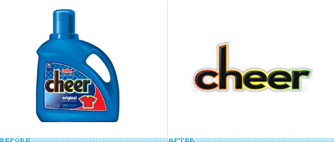
Laundry detergent: it’s one product you never think about until you need it. As a designer, it’s one of the few products I think of when I hear “consumerism.” I have this picture in my head of all the products looking the same up and down the aisles — it’s quite terrifying. Oh wait, it’s no picture in my head, it’s reality.
Continue reading this entry
Pain relief comes in many different antidotes. Sometimes pills, maybe music, or even a nap. For designers, it occurs when we see a nice redesign of a tried and true brand. Unfortunately this isn’t the case for the redesign of the headache medicine, Excedrin — a pain reliever that has been around since the 1960s and just underwent a package makeover. The new color palette is toned down from the disjointed colors of the old. It is much easier to choose which product you need at first glance now that the design highlights the product name. There is also a tag line change from “The Headache Medicine” to “The pain stops. You don’t”.
Continue reading this entry
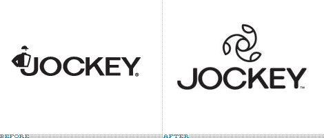
Jockey, the folks that invented men’s briefs in the 1930s have undergone a rebranding. What has traditionally been seen as a men’s underwear company (they didn’t start selling women’s undergarments until 1982) is now going gender-neutral. Their old logo was an actual horse jockey complete with cap although the name jockey was a reference to jock-strap which was the inspiration for their breakthrough underwear design.
Continue reading this entryPrevious Page |
(Total Number of Pages in Consumer products: 4)


