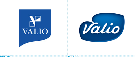
Originally established as a butter producer in 1905, Valio has grown to produce numerous dairy products in its more than hundred-year-old history and in February it introduced a new identity that will begin to roll out across their product line this month and into 2011. Hopefully our Finnish readers can contribute any thoughts about the presence of this brand in Finland.
Continue reading this entry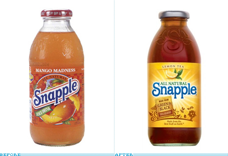
Back in December of 2007 we reported on a new range of teas by Snapple and the introduction of a new logo. While that look hadn’t yet affected the main Snapple teas I preemptively bemoaned their imminent disappearance so you may read most of my reasoning in that post. This month, along with a new formula, Snapple introduced the new bottle and label design for their core range of teas.
Continue reading this entry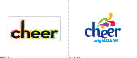
No more than sixteen months ago we reported on the change of the Cheer detergent logo and packaging, and since then we have seen good things (I think) like the introduction of the Cheer Laundress, a lady whose hands you would want your clothes in. It seemed like the brand was moving on. So, it’s very surprising that not even with a year and a half in the market Cheer’s logo and label have changed once again.
Continue reading this entry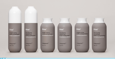
Living Proof considers itself a rather unconventional beauty product company — gathering scientists outside of the beauty field under Bob Langer, an MIT Institute Professor, lead by the former Senior VP of Marketing for L’Oreal and backed by Polaris Venture Partners in Cambridge. Their first product to get out in the wild is a line of No Frizz solutions that employ PolyfluoroEster rather than the traditional method of utilizing silicone — they’ve got a great video describing the process on their products page (right column, “watch” button). Living Proof’s elevator pitch:
Continue reading this entry![]()
After a little break from soda discussion — although the eternally climbing comment count here suggests otherwise — here is a fresh one, Sprite. Just in time for the NBA All-Star’s Slam Dunk contest which Sprite sponsors they are putting into use a new, dynamic and active logo that, in context, is actually quite decent. I’m not sure I fall for the “explosive” starburst but there is something interesting about the way the lettering and the lemon/lime interact with it. Also, I realize there is this other Sprite logo, but I can’t figure out or don’t remember if it was just temporary, but the new logo certainly seems like an evolution of that. And reader Jared Ramey pointed out that the logo might be based on this. So for a mass consumer brand trying to appear cutting edge and “with it” this is not bad. Not my style or my thing, but not bad.
Thanks to Christopher Martin and Jared Ramey for the tip.
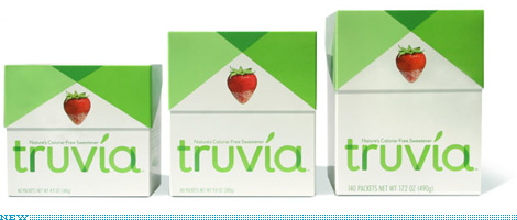
I had been meaning to write about the packaging and identity that Pentagram partner Paula Scher did recently for the new player in the sweetener category, Truvia. Then, with the swirl of the Holidays and the craziness of trying to finish things before and around them, I just kind of forgot. A couple of days ago, while grocery shopping with my parents and the rest of the Vit clan in a grocery store five or forty-three times bigger than our Brooklyn Key Food, the new Truvia packaging literally stopped me in my tracks as I reached for my own preferred sweetener (Splenda).
Continue reading this entry
CREDIT UPDATE: The new Seal was designed by Louise Fili.
I must be making all the wrong consumer choices because I had never seen or heard about the Good Housekeeping Seal that adorns the packaging (and in some cases the advertising) of everything from washers and dryers, to cell phones, and even to movers. The Seal, issued by the Good Housekeeping Research Institute — a 17,000-square-foot (since 2006 when it moved to the Hearst building) lab and kitchen testing facility with scientists and engineers as its staff — is given to products that pass their rigorous tests, granting them not just use of the seal, but entry into the its namesake magazine, Good Housekeeping, which only takes advertisers whose claims and promises can be corroborated by the Institute. The seal gives consumers a two-year warranty on any approved product and will happily issue refunds if necessary. The Seal was introduced in 1909 and, to celebrate its 100th anniversary, a new version has been released.
Continue reading this entry
Time for a palate cleanser after all that soda talk: Founded in 1979, Wine Enthusiast Companies has been providing all things wine — from products like glassware, refrigerators and wine racks, to tasting events, and to a magazine for, um, wine enthusiasts — to the ever growing market of wine consumers, from experts to novices and everything in between. For better or for worse, wine has become less the domain of experts who can sniff and swirl their way through a tasting flight to a broader market that buys their wine from Costco. (A good friend of mine and wine snob, actually praises their selection so that last sentence isn’t meant as an insult). Wine Enthusiast Co. realizes the need to expand into a broader market and that its identity should reflect the eclectic wine audience. Working with New York-based CBX, they created a whole new identity for their broad range of offerings.
Continue reading this entry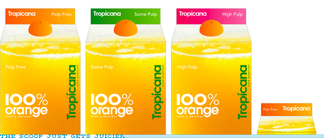
Just when you thought Pepsi week was over, comes the original scoop I had been talking about. Tropicana, another one of the Pepsi brands, has also gone under the knife… or the juicer. This is perhaps the least offensive work we’ve seen come out yet but it certainly pales in comparison to the previous line of packaging designed by Sterling Brands that hit the shelves no more than one or two years ago at the most. This new packaging feels, at best, like a discount store brand with what looks like, again, at best, rights-managed stock photography if not outright royalty free. And the typography is, once more, at best, a lame derivative of how the British have lately exploited geometric sans serifs like Futura and Avenir to great results — here’s just one example of many. And I really want to believe that the screw-cap will not be an orange-colored boobie as in the rendering above.
Continue reading this entry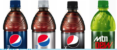
Update: Another friendly reader has sent in cans for Pepsi and Sierra Mist.
Update 2: A photo of actual cans posted on Fark has been added here.
And the goodies keep coming in! Let it be known that the week of October 20, 2008 has been declared as Pepsi Week at Brand New. A kind reader has sent in these renderings of the new bottles. Redeeming or just digging a deeper hole? You decide.
Previous Page | Next Page
(Total Number of Pages in Consumer products: 4)


