

NOTE: This is an archived version of the first incarnation of Brand New. All posts have been closed to comments. Please visit underconsideration.com/brandnew for the latest version. If you would like to see this specific post, simply delete _v1 from the URL.
![]()
The American Major League Soccer Club, Los Angeles Galaxy re-launched their brand last week in time for a new crew member, David Beckham. Originally of the British Football Club Manchester United, Beckham and wife Victoria will bring an atmosphere of skill and spice, respectively, to LA; and certainly a wider audience.
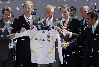
Beckham with new uniform, confetti and folks that will profit from his mean kicks.
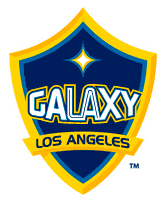
The projected popularity of the all-star team is signaled by a logo of bespoke heraldry with a bright quasar the size of the Falkand Islands. International media will have its lens on Beckham on and off the field, as evidenced in the care that was put into their new uniforms (navy at home and white away, with blue accents). Catchy copywriting, inspired by the logo is all too easy now, with many levels of astral-punnery to be had. The finest currently sits on the team site: “The Stars Align.”
Founded in 1995, the name “Galaxy” refers to the parlance of LA celebrity, “stars.” The new Quasar shield supplants the team’s former Cyclone which was more or less an overhead picture of a galaxy.
“We wanted a classic and clean look that would stand the test of time, something that generations of players and fans would wear with pride on and off the field,” said Los Angeles Galaxy President and General Manager Alexi Lalas.
— Press Release

Identity associations.
When I space out and stare at this logo, all I see is Dan Friedman’s old Citicorp logo (which is an abstract windmill.) But who cares, designers aren’t going to have this in their telescope, soccer fans will. The almost-NASA worm type may be a serious injury, but they can replace that next season. Implementation will be a cinch for those designers obsessed with pitch-perfect embroidery. An absence of gradients is pleasantly surprising. Depth has been achieved with some careful use of lines and sober color choices — here is a bigger view of the logo in pop-up form. Even though this shield is static in comparison to the former, its brevity is powerful. One can only wonder if the Spice Girls will soon have a new logo and uniforms as well.


Jump to Most Recent Comment
felix’s comment is:
i always admired the LA in gaLAxy being subtley engaged.
While theres nothing new under this sun, it does represent the city better.. and it's good to see Rutger's own Alexi Lalas doing us proud. As far as Beckham and LA.. well, you get what you ask for.
On Jul.18.2007 at 09:46 AM
Leanne Johnson’s comment is:
It's quite reminiscent of the strong, masculine logos sported by American hockey teams. It's a bit slicker than the previous design, and it says more 'L.A.' to me.
Btw, Beckham was 'originally' of Manchester United but hasn't actually been there for years. He has moved to L.A. Galaxy from Real Madrid, in Spain.
On Jul.18.2007 at 10:15 AM
Aaron’s comment is:
This will definitely look better when embroidered on a shirt or jersey. The lack of gradients is nice. I'm not happy with the star over the LA.
On Jul.18.2007 at 11:11 AM
Justin Siddons’s comment is:
This re-branding is probably a great move for the Galaxy. Not that their old mark was bad, it's just needed a color-lift. It most definitely does scream Los Angeles with it's gold crest emulating that upper class, the rich & famous, that monetary value that everyone respects out west.

One other observation, don't you just love how the "HERBALIFE" brand is most predominant on the jersey. Not the team brand but the company sponsoring the team. I foresee all sports moving in this direction, the NASCAR covered in brand look. It won't be long before the team will be branded. Instead of LA Galaxy, it would be more like "The Lasalle Bankers", or "U.S. Cellular Phones". It already happens in Japanese baseball, like the Nippon Ham Fighters.
On Jul.18.2007 at 11:15 AM
JonSel’s comment is:
I thought the Citicorp/Citibank logo was a compass rose. Where'd the windmill come from?
I can't say I'm a huge follower of soccer, but I've always been interested in how the team sponsor logo is the biggest thing on the jersey, with the club logo considerably smaller. I'm happy that isn't the norm in the other major american sports leagues. I just can't see my beloved (and mediocre this year...) Yankees sporting a giant Sprint logo or something similar across their chests.
On Jul.18.2007 at 11:25 AM
Joe’s comment is:
Jon, The Citicorp windmill was (in addition to a compass rose) an abstraction based on their "First City Bank of New York" windmill logo from 1812...say some people.
On Jul.18.2007 at 11:59 AM
rynot’s comment is:
bland, lifeless. a perfect identity for city that lacks one of it's own.
On Jul.18.2007 at 12:03 PM
Splashman’s comment is:
A very nice upgrade, and, as has been mentioned, the lack of "Web 2.0"-ishness is a pleasant surprise.
Believe it or not, I've got no complaints about this one. That's another pleasant surprise!
On Jul.18.2007 at 12:12 PM
drew kora’s comment is:
I ABSOLUTELY LOVE IT. Has a very futuristic, Federation of Planets feel to it. But at the same time it's not overly geeky or sci-fi.
Perfect and a nice departure from a lot of the sports logos we've seen lately.
On Jul.18.2007 at 12:54 PM
Anonymous’s comment is:
I like the new color scheme and the more traditional 'shield' approach to the crest, but I wish they'd retained the excellent wordmark. The imbedded 'LA' in 'GALAXY' remains creative (like Felix said) and it almost makes the larger 'LA' look redundant in the new crest. I did a quickie mockup, just for comparison.
I think it comes down to a matter of taste.
On Jul.18.2007 at 01:06 PM
Doug’s comment is:
That was my comment above...forgot to put my name in.
On Jul.18.2007 at 01:08 PM
felix’s comment is:
since we're on offense, I couldn't help but repair the goal post in one of the letterforms:
![]()
Look stronger? Theres certainly nothing unique in either... but...
On Jul.18.2007 at 02:28 PM
Kyle Z’s comment is:
”Don’t you just love how the "HERBALIFE" brand is most predominant on the jersey. Not the team brand but the company sponsoring the team.”
European soccer already does that across the board. Google search any team over there (Liverpool FC, Juventus, Bayern Munich to name a few) and they'll have a giant sponsor logo across they're jersey chest.
”It won't be long before the team will be branded.”
see New York Red Bulls.
On Jul.18.2007 at 02:28 PM
Andrew Dupont’s comment is:
Regarding the prominent advertising on soccer jerseys: I'd theorize it has to do with the need for more advertising opportunities. Soccer games don't have stoppages like the American sporting events we're used to, so there's very little room for commercials.
On Jul.18.2007 at 02:43 PM
Nick’s comment is:
Its not just soccer in Europe that's all about the advertisements, its also on the Hockey side of things as well. During international tournaments, you will often see teams with a funny looking rectangles on the forhead of the helmet with a large corporate logo, little billboards if you will. If you google "MODO Hockey", you'll get a little glimpse at what I mean. Even back when Peter Forsberg was playing, for those who know how long ago it was, there were logos dancing all over that jersey.. and pants. Soon enough the NHL will get the same treatment, with the logos overflowing from the boards to the jerseys. Its bound to happen eventually, especially with how the NHL is struggling with the American Market.
On Jul.18.2007 at 03:28 PM
Shane Guymon’s comment is:
So do we know who designed the logo?
On Jul.18.2007 at 04:41 PM
Von Glitschka’s comment is:
Nicely done.
I dare a NASCAR sponsor to simplify their branding like this.
On Jul.18.2007 at 05:37 PM
Armin’s comment is:
> So do we know who designed the logo?
From the press release:
"Adidas and the LA Galaxy worked closely with SME Brands to develop the new logo."
I like this logo a lot, surprisingly. It's almost as if it's signaling a new era for soccer crests. Simple, slightly futuristic, yet dignified in its nice crest shape. I also like the subtle dimension. And I find the NASA type on a curve oddly appealing. Plus, as a Before/After comparison, this is one of the best I've seen on this blog. The old one looked like an old rotary phone with a tornado swirling on the receiver. Very odd logo.
On Jul.18.2007 at 08:58 PM
Danny Tanner’s comment is:
I find myself drawing comparisons between heraldic crests and startrek uniform badges. Beam me up Scotty.
On Jul.18.2007 at 11:15 PM
Shane Guymon’s comment is:
Thanks Armin!
On Jul.19.2007 at 10:46 AM
Tom Dolan’s comment is:
The mark not bad, the type horrendous. Is that really some arc'd form of Handel Gothic? I thought that was outlawed years ago. If you're going to go crest/heraldic, go all the way and get Hilfiger/Polo classic. This one could be worse, but ultimately it's weak. The numerals (on the back) are bad as well. The uniform design is quite good however.
Re: Herbalife and sports billboards, it's really only the American major leagues of Football, Baseball, Basketball and Hockey that retain the quaint tradition of not plastering their uniforms with corporate sponsorship (that aren't Nike, Reebok, or Champion). I think 'going Euro' with the Herbalife (again, how LA) logo is a great move -- makes the uni seem more mature.
On Jul.19.2007 at 11:35 AM
exigent’s comment is:
I love it! The typography and star-shape works with the nature of the logo. It is astrological in all aspects due to the team's name.
Even if it does look trek-ish, it still works due to the theme.
Absolutely brilliant!
On Jul.19.2007 at 11:45 AM
humanot’s comment is:
Aaaahhh ... thats nice. Seeing a sports team just get it right, is such a nice feeling.
Simple clear symbolism, in a crest form (as thats how soccer clubs should look), and no goofy FC added to it like other teams, when its called soccer in the States, not football.
My only complaint is that their kits are embracing too much of this 'futuristic' look going on ... they're old kits had a nice iconic sash design that could have been used in this rebrand pretty well i think:

ben’s comment is:
just looks like a police department badge. There's no identity with american sports club badges as there is in other countries. They all seem so fake...and whilst the style works for basketball and baseball it doesn't work for a football(soccer) team. I hope any of that made sense :)
On Jul.20.2007 at 07:59 AM
Simon’s comment is:
I like it. I think they will with this mark have "something that generations of players and fans would wear with pride on and off the field,"
On Jul.20.2007 at 02:28 PM
Darrel’s comment is:
Space Agey. Cool.
On Jul.20.2007 at 03:57 PM
disgruntled designer’s comment is:
the lettering looks like pipe cleaners.
On Jul.20.2007 at 05:22 PM
Vavoom’s comment is:
It looks more like a car logo to me. Regardless of the colors. I see it, I see a cheap version of LAncia!
On Jul.22.2007 at 11:17 AM
John’s comment is:
MLS appears to be moving towards a contemporary Euro look for its identities. They're giving up on the visual blender look that the old Galaxy mark represented, and embracing contemporary shields and crests, a la the major Euro footie teams. Check out FC Dallas, or the recently SME-redesigned Colorado Rapids.
On Jul.22.2007 at 03:17 PM
Frank’s comment is:
The crest's depth colors/shadows make no sense for me.Makes the crest look as if it is bent inwards.They should have chosen *one* direction from where the light is coming.
On Jul.22.2007 at 07:12 PM
Ben’s comment is:
Yuck. While I'm going to avoid the technical details of this one, I'm of the opinion that the finished product looks like a rough draft. I like the direction it's going, I guess, but my gut reaction is that it lacks polish and coherence.
To me, it looks like the kind of logo a cheesy movie would come up with. But I guess a lot about that city reminds me of cheesy movies.
@rynot - LA lacks its own identity? Hardly. You're allowed not to like its identity (I go to school there and hate it), but arguing that it doesn't have one is just silly.
On Jul.23.2007 at 04:48 PM
Moriarty’s comment is:
A bit Disney for my liking but loads better than the previous one – but not too much of an issue as it's for a football team in the States and they don't have much history to build on (unlike, eg: Man Utd, Arsenal, etc…).
At least the shirts look like they're proper football shirts so wouldn't be an embarrasment to wear unlike the one they had last year with the stripe making it look like a bloody polo shirt…
Not living in the States, I've never heard of Herbalife, but is it just me or does their name and logo look like they're flogging weed?
On Jul.24.2007 at 05:41 AM
Blake’s comment is:
The colors are much improved...brighter is definitely better here, but it still looks like any other sporting team logo to me. Oh well.
On Jul.24.2007 at 08:53 AM
DadoQueiroz’s comment is:
Two things here... First of all, I'm a bit impressed with the overall mediocracy of contemporary brand making in america, as I've been seeing on this website. Beeing from abroad, I always had the feeling things were way improved up there. Of course Armin has to come up with pretty much every rebranding there is to make us come back, and one shouldn't expect the majority to be spectacular, but still...
Just to be clear, I love the site, and understand that the goal is to discuss rebrandings in general, and not put up some selection of good identities.
That said, I pass on to this one. American soccer sounds a bit of a joke to me, as when the major league started, it was like all uniforms and team logos, often referred to as shields, as in heraldry, looked a lot like NBA ones.
It so had nothing to do with what soccer is all over the world and the skill levels were generally so low that, whitout (m)any teams on international competitions (a soceer must), it all looked too amateurish.
On the one hand, it's refreshing to see a country stick to its design idiosincrasies on such an international matter, given the current global state of affairs. On the other, the logos just reinforced the amateur feel.
This new one, however, comes closer to what football (as this sport is actually played with people's foot 99% of the time, and not the other way around) is abroad. It's quite a traditional sport, for the most popular in the globe.
But we come back to the beggining. It's poor craftsmanship all over. And what's up with all those shadings? The shields are often embroidered, and that should be what it'd look like anyway in the jerseys, but... Well, that's about it. Got to get back to work. Sorry not to be more specific in my dislikes, nor come up with good examples of nice shields from present and past. But I figure you're not interested anyway.
Shaun’s comment is:
Not to get too dorky, but I instantly thought of star trek when I saw this. Which I think is great. A very hollywood, historical-futuristic take on it.

Bob’s comment is:
Soccer is a sport that is played with no commercial breaks or "TV timeouts"... I have a theory that the networks are at fault for soccer not getting a foothold in the USA... How on Earth will they advertise? That said, corporate sponsorship needs to be more visible DURING gameplay, so (I believe) that's why (in soccer) we see large sponsor logos on the jerseys.
On Jul.26.2007 at 03:37 PM
DadoQueiroz’s comment is:
Yeah Bob, as far as I'm aware, all you said is exactly right. There were even some efforts to try and make it more likewise to boom in america. Some of the projects included a bigger goal, so that scores would be higher; specified timeouts in the middle of each half and other stuff. But unlike volleyball, for instance, soccer authorities are very unlikely to approve any minor change.
On Jul.26.2007 at 08:56 PM
Comments in Brand New, V1.0 have been closed.


