

NOTE: This is an archived version of the first incarnation of Brand New. All posts have been closed to comments. Please visit underconsideration.com/brandnew for the latest version. If you would like to see this specific post, simply delete _v1 from the URL.
![]()
When one thinks about massive convention centers it’s not rare to visualize an endless maze of soulless corridors, horribly patterned carpeting, and a sense that sunlight has not seeped inside for many, many years. The 2003 AIGA National Design Conference was held in the Vancouver Convention Centre (VCC), and while there were hints of its convention centerness, the floor-to-ceiling glass windows that welcomed you as you stepped out of each session with views of mountains, sea and birds was literally a breath of fresh air. That was by far one of the best settings for a conference I have been to. Since then, the VCC has expanded and been beautified even more over the past five years. While convention centers wouldn’t be the first industry you would think of of having some serious branding energy devoted to them, VCC has risen the bar for the kind of branding these places need to start thinking about.
![]()
Four creative agencies — all part of DDB Canada — are credited in the press release, Karacters Design Group, Tribal DDB, Radar DDB and Rapp Collins; with Karacters leading the actual design end of it. Clearly, VCC was serious about this.
The Vancouver Convention Centre was built using some of the clearest glass in the world, designed to let the outside in and the inside out. Perched directly on Vancouver’s waterfront, delegates are inspired by an uninterrupted view of water and mountains. Instead of the usual literal architectural or place themed logo, Karacters Design Group developed an identity system that is evocative of the unique feeling one experiences whilst in the new facility. With layered images of water, light and glass, the identity reflects both the spacious, modern feel of the building and its spectacular surroundings. The photography-based logo prominently features the word VANCOUVER to emphasize that the brand is much more than just a facility, but reflective of the entire Vancouver experience.
— Press Release
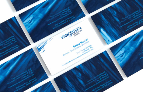
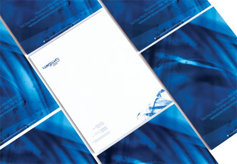

Business cards, letterhead and folder.
For the most part I want to like the logo simply because it dares to be different and step out of the conventions of typical wordmarks. I also understand the desire to translate how glassicious the VCC is and, conceptually, I much prefer this than the old logo that just rendered the architecture of the place. But my gut reaction is that I don’t quite like it, actually. The effect, to me, is a little fragmented and I just have a bad aversion to this kind of techie textured look that was so pervasive in the late 1990s and early 2000s. I do like how the identity is extended to other pieces and can see the textures being more effective there. So, in the end, I’m a little torn as I don’t want my prejudices to force to dislike the logo as I see its value, but I’m not ready to give in yet.


Print advertisements and detail of the logo used in white.
As an aside from the identity aspect, the advertisements are pretty humorous. Here is also a detail of how the logo works (or not quite well works) in white.


Jump to Most Recent Comment
Gray McCarty’s comment is:
LOVE Karacters - they do all of the Life branded stuff at Shoppers, and did some early VANOC work.
On May.08.2009 at 07:55 AM
Daniel’s comment is:
I'm not a fan.
It looks like nothing more than the word VANCOUVER cut out of a random Microsoft desktop wallpaper with a pointless smear across the middle. It's supposed to be water and glass layered and ends up looking like neither.
I like the ads, though.
On May.08.2009 at 07:58 AM
Tony Miller’s comment is:
While I certainly approve of the thought that went in to the desired goals, the end result dosn't quite work for me. In the smaller 'after' image and in the larger full color image, I think nothing more than of hurricanes and destruction. I'm not a graphics designer, though, so it's not like my thoughts make a lot of difference.
Concur with others, the ads are fantastic.
On May.08.2009 at 08:23 AM
Philip’s comment is:
I share your sentiment. This isn't a logo. This is text with photoshop 'junk' on it and it would probably look horrible as a solid icon adorning an envelope (and can you imagine that thing embroidered on a polo? yikes). Just take a look at the reverse logo on the carpet ads. It looks like a printer error. I do, however, enjoy the look and feel surrounding the new branding.
On May.08.2009 at 08:36 AM
Jonathan’s comment is:
This is not a logo, this is just jazzing up the word Vancouver with some cool effects. A real logo wouldn't look like crap when applied on the business cards and ads... YUK!!! I agree with Daniel, looks like Vancouver was just layed over some microsoft wallpaper. Besides the copywriting, the ads don't really do much for me either. This just bothers me.. yes it looks cool, but does it make any production sense at all... NO! And for that its going on my worst of '09 list, hell, it might go behind Blimpie.
On May.08.2009 at 09:30 AM
Able ’s comment is:
The branding is quite nice. Would work great for a movie about a ship in a storm.
On May.08.2009 at 09:48 AM
Ryan Adair’s comment is:
Ugh. Looks very dated.
From the lame graphics of ice (?) on the back of everything, to the kinkos style, coil-bound pocket folder thingy...this screams 1990.
Just a bunch of old tricks. Plus, I agree, as a logo it just flat out sucks.
Too bad because Vancouver is such a cool city, this is really cheap and trashy looking. What a shame.
On May.08.2009 at 09:51 AM
jRod’s comment is:
Looking at this logo makes me think that doing something truly original in a rebranding effort is getting more and more difficult. Now it seems that we have gotten to the point where we are relying on gimmicks to create something memorable. i think the font used was very good, with the C, O and U all tying neatly together. Too bad the O decided to explode. Overall a memorable rebrand that pushes the envelope of acceptable style.
"You can push the envelope all you want, but it will still be stationary."
On May.08.2009 at 09:54 AM
Gabrielle’s comment is:
while i think the logo will NOT work for most other media, it works here. Its different, attention grabbing and inspiring. How they handle embroidered shirts is going to be another issue. The ads are witty and rival the most high end of marketing schemes.
On May.08.2009 at 10:15 AM
Peter O'Connell’s comment is:
Armin
I totally agree with your take on this. I wanted to like it to and I did like the ad work but I don't think overall the look has legs.
Best always,
- Peter
emily’s comment is:
the ads confuse me. i feel the setup and payoff of the ad is not in balance.. it reminds me of student work.
its a strong idea, i think it might work better as some sort of time based media advertising.
On May.08.2009 at 10:45 AM
Kiel West’s comment is:
I really like where they set the words "Convention Centre." I think that works really well visually.
On May.08.2009 at 11:09 AM
Amanda B’s comment is:
Yeah, not working for me either. I appreciate what they were trying to do with the new logo, but I can't get behind that big random splotch in the middle of the logo.
The expansion to the convention centre looks awesome by the way. They really went all out and got a lot of local artists to contribute to the interior design in some way.
On May.08.2009 at 11:31 AM
marnie’s comment is:
Oh, it's perfect. All that business by the 'O' manages to convey burst pipe and flooding very nicely.
On May.08.2009 at 11:36 AM
Lester’s comment is:
It looks okay in full color. It's an improvement, in most senses, over the old logo; however, when printed in white like in those ads, it loses all semblence of "clear glass and water," and resembles something more like "semenal fluids on bad carpet." You would think that if they were going to trumpet the whole glass+water theme of the logo in the announcement of it, that they'd figure out an ad campaign where they were able to apply the logo in a way that kept those properties.
Also, when I see it in full color, I don't see "convention centre," I see "water filtration company." I'm not saying that all logos should try to fit into some norm and fit into the style of their competitors, but it's potentially a problem if their logo looks like a completely unrelated product or service.
On May.08.2009 at 12:19 PM
BJN’s comment is:
All I can think of looking at this logo is shattering windows and glass shards in my eyes. What's the rationale for branding a convention center with graphics that would be appropriate for an action adventure movie?
The ads are very good. The shattered logo should be swept up and put in the dustbin.
On May.08.2009 at 12:27 PM
cary’s comment is:
It's good - not great. Any logo that depends on a photoshop filter/image/blur, just can't really rise above the other stuff out there can it? If you take that glass/ice stuff away, it's boring DIN type and nothing more.
The ad work is nice, and the business collateral looks great with all that blue.
On May.08.2009 at 12:36 PM
Proverbial Thought’s comment is:
I love the color blue they used, but don't loke the way the letters are broken up like wood chips. Seems murderous on applying it to other mediums. Imagine trying to produce a lapel pin of the logo. Also, not necessarilly legiable from a distance, or up close. Not bad otherwise.
On May.08.2009 at 12:49 PM
RSG’s comment is:
It's fitting that the logo looks stormy and broken:
http://www.straight.com/article-216510/gordon-campbells-fast-ferry
On May.08.2009 at 12:55 PM
tivogirl’s comment is:
designers should think about the target audience. they are normal business people who don't "get" designers. seems that the designers more interested building their design portfolio, than the fulfilling the client's needs.
On May.08.2009 at 01:02 PM
LB’s comment is:
I hope they keep to their promise of not having ugly carpet. There must be some kind of psychological reason why meeting rooms have the most bizarre carpet ever woven. Since I'm a visual person, sometimes I fixate on it, even when the speaker is interesting. Is it the Vegas thing? Keep the carpet busy and the ceiling boring and the customers will be forced to look at the slot machines and tables? Or in a convention center, the speakers and presentations.
On May.08.2009 at 01:44 PM
Morgan Smail’s comment is:
tivogirl:
you raise a great point. I certainly agree with you that a huge portion (far too much) of design work and designer critiques come out of this sub-culture "design world" vacuum without regard for the client's audience.
However, I also feel it's possible to create "good/smart design" that an otherwise non-design-savy audience would "get" and appreciate; if done right.
On May.08.2009 at 02:08 PM
Armin’s comment is:
> There must be some kind of psychological reason why meeting rooms have the most bizarre carpet ever woven.
LB, it's a defense mechanism against dirt and stains. Same as in airports or any place with a lot of foot traffic. It's easier to conceal a ketchup stain (or something more disgusting) on a heavily patterned carpet than on a solid color one.
On May.08.2009 at 02:18 PM
Paul’s comment is:
I love the colors, but it looks like Vancouver has just been mauled to death by a bear. Which is kind of what I think might happen to me if I venture into the vast Canadian wilderness of the convention centre. Who's in charge out there? People? Or bears???
Yeah, the water / glass / etc effect doesn't really come through for me. I just see grizzly paws.
On May.08.2009 at 02:41 PM
Mike’s comment is:
That's a fantastic looking website they have.
On May.08.2009 at 03:07 PM
matt’s comment is:
Reminds me of the treatment of some Final Fantasy title logos -
![]()
something about the texture and the crackly effect.
On May.08.2009 at 06:54 PM
DC’s comment is:
Can I just make it clear that this new identity is for a completely new building - different to the one the OP visited back in 03 (although the new building is very close to the old one and still on the water's edge). The old VCC is going to be somewhat retired and wasn't large enough to attract the "bigger" shows/conferences.
That said, I agree with some of the comments here, not that well executed, at first glance it seems like someone smudged the ink on the C O U while it was still wet. The sign at the front of the centre doesn't have the "smudgeys" and this posting was the first time I had seen the new watery logo.
On May.08.2009 at 07:33 PM
Glenn Sakamoto’s comment is:
A great improvement over the original in terms of look and feel – but the "smear" is strange and disturbing. And your typical convention attendee is not going to "get it."
On May.08.2009 at 11:19 PM
Goffredo Puccetti’s comment is:
Maybe it's only me but I cannot bear any longer DIN and DIN-like fonts. They have been everywhere in advertising and corporate identity design for the last ten years...
Din aside, it is an extremely interesting identity.
Great ads, too.
G.
On May.09.2009 at 05:06 AM
Moeed’s comment is:
Not liking this at all.
Looks like a downgrade from their old logo. The symbol was nicely designed, the only thing they needed to do was work with the typography.
No matter how much time and color you put in the apps, if t he logo is not up to par, its going to look blah.
"Hey Mom, I learned how to use clipping masks today!"
On May.09.2009 at 11:00 AM
Robin’s comment is:
Call me crazy ("Hello, Crazy") but I'm not seeing the watery look.
This designer seems to blow off every rule about a good logo. It's not scalable, it doesn't hold up as a one color and it doesn't convey "convention center". I see a broken windshield at night.
I'm sure the idea started off on the right foot. Having designed for non-profit groups and government organizations, I'm guessing there was a committee that took an originally good design, had several meetings and emails and then gave birth to this.
On May.09.2009 at 04:25 PM
Joseph Maguire’s comment is:
The work is talented but the mark is overtly illustrative. I think they made it look messier than needed. But it's talented work. Busy illustrative but clean design for the rest of the print and site work. I think they should re think the mark.
On May.10.2009 at 01:01 AM
Felix’s comment is:
Looks more like a title for a B-rated horror movie...
On May.10.2009 at 02:17 AM
Paul Holstein’s comment is:
Interesting. Well executed in it's application - though the brand mark does not really do a whole lot for me.
One would be interested to see how this brand works on applications such things as embroidery (it might look like the machine that made the stitch went a little out of control).
On May.10.2009 at 09:52 PM
EGray’s comment is:
Doesnt every convention center have some stylized logo depicting the shape of the building?
I like this. The business cards and communications material look amazing.
The advertising is sharp and funny. An easy fix would be to just add a colored block along the bottom and stick in the whatever colored version of the "logo" that is needed.
I think the people who dislike this logo are envisioning more of a true logo and that was obviously not the objective here.
On May.11.2009 at 02:42 AM
Nate’s comment is:
While I won't be signing up as a member of the Vancouver Convention Center, er Centre, logo fan club, I do have to admit that the new logo captures the feeling of the premises much better than the old logo.
And this fresh logo flip in all it's tentative grungy, swashiness falls perfectly in-line with the branding. If I were to put a Loonie on this logo, I say it would live a long life and be well received in eventuality.
And on a tangent…
One occurrence I notice fairly often in this blog are the comments comparing logos to this or that. Hell, even in this thread, the logo was compared to Final Fantasy identity. Does that make it bad or good? Does it even matter?
What I mean is it seems as we move forward in these feeding frenzy logo critiques, we need to address the issue of style versus concept and how it relates to the overall function and success of the logo.
In my opinion, it's too easy to dismiss the value of a logo simply because it looks similar to something that's been done in the past. Now, I'm not talking about swiping someone else's work--that's different--I'm talking about capping on someone's work simply because it uses a 1997 swoosh or a 1955 script.
Call me a cynic, but in 2009, I thoroughly believe everything in the world of art has been done. Everything. We will not see a new logo, sign, overture, dance interpretation, or black velvet painting that can't be traced back to something similar that has already been created.
Case in point. In 1974 Chris Burden crucified himself on the back of a VW bug in the name of art. Think about that shit.
With that in mind, I feel we can only build and improve upon the layers of our past, hence the importance of studying our history. At some point we need to realize that we will not have a distinct epoch, otherwise we keep turning over the same stones in hopes of finding something new.
If we continue in this manner, the only new logos we'll see in the future will not be the next Nike swoosh, only an inferior Nike swoosh or some poor copy of a Nike swoosh. Or for that matter, the Final Fantasy logo.
Sorry for the rant.
On May.11.2009 at 02:47 AM
g-sppud’s comment is:
Interesting, but I think it falls short. There were elements of the old logo that could've been saved, keeping some of the brand recognition. While the print materials shown look nice, I'm not sure that the actual logo do anything to enhance them, as they would be equally as strong with a different logo in that space.
A shame to completely disregard the graphic elements in the previous. I think in ten years(if it even takes that long), this logo will look very dated.
On May.11.2009 at 11:25 AM
Tim’s comment is:
I liked the old logo much more. Nothing about the logo communicates the beauty of Vancouver's scenery, it seems cold and threatening (at least to me). Like a logotype for some apocalyptic sci-fi show.
And I am not sure it even works as a logo. Too cluttered. The "explosion" (?) is making it too nervous... it just seems so zeitgeisty, it's hard to imagine it will stand the test of time. Too bad...
On May.11.2009 at 12:13 PM
Fabian ’s comment is:
So this is what logo design has become...mask in some raster pretty imaginary...HOW SAD!
On May.12.2009 at 08:25 AM
Steve’s comment is:
Not a huge fan of the logo itself, but I AM liking their applications of it -- and the ads are great.
On May.13.2009 at 12:05 AM
e|v|l’s comment is:
I do think this is an improvement over the previous logo and does do a good job of portraying the venue as something more hip/cool than your typical convention center.
I do wish that since they are going with the Photoshop glass/water technique that they could have integrated it into the ads better so everything was a bit more cohesive.
Thanks,
~E
Leroy’s comment is:
Hmpf dé ja vu?
http://news.toky.com/tag/logo/
On May.14.2009 at 11:23 AM
Mark’s comment is:
It's an improvement, but I think it could have worked without the complicated background in the letters.
I'd hate to embroider this...
On May.14.2009 at 04:06 PM
Dan Warner’s comment is:
Sounds like a lot of these posts echo a few basic logoshop 101 concerns — I'm unsure if the mark scales down particularly well, for instance. And, ok, it does feel way closer to pixel-texture grunge than I'm personally into. Nor would it seem to recall the architectural elegance / sublime simplicity of the actual center described in Armin's post.
(Perhaps grunge is getting sufficiently closer to the re-chew, regurgitate & retro-resurrect stage?)
NOoooooo!
The logo speaks to me, but what it says is more, "I've just been claw-swiped by a polar bear" than what the convention center sounds like: "architecturally sublime, lets the gorgeous natural setting pour through."
On May.25.2009 at 05:16 PM
Dennis Van Staalduinen’s comment is:
For me, this one is a big fat "blech!".
Two fatal flaws:
1) It looks okay in some of the extended design treatments, but on its own, it looks broken, shattered, untrustworthy.
2) The old logo, while conventional, had a poowerful mnemonic value in that it REMINDED YOU WHICH CONVENTION CENTRE THIS IS!!! This may not be important to those who work in the building (as, presumably, the decision makers do), but to those of us from out of town, having a clear reference to this distinctive landmark on Vancouver's waterfront was very helpful.
The building IS the brand.
Check out the logo for the White House http://www.whitehouse.gov/ or the Sydney Opera House http://www.sydneyoperahouse.com/ - two of the most famous buildings on the planet, yet they still use their logo as an opportunity to remind people "oh, THAT building!"
Dull? Pedantic? Yup. But it works.
On Jun.18.2009 at 12:34 PM
Comments in Brand New, V1.0 have been closed.


