
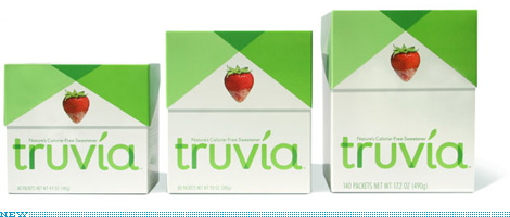
I had been meaning to write about the packaging and identity that Pentagram partner Paula Scher did recently for the new player in the sweetener category, Truvia. Then, with the swirl of the Holidays and the craziness of trying to finish things before and around them, I just kind of forgot. A couple of days ago, while grocery shopping with my parents and the rest of the Vit clan in a grocery store five or forty-three times bigger than our Brooklyn Key Food, the new Truvia packaging literally stopped me in my tracks as I reached for my own preferred sweetener (Splenda).
Continue reading this entry
As the year comes to a close and the list tradition bears on, I thought a Best & Worst selection from the 2008 archives of Brand New would be entertaining. These are my best and worst and they don’t represent the comments on each of the original posts, whether positive or negative. Other than the first item in each category (my favorite and my least favorite) the selections are in no particular order. I’ll take this opportunity too, to thank everyone that visits Brand New — every single month of 2008 our readership increases — and for all of you that send us tips, we would literally not have the great content we have if it weren’t for your contributions. Posting will be light for the next two weeks. Enjoy your Holidays and have a happy new year.
Continue reading this entry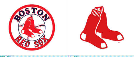
I vividly remember the day I stopped watching baseball: It was the day I never started watching it. In part this makes me completely inappropriate to judge anything related to a team with one of the most ardent set of fans, but just as well, this objective detachment from the history of the Boston Red Sox or any nostalgia towards their iconography may be the best suited to pass graphic judgement. This week, the Red Sox unveiled new primary and alternate home and road uniforms plus a new(ish) logo. (Plenty more images and news if you search online for “New Red Sox Logo.”)
Continue reading this entry

Many changes happened across the CNN network this week, most notably the replacement of the on-screen ticker at the bottom of the TV with the “flipper.” The other notable change is the redesign of the CNN Headlines News logo, which has dropped the CNN and moved away from the overarching use of lowercase sans serif and red. As far as speech bubble logos go, this is perhaps one of the nicest and most appropriate. It feels contemporary and hardcore, just like the channel itself. At first I was taken aback by the HL ligature, but it’s actually quite smart as it creates a better acronym than just HN and reminds people that “headline” is one word. You can never have enough grammar and spelling lessons in the world. This is a nice move to give Headline News its own look and feel that doesn’t rely so much on its parent identity.
Thanks to Geoffrey Sorensen for the tip.
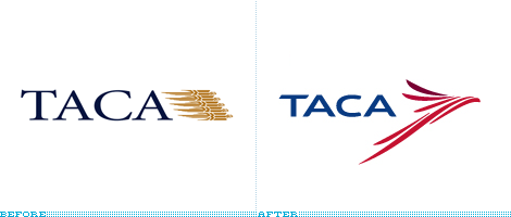
Connecting the American content, from South to North and for 77 years, TACA —Transportes Aéreos del Continente Americano (Air Transport of the American Continent) — unveiled a new identity at the end of September. (Sorry for the delay on this one!). I believe the golden thingies in the old logo were super streamlined eagles, and they were in need of a major overhaul that they handsomely received from Lippincott. This is a really great update, the new icon is elegant and dynamic with an inherent motion that most airline logos strive for but rarely achieve even when they “italicize” every element of the identity. The wordmark is also rather nice, and it evolves the extended serif from the previous logo with a custom sans serif that complements the icon very well. The one thing I don’t get is the purple “crest” at the top of the eagle’s head, it seems a little unnecessary to add that third color. And the one thing that did disappoint was the livery, it just seems like the identity would have lent itself to a much more engaging and attractive design on the airplane. Nonetheless, one of my favorite icons of the year.
Continue reading this entry
It’s important to note that Sender did the logo and initial identity standards but it was art director John Slabyk and creative director of new media Scott Thomas who extended the identity into novel and exciting executions, like the mutable logos for different sectors of the population.
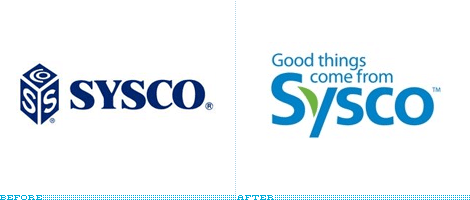
Sysco is the largest distributor of food-service related items in the U.S., with approximately 9,000 trucks delivering all sorts of food (frozen, canned, produce) as well as tableware and kitchen equipment to restaurants, fast food chains, colleges, hospitals and hotels. Last month Sysco unveiled a new identity to replace its 38-year-old cube logo used since its inception, which was quite a work of art (not) in its attempt to make the most clever interpretation of the acronym for Systems and Services Company. The new logo does away with the acronym and turns it into a proper name by going with the friendlier “Sysco” building on the familiarity of the name and surely the lack of anyone asking what SYSCO stood for. The new logo is meant to emphasize Sysco’s commitment to sustainability and delivering quality products. I very much like this new logo — I would have probably chosen another typeface (Gotham for all you haters!) and drawn the leaf differently but it doesn’t really matter — as it creates a memorable logo from a very simple typographic treatment. I hate the tag-line being shoved in there so tightly and being so dependent of the logo. A great improvement overall.
Thanks to Hsu Cennatian for the tip.

The United Football League (UFL) is a new professional league that is set to begin its first season in August of 2009 with eight teams in markets where that other professional football league isn’t and if it doesn’t get crushed by lack of ratings or attendance it will probably serve as sort of a minor league for the NFL. This week the UFL unveiled a new shiny logo. I really like the color choice, I think U.S. professional leagues get too enthralled with the red-white-and-blue combo that they forget other colors exist; I like that it’s the green field and the open skies above, although I’m sure they’ll play at night or in closed stadiums. The type is, well, whatever, it’s footballish. The ball and star icon are a little awkward, and I’ll leave it up to everyone else to say what it looks like. The overall shape is interesting — it reminds of the New Jersey Nets logo — as it avoids pure symmetry, which can sometimes make a logo hard to work with, but it also makes it stand out. I would have loved to see this without the shading and gradients and just the shadow of the ball and star, would have been pretty strong. While play begins for the UFL you can play Name Consultant and suggest team names.
Thanks to John Quijano for the tip.
Next Page(Total Number of Pages in December 2008: 2)


