


….bzzz….snap….crackle…awheeeeeeyoooooo…distortion….static…fade in…. Excuse me while I break into your regularly scheduled programming of corporate identity changes to focus on another aspect of Brand™: packaging. I’ve worked in both the corporate identity and packaging fields for over 10 years now. If I could sum up my general feeling on mass-market packaging (in the United States), I’d say it sucks. At some point, there are only so many variations one can do on ribbons, splashes, swooshes, dimensional type and fake water droplets. When small percentage points of market share can mean hundreds of millions of dollars, you can kind of understand. Kind of. So it thrills me to no end when someone of stature refuses to do it anymore.
I present the New Old Coke.
Continue reading this entry![]()
Jiffy Lube, the quick oil change company, decided it was time to update their highly recognizable mark and go horizontal. Jiffy Lube was founded in 1979 and was the first company to have a drive through service bay — signaling a new trend in the business of oil-changes.
Continue reading this entry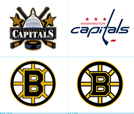
Before we start, let’s get something out of the way. I don’t watch Hockey and I can’t tell who’s who or what’s what. The closest I have come to enjoying Hockey, and knowing anything about it, was when I used to play Electronic Arts’ NHL Live on my Sega Genesis back in the early 90s and my favorite team was Chicago, with its Roenick-Chelis-Belfour trifecta which allowed me to humiliate my fellow high schoolers. Perhaps it’s because I haven’t watched a game in this century and, to this day, I’m still baffled that a Disney movie became a real team, but I have always felt that Hockey (the NHL in particular) was more “Old School” than the NBA or the NFL with their hot cheerleaders, mainstream fans and flashy events. Hockey, on the other hand, seems (to me) like an acquired taste — a rugged taste, best served cold. This feeling was then confirmed when this past week, two teams unveiled new identities — designed in the 21st Century — that are decidedly (with mixed results) Old School.
Continue reading this entry![]()
Guest Editorial by Joe Marianek
Earlier this month, Landor Associates announced a new name, strategy and identity for The Paley Center for Media; formerly the Museum of Television and Radio, with branches in Los Angeles and New York. The Paley Center for Media offers a curated collection of privately-donated media, holds panel discussions, and screenings in its theaters. The Paley Center doesn’t feature physical Smithsonian-type artifacts like vacum tubes, Alf’s carcass, or a comprehensive collection of everything ever broadcast on television and radio. What it does offer is a curated collection of 140,000 programs that one can access.
Continue reading this entry![]()
Guest Editorial by Ryan Hembree
In April, Unum, a leading employee benefits provider in the United States and the United Kingdom, unveiled a new identity in an attempt to better communicate the company’s core competencies and focus. Formerly UnumProvident, the company’s new logo, designed by The Gate Worldwide, is visually superior to the old — while at one time the highly patriotic logo probably appealed to companies based largely in the United States who desired to “buy all things American” (and who doesn’t love the logo’s ode to “Ole’ Glory’s” stars and stripes?), the company’s products and services have expanded well beyond the borders of this country and into Europe. And in today’s geo-political climate, looking “American” might be considered a liability and unpopular with an international audience.
Continue reading this entry![]()
It seems everyone knows the brand “AstroTurf” but what many might not realize is AstroTurf has not been used in any major U.S. professional surface since 2005. AstroTurf has become as ubiquitous in language and common use as other brands like Kleneex, Band-Aid, or Q-Tip — yet AstroTurf owns no market share in the United States, even as a category creator. AstroTurf hopes their new identity and marketing campaign will put them a step above their competition and cut into the market share, mostly held by FieldTurf.
Continue reading this entry![]()
As was discussed in our recent UCF post, the state, style and aesthetic of sports logo design has changed dramatically. No longer are simple icons like the Chicago Cubs and Bulls or New York Yankees and Mets the desired goal for a new sports identity. Too simple and boring, perhaps. In return we have illustrations that act well enough as logos — as long as you don’t reduce them to less than a couple of inches. But this is not new, sports branding has been steadily changing in the last ten years to the overdeveloped design we know today and has become a niche within identity work. Firms like SME Power Branding and, at the core of this post, Phoenix Design Works have turned beveling and dimensionality into an art form, spread across leagues and sports. This is the way it is. But has it gone too far? And can we ever go back? Late last month the official logo of a new Minor League baseball team, the Northwest Arkansas Naturals, was unveiled. And if ever there was a logo that needed unveiling was this one, with so many elements involved.
Continue reading this entry![]()
If you hate and mistreat animals, please stop reading now and go bang your head against a brick wall. If, on the other hand, you love animals and are offended and saddened when hearing stories of cruelty or mistreatment of our often furry companions on earth, I have a great logo to cheer you up. The Humane Society of the United States (HSUS), “the nation’s largest animal protection organization with more than ten million members and constituents”, now serving animals for more than 53 years, recently updated their previous bureaucratic-looking identity for a lively, all-encompassing new identity full of proud fauna.
Continue reading this entry![]()
First, thank you all who e-mailed in a branding frenzy to let us know about this new identity. As an exception to the rule, this identity has been posted on Speak Up, Brand New’s “mom”, so that we can have a broader discussion with the broader design community. You are all invited to read and comment on: London, How do I Hate Thee? Let me Count the Ways, 1, 2… 2012
![]()
Some of the hardest identity projects are for cultural institutions: Long names coupled with (or replaced by) funny-sounding acronyms, high expectations, opinionated board members and a need to appear, well, cultured. [Book recommendation: C/ID]. Dance institutions (of any style and kind) prove even harder, as there is an added layer of complexity that revolves around the inevitable desire to convey the dynamism and movement of what is being shown on stage or offered in their programming. MetaDesign (of Erik Spiekermann and Adobe packaging fame) have taken this challenge and redesigned the identity of the San Francisco Ballet with an entrechat of cropped and baseline-shifted classic Didot and contemporary Galaxie Polaris.
Continue reading this entryNext Page
(Total Number of Pages in June 2007: 2)

