
Ditech, the infamous mortgage loan company, ditched the awful swoosh-mouse-cursor-Optima logo and upgraded to a clean sans-serif look. Along with the new logo, designed by L.A.-based Ground Zero, comes a new campaign slogan, “People are smart.” The irony is I can’t quite figure out what the new logo represents. Or maybe I’m not their kind of people.
Continue reading this entry
I have always been disgustingly fascinated by the name “Fifth Third Bank”. Specially since I had no idea where it came from. I wondered, how stupid can a bank be that divides anything into two times more than it mathematically could? Having never had to satisfy that curiosity until today — since I bank at Pentagram-designed banks only — I finally learned that the name comes from the merger of Fifth National Bank and Third National Bank almost one hundred years ago, in 1908, forming Fifth Third Bank. In the same vein, the old logo has consistently struck me as both repelling and fascinating, with its ultra thickness, italicism and super curves. Luckily, with a redesign by Cincinnati-based branding agency Deskey, I have now come to peace with my paradoxical feelings: I just find it repelling, nothing else.
Continue reading this entry
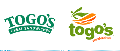
I love me a good sandwich. Whether it’s from Subway, Quizno’s, Jimmy John’s (probably some of the best), or the unnamed deli down the corner I appreciate the art of a good, balanced sandwich. Togo’s however, was never on my lunch considerations. One, because it was always next to a Dunkin’ Donuts and/or Baskin Robbins — making perfect sense since they are all part of Dunkin’ Brands food chain — second, because I could never figure out how to pronounce the name (silly excuse, I know), and third, the logo always seemed like a cheap, fast foodish hole desperately trying to look healthy, in that Whole Foods logo kind of way. One day, in Chicago, with little time for lunch and a Togo’s on the opposite corner from my previous office it was the only choice. Boy, was I surprised: They make a good sandwich. Good amount of turkey, cheese, greens and just enough Mayo oozing from the sides. Clearly I wasn’t aware of their founding principles, “freshly prepared, generously portioned, made to order sandwiches.” Nor did I know that Togo’s was a California-bred sandwich shop — with their previous logo, my best bet would have been New Jersey-bred, no offense. With their new logo, Togo’s is claiming its sea-side origins and laid back attitude by embracing a surfing dude, ripping some waves on what I would think is a surfboard/salami sub and a quirkily-set wordmark. All of which I, well, hate. But at least I know what Togo’s is about now and what to expect. And that can’t be that bad. Like their sandwiches.
Thanks to Daniel Khamsing for the tip.

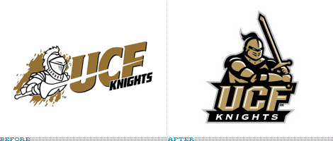
The University of Central Florida (UCF) recently updated their athletics logo with a new stylized knight. This comes at an opportune time for UCF as they are starting to become a major player in Conference USA. Designed by Rickabaugh Graphics, Inc. (consistent purveyors of sports logos), the new identity system is highly functional for all sports.
Continue reading this entry
This one comes with little background or explanation, and it may be somewhat old — a quick test, if you are interested, is doing a Google image search for “[blank] logo” and if the logo is fresh it won’t come up as it hasn’t circulated the web enough. But enough about searches. Let’s talk swooshes, gradients and bold, uppercase italics with strokes around them. AdvoCare, “a premier health and wellness company offering more than 70 exclusive nutritional and skincare products” has definitely undergone a transformation… Perhaps to demonstrate the power of their products? The old logo looked more like car insurance or healthcare for senior citizens, whereas the new logo has caught the case of Logo Sportsitis — where icons and type become pointy, italicized and multi-stroked — to appeal to the health- and fitness-conscious. (Although maybe to a fault?) Unlike other sports logos, that are at least carefully crafted, AdvoCare’s looks cheap and like a knock-off you wouldn’t want to put into your digestive system.
Thanks to Lance Ford for the tip and Colorado Avalanche comparison.

Guest Editorial by James Bowie
Redfin, a Seattle-based online real estate service, was content with its little house-in-a-circle logo until Move.com threatened to sue to protect its house-in-a-circle mark. So Hornall Anderson Design Works was enlisted to create Redfin’s new identity, which features, in addition to a stronger wordmark, a more elaborate logo. It shows an aspiring homeowner (clearly a graduate of the Dallas Independent School District) reaching to pluck his ideal house out of the crowded market. And the whole thing looks like a tree!
Continue reading this entry
From the Department of No Way I Would Have Ever Known Without Someone On The Inside Filling Me In comes this tale of identity change from the deepest corners of Canada. To add to the intrigue, our informant wishes to remain anonymous.
Continue reading this entry
Like most major airlines this century, Delta Air Lines has had it rough: A number of restructurings, route changes, personnel cuts, the precipitous (and, I imagine, costly) rise and fall of its low-fare carrier Song, and eventually its filing for bankruptcy. But as has been apparent in the last two or three years people are back in the air and flying their butts off, crowding every possible plane at every possible hour, so it’s no surprise that Delta (and United before it) have been able to slowly exit from such sad, demoralizing state. On April 30, Delta emerged from bankruptcy protection as an independent carrier and what better way to celebrate than in style? With a new logo and new livery design, courtesy of New York-based Lippincott Mercer.
Continue reading this entry(Total Number of Pages in May 2007: 1)


