
A B-Side BY Armin
YEAH!

About: (Est. 2013) “YEAH! is a new online movie site that takes your favorite movies — movies you know and love — and dissects them in ridiculous detail, surrounded by factoids, secrets, brand new interviews, quizzes, polls, and much, much more.” YEAH! comes from the folks at AMC.
Design by: Trollbäck+Co.
Ed.’s Notes: It all kind of works and in terms of speech bubble logos this is one of the more attractive ones but, yeah, it’s still a speech bubble logo. Samples of the visual language below (or after the jump). A few motion samples at the case study link below.
Update: I’ve been informed by Trollbäck+Co that the speech bubble is not meant to be a speech bubble, but a “flag or pointer”.
Relevant links: Trollbäck+Co case study.
Continue reading this entry

DATE: May.29.2013 POSTED BY: Armin
 CATEGORY: Entertainment The B-Side
  COMMENTS:

TAGS: movies, speech bubble, trollback and company, yellow,

A B-Side BY Armin
Seattle Office of Arts & Culture

About: (Est. 1970) “The Office of Arts & Culture promotes the value of arts and culture in and of communities throughout Seattle. By fostering and investing in the creative contributions of our artist citizens to every facet of the community, we engage the creativity in every resident and build a healthy and vibrant Seattle.”
Design by: Civilization.
Ed.’s Notes: Not sure what it is about this one, but I like it. Bigger view of the logo and sample application below (or after the jump).
Relevant links: Arts & Culture Office blog post.
Continue reading this entry

DATE: May.28.2013 POSTED BY: Armin
 CATEGORY: Government The B-Side
  COMMENTS:


A B-Side BY Armin
Continental
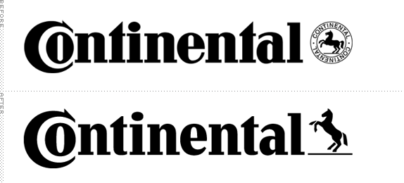
About: (Est. 1871) “Continental was founded in Hanover in 1871 as the stock corporation ‘Continental-Caoutchouc- und Gutta-Percha Compagnie’ Manufacturing at the main factory in Hanover included soft rubber products, rubberized fabrics, and solid tires for carriages and bicycles. Today, Continental ranks among the top 5 automotive suppliers worldwide. As a supplier of brake systems, systems and components for powertrains and chassis, instrumentation, infotainment solutions, vehicle electronics, tires and technical elastomers, Continental contributes to enhanced driving safety and global climate protection. Continental is also a competent partner in networked automobile communication. With around 170,000 employees (Status: December 31, 2012) in 46 countries, the Continental Corporation is divided into the Automotive Group and the Rubber Group.”
Design by: Peter Schmidt Group.
Ed.’s Notes: It’s time to play “Spot the Difference”! It’s a nice update, specially to the horse. Application image below (or after the jump).
Relevant links: Annual Shareholders’ Meeting presentation (PDF). News story (in German).
Select quote: “The revamped, more contemporary, fresh design represents the positioning of the Corporation. The message it projects is this: Our technological solutions are helping people enrich the quality of their lives through mobility and structure their living space in a sustainable way.”
Continue reading this entry

DATE: May.24.2013 POSTED BY: Armin
 CATEGORY: Corporate The B-Side
  COMMENTS:


A B-Side BY Armin
Winsor & Newton
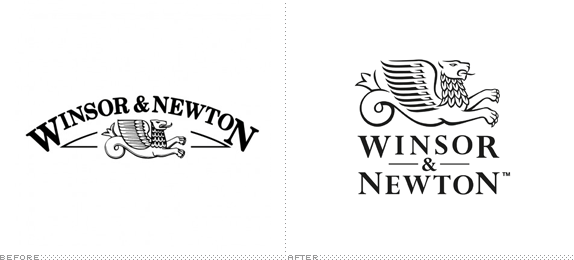
About: (Est. 1832) “Winsor & Newton is the world’s leading brand of fine art materials and has developed an unrivaled reputation for quality, reliability and product innovation. We proudly maintain our pledge of manufacturing ‘The World’s Finest Artist’ Materials.’ We have built our reputation on the quality and reliability of our products, combined with continual product development, improvement and innovation. However, while keeping true to the principles laid down by William Winsor and Henry newton in the 1800’s we actively embrace new ideas, new technologies and search the world for the best raw materials available.”
Design by: Pearlfisher.
Ed.’s Notes: A nice update. Nothing too drastic. A handful of application images below (or after the jump).
Relevant links: Press Release.
Select quote: “The original marque was lost on an information heavy pack. We have strengthened the hierarchy and optimisation on pack by giving the brand a strong and central place at the top — with the logotype redrawn and reformatted. The Griffin has been redefined and removed from the holding device of the arch to give it more status and clarity as a true icon that has more synergy with the brand.”
Continue reading this entry

DATE: May.23.2013 POSTED BY: Armin
 CATEGORY: Consumer products The B-Side
  COMMENTS:

TAGS: packaging, paint, pearlfisher, serif,

A B-Side BY Armin
Mercado Libre

About: (Est. 1999) “MercadoLibre.com (literally “free market” in Spanish) or MercadoLivre in Portuguese (Brazil, Portugal) is a website dedicated to e-commerce and online auctions. It is eBay’s Latin American partner. MercadoLibre is Latin America’s number-one e-commerce site. It is currently present in Argentina, Brazil, Chile, Colombia, Costa Rica, Dominican Republic, Mexico, Ecuador, Peru, Portugal, Panama, Uruguay and Venezuela.” (Source: Wikipedia)
Design by: Imaginity.
Ed.’s Notes: No es bueno. Exposed grid and step-by-step devolution of Helvetica below (or after the jump).
Relevant links: Imaginity case study. News story about their $10-million media buy.
Select quote: “We have refreshed and modernize the identity whilst retaining the inherent equity held in the current look and feel. We took some of the current brand elements to reflect the heritage and also support the brand for the next phase of the company’s growth. You will still see the iconic handshake but the typography and colours have been updated.”
Continue reading this entry

DATE: May.22.2013 POSTED BY: Armin
 CATEGORY: Retailers The B-Side
  COMMENTS:

TAGS: custom, hands, helvetica, latin america,

A B-Side BY Armin
Emma
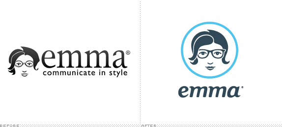
About: (Est. 2003) “Emma is a web-based email marketing service helping more than 40,000 customers manage their online communication efforts. With sophisticated design, easy-to-use features and stellar customer support, it’s the easiest way to create, send and track stylish email newsletters and campaigns.”
Design by: In-house (Chris Korbey, Creative Director).
Ed.’s Notes: Sexy librarian, anyone? Logo variations below (or after the jump).
Relevant links: Emma blog.
Provided quote: “The new logo is simpler, more modern and more flexible, but the real story is in the wordmark. Emma is dedicated to great design — even within the tight parameters of HTML for email. One of email’s biggest restrictions is a limited choice of typefaces. Web fonts don’t work with email, so you’re beholden to system fonts. With that in mind, we created the new wordmark from Georgia Bold Italic, which every Emma user has access to. The letterforms were customized to marry with the new Emma face, but the logo pays homage to our customers.”
Continue reading this entry

DATE: May.21.2013 POSTED BY: Armin
 CATEGORY: Technology The B-Side
  COMMENTS:


A B-Side BY Armin
Fusion (TV)

About: (Est. 2013) A new TV channel by ABC News and Univision News, “Fusion capitalizes on Univision’s news leadership and expertise in reaching U.S. Hispanics and ABC’s global news leadership to serve over 50 million Hispanics, the youngest and fastest-growing demographic in the U.S. Currently, Hispanics represent 16 percent of the total population in the United States, a number that is projected to double to 30 percent by 2050. Hispanics wield considerable spending power of over $1.2 trillion and have an increasing impact on social, economic and political trends.”
Design by: Logo: Caspar Nonner through Buster
Ed.’s Notes: Univision continues its streak of commissioning (and approving) unintelligible logos and watered-down versions of the parent brand wordmark. Bigger view of the logo below (or after the jump).
Relevant links: ABC press release.
Select quote: “‘The logo is a powerful representation of Fusion’s identity. Our brand will reflect the attitude of millennials — shaped by a sense of unity with a voice that’s fun, fresh and even irreverent,’ said Beau Ferrari, interim President for Fusion and Executive Vice President of Operations for Univision Networks. […] ‘This shape is bold, evolving and engaging. It is an iconic stamp that will be instantly recognizable,’ added Michael Berkman, VP and Creative Director, Fusion.”
Continue reading this entry

DATE: May.20.2013 POSTED BY: Armin
 CATEGORY: Entertainment The B-Side
  COMMENTS:


A B-Side BY Armin
Gala TV
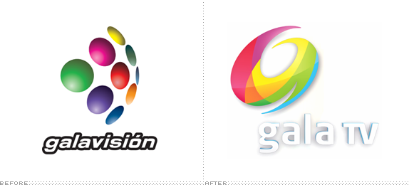
About: (Est. 1968) “Gala TV is a Mexican television network owned by Televisa. Originating at XEQ-TV in Mexico City, the network is distributed throughout Mexico through affiliates. […] The Gala TV schedule features mainly reruns of major Mexican telenovelas, reruns of Televisa series, soccer and lucha libre.” It was formerly called Galavision. (Source: Wikipedia)
Design by: Logo: Ideograma. Motion: Troika
Ed.’s Notes: This is not to be confused with the U.S. version of Galavision, covered here. It is also not to be confused with a subtle, sophisticated logo. Bigger view of the logo below (or after the jump).
Relevant links: Televisa press release (in Spanish). Troika case study (only still frames).
Select quote: (translated with Google from Televisa press release) “This development will also be reflected in the new logo graphic image GalaTV that integrates three key areas: one stylized G comes from Galavision, its former name, a number 9 the channel in which currently airs in several cities, and range of colors representing the color bar television and dynamic and lively spirit of the new proposal, as well as a mosaic of colors that are a reflection of our spirit.”
Continue reading this entry

DATE: May.17.2013 POSTED BY: Armin
 CATEGORY: Entertainment The B-Side
  COMMENTS:


A B-Side BY Armin
West Chester University
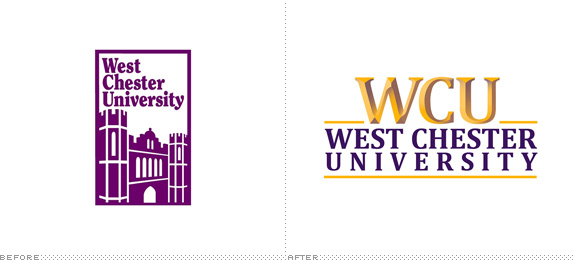
About: (Est. 1812) “West Chester University has evolved into a comprehensive university which excels in teacher education, business, health, natural and social sciences, music and the arts. Ranked among Kiplinger’s 100 best values in public colleges for its academic quality and affordability, the University is committed to providing access and serving the educational needs of a diverse student body. The second-largest school in Pennsylvania’s State System of Higher Education and the fourth-largest university in the Philadelphia area, West Chester is a leading resource and partner in fostering the region’s economic, social and cultural vitality. Its 400-acre campus is situated in the beautiful, historically significant Brandywine Valley. Today, West Chester University offers more than 80 undergraduate and 70 master’s degree and graduate certificate programs.”
Design by: Erica Thompson with help from graphic designer, Joan Lordan.
Ed.’s Notes: I don’t know what’s worse, the cheap chiseled effect or the horrendous tracking difference between “West Chester” and “Uiversity”? Why choose. Both are. A few different views of the logo below (or after the jump).
Relevant links: WCU New Logo Unveiling.
Select quote: “In spring 2012, concurrent with the strategic planning process, Dr. Greg Weisenstein, president, invited the Marketing Committee to develop a new logo for West Chester University to give WCU’s main graphic image a fresh, updated look.”
Continue reading this entry

DATE: May.16.2013 POSTED BY: Armin
 CATEGORY: Education The B-Side
  COMMENTS:

TAGS: chisel, university,

A B-Side BY Armin
Accuweather

About: (Est. 1962) “AccuWeather is the World’s Weather Authority. They provide local forecasts for everywhere in the United States and over two million locations worldwide. They also provide products and services to more than 175,000 paying customers in media, business, government and institutions. AccuWeather headquarters are in State College, PA, home to the greatest number of forecast meteorologists in one location anywhere in the world.”
Ed.’s Notes: Forecast for this new logo: sunny!
Relevant links: Accuweather press release.
Select quote: “The updated identity system prominently features a sun icon along with the ‘AccuWeather’ name appearing in a warm orange tone. Orange was chosen as the new corporate color after extensive international research on color usage and meanings in various cultures. The orange tone is meant to reflect warmth, friendliness, and trust.”
Thanks to James I. Bowie for the tip.

DATE: May.15.2013 POSTED BY: Armin
 CATEGORY: Media The B-Side
  COMMENTS:


