
BY Christian Palino
Vectors and Gradients Run Rampant: The New Swiss Style
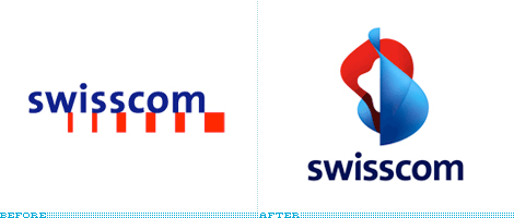
Swisscom is Switzerland’s largest telecommunications company, delivering services and products for mobile, fixed and IP-based voice and data communications. Since 1997 — when PTT’s (Post, Telegraphy and Telephony) telecom division went public as a limited company — Swisscom has sported its blue and red, boxy corporate logo… “[the previous logo] with its simple style, combines the human side of technology with the image of credibility and security offered by a traditional company.” The previous logo was traditional indeed, perhaps even downright stagnant. And as with so many large corporations of late, the old logo has gotten thrown out the window to live amongst the lost hits of Hanson and Toni Braxton (that’s right, Hot 100 number-one hits of 1997!), making room for the more contemporary and trendy image.
Continue reading this entry

DATE: Dec.19.2007 POSTED BY: Christian Palino
 CATEGORY: Telecom
  COMMENTS:

TAGS:

BY Armin
The Wave of the Future
When it comes to telecommunications companies the modus operandi is apparently clear: The bigger, the better. And what could be bigger (and better?) than a new joint spin-off company by, already-big corporations, Finland-based Nokia and Germany-based Siemens, two of the most influential technology companies in the world. The result is Nokia Siemens Network (NSN). Like most telecommunication giants (Alcatel-Lucent, Ericcson and Cisco), NSN’s scope is broad, ambitious and ambiguous so creating an identity around it becomes increasingly complex. Moving Brands, a London-based branding agency — and a newcomer to the highly public branding game — scooped the project from a handful of the major players and proceeded to create and, most amazingly, launch a new identity in the span of two months, premiering at the 3GSM World Congress in Barcelona this past February.
Continue reading this entry

DATE: Mar.25.2007 POSTED BY: Armin
 CATEGORY: Telecom
  COMMENTS:

TAGS:

BY Armin
A + L = Infinity
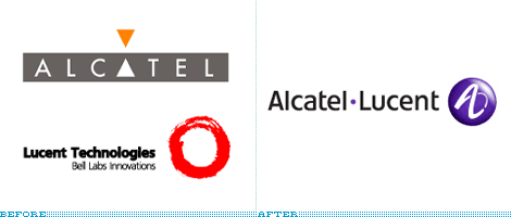
In April of 2006 Paris-based Alcatel announced that it would merge with New Jersey-based Lucent Technologies, creating one of the world’s biggest telecommunications companies. This past December 1st, the merger was official and a new identity for the siamesed company was unveiled.
Continue reading this entry

DATE: Dec.02.2006 POSTED BY: Armin
 CATEGORY: Telecom
  COMMENTS:

TAGS:

BY David Weinberger
Whatever It Is, It’s Extreme
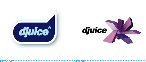
djuice is one of the worlds leading mobile content providers for young people. Wolff Olins, who also helped rebrand djuice’s parent company Telenor earlier this year, created the new identity.
Ok, I am clearly not the audience here as I’ve never downloaded anything on to my phone. Until last year, I still used a StarTac and still would be if it didn’t break. So it’s probably not important that I’m not exactly sure what the new logo is. I do know, however that whatever it is, it’s extreme. So extreme, maybe I should have spelled it x-treme. Don’t let it get too close to your eye, it may stick you.
Continue reading this entry

DATE: Nov.05.2006 POSTED BY: David Weinberger
 CATEGORY: Telecom
  COMMENTS:

TAGS:

BY David Weinberger
Verizon Comes Back for Seconds

There are a handful of logos out there that most of us can agree that we don’t like and no, UPS is not one of them. PricewaterhouseCoopers definitely and I’d say Verizon. Although we can’t completely blame Landor, they created the Verizon name and most of the logo in 2000. Well, Verizon must have been happy, because after 6 years, Verizon came back and asked Landor to create a name and logo for a spinoff of their directories business. The result is Idearc.
Continue reading this entry

DATE: Nov.04.2006 POSTED BY: David Weinberger
 CATEGORY: Telecom
  COMMENTS:

TAGS:


