
Opinion BY Armin
Microsoft Office, Version Bland.0
It’s no secret that I do not — repeat, do not — enjoy the design stylings of Microsoft. But that’s like a 5-year-old saying he or she does not like broccoli, except for the fact that not even with age does the Microsoft taste become acquired. Part of these raging feelings against Microsoft are fostered by their applications that defy user-interface standards of comfort and friendliness. Granted, this is mostly for us, designers, for whom the mere sight of an Excel, Word or PowerPoint file can bring us to our knees, as we struggle to find something as natural as the letter-spacing option. Regardless of what most outsiders see as diva-like apprehension towards these applications, and no matter how much chutzpah Apple or Google bring to their own productivity tools, Microsoft Office — the Trojan Horse bundle of “productivity” suites that includes the aforementioned, plus Outlook, plus nightmares like Publisher — makes the world turn, twenty years after its v1.0 debut. This past December, Microsoft released a Beta version of Microsoft Office 2010, which will replace Office 2007 for PCs and Office 2008 for Macs.
Continue reading this entry

DATE: Jan.19.2010 POSTED BY: Armin
 CATEGORY: Technology
  COMMENTS:

TAGS:

Opinion BY Armin
Smile, You are on Friendster (or Not)
Before there was Twitter and Facebook — and even before there was MySpace, so we are talking internet aeons here — the original social network was Friendster, launched in March of 2003 to the tune of three million subscribers within months of its release. Today it claims 110 million members worldwide yet, despite that high figure, it seems Friendster disappeared as the now famous and highly embraced social networks improved upon its premise and they all gathered their own millions of subscribers across the world — that is, except for the Philippines, Indonesia and Malaysia and, to a smaller degree, Australia where Friendster remains relevant and with a devoted following. Last Friday, Friendster relaunched its web site with new features, a new look, designed by Sydney-based Yellow Studio Yello, and a new tag line, “connecting smiles.”
Continue reading this entry

DATE: Dec.07.2009 POSTED BY: Armin
 CATEGORY: Technology
  COMMENTS:

TAGS:

Opinion BY Armin
Equal Sign = Exact
Established in 1984 in Delft, the Netherlands, Exact serves over 100,000 customers with business software and solutions, employing over 2,400 employees in 40 countries. (I’m not in the business software and solution software, but isn’t 2,400 people too many? I digress.) To celebrate its 25th anniversary, Exact introduced a new logo designed by Brussels based Duval Guillaume.
Continue reading this entry

DATE: Nov.23.2009 POSTED BY: Armin
 CATEGORY: Technology
  COMMENTS:

TAGS:

Opinion BY Armin
Wi-Fi (and Gotham) Certified

Whether I’m traveling or just idle in between things, and I have my laptop with me, there is nothing more pleasant than finding an open Wi-Fi spot. Open or not, Wi-Fi has become not just essential but an expected feature of today’s living and working environments, so it’s easy to overlook that this connectivity is made possible by the efforts of the Wi-Fi Alliance — who, and I sheepishly was unaware of this, own the trademark to Wi-Fi®. The term is to air-bound internet connections what Kleenex is to tissues. Established in 1999 by six companies — 3Com, Aironet, Intersil, Lucent Technologies, Nokia and Symbol Technologies — as a consortium whose vision is to be “the center of seamless connectivity, providing the best connected experience across devices, market segments, and geographies.” And to ensure this vision, the Alliance is committed to ensuring that we get the best products for this experience and offers official certification in the form of the Wi-Fi CERTIFIED™ programs. There is plenty of geekery to go through to learn what the certification ensures but what we, as consumers, need to know is that when we see the logo above, all is good.
Continue reading this entry

DATE: Oct.30.2009 POSTED BY: Armin
 CATEGORY: Technology
  COMMENTS:

TAGS:

Opinion BY Armin
Eff you Viruses
Three years after its founding as Data Fellows in 1988, this Finnish company based in Helsinki launched its first antivirus product in 1991. Refining their products all through the decade, it changed its name to the more intimidating name of F-Secure and has become an important player in the development of computer and mobile device protection and antivirus products. This past September, it launched a new identity.
Continue reading this entry

DATE: Oct.29.2009 POSTED BY: Armin
 CATEGORY: Technology
  COMMENTS:

TAGS:

Opinion BY Armin
So Long o_O
Correct, this is not a logo. Yet for many of us who use Twitter and for others who don’t but at least know of its existence even if puzzled by it, the default avatars that Twitter bestowed upon new account holders that have yet to upload a custom pic, is part of our visual, web-based landscape. And, at least for me, it’s quite a respite to see the crazy-eyed avatar being replaced by a slew of colorful birdies.
Continue reading this entry

DATE: Sep.22.2009 POSTED BY: Armin
 CATEGORY: Technology
  COMMENTS:

TAGS:

Opinion BY Armin
Vanishing Visual Effects
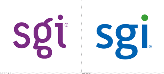
It used to be, back in the late 1980s and early ’90s, that you couldn’t talk about Hollywood visual effects without mentioning Silicon Graphics, Inc. (SGI), the company responsible for the hardware and software behind blockbusters like Jurassic Park, Terminator 2 and Abyss among many others. With such high profile projects it seemed unlikely that SGI would eventually become obsolete, but by the mid-2000s, that’s exactly what SGI had become as other players pushed into its market with faster and cheaper technology, leading SGI to declare bankruptcy. Its most recent technological foray was in “large-scale clustered computing [and] storage,” or, to boil it down, servers. In May, another server company, Rackable, purchased SGI and despite the battered reputation it adopted the SGI name and introduced a new logo.
Continue reading this entry

DATE: Sep.09.2009 POSTED BY: Armin
 CATEGORY: Technology
  COMMENTS:

TAGS:

Opinion BY Armin
The Fat O Sings
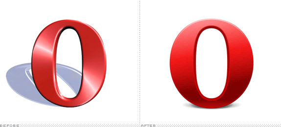
According to my Google Analytics, only 1.49% of you will passionately care about this redesign. That is, of course, the minute percentage of people reading Brand New in the Opera web browser. I have long lost sense of which of the underdog browsers has the most street (geek) cred, if it is Opera, Camino or some other cleverly named browser, but its limited market share probably gives it enough cult status and it has been around since the mid 1990s, which is a feat in itself in such a competitive market. With the release of Opera 10, the browser is updating its logo.
Continue reading this entry

DATE: Sep.01.2009 POSTED BY: Armin
 CATEGORY: Technology
  COMMENTS:

TAGS:

Opinion BY Armin
Loopy Solutions

Many internet moons ago, way back in the twentieth century, it used to be that you could only register top level domains (.com, .net, or .org) with a single company, Network Solutions, and not for the bargain price of $12 each 2-year period you can today but for a hefty $100 price tag. Network Solutions pioneered domain registration but it also engendered some shady domain swooping practices like locking up any domains that were searched for availability but not purchased and, all things considered, they were a monopoly which is not the American way, and today you can register domain names pretty much anywhere in places whose name actually includes the word “daddy.” This past month, Network Solutions has been letting their customers know about an upcoming change in identity and web design.
Continue reading this entry

DATE: Jul.30.2009 POSTED BY: Armin
 CATEGORY: Technology
  COMMENTS:

TAGS:

BY Armin
Words. Periods. Arial. Company Name.
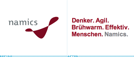
The background on this will be brief as I lack in German fluency. Namics is a web design and development, and information technology company based in Frankfurt, Germany and from what our generous tipster informs us it is one of the biggest in Europe. They recently launched a new identity, designed by Zurich based firm Heads, that replaces their ambiguous icon for an ever-changing wordmark.
Continue reading this entry

DATE: Jun.25.2009 POSTED BY: Armin
 CATEGORY: Technology
  COMMENTS:

TAGS:


