
Opinion BY Armin
Abstract Sports
Established in 1990, FADU (Federação Académica do Desporto Universitário, Academic Federation of University Sports in English) is an organization in Portugal focused on sports as a tool of educational development. It acts like a less carnivorous version of the NCAA by organizing events and enabling communication between higher education students, almost 7,000 of them, across all possible sports from soccer to basketball to chess to bridge among 25 total activities. A new identity has been created by Braga, Portugal-based Gen Design Studio.
Continue reading this entry

DATE: Nov.15.2011 POSTED BY: Armin
 CATEGORY: Sports
  COMMENTS:

TAGS: flexible identity, portugal, purple, sports,

Opinion BY Armin
Like Marlin out of Water
Established in 1993 as an expansion team of the Major League Baseball, the Florida Marlins, winners of two world series (1997 and 2003), have been renamed the Miami Marlins and will be moving into a fancy new stadium at the start of the 2012 season. Miami Marlins’ management had a hard time keeping the name, logo, and uniform change under wraps, with the logo being leaked as early as September and, stealing the thunder from a webcast conference unveiling the new look, a picture of the uniforms and a ticket brochure surfaced earlier in the week. This past Friday, the official unveiling took place at their new stadium.
Continue reading this entry

DATE: Nov.14.2011 POSTED BY: Armin
 CATEGORY: Sports
  COMMENTS:

TAGS: baseball, miami, mlb, sans serif,

A B-Side BY Armin
New York Road Runners
Established in 1958, the New York Road Runners (NYRR) is “dedicated to promoting the sport of distance running, enhancing health and fitness for all, and responding to community needs” and counts with over 40,000 members NYRR is the organizer of the ING New York City Marathon (which happened yesterday). The new logo was designed by New York-based Doublespace. Press release here.
Thanks to Hannah Ratzlaff for first tip.

DATE: Nov.07.2011 POSTED BY: Armin
 CATEGORY: Sports The B-Side
  COMMENTS:

TAGS: new york, sans serif,

Guest Opinion by John J. Custer Posted BY Brand New
A Mean Pegasus
Korinthos FC’s history began in the 1950s with the merger of two Greek teams of Corinth: Olympiakos Korinthos and A.E. Korinthos. Since then the team has powered through two more mergers combining the power of Aris Korinthos in 1964 and more recently joining forces with Pankorinthiakos in 2000. Since 2000, Korinthos FC has been competing in Greece’s semi-professional league Delta Ethniki, until 2010 when it was promoted to Gamma Ethniki (Football League 2), Greece’s third highest professional football league. With such fast growth and communal fans the football club was in need of a visual breath of fresh air that Portland, OR-based EIGHTDAY provided.
Continue reading this entry

DATE: Aug.19.2011 POSTED BY: Brand New
 CATEGORY: Sports
  COMMENTS:


A B-Side BY Armin
Famous Idaho Potato Bowl
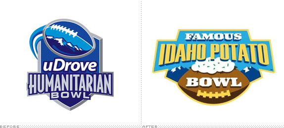
Formerly known as the Humanitarian Bowl, an NCAA football game that features “a top selection from the Western Athletic Conference (WAC) and the Mid-American Conference (MAC)” and is the longest-running outdoor cold-weather Bowl, played since 1997. The Idaho Potato Commission has signed a six-year naming rights deal to sponsor the bowl and it follows “the tradition of commodity-named bowl games with connections to a state’s top agricultural export.” (i.e., the Orange Bowl, Sugar Bowl and Cotton Bowl). But let’s be honest here, this is on Brand New because I have always wanted to post a logo that is a potato-colored football covered with sour cream and chives. Press release here.
Thanks to Noah Rothschild for the tip.

DATE: Aug.16.2011 POSTED BY: Armin
 CATEGORY: Sports The B-Side
  COMMENTS:


Opinion BY Armin
Montreal Impact Earns a Crest
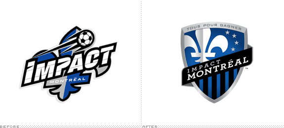
The Montreal Impact first played soccer in 1993 in the American Professional Soccer League. Despite finishing last in their inaugural season, they went on to win the championship the following one. They have been a staple of Canadian soccer ever since, most recently playing the in the North American Soccer League, and next year they will bump up to the big league as the latest expansion team of Major League Soccer. This, of course, warrants a new logo, designed by Montreal-based Pigeon*, who also designed the previous logo.
Continue reading this entry

DATE: Aug.12.2011 POSTED BY: Armin
 CATEGORY: Sports
  COMMENTS:


Opinion BY Armin
Royal All-Stars
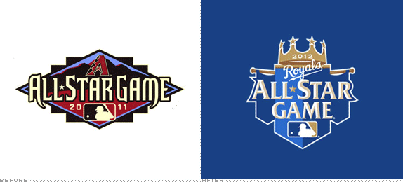
With less than thirty days since the last All-Star Game for the Major League Baseball (MLB) was played in Phoenix Arizona — National League won — the league and the host team of the 2012 All-Star Game, the Kansas City Royals, have unveiled the logo for next year’s “Midsummer Classic”. According to our archives we haven’t covered an MLB All-Star game since 2007 so just to fill you in, the first image you’ll see is a recap.
Continue reading this entry

DATE: Aug.03.2011 POSTED BY: Armin
 CATEGORY: Sports
  COMMENTS:


Opinion BY Armin
Winnipeg Hockey gets Bellicose
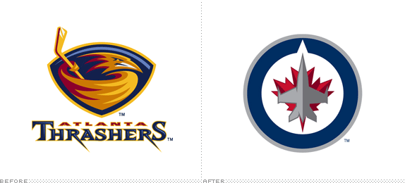
Set to begin play in the 2011/12 season of the NHL, the Winnipeg Jets are the result of the purchase of the Atlanta Thrashers (who joined the league as an expansion team in the 1999/2000 season) by True North Sports & Entertainment with the full intent of bringing the team to Canada, where they own the MTS Centre in downtown Winnipeg. If, to some, the Winnipeg Jets name sounds familiar it’s because it used to exist first as a World Hockey Association team from 1972 to 1979 and then as an NHL franchise from 1979 to 1996. Last week, the Jets unveiled their new identity designed by Reebok, that celebrates the city’s ties to the Canadian Air Force.
Continue reading this entry

DATE: Jul.25.2011 POSTED BY: Armin
 CATEGORY: Sports
  COMMENTS:


Opinion BY Armin
What Big Teeth you Have
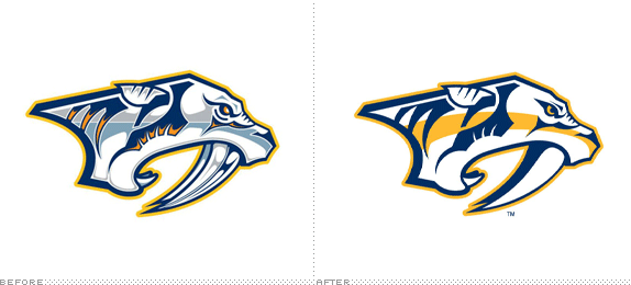
Established as an expansion team of the NHL in 1997 in Tennessee, the Nashville Predators first took to the ice in the 1998 – 99 season. They finished second last that year and the year after that. Since then they have made the playoff on and off. I don’t follow hockey but I’m generally aware of what cities have teams in which professional sports but I had no idea there was a hockey team in Nashville and once I knew that information I had no idea why it had a saber-toothed cat as a logo. Turns out in 1971, the skeleton of one of these was found during construction of the First American National Bank building in downtown Nashville. The Predators — or “Preds” as they are also known (really?!) — have been using the same logo since they joined the league and this week they unveiled an updated identity.
Continue reading this entry

DATE: Jun.24.2011 POSTED BY: Armin
 CATEGORY: Sports
  COMMENTS:


Opinion BY Christian Palino
Olympic Maple
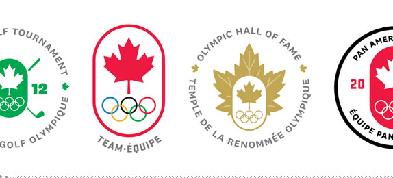
The Canadian Olympic Team needs little introduction: Over 100 years of competition in the modern Olympic Games and undoubtedly one of the powerhouses of the winter events over recent years (not to mention some impressive summer showings). After contributing to the 2010 Olympic Games in Vancouver as Design Manager, Art Director Ben Hulse worked with Greg Durrell, Adam Bognar and Andrew Simpson through the entire process in rebranding the Canadian Olympic Team for the Canadian Olympic Committee. A summary page with the new identity can be found here.
Continue reading this entry

DATE: Jun.20.2011 POSTED BY: Christian Palino
 CATEGORY: Sports
  COMMENTS:

TAGS: ben hulse, canada, olympics, sans serif,


