
Opinion BY Armin
Everything but the Stadium Sink

Melbourne FC is one of the oldest teams in Australian rules football, with a tradition dating as far back as 1859. It celebrated its 150th anniversary last year. That’s a lot of footballs kicked, bounced and caught. Melbourne FC is also a venerable champion, having won 12 championships in the Australian Football League, their last one in 1964. The twenty-first century hasn’t been kind to the club, with on- and off-field lows. The most distracting being a $5 million debt the club dug itself into through a variety of circumstances around 2008. Last week, however, Melbourne FC announced in a fundraising event that the debt had been cleared and, to celebrate, or just coincidentally, they unveiled a new emblem designed by Melbourne-based R-CO.
Continue reading this entry

DATE: Aug.10.2010 POSTED BY: Armin
 CATEGORY: Sports
  COMMENTS:

TAGS: australia, illustration, melbourne fc,

Opinion BY Armin
Pac-10 does The Wave (and The Mountain)

I have always been amazed at both the freakish passion with which Americans love their college sports and the economical, social and logistical complexity of its athletic governing body, the NCAA. Every layer of the operation matters. Which is why something as natural as a redesign can be turned into a big media crusade when one of the more than thirty conferences that make up the NCAA announces a redesign. The Pacific-10 Conference (Pac-10) is not just any conference, of course, it is one of the most successful, specifically in the sport that inspires the most freakazoid passion, football, counting perennial champions UCLA, Stanford and the University of Southern California among its ten teams. The Pac-10, however, has not been as successful as its East Coast counterparts in securing broadcast and sponsorship deals, in part because by the time a game starts on the West Coast, East Coasters are already watching The Daily Show. Storming New York City this month with press conferences, Pac-10 Commissioner Larry Scott introduced a new brand positioning crafted by New York-based SME Branding and the new identity designed by Portland, OR-based Mutt.
Continue reading this entry

DATE: Jul.28.2010 POSTED BY: Armin
 CATEGORY: Sports
  COMMENTS:


Opinion BY Armin
Brazil Mishandles 2014 World Cup Logo
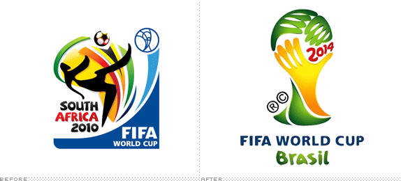
With the World Cup over and the sound of the vuvuzelas now just a distant echo, it’s only a matter of four years before the world becomes enthralled with futbol once again and for Americans to pretend they like it. In the meantime, we can all look forward to the 2014 FIFA World Cup in Brazil by enjoying the officially released emblem, designed by Brazilian agency Africa, after 25 agencies were invited to submit proposals and be judged by Brazilian Football Confederation chairman Ricardo Teixeira, FIFA executive secretary Jérôme Valcke, supermodel Gisele Bündchen, architect Oscar Niemeyer, writer Paulo Coelho, singer Ivete Sangalo, and designer Hans Donner. The logo was unveiled last week in Johannesburg.
Continue reading this entry

DATE: Jul.14.2010 POSTED BY: Armin
 CATEGORY: Sports
  COMMENTS:

TAGS: brazil, fifa, illustration, world cup,

Opinion BY Armin
The French get their B-Ball On
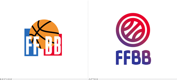
Established in 1932, the Fédération Française de Basket-Ball (FFBB for short, and French Basketball Federation in English) is the governing body of basketball in France, overseeing more than 4,000 clubs across the country as well as managing the French national team. With a 16-year-old logo in use, the FFBB unveiled a new identity last week designed by Lille- and Paris-based agency Graphèmes who, as I understand, beat out another six agencies through a competition, although there are no details about what said competition entailed — hopefully it was a free throw competition that didn’t involve free logos.
Continue reading this entry

DATE: Jul.08.2010 POSTED BY: Armin
 CATEGORY: Sports
  COMMENTS:


Opinion BY Christian Palino
Not so Golden State Warriors
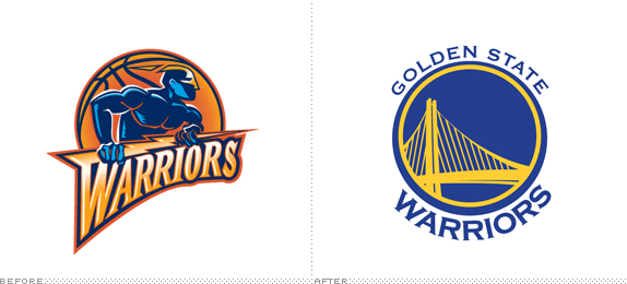
This is one of those occasions where — and let me show my cards early here — the rebranding effort is so poor it is hard to know where to begin. For those that may not follow the National Basketball Association (NBA), the Golden State Warriors have been in California, and more specifically in the Bay area, since moving out here in 1962 from Philadelphia. They were first based out of San Francisco and then moved to Oakland after nine seasons, where they have since resided. The current redesign marks the first rebranding effort by the team since 1997. Apparently, the sale of Warriors merchandise as part of the NBA marketing initiative Hardwood Classics was so popular that the Warriors franchise could not overlook the opportunity to try and recreate some of the magic nostalgia that was selling so well.
Continue reading this entry

DATE: Jun.22.2010 POSTED BY: Christian Palino
 CATEGORY: Sports
  COMMENTS:


Opinion BY Armin
Vancouver’s Sharp Mountains

Earlier this week we covered the inclusion of the 18th team to Major League Soccer but, as some astute Canadian soccer fans had pointed out since last week, it was the 17th team to join MLS that had them excited: The Vancouver Whitecaps. Their story is quite similar to the Portland Timbers, originally established in 1973 playing in the North American Soccer League and most recently played in the United States Soccer Federation (USSF) Division 2 league. They will start playing in MLS in the 2011 season.
Continue reading this entry

DATE: Jun.18.2010 POSTED BY: Armin
 CATEGORY: Sports
  COMMENTS:

TAGS: canada, sans serif, soccer, vancouver whitecaps,

Opinion BY Armin
Lumberjack Soccer

While the whole world has soccer in their brains I figured the timing might be right to feature a diminutive component that helps fuel this worldwide craze. From the deep, damp and cold confines of the United States’ northwest, the Portland Timbers have had a soccer team since 1975 when it competed in the North American Soccer League and most recently played in the United States Soccer Federation (USSF) Division 2 league, or, more bluntly, the minor league to the Major Soccer League (MSL) where the Timbers will be graduating to in the upcoming 2011 season, becoming the 18th team. In preparation for the move, the Timbers unveiled a new identity designed by Rare Design, a firm in Hattiesburg, Mississippi with plenty of athletic identity experience.
Continue reading this entry

DATE: Jun.15.2010 POSTED BY: Armin
 CATEGORY: Sports
  COMMENTS:

TAGS: axe, portland, rare design, soccer, sports,

Opinion BY Armin
The Ultimate in Swoosh Possibilities

For some reason, the frisbee seems to be the throwing object that is most adaptable to any number of other sports, most notable Golf Frisbee (combining, well, frisbee with golf) and Ultimate Frisbee (combining frisbee with American) football. For the record though, neither spin-off sport can actually use the word Frisbee, as it is a brand name and registered trademark of Wham-o Inc., think Kleenex vis a vis facial tissues, so instead they have to use the word Disc or Flying Disc. But I digress before the gressing gets too out of hand. The subject at hand concerns the newly named USA Ultimate, formerly known as the Ultimate Players Association, originally established in 1979. USA Ultimate acts as “the National Governing Body for the Sport of Ultimate.” The sport of Ultimate if you are not familiar, involves teams of seven, who score by passing the disc from one end zone to another, much like football, but when the a player has the disc he or she can only pivot before throwing it. It sounds like something you do after a few beers, but it’s actually a sport taken very seriously. Just check any of the videos here to get a sense.
Continue reading this entry

DATE: Jun.09.2010 POSTED BY: Armin
 CATEGORY: Sports
  COMMENTS:

TAGS:

Opinion BY Armin
A Fierce Blue Camel
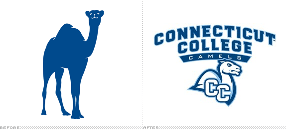
Let’s be perfectly honest here. The only reason we are talking about this is because it involves camels. Specifically the “before” camel. Look at it and tell me you don’t want to learn more? Why is it so complacent? Who is it waiting for in such relaxed repose? Is it smiling at me? Can I take it home and feed it blue food? Okay, maybe I’m getting carried away and we should just state some facts. The adorable camel is the ex-mascot of the Connecticut College Camels, the 28-team athletics department of this small liberal arts college in New London, Connecticut, with a petite student body of 1,900. The Camels compete in the NCAA Division III but are also part of the exclusive New England Small College Athletic Conference (NESCAC), a fact worth pointing out as it is a conference that features athletic departments with a chicken, a cow, a donkey and a polar bear as their mascots — needless to say, they are not the fiercest teams in U.S. college sports. Earlier this month, the Camels unveiled a new camel, created by sports-branding-machine Rickabaugh Graphics. (Sadly, their web site has been the same since 2006).
Continue reading this entry

DATE: Apr.23.2010 POSTED BY: Armin
 CATEGORY: Sports
  COMMENTS:

TAGS: athletics, camel, college, rickabaugh graphics, sports,

INTL. REVIEW BY CHRIS THORPE POSTED BY Brand New
Melbourne, One Heart Too Many?

Melbourne Heart FC is a soccer team that will begin competing in the A-League during the upcoming 2010/11 season, and, until recently, lacked a concrete name and identity. Soccer has a strange place within Australian sporting culture. In spite of the relative success of our national team at the last World Cup, and the increase in popularity with the introduction of the A-League in 2004, the world game has always been the bridesmaid to the brides of the other (more successful) Australian football codes. Melbourne, in particular, is a hard place for new team to succeed — with 9 out of 16 AFL teams, and highly successfully rugby and soccer teams — any new sports franchise that enters into such a saturated market has to hit the ground running.
Continue reading this entry

DATE: Mar.04.2010 POSTED BY: Brand New
 CATEGORY: Sports
  COMMENTS:

TAGS:


