
A B-Side BY Armin
Wo Hing General Store

Parallel to today’s main post, Wo Hing General Store is a new Chinese restaurant by Charles Phan and The Slanted Door Group. The identity has been designed by San Francisco-based Manual. “The logo plays with the delicate nature of noodles, a main staple on the restaurant’s menu. We also noticed a similarity to the structure of tubular neon signs that are often associated with Chinese street food. In addition to the logo, we created a rich, colorful visual language using only the aforementioned humble noodle. Using a scanner, designers experimented with raw and cooked noodles to create a number of flowing, abstract images.” Plenty of cool application shots here.

DATE: Feb.23.2012 POSTED BY: Armin
 CATEGORY: Restaurant The B-Side
  COMMENTS:

TAGS: blue, manual creative, Sans Serif,

Opinion BY Armin
Slant This Way

Today we are going small and local… Established in 1995, The Slanted Door, located in San Francisco, CA, is one of the most renown Vietnamese food restaurants in the country. Led by James Beard-nominated chef Charles Phan, The Slanted Door has grown from a hole in the wall establishment to a posh spot in the foodie-friendly Ferry Building and is the center point of a family of four restaurants under The Slanted Group Door umbrella. A new identity has been designed by San Francisco-based Manual.
Continue reading this entry

DATE: Feb.23.2012 POSTED BY: Armin
 CATEGORY: Restaurant
  COMMENTS:

TAGS: custom, manual creative, Sans Serif, stationery,

A B-Side BY Armin
California Tortilla
Established in 1995 in Bethesda, MD, California Tortilla is a chain of fast casual Tex-Mex restaurants with 36 locations on the East Coast in Delaware, Maryland, Virginia, Pennsylvania and DC. A new avocado-based logo was introduced earlier this year. Story here. Logo detail below (or after the jump).
Continue reading this entry

DATE: Feb.20.2012 POSTED BY: Armin
 CATEGORY: Restaurant The B-Side
  COMMENTS:


A B-Side BY Armin
Daphne’s California Greek
Established in 1991 Daphne’s California Greek restaurant is “the fast casual choice of diners who live healthy, active lifestyles and crave something unique” with 60 locations across the West Coast. In 2010, Daphne’s emerged from bankruptcy protection with new owners, who redesigned every aspect of the restaurant in 2011.
Thanks to Abe Vizcarra for the tip.

DATE: Jan.24.2012 POSTED BY: Armin
 CATEGORY: Restaurant The B-Side
  COMMENTS:

TAGS: blue, orange, Sans Serif, wreath,

A B-Side BY Armin
SusieCakes

SusieCakes is “an all-American bakery offering classic desserts such as cakes, cookies, cupcakes, pies, and puddings” with six locations across California where you can sit down, take out, or custom order. The new identity, packaging and website have been designed by Brooklyn-based Red Antler. The custom wordmark was created by “literally exploring letter forms drawn with buttercream frosting.” Plenty of applications here.

DATE: Nov.02.2011 POSTED BY: Armin
 CATEGORY: Restaurant The B-Side
  COMMENTS:


A B-Side BY Armin
Steak ’n Shake
First opened in 1934 in Normal, IL, Steak ‘n Shake is a chain of around 500 diners around the U.S.. Revised logo has been appearing slowly this year.
Thanks to Laura Shumaker for first tip.

DATE: Sep.06.2011 POSTED BY: Armin
 CATEGORY: Restaurant The B-Side
  COMMENTS:

TAGS: black, sans serif,

A B-Side BY Armin
Zaatar w Zeit

Established in 1999, Zaatar w Zeit — or “Thyme and Olive Oil Mix” — is a fast food chain in Lebanon, Kuwait and the Emirates. New logo has been designed by Pearlfisher, with this to say about it: “The new logo is a distinctive, modern marque that provides a more literal and graphic expression by creating a simple link between the thyme and the oil, the leaf and the droplet, and forms a distinctive ‘Z’ within the negative space.”

DATE: Aug.10.2011 POSTED BY: Armin
 CATEGORY: Restaurant The B-Side
  COMMENTS:


Opinion BY Armin
Shiny Happy Lobster
First opened in 1968 in a single location in Lakeland, Fl, Red Lobster, “the world’s largest casual dining seafood restaurant”, currently has almost 700 locations across the U.S. and Canada, with more than 63,000 employees. Owned by Darden Restaurants — which also owns Olive Garden and Longhorn Steakhouse and named after Red Lobster founder Bill Darden — Red Lobster’s average sales per restaurant for this past fiscal year was $3.9 million. I haven’t been to a Red Lobster in more than a decade, but I always remember eating my belly out at that place and the garlic biscuits that they serve while you wait for your food are heavenly. It’s not 5-star dining, but it’s very decent, accessible seafood. Last week, Red Lobster debuted a new national TV advertising campaign featuring a new tagline, “Sea Food Differently”, (cute!), and a new logo. Press release credits Grey New York for the overall campaign, not certain if they did the logo as well. Red Lobster will also be updating all of its new locations to the Bar Harbor design, “inspired by the New England coast.”
Continue reading this entry

DATE: Aug.01.2011 POSTED BY: Armin
 CATEGORY: Restaurant
  COMMENTS:

TAGS: animal, grey advertising, serif,

A B-Side BY Armin
Maudie’s Tex-Mex
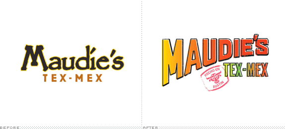
Established in the early 1950s and turned Tex-Mex in 1992, Maudie’s is one of the most popular restaurants in Austin, TX with six locations throughout. After designing the look of its newest location as a standalone application, Maudie’s decided to expand the look to all locations. Designed by local Pentagram partner DJ Stout. Full identity here.

DATE: Jul.26.2011 POSTED BY: Armin
 CATEGORY: Restaurant The B-Side
  COMMENTS:

TAGS: gradient, pentagram, restaurant, texas,

Opinion BY Armin
Little Chef, Big Dreams
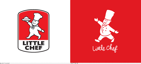
First opened in 1958, Little Chef is a chain of restaurants found along the highways and “A roads” in the UK. Currently operating 162 locations, Little Chef boasts of serving 10 million cups of tea, 12 million rashers of bacon, 10 million eggs, and 13 million sausages each year. At Little Chef you can sit down and order food, or take food to go, or just buy stuff. Sounds like a combination of Canada’s Tim Hortons and the US’s IHOP and 7-Eleven. Little Chef has just undergone a big revitalization of its identity, designed by London-based venturethree, and its restaurant design by Ab Rogers Design.
Continue reading this entry

DATE: May.19.2011 POSTED BY: Armin
 CATEGORY: Restaurant
  COMMENTS:

TAGS: icon, restaurant, script, signage, uk, venturethree,


