Sponsored Feb. 20, 2017 by Hoefler & Co.
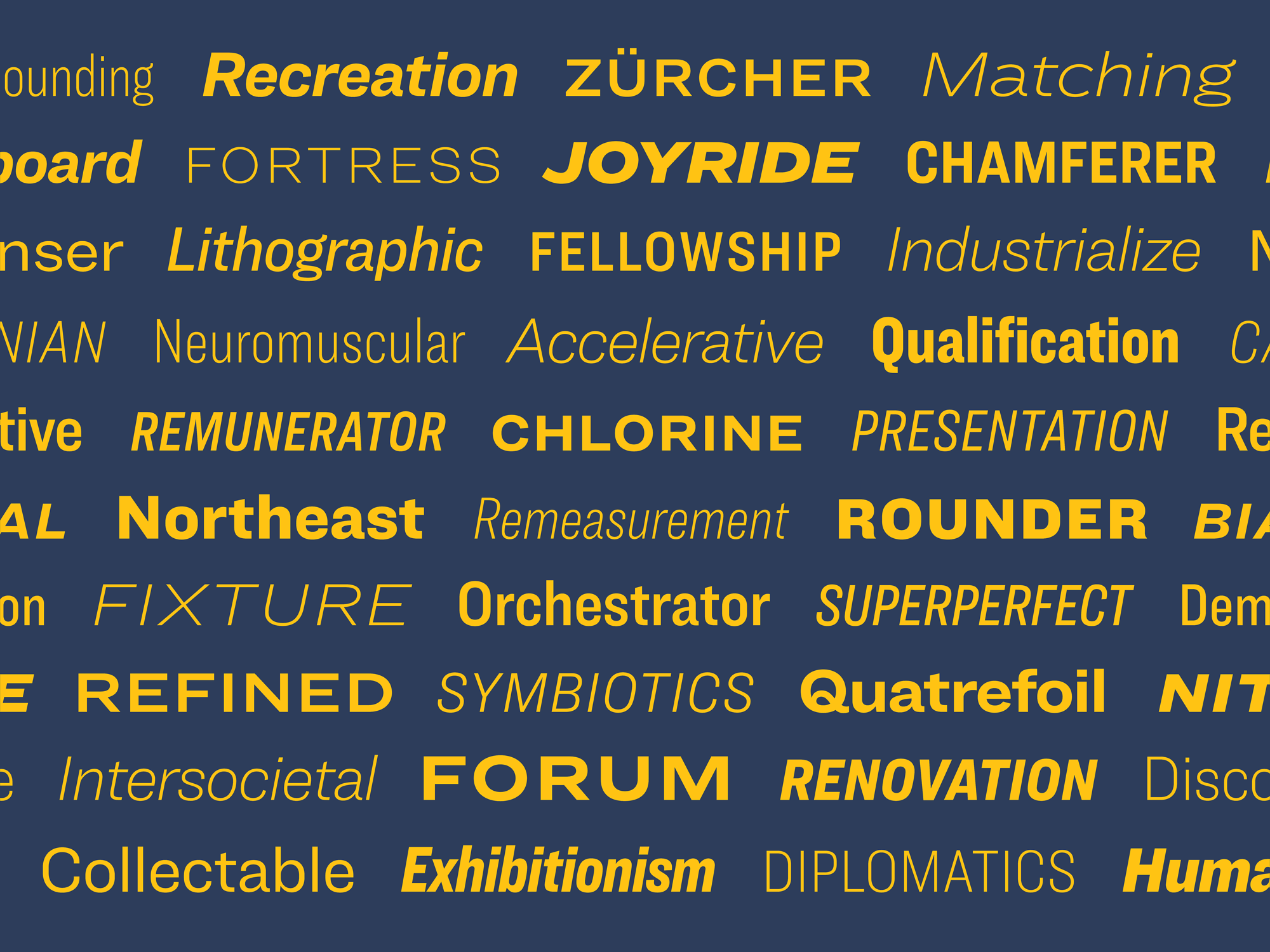
Designed for diversity instead of homogeneity, Ringside brings the charming individuality of the potluck sans serif to the modern superfamily. Meet Ringside, the new font family for print, web, office, and mobile, exclusively at H&Co.

Modernism was a mixed blessing for typography. Half a century before Helvetica and Univers, there were no type families: the designer who hoped to use different weights and widths was left to grope among an anarchic collection of unrelated styles. One font might be bold, another condensed, and only the occasional style might offer an italic. And while the rationalism of the type family brought order to the chaos, offering designers the promise that a sans serif with a Light would also have a Bold, it also drove some of the world’s most colorful sans serifs into extinction. Twenty years ago, our Knockout collection was designed to celebrate the beauty and diversity of nineteenth century sans serif wood types, one of America’s great contributions to type history. Picking up where this project left off is Ringside, a sans serif shaped by new challenges, new influences, and new ideas.

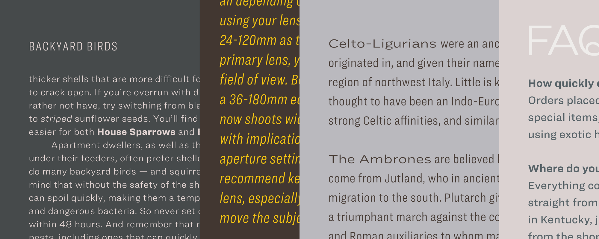
Where Knockout was designed for headlines, Ringside is made for text. Its proportions, fit, and details are designed to thrive at the smallest sizes, and each of its weights and widths includes that most essential quality of a dependable text face: a companion italic. Extended character sets that include tabular figures and fractions ensure that designers can use the fonts to articulate even the most complex information, and six parallel families of ScreenSmart® webfonts ensure that Ringside performs flawlessly on every kind of screen.

While it offers all the versatility of a rationalized font family, Ringside works to avoid the bland plasticity of digital type. Instead of relying on restrained shapes that can predictably stretch in different directions, Ringside follows different design decisions in each part of the family, to ensure that every style is visually distinctive. Its most compact faces, Ringside Compressed and Condensed, feature romans with flat sides and parallel gestures, paired with italics whose swelling curves and subtle diagonals offer a contrasting texture. In its broader Narrow and Regular, flat sides are traded for round ones, giving both designs the familiar visual rhythms of traditional text faces. And the broadest designs, Ringside Wide and Extra Wide, introduce fully-curved characters with diagonal stroke endings, lending the design both warmth and character.

Ringside ScreenSmart: High-Performance Webfonts
Ringside ScreenSmart is an adaptation of the family specifically engineered for the screen, and available for use on the web through Cloud.typography. To ensure outstanding rendering on screen at sizes as small as nine pixels, we carefully adjusted the fonts’ fit, color, and proportions, and orchestrated their progression of weights so that each style is distinctly different from its neighbors. Like all ScreenSmart fonts, Ringside ScreenSmart is equipped with a set of detailed instructions called “hints,” which tell its outlines how to adapt themselves to pixel grids at different point sizes, to ensure that the fonts always retain both their legibility and their personality.
See more of Ringside at typography.com.

Comments