
In Brief BY Armin
Recycling Canadian Retro
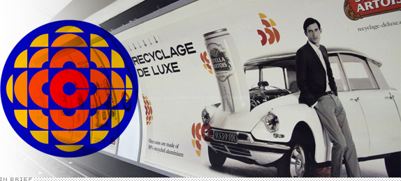
The composite image above shows two things: To the left is the logo for the Canadian Broadcasting Corporation (CBC) designed by Burton Kramer in 1974, and the remainder of the image shows a photograph taken by Stefan Kraft in the London Underground of a current campaign for Stella Artois developed by Mother London with the help of Cristiana Couceiro. The campaign, titled “Recyclage De Luxe,” touts the Belgian’s beer commitment to the environment and its embrace of recycled production in their packaging. And somehow, taking a beloved and well known Canadian logo, disassembling it, and spraying it like retro fairy dust throughout this campaign helps carry Stella Artois’ message forward. Discuss.
Thanks to Jesse Woodward for the tip.

DATE: Oct.12.2009 POSTED BY: Armin
 CATEGORY: In Brief
  COMMENTS:

TAGS:

In Brief BY Armin
Follow Up: Woolworths

Last year, as reported on Brand New, Australia’s largest grocery store chain, Woolworths, underwent a redesign that yielded a stylized “W” that could resemble some kind of ambiguous piece of produce but that undeniably looked like an apple. This past month, before Apple came into the picture, the owner of Woolworths, Progressive Enterprises, announced that another one of its grocery store brands, Countdown, would be replacing the Woolworths name across Australia and New Zealand, leaving the stylized “W” devoid of its double-u-ness. Then, at some point in the last twelve months Apple has decided to contest the trademark application of Woolworths/Countdown with IP Australia, the government agency that handles trademarks. One of Apple’s main concerns was that Woolworths wants to cover all possible categories including “electrical goods and technology.” Even though you are more likely to find Woolworths-branded napkins at their store, Apple still feels threatened by this logo which, in my mind, is a whole other kind of logo and Apple should keep their attorneys busy with something else.
Update: Apologies, I got some facts wrong. Countdown is replacing Woolworths only in New Zealand not Australia. Also, Woolworths Limited owns the Woolworths chain and Progressive Enterprises as its New Zealand subsidiary, which in turn owns Countdown. (Thanks for the corrections readers!).
Thanks to Lindsay Yee and Chris Rank for the tip.

DATE: Oct.06.2009 POSTED BY: Armin
 CATEGORY: In Brief
  COMMENTS:

TAGS:

In Brief BY Armin
Wisconsin Gets Jiggy with Acronyms
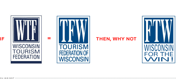
Who would have thought that a web site called Your Logo Makes me Barf would one day influence the identity design of a state-level organization? This past July, when YLMMB added the logo of the Wisconsin Tourism Federation (WTF) to its list of victims — along with the inevitable post title of “WTF Wisconsin?! — the change was set in motion. Yesterday, Milwaukee’s Journal Sentinel reported that WTF had changed its logo to avoid the now infamous acronym of the words “What”, “The,” and “Fuck.” From now on they are to be known as the Tourism Federation of Wisconsin (TFW) with a logo to match. Besides the question of why not fix their visually painful logo while they are at it, I can’t help but point out this missed opportunity: If web lingo has taken you down, embrace it and change it from Wisconsin Tourism Federation to, say, Federation of Tourism of Wisconsin. You know… FTW. For the Win!

DATE: Oct.02.2009 POSTED BY: Armin
 CATEGORY: In Brief
  COMMENTS:

TAGS:

In Brief BY Armin
Follow Up: Aalto University
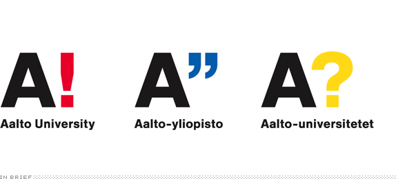
In June of this year, we reported on the redesign of Aalto University’s identity as the result of contest. The winning entry by Rasmus Snabb was received pretty divisively around here, with both praise and scorn. Aalto University just released a simplified version of Rasmus’ idea. There is an announcement in Finnish that can be more or less understood with Google Translate. So, better or worse?
Thanks to Jyri Niemi for the tip.

DATE: Sep.28.2009 POSTED BY: Armin
 CATEGORY: In Brief
  COMMENTS:

TAGS:

In Brief BY Armin
$5 Reward for Stock Logos
By now, you have probably heard about this but, just for the sake of discussion, let’s establish the facts: iStockphoto, purveyor of very low-priced stock photography and illustration, will now start selling logos created by its community. People whose logos are approved by iStockphoto in the first 10,000-logo inventory will receive a whopping $5 and, once their logo is available for sale, they can earn up to 50% royalties at a price point of somewhere between $100 and $750 (although in iStockphoto parlance, those are 100 and 750 credits). Once a logo has been purchased by a “client,” that logo is off the inventory, a one-of-a-kind logo if you will. If you need any further clarification, you can read the announcement, nicely titled “Become a Logo Designer for iStockphoto.” And if you doubt there is a designer market for this, simply read the first few pages of this forum thread with excited reactions — by page 69 the mood has definitely changed. Since this is an In Brief, I will reserve my opinion for the comments.

DATE: Sep.25.2009 POSTED BY: Armin
 CATEGORY: In Brief
  COMMENTS:

TAGS:

In Brief BY Armin
City of Melbourne, Expanded
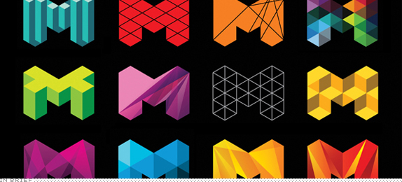
Back in July 22 we reported on the new identity of the City of Melbourne, and I remember at the time, someone had e-mailed me saying that the blueish green M iteration was only one of dozens. On LevelEleven, a blog devoted to the work of Landor’s Sydney office, they have posted, indeed, dozens of versions of the icon as well as a ton of snazzy applications.
Thanks to Googe Farrugia for the tip.

DATE: Sep.04.2009 POSTED BY: Armin
 CATEGORY: In Brief
  COMMENTS:

TAGS:

In Brief BY Armin
Verdanagate

Like most of us here, I have been following the IKEA debacle over the switch from its proprietary Futura to the egalitarian Verdana as the corporate type family used from catalogs to store signage across the world. First spotted at Typophile, then dissected at idsgn, the news finally made it to Time magazine and an online petition to revert has garnered over 3,000 signatures. The main complaint, that serves as objective leverage, is that Verdana was designed — by Matthew Carter for Microsoft — to be used on screen and at small sizes, something it exceeded at, but the underlying current in the uproar is that designers and type designers seem to subjectively hate Verdana, perhaps not for its design but for what it stands for: The homogeneity of typography in the hands of the masses. Sure, Verdana looks weird and out of place in a catalog and on store signs but I really don’t believe it is that far-fetched and in some cases it even manages to look oddly avant-garde. Verdana is not Futura, but for the time being it does look like it’s the future.

DATE: Aug.31.2009 POSTED BY: Armin
 CATEGORY: In Brief
  COMMENTS:

TAGS:

In Brief BY Armin
In Brief: London Calling (all Designers)

The Greater London Authority (GLA) has issued a tender (or Request for Proposals for us US’ers) asking for a substantially big and complex rebranding and redesign project: London. The abbreviated version of the brief is to develop a brand that will: Create a unified brand for London / Set the vision for London post-2012 / Lead stakeholders around a shared brand / Develop international promotion into a powerful policy mechanism. The full tender, PN493/2, can be requested here. One firm responding to the tender will be Moving Brands — who did the lovely SwissCom work almost two years ago — and they have decided to make their process not just transparent but open to, and informed by, public opinion. You can follow the process at A Brand for London. And, yes, that’s one of the most important metropolis asking for free brand work.

DATE: Aug.28.2009 POSTED BY: Armin
 CATEGORY: In Brief
  COMMENTS:

TAGS:

In Brief BY Armin
The Logo Formerly Known as Freshjive
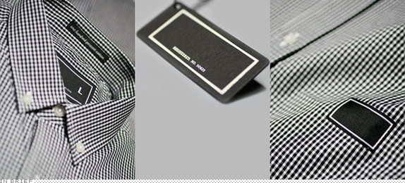
“Beginning with our spring 2010 line,” states Rick Klotz, founder of the hip-hop streetwear clothing line Freshjive, “we will no longer be using our brand logo or name on any of our product, including all labeling and t shirt designs.” Further, in an exclusive interview for The Hundreds, Rick elaborates that “I’m not the type of person that buys something for the brand name. I’ve also never done a very good job at creating a captivating identity to our own brand logo.” Can a clothing label survive without a logo? I wonder if the level of publicity this no-logo approach generates between now (it’s already on the Huffington Post) will create enough non-brand awareness that the no-logo will become, well, a logo in itself.

DATE: Aug.14.2009 POSTED BY: Armin
 CATEGORY: In Brief
  COMMENTS:

TAGS:

In Brief BY Armin
Coca-Cola vs. Pepsi, Revised Edition
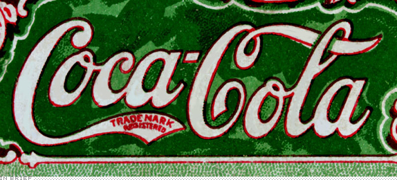
In the last couple of weeks, a JPG has been making the internet rounds and, in the process, has gathered more than 6,500 Diggs (not that that is any measure of successful success, but still…) and has been mentioned in dozens of design and culture blogs, including many which I frequent and respect. The problem is that the JPG is wrong and disingenuous. It comparatively illustrates the evolution of the Pepsi and Coca-Cola logos from their beginnings in the late nineteenth century to their current state at the end of the 2000s. The comparison chart mocks the ever-changing personality of the Pepsi logo in contrast to Coca-Cola’s stoic script logo, unaffected by the effects of time. The philosophical point it makes is indeed funny and, for the most part, accurate: Coca-Cola has long been the steady brand that triumphs over Pepsi as the latter attempts to gain ground with brand gimmicks and changes. And I will be the first to admit that the Coca-Cola logo and its consistency over the years is far more supreme than Pepsi, but every time I saw this JPG come up in more and more web sites and blogs I couldn’t help but cringe at the inaccuracy and deception it engenders.
Continue reading this entry

DATE: Aug.05.2009 POSTED BY: Armin
 CATEGORY: In Brief
  COMMENTS:

TAGS:


