In Brief BY Armin
In Brief: New Universal Logo

As part of their ongoing 100th anniversary celebration Universal Pictures has just premiered a new animated version of their famous globe logo. The new sequence has been created by digital effects powerhouse Weta (of Lord of the Rings fame) and features detailed satellite imagery on the globe as well as a new take on the recognizable intro music. A bit more story here. The above video shows previous logo animations, with the new one starting at the 0:39 mark.

DATE: Mar.06.2012 POSTED BY: Armin
 CATEGORY: In Brief
  COMMENTS:

TAGS: animation,

In Brief BY Armin
In Brief: 5-year-old Analyzes Logos

Cincinnati, Ohio-based identity designer Adam Ladd asked his 5-year-old daughter her impressions on some popular logos — my favorite is her response to the Republican Party logo. This is both adorable and some of the best and most authentic field research out there.

DATE: Jan.30.2012 POSTED BY: Armin
 CATEGORY: In Brief
  COMMENTS:

TAGS: cute,

In Brief BY Armin
Redesigning “Teachers”

In the latest redesign challenge from Studio 360 — we redesigned Valentine’s in 2010 and Pentagram redesigned Christmans in 2006, among others — Brooklyn-based Hyperakt has been tasked with redesigning Teachers. “We began with a simple premise, that education is the key to human progress, therefore teaching is among the most important professions for humanity.” The result, “all about connecting the dots,” is detailed at Hyperakt’s website and in their conversation with Studio 360 host Kurt Andersen. A few sample images are posted below (or after the jump).
Continue reading this entry

DATE: Jan.20.2012 POSTED BY: Armin
 CATEGORY: In Brief
  COMMENTS:


In Brief BY Armin
In Brief: Saul Bass’ Bell System Pitch

This is a video prepared by Saul Bass as a presentation to executives of his identity system for Bell System in the early 1970s. The first half is a fantastic primer on identity design and the second half (starting at around 13:00) is the identity pitch. A little long for today’s video-viewing standards but totally worth it.
Thanks to Brad Loliger for the tip.

DATE: Jan.18.2012 POSTED BY: Armin
 CATEGORY: In Brief
  COMMENTS:


In Brief BY Armin
In Brief: Herb Lubalin on his PBS Logo

In this great video, Herb Lubalin explains the genesis of his logo for PBS as it evolved through client feedback.
Back with regular posts tomorrow.
Thanks to Matt Hunter Ross for the tip.

DATE: Jan.09.2012 POSTED BY: Armin
 CATEGORY: In Brief
  COMMENTS:

TAGS: vintage,

In Brief BY Armin
In Brief: December Miscellany
For a slight change of pace today, I have a few interesting tidbits worth posting.
Continue reading this entry

DATE: Nov.30.2011 POSTED BY: Armin
 CATEGORY: In Brief
  COMMENTS:


In Brief BY Armin
British Airways Goes Vintage

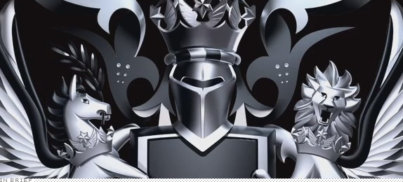
British Airways is trying to infuse its brand with some of its past. Last week they launched a new 90-second TV spot that brings together vintage aircraft with modern day, big ass planes and even the Concorde — the Concorde! Remember that? — makes an appearance. They are also reviving British Airways’ motto “To Fly. To Serve.” and coat of arms, the latter revised in 3D by forpeople design.
For clarification: The crest does not replace the BA logo. It’s an additional identity element.
Continue reading this entry

DATE: Sep.27.2011 POSTED BY: Armin
 CATEGORY: In Brief
  COMMENTS:


In Brief BY Armin
Wikipedia Concept

Invited by Viewpoint magazine in the UK to showcase their process, Moving Brands has come up with a proposed identity for Wikipedia: “The mark is created from five lines that reference [Wikipedia’s] ‘5 pillars,’ and also represents the nine sister sites [of Wikimedia] with nine equidistant nodes. As a living identity, the mark uses javascript to self-generate a unique movement and mark for every search term. This mark highlights where information exists on Wikimedia sister sites, advocating broader information gathering and encouraging contribution where content is missing.” I love the simplicity of this, even if it has a slight totalitarian-cult-looking-to-take-over-the-world look to it. See the full project here and vote for it below (or after the jump).
Update: Moving Brands’ site is currently down. Try Google’s cached version or this Flickr set with all the images.
Thanks to Anthony Lane for the tip.

DATE: Sep.07.2011 POSTED BY: Armin
 CATEGORY: In Brief
  COMMENTS:

TAGS: moving brands, wikipedia,

In Brief BY Armin
In Brief: August Miscellany

This edition of In Brief isn’t particularly uplifting. But it sure is entertaining.
Continue reading this entry

DATE: Aug.16.2011 POSTED BY: Armin
 CATEGORY: In Brief
  COMMENTS:


In Brief BY Armin
W & Cie’s Tribute to Brands

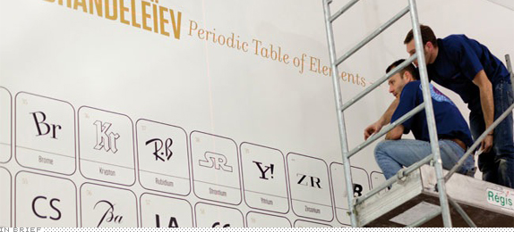
We interrupt this Summer break to bring you a fun project. The new Paris office of W&Cie, a design and advertising agency, have been decked in a very ambitious tribute to brands. From a giant periodic table of brands, to a giant Bauhaus sculpture, to a “Bestiary of Brands”, the execution is pretty smart and clean. Summary video below (or after the jump) and additional images can be found at Identity Designed.
Continue reading this entry

DATE: Jul.28.2011 POSTED BY: Armin
 CATEGORY: In Brief
  COMMENTS:

TAGS:


