BY Armin
In Brief: Will the Real Bruce Please Stand Up?

Three months ago we reported on the rebranding of AkzoNobel, noting that Saffron had designed the logo but not mentioning that Pentagram (London) had later implemented the identity, I assume I wasn’t aware of this at the time, which brings us to the matter at hand… Martijn Rijven, an Amsterdam-based illustrator and designer, was responsible for drawing Bruce (as the pointing man is referred to in the inner circle) and has written an extensive post about the process, with a great video at the bottom, showing the evolution of the drawing and mourning the truncated version of his drawing that was the final logo — or as Rijven describes it, “they appear to have sank him into the ground and left him begging an invisible passer by to take his aged skinny hand to drag him out.”

DATE: Aug.13.2008 POSTED BY: Armin
 CATEGORY: In Brief
  COMMENTS:

TAGS:

BY Armin
In Brief: Views on Brands

Given that I visit more web sites than I should, I rarely spend more than a minute on any of my internet stops — and it’s usually those with pretty pictures that manage to keep me around the longest. Avid Brand New commenter Jerry Kuyper pointed me today to the blog of Claude Singer, a strategist and non-designer for firms like Siegel + Gale and Lippincot… After many (many) minutes I finally stopped, not because I had to, but because I had gone through the entire archive. In other words, I recommend it, and suggest you consider adding it to your branding reads for a fresh take on the subject.

DATE: Jul.29.2008 POSTED BY: Armin
 CATEGORY: In Brief
  COMMENTS:

TAGS:

BY Armin
In Brief: The Dharma Initiative

The first season of Lost came when we made the decision to not have Cable TV or even rabbit ears to catch the networks so I completely missed the boat (ha! get it?) on that one. I’m sure, had circumstances been different, I would be a devout follower of the series and completely geeked out about a rebranding happening within the show. Jamison Wieser, a Brand New reader, explains the brand mysteries behind the Dharma Initiative for you, Brand New style.

DATE: Jul.28.2008 POSTED BY: Armin
 CATEGORY: In Brief
  COMMENTS:

TAGS:

BY Armin
In Brief: Iconography 2.0

With today’s release of its 2.0 software, iPhone users are about to be clobbered by a new generation of bubbly and glossy graphics for the hundreds of applications by third party developers that are now immediately available for download and ready to, um, be stroked by your fingers. Among those many applications is a news reader for The New York Times with some lovely iconography work by Felix Sockwell. True, this is not specifically logo-related, but in terms of brand extension, this is a great demonstration of a traditional organization adapting rather swiftly to the, literally, latest technology. And iconography shares a lot of the reductive qualities necessary to tell the biggest story with the smallest amount of visual elements. The icons look really great on the iPhone and Felix’s process (link above) is pretty cool to see.

DATE: Jul.11.2008 POSTED BY: Armin
 CATEGORY: In Brief
  COMMENTS:

TAGS:

BY Armin
In Brief: Branding, an Illustrated Perspective

Will Ayres and Scott Lerman, veterans of the branding world, publish Pulp Branding, a monthly issue executed in a charming illustration style. The latest, “Snipers,” explores the vein of our existence: Critiquing logos.

DATE: Jun.18.2008 POSTED BY: Armin
 CATEGORY: In Brief
  COMMENTS:

TAGS:

BY Armin
In Brief: The Public. Period.

Paula Scher reinvigorates the identity she created for the Public Theater in 1994. Here is a great look at the work over the years.

DATE: Jun.13.2008 POSTED BY: Armin
 CATEGORY: In Brief
  COMMENTS:

TAGS:

BY Armin
In Brief: Me Mobile Pretty One Day

With title apologies to David Sedaris.
While iPhone owners were busy banging their overpriced first-generation iPhones on their foreheads, Apple followers have been fiercely belittling the logo for the new syncing feature, MobileMe. BuzzFeed gathers the links to the best, seemingly endless cheap shots.

DATE: Jun.10.2008 POSTED BY: Armin
 CATEGORY: In Brief
  COMMENTS:

TAGS:

BY Armin
In Brief: Starbucklers vs. Rollergirls

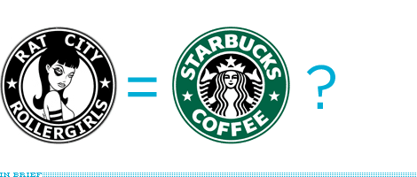
Seattle’s Rat City Rollergirls of the Women’s Flat Track Derby Association are facing opposition from their hometown coffee empire, Starbucks. When the Rollergirls attempted to register their logo so that they could be included in a videogame, conflict arose. Starbucks asked the U.S. Patent and Trademark Office to hold off on registering the Rollergirls logo as they might oppose the filing — just like Apple did recently against GreeNYC. It’s hard to not admit the similarities in construction of the logo, but they are decidedly of different spirit. I would guess it would be in the best interest of good will that Starbucks not be a-holes on this one. Plus, any logo that dares to put Verdana on a curve deserves to stick around. [Thanks to Nick Collecchi for the item]

DATE: May.26.2008 POSTED BY: Armin
 CATEGORY: In Brief
  COMMENTS:

TAGS:

BY Armin
In Brief: A Day Experienced through Brands

Jane, an advertising account executive, has put together a visual representation of all the brands that she interacts with on a typical Friday from dusk to dawn — where, ahem, it’s nice to see someone getting some action, if you know what I mean. And I’ve run out of places to put another em dash, but it’s also funny that she lists marijuana as a brand. [Link spotted on SwissMiss]

DATE: May.23.2008 POSTED BY: Armin
 CATEGORY: In Brief
  COMMENTS:

TAGS:

BY Armin
In Brief: Logo Equations

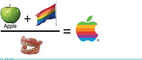
More logo fun! This time, Argentinian bloggers La Luna and Javier, bring us the math and arithmetic behind well known logos. [Quip’d by Plamen on our own Quipsologies]

DATE: May.21.2008 POSTED BY: Armin
 CATEGORY: In Brief
  COMMENTS:

TAGS:


