
Opinion BY Armin
Follow-Up: DC Comics

Yesterday, DC Comics officially unveiled its new identity, after the whole internet (including us) stole its thunder at the start of the week when we all judged its new branding effort based on a single, black-and-white rendition of their new logo. Now it’s an uphill battle to get people on board with what is actually a fairly good looking and flexible identity designed by Landor.
Continue reading this entry

DATE: Jan.20.2012 POSTED BY: Armin
 CATEGORY: Entertainment
  COMMENTS:

TAGS: flexible identity, landor,

Opinion BY John J Custer
Life OK is Okay
Life OK is the new youth-oriented channel that is joining the STAR India network. It replaces the network’s previous youth channel, STAR One, as of December 2011. The new identity was designed by London-based venturethree.
Continue reading this entry

DATE: Jan.19.2012 POSTED BY: John J Custer
 CATEGORY: Entertainment
  COMMENTS:

TAGS: colorful, gradient, Icon, india, television, venturethree,

A B-Side BY Armin
Cadena 100
Established in 1992, Cadena 100 is one of the most popular radio stations in Spain. Their new logo and identity have been designed by Madrid-based Coleman CBX. More applications below (or after the jump).
Continue reading this entry

DATE: Jan.17.2012 POSTED BY: Armin
 CATEGORY: Entertainment The B-Side
  COMMENTS:

TAGS: colemancbx, custom, radio, script, spain,

Opinion BY Armin
DC may be its own Villain

Founded in 1934 (originally as National Allied Publications), DC Comics is one of the biggest publishers of comic books and is home to some of the most famed superheroes like Superman, Batman, Green Lantern, and the Flash. This past Summer, DC Comics made big news when it announced it would reboot 52 of its titles back to issue #1, giving many of its characters full-on makeovers, to mixed reviews and feelings. Now, DC is back in the sight of fanboys and critics with an imminent new logo that was spotted at the United States Patent and Trademark Office (USPTO), meaning that DC was filing for protection before launch. Sometimes companies file various logos for protection even if they don’t use them and I was initially hesitant to post this logo because DC could always change its mind and because there is no official word from them. But in looking through the records at USPTO — here is one example — DC has filed the new logo for registration under 19 different categories: from backpacks and wallets; to video games and motion picture films; to bowls, plates, and mugs; to metal key holders and rings; to, even, processed and dried vegetables. In other words: for every kind of merchandise imaginable. They have also filed for registration at the Office for Harmonization in the Internal Market (Trade Marks and Designs) in the European Union. So, they are serious about this new logo.
Continue reading this entry

DATE: Jan.17.2012 POSTED BY: Armin
 CATEGORY: Entertainment
  COMMENTS:

TAGS: comics, Sans Serif,

A B-Side BY Armin
Star TV (Turkey)

Launched in 1989, Star TV was the first private television channel in Turkey, showing original programming as well as international shows. Recently a new logo was introduced.
Thanks to Günes Ülker for the tip.

DATE: Jan.11.2012 POSTED BY: Armin
 CATEGORY: Entertainment The B-Side
  COMMENTS:

TAGS: star, television, turkey,

Opinion BY Armin
Blip goes the Tittle

Established in 2005, Blip (formerly the annoyingly period’d Blip.TV) is a video site specifically designed for web series, as opposed to the one-hit-wonder machine that is YouTube or Vimeo, which is why many have never heard of it. It doesn’t have the inherent shearableness of the other two, which is why your aunt doesn’t send you FWDs of cats falling of a table on Blip. You have to go to it, just like you go to ABC or Showtime. Blip hosts over 300 million video views per month and unlike other video sites, it splits ad revenue 50/50 with the producers of each series. This month Blip introduced a new logo (and name) designed by Chermayeff & Geismar.
Continue reading this entry

DATE: Jan.06.2012 POSTED BY: Armin
 CATEGORY: Entertainment
  COMMENTS:

TAGS: chermayeff and geismar, red,

Opinion BY Armin
Paramount Pictures Goes Wide Shot
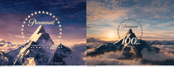
Established in 1912, Paramount Pictures is the oldest and one of the major, top-grossing film studios in Hollywood. Among thousands of movies some notables are franchises like The Godfather, Indiana Jones, The Naked Gun, and Mission: Impossible. To celebrate their upcoming 100th anniversary in 2012, Paramount Pictures is introducing a revised logo to play at the beginning of its movies, designed by Santa Monica, CA-based Devastudios.
Continue reading this entry

DATE: Dec.16.2011 POSTED BY: Armin
 CATEGORY: Entertainment
  COMMENTS:


Opinion BY Armin
Up + Down = 1

Established in 1998 as the Chart Information Network, The Official Charts Company (OCC), as it was renamed in 2002, is the gatekeeper of, basically, what is hot in the music and entertainment industry. Every week, after canvasing data from over 5,900 retailers in the UK selling at least 100 units of audio or video product per week, OCC publishes the definitive chart that is then published or used by BBC Radio 1, BBC Radio 2, MTV, Music Week, 80% of the national daily newspapers, and other magazines and websites. Although best known for their Official Singles Chart and the Official Artist Albums Chart, they compile more than 50 different charts. In October, with the launch of a robust consumer website, OCC introduced a new logo designed by London-based Give Up Art.
Continue reading this entry

DATE: Nov.09.2011 POSTED BY: Armin
 CATEGORY: Entertainment
  COMMENTS:

TAGS: icon set, overlay, Sans Serif, uk,

Opinion BY Armin
Yellow Woodpecker Farm v5.0
Today I’m stepping a little outside my comfort zone by writing about a subject that I fear I will miss to capture its cultural impact. But worse things have happened in this world. Sitio Picapau Amarelo (Yellow Woodpecker Farm) is a classic of children’s literature in Brazil, originally written as early as 1920 by Monteiro Lobato, later transformed into a TV show in the 1950s, going through various iterations of casts, and most recently has been turned into cartoon characters. The stories take place in a picturesque farm and plots form around its main characters: The farm’s owner and a widow, Mrs. Benta; her grandkids, a girl and a boy; a maid; a talking rag doll; a corncob puppet; and a cadre of animals and other visitors. The series has always had an educational bent, more than just pure entertainment, and many generations of Brazilian kids have grown up on its lessons. Recently, Globo TV, Brazil’s biggest TV network, redesigned the complete Sitio Picapau Amarelo with new character illustrations by Bruno Okada and an identity system by Romulo Castilho.
Continue reading this entry

DATE: Nov.04.2011 POSTED BY: Armin
 CATEGORY: Entertainment
  COMMENTS:

TAGS: brazil, guidelines, kids, packaging,

Opinion BY Armin
Taking the Comedy out of Comedy
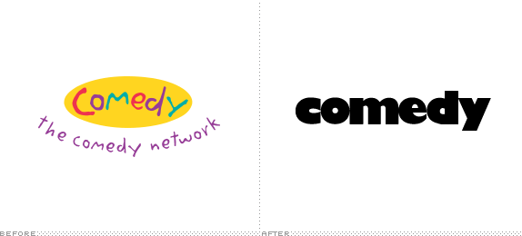
Launched in 1997 in Canada, The Comedy Network is, as its name implies, a channel devoted to all things funny. Its programming consists of a selection of existing programming from other channels including Comedy Central (The Daily Show, The Colbert Report, Tosh.0), TBS (Conan), and NBC (Up all Night, Whitney). It also sprinkles in some original programming. Yesterday, The Comedy Network introduced a new logo, on-air look, and advertising all designed, from what I can gather, in-house, through the parent company, Bell Media.
Continue reading this entry

DATE: Nov.02.2011 POSTED BY: Armin
 CATEGORY: Entertainment
  COMMENTS:

TAGS: canada, gill sans, Sans Serif,


