
A B-Side BY Armin
HGTV Canada
Launched in 1997, HGTV (short for Home & Garden Television) is a Canadian (and American) channel that is described by itself as “the hottest address for the most compelling and entertaining stories about the connections people have with the places they call home.” Hottest. Yeah! Basically you just watch it to see if you paid too much for your house or if you are the only tool (as in dumbass not the physical thing in a shed or box) that gets screwed (no pun intended) by their contractors. The Canadian version redesigned its logo in July to match the American version and also introduced a new on-air graphics package designed by Toronto-based Tendril. On-air video below (or after the jump). For an in-depth look at the typography see this Fonts In Use post.
Continue reading this entry

DATE: Aug.07.2012 POSTED BY: Armin
 CATEGORY: Entertainment The B-Side
  COMMENTS:

TAGS: canada, on-air, television,

Opinion BY Armin
SF = Syfy = Sci Fi = Science Fiction
Launched in 2006, Sci Fi Channel is the Australian version of Syfy… although at the time, it was simply the Australian version of the channel by the same name. Now, however, three-plus years after the name (and logo) change — funny how the grammar police has moved on to other things needing their devoted attention and Syfy has grown into being most excellent these days — the Australian version, which is owned not by NBCUniversal but by Australian media conglomerate Foxtel is changing its name not to Syfy, because that would be way too many letters, but to SF. Try to pronounce it. Suuhhfffhhn. Rolls off deep of your sternum, no? Shut up, I know it’s pronounced S [breathe] F. Anyway. With the new name, SF has introduced a new logo and on-air package designed by Sydney-based Ink Project that will begin rollout at the end of August.
Continue reading this entry

DATE: Aug.07.2012 POSTED BY: Armin
 CATEGORY: Entertainment
  COMMENTS:

TAGS: australia, purple, science, television,

A B-Side BY Armin
OLN
Launched in 1997, OLN (originally Outdoor Life Network) is a Canadian television channel owned by Rogers Media “offering viewers a one-stop destination for adrenaline pumping action and adventure entertainment” with original reality, adventure, and travel series, and sporting events. A new logo was introduced recently. No design credit given and no press release issued.
Thanks to Shawn for the tip.

DATE: Jul.17.2012 POSTED BY: Armin
 CATEGORY: Entertainment The B-Side
  COMMENTS:

TAGS: canada, slab serif, television, texture,

Opinion BY Armin
Style Finally Looks Stylish
Launched in 1999, the Style Network is a television channel owned by NBCUniversal targeted to “women 18-49 with a passion for the best in relatable, inspiring and transformational lifestyle programming.” Style counts with 75 million cable and satellite subscribers, tuning in to shows like Jerseylicious, Chicagolicious, and How Do I Look? In June, Style introduced a new logo and on-air identity designed by New York, NY-based Gretel.
Continue reading this entry

DATE: Jul.10.2012 POSTED BY: Armin
 CATEGORY: Entertainment
  COMMENTS:

TAGS: gretel, hand-drawn, on-air, serif, television,

A B-Side BY Armin
Rolling Stones 50th Anniversary
Shepard Fairy has designed the logo commemorating the 50th anniversary of the Rolling Stones. Shepard writes on his site: “One of the first things I asked Mick was ‘don’t you think the tongue HAS to be included?’. He responded ‘yeah I guess it ought to be’. […] With that in mind I set out to integrate the 50 in a creative and memorable way. I think the solution speaks for itself in celebrating the Stones’ trademark icon and historical anniversary.” Yes, it does speak for itself: that type is whack. Bigger view of the logo below (or after the jump).
Continue reading this entry

DATE: Jul.02.2012 POSTED BY: Armin
 CATEGORY: Entertainment The B-Side
  COMMENTS:

TAGS: music, shepard fairey,

Opinion BY Armin
Kids in Brazil Get their Gloob On
Launched last week, Gloob is a children’s entertainment channel created by Brazilian TV powerhouse Globosat, a network of 38 channels. Aimed at a pre-school audience, Gloob — an anagram of “Globo” (which translates to both balloon or globe) and pronounced Gloobee — will show animated series and movies. The logo and on-air application were designed by Globosat’s in-house team, led by Manuel Falcão. Additional 3D animation was created by Rio de Janeiro-based Seagulls Fly.
Continue reading this entry

DATE: Jun.19.2012 POSTED BY: Armin
 CATEGORY: Entertainment
  COMMENTS:


A B-Side BY Armin
OUTtv
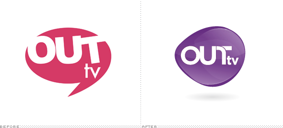
Launched in 2001, OUTtv is a Canadian television channel focusing exclusively on television programming for the Gay and Lesbian audience, available on every cable and satellite service in Canada. This week, OUTtv introduced a new logo designed by San Francisco, CA- and Vancouver, Canada-based B’stro. Variations of the logo for different topics were created too, shown below (or after the jump). Press release here.
Continue reading this entry

DATE: May.24.2012 POSTED BY: Armin
 CATEGORY: Entertainment The B-Side
  COMMENTS:


Opinion BY Armin
Telenovela-Red is the New Fire-Engine-Red
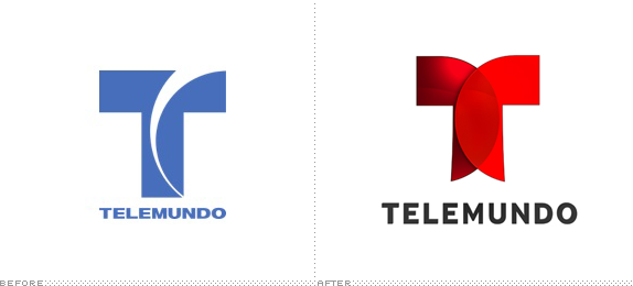
Launched in 1954, Telemundo, a division of NBCUniversal, is a Spanish-language media company revolving around its television network that features “original productions, theatrical motion pictures, news, and sports events, reaching U.S. Hispanic viewers in 210 markets through its 14 owned stations and its broadcast and cable affiliates.” At the upfronts this month, among announcements of more new original telenovelas than you can count unbuttoned men shirts, Telemundo introduced a new logo that will be implemented starting in Fall with the launch of the new TV season. No design credit given.
Continue reading this entry

DATE: May.21.2012 POSTED BY: Armin
 CATEGORY: Entertainment
  COMMENTS:

TAGS: hispanic, red, Sans Serif, television,

Opinion BY Armin
TV Land: Time to Let Go
As a refresher, from this January’s post on TV Land: “Launched in 1996 and originally part of a Nickelodeon programming block called Nick at Nite, TV Land is a cable television channel aimed (according to owner MTV Networks) at the 40- to 50-year-old with a blend of original programming, classic and contemporary television series acquisitions, and movies.” What has changed in the last five months since I last wrote about the on-air look of TV Land is the development of more original programming, bringing their total to five shows, and they also seem to be gunning for a slightly younger audience. Last week, TV Land introduced a new logo and on-air package designed by sixth-year collaborator Trollback + Company and new mnemonic and theme by CORD Worldwide.
Continue reading this entry

DATE: May.17.2012 POSTED BY: Armin
 CATEGORY: Entertainment
  COMMENTS:

TAGS: colorful, on-air, television, trollback and company,

A B-Side BY Armin
Bravo (Canada)
Launched in 1995, Bravo in Canada is a cable channel owned by Bell Media, who licensed the name from NBCUniversal. Bravo shows a range of programs from other channels like TNT and USA, along with some minor original content. A new logo was introduced recently. If the type were any tighter the letters would need to get a room.
Thanks to Shawn for the tip.

DATE: May.15.2012 POSTED BY: Armin
 CATEGORY: Entertainment The B-Side
  COMMENTS:

TAGS: canada, lowercase, Sans Serif, television,


