BY Armin
This is not Your Parents’ Art School

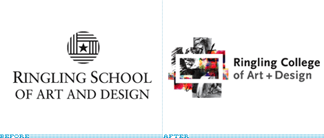
The mention of “art school” as a choice in higher education carries with it the stereotype of a classroom full of high school outcasts sketching a nude model. Yes, a sarcastic and outdated notion easy to refute, but a real hurdle nonetheless. And the newly named Ringling College of Art and Design knew that its previous moniker, Ringling School of Art and Design — coined in 1933, two years after the college was originally established as, big breath, The School of Fine and Applied Art of the John and Mable Ringling Art Museum — was not the best option to represent a thriving private institution that has grown from a 3-building campus to one that houses more than 80 in 35 acres and serves 1,090 students. Ringling must also realize that it faces stiff competition in the boutique undergraduate education in design from the likes of RISD, Art Center, SCAD, MICA and others who also happen to have strong visual identities of their own. So this past April, Ringling changed its name and unveiled a new identity that will be ready to roll at the start of the upcoming school year.
Continue reading this entry

DATE: Jul.29.2007 POSTED BY: Armin
 CATEGORY: Education
  COMMENTS:

TAGS:

BY Armin
Kwantum Leap

From the Department of No Way I Would Have Ever Known Without Someone On The Inside Filling Me In comes this tale of identity change from the deepest corners of Canada. To add to the intrigue, our informant wishes to remain anonymous.
Continue reading this entry

DATE: May.07.2007 POSTED BY: Armin
 CATEGORY: Education
  COMMENTS:

TAGS:

BY John Feldhouse
MICA Finds Itself

From simple things like finding a lucky penny to stumbling across a beautiful building, life supplies many unexpected surprises and serendipitous moments. Seeing the Maryland Institute College of Art (MICA) new identity was both of these for me: I saw rhythm, simplicity, and a catchy acronym. Upon further exploration I found an intelligent, remarkable, and sophisticated mark.
Continue reading this entry

DATE: Apr.08.2007 POSTED BY: John Feldhouse
 CATEGORY: Education
  COMMENTS:

TAGS:

BY Brand New
Dallas gets a “D” in Design

Guest Editorial by Felix Sockwell
Chances are you’ve participated in a talent contest. Hell, you may have even voted for Sanjaya Malakar. Kids, futures, democracy… it’s all serious business worth voting for. Behold�the winning entry (designed free) among more than 275 designs submitted by district students and staff members.
Continue reading this entry

DATE: Apr.04.2007 POSTED BY: Brand New
 CATEGORY: Education
  COMMENTS:

TAGS:

BY Armin
Logo by a Child Left Behind

Over the years I have emphasized to our authors (and myself) how important it is to tell the story of an identity, frame it in context (even if brief), form an opinion of the subject matter and to avoid pithy, sarcastic posts a la Gawker. So it is with a slap to my own wrist that I post this with no points of reference, no story, no press release links or otherwise relevant information. But I seriously have no idea what’s going on here nor do I feel compelled to expend more energy than necessary on this. This being the logo for No Child Left Behind, unveiled sometime in mid-January. Sigh.
Thanks to Delaina Biernstein for the tip.

DATE: Apr.01.2007 POSTED BY: Armin
 CATEGORY: Education
  COMMENTS:

TAGS:

BY Brand New
Linking Design with Academia

Guest Editorial by John Feldhouse
It’s refreshing to see an academic institution embrace and invest in a new identity — and in local design. Portland State University (PSU) recently unveiled their new mark created by Portland-based Sockeye Creative, Inc..
Continue reading this entry

DATE: Mar.17.2007 POSTED BY: Brand New
 CATEGORY: Education
  COMMENTS:

TAGS:

BY Armin
The Long, Winding R

Perhaps one of the most underrated and overlooked aspects of identity design is that done for universities. Typically typographic-driven, these identities are low-key and rarely too distinct; understated and elegant is the name of the game; and “a workhorse” is the most sought-after quality, as the identity must accommodate dozens of programs, schools, divisions and more in hundreds of applications. Coming up with unique and proprietary characteristics for a university wordmark is usually the challenge. In its elongated R and funny-serifed U, Rutgers, The State University of New Jersey, has found an identity that saves it from 20 years of different and inconsistent identities.
Continue reading this entry

DATE: Dec.16.2006 POSTED BY: Armin
 CATEGORY: Education
  COMMENTS:

TAGS:


