
Opinion BY Armin
Generative Alumni
The A3 EPFL Alumni Association is, as its name evidently implies, the alumni association for the École Polytechnique Fédérale de Lausanne (EPFL), a higher education institution established by the Swiss Federal Government in 1853 devoted to engineering and science. With close to 9,000 enrolled students in undergraduate and graduate courses, EPFL is constantly ranked among the top universities in the world and its alumni include CEOs of Logitech and Danone, among other notables. The alumni association is a network of more than 18,000 graduates of the EPFL and it recently introduced a new identity designed by Geneva, Switzerland-based Enigma.
Continue reading this entry

DATE: Jun.04.2012 POSTED BY: Armin
 CATEGORY: Education
  COMMENTS:

TAGS: flexible identity, generative, sans serif, switzerland,

Opinion BY Armin
Kids will be Kids will be Brand Assets
Established in 1975, Catalpa Kinderopvang (Catalpa Childcare) is one of the largest professional childcare organizations in the Netherlands, providing day care, after school care, and child-minding for more than 18,000 children aged 0 to 13 years across 220 locations that employ 2,300 people. Catalpa introduced a new identity earlier this year designed by Amsterdam-based Koeweiden Postma.
Continue reading this entry

DATE: May.02.2012 POSTED BY: Armin
 CATEGORY: Education
  COMMENTS:

TAGS: colorful, custom, kids, koeweiden postma, the netherlands,

Opinion BY Armin
Simplicity Galore
Launched no more than six months ago in December 2011, Coursekit is an online application that re-imagines the education experience for the Internet age by combining simple course management tools with social networking. Over 600 institutions use the service where teachers students can have discussions, share resources, and give and receive grade assignments on the spot. Yesterday, Coursekit announced it would change its name to Lore — co-founder and CEO Joseph Cohen explains that it “gives us freedom to grow, and reflects our belief that learning is about connecting people.” A very nice parallax scrolling microsite explains the name change and defines Lore as “knowledge shared between people.” The design was done in-house, led by Aaron Carambula. The process and inspiration of the identity is captured in another microsite worth a look.
Continue reading this entry

DATE: Apr.24.2012 POSTED BY: Armin
 CATEGORY: Education
  COMMENTS:

TAGS: red, slab serif,

A B-Side BY Armin
International School Moshi

Established in 1969, International School Moshi (ISM) is “a boarding and day school on two campuses in Moshi and Arusha in northern Tanzania” and a fully accredited international education for about 400 children from ages 3 to age 19. A new identity was designed by Birstwith, Harrogate UK-based Face. Some application images below (or after the jump) and more here.
Continue reading this entry

DATE: Apr.17.2012 POSTED BY: Armin
 CATEGORY: Education The B-Side
  COMMENTS:

TAGS: inline, sans serif, tanzania,

A B-Side BY Armin
Saint Paul University
Established in 1965, Saint Paul University (Université Saint-Paul in French) is a Catholic and bilingual (French/English) institution in Ottawa, Ontario, Canada with less than 1,000 students. A new logo was introduced recently. Promo campaign video below (or after the jump).
Continue reading this entry

DATE: Mar.19.2012 POSTED BY: Armin
 CATEGORY: Education The B-Side
  COMMENTS:

TAGS: canada, monogram, university,

Opinion BY Armin
Western University: Less Pixelated, More Boring
Established in 1878 in London, Ontario Canada, The University of Western Ontario is one of the largest universities in Canada with over 25,000 undergraduate and graduate students combined and more than 1,300 faculty. Last week they announced a change to their brand name, to Western University, and introduced a new identity designed by Toronto-based Hahn Smith Design and execution of the crest and typography by local type craftsman Ian Brignell.
Continue reading this entry

DATE: Jan.30.2012 POSTED BY: Armin
 CATEGORY: Education
  COMMENTS:


A B-Side BY Armin
Long Island University
Established in 1926, Long Island University is reportedly “one of the largest and most comprehensive private universities in the country” with over 575 degree programs and certificates and over 23,000 students. This month they have introduced a new identity to go with their shortened name of LIU. Why the triangle? Simple: “Instead of dotting the ‘i’ in a conventional way, we chose to use a symbol to add meaning to the logo and make it more ownable. The upward-pointing triangle represents upward mobility and aspiration. The triangle also is commonly viewed as a delta symbol, which means change. These associations are a natural fit for a campaign that urges students to achieve their potential through the transformative power of education.” Yuck all around. Press release here.
Thanks to Stephen Dettling for the tip.

DATE: Jan.04.2012 POSTED BY: Armin
 CATEGORY: Education The B-Side
  COMMENTS:

TAGS: sans serif, university,

Opinion BY Armin
Sign Language for Swoosh
Founded in 1864, Gallaudet University in Washington, DC is “the world’s only university in which all programs and services are specifically designed to accommodate deaf and hard of hearing students.” Gallaudet is a bilingual university, offering all of its courses in both English and American Sign Language to close to 1,800 students with more than 900 employees, of which almost half are deaf or hard of hearing. This week Gallaudet introduced a new logo, designed by an internal design committee with two Gallaudet alumni, Zhou Fang and Scott Carollo, credited as the designers. The process of the redesign has been thoroughly documented here.
Continue reading this entry

DATE: Dec.08.2011 POSTED BY: Armin
 CATEGORY: Education
  COMMENTS:

TAGS: serif, swoosh, university,

Opinion BY Armin
A Not Conservative Conservatoire
Formally established in 1968 but with roots as far back as 1847, the Royal Conservatoire of Scotland (formerly Royal Scottish Academy of Music and Drama) is Scotland’s “national centre of professional vocational training in performance arts.” RCS offers undergraduate and postgraduate degree programs — in music, Scottish music, acting, musical theatre, modern ballet, and technical production & arts among others — to about 800 students and currently has 873 people on staff, giving it the “highest staff-student ratio of UK Conservatoires, offering intensive one to one tuition.” This past September RCS announced its name change and introduced a new identity designed by Glasgow-based Stand.
Continue reading this entry

DATE: Dec.01.2011 POSTED BY: Armin
 CATEGORY: Education
  COMMENTS:


A B-Side BY Armin
University of Southern California
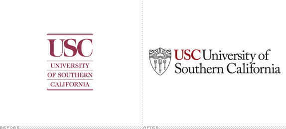
Established in 1880, the University of Southern California counts with 37,000 enrolled students. A new identity has been designed by Pentagram partner DJ Stout in Austin, TX. Press release here. A quick overview of the identity guidelines can be found here [PDF].
Thanks to Alberto G. Manuel for the tip.

DATE: Nov.10.2011 POSTED BY: Armin
 CATEGORY: Education The B-Side
  COMMENTS:

TAGS: crest, pentagram, serif, university,


