


Online
- FPO (For Print Only) / Celebrating the reality that print is not dead by showcasing the most compelling printed projects.
- Art of the Menu / Cataloguing the underrated creativity of menus from around the world.
- Quipsologies / Chronicling the most curious, creative, and notable projects, stories, and events of the graphic design industry on a daily basis.
- Speak Up (2002 – 2009) / Discussing, and looking for, what is relevant in, and the relevance of, graphic design. Archives Only.
- Word It (2003 – 2010) / Encouraging creative diversity in the community through monthly, one-word challenges. Archives Only.
- Brand New Classroom (2010 – 2011) / Providing a space for critique and opinions on student identity work. Archives Only.
Publishing
- The 2010 Brand New Awards / 2011, self-published.
- Flaunt: Designing effective, compelling and memorable portfolios of creative work / 2010, self-published.
Events & Judged Competitions
- Brand New Conference / A one-day event on the development of corporate and brand identity projects by some of today’s most active and influential practitioners from around the world.
- Brand New Awards / Celebrating the best identity work produced around the world.
- FPO Awards / Celebrating the best print work from around the world.
Writing
- Graphic Design, Referenced: A Visual Guide to the Language, Applications, and History of Graphic Design / 2009, Rockport.
- Women of Design: Influence and Inspiration from the Original Trailblazers to the New Groundbreakers / 2008, HOW Books.
- The Word It Book: Speak Up Presents a Gallery of Interpreted Words / 2007, HOW Books.
Graphic Design
- Department of Design / Designing corporate and brand identities and full development of printed and digital matter for clients.

BY Armin
I ♥, You ♥, We all ♥ NY
![]()
Back in May of 2007, it was announced that advertising agency Saatchi & Saatchi had been awarded the I Love New York campaign run by The Empire State Development Corporation with an alloted budget of approximately $17 million — budget that goes into the production and media buys, not into Saatchi’s pocket as some people have misunderstood — to promote tourism for the state of New York. The first set of print ads came earlier this year and the now infamous logo with a squirrel on it has been popping up regularly but for some reason there is a rekindled interest in this story and some fun material has come up, so we are happy to give this the attention it deserves.
Continue reading this entry

DATE: Nov.21.2008 POSTED BY: ArminCATEGORY: Destinations COMMENTS:

TAGS:

BY Joe Marianek
Realeigh?

Imagine a utopian destination�a geographic equilibrium servicing the dualing needs of business & pleasure�conveniently near a regional airport. In this mythical location, one might fantasize about relaxing with a proverbial partner and two children at a waterpark, mall, zoo, or even an art museum. Maybe some golfing with executives followed by candid conversation…and closing a deal or two in a comfortable hotel lobby. There would be strong exotic drinks served by colorful and sexy locals in a continental atmosphere drenched in free wi-fi. This natural state of promise, abundance, and uniquely American opportunity does exist. It’s not in the Bahamas, not in Second Life, and not in Dubai. It’s in Raleigh.
Continue reading this entry
DATE: Aug.05.2008POSTED BY: J. MarianekCATEGORY: Destinations COMMENTS:
TAGS:
BY Armin
Belfast Lobes You
![]()
At the heart (pun!) of every city or country branding effort is a zealous desire to portray the destination as world-class and home to the greatest people on earth — and, sometimes, like New York or Slovenia, there is nothing sweeter to communicate this than with a heart. Belfast, the capital city of Northern Ireland, unveiled a new identity to help promote tourism and enhance the perception of a city that has experienced its share of political, cultural and religious troubles from the 1970s to the 1990s, and has only recently experienced positive growth and perception. And what better way to grow than by opening your heart.
Continue reading this entry
DATE: Jul.22.2008POSTED BY: ArminCATEGORY: Destinations COMMENTS:
TAGS:
BY Christian Palino
Auckland Sets Sail into the Abstract
![]()
In and around Auckland, New Zealand there is a lot of controversy surrounding not only the Auckland City Council logo, but also other ratepayer-owned organizations such as Metrowater and the Auckland Regional Council. Criticism of the cost of the logos has been very central to the argument. The Auckland City Council logo was originally announced to have cost NZ$25,000/US$18,840 (which may have been accurate for the cost of the logo development alone) which then inflated to NZ$1 million/US$753,600 (which included market research, staff hours, consultant fees and some signage applications). The cost of the Metrowater logo was noted at NZ$20,000/US$15,072 — without implementation fees (in their defense they claim that the savings on printing in two colors rather than four will easily cover the cost of the new logo). While the Auckland Regional Council logo will cost NZ$165,000/US$124,344 to develop. Meanwhile, Triangle Television is claiming that the new Auckland City Council logo infringes on their intellectual property rights. Of course amidst the cost controversy, Triangle is also proudly noting that their logo “was designed 12 years ago by a student from Whitecliffe College of Arts and Design and cost about NZ$500/$376,” which is not surprising (yikes!). But setting aside the fiscal and IP controversy…
Continue reading this entry
DATE: Nov.14.2007POSTED BY: Christian PalinoCATEGORY: Destinations COMMENTS:
TAGS:
BY Armin
I ♥ Wolff Olins
![]()
Poor Wolff Olins. Can’t get a break no matter how hard they try — and lord knows that if anyone tries hard, maybe a little too hard, it’s Wolff Olins. We all know (and most, not me) hate the London 2012 identity and pretty much everyone is baffled by the Wacom color thingie, but it’s perhaps the new New York City taxi logo that everybody, at least in the (212) area code, has hated the most. And with good reason. But, for a change, it’s not Wolff Olins’ fault.
Continue reading this entry
DATE: Nov.07.2007POSTED BY: ArminCATEGORY: Destinations COMMENTS:
TAGS:
BY Brand New
If it’s Broken, Don’t Unbroken it
![]()
Guest Editorial by James Bowie
When a city or town adopts a new logo, it’s inevitable that at least a few local taxpayers will exclaim, “You paid how much? For that?” Such complaints are typically unwarranted, but in the recent case of Broken Arrow, Oklahoma, the critics may have a point.
Continue reading this entry
DATE: Oct.19.2007POSTED BY: Brand NewCATEGORY: Destinations COMMENTS:
TAGS:
BY Brand New
Equality is King
![]()
Guest Editorial by John Feldhouse
King County is in Seattle, Washington. For those who are unaware of King County do not feel bad, you are not alone. I never heard of this county before (being from Atlanta) but I suddenly found myself wanting to learn more about it.
Continue reading this entry
DATE: Mar.28.2007POSTED BY: Brand NewCATEGORY: Destinations COMMENTS:
TAGS:
BY Armin
Italia: Like you’ve Never Seen it Before
![]()
After not having been to Italy in all of my young life, in 2006 I found myself there twice: First in May when we spent some leisurely time in Rome and then Tuscany and again in September when we went to Venice as guests of the über friendly folks at Università Iuav di Venezia’s for their Teachme3: Comunicare l’oggetto conference. We were there to talk about blogs and the vibrancy, immediacy and connectivity they bring to our (and every other) industry. And these three attributes are strong at play this week. Two of the major Italian design blogs — designerblog and SocialDesignZine — are wildly hosting the discontent of the Italian design community (click on the em-dashed links) immediately after Premier Romano Prodi and Culture Minister Francesco Rutelli unveiled the new logo this past Wednesday.
Continue reading this entry
DATE: Feb.22.2007POSTED BY: ArminCATEGORY: Destinations COMMENTS:
TAGS:
BY Armin
The Haggardly Hague
![]()
The Hague — beyond being beautiful in a way that only European cities can and besides being the third largest city in the Netherlands and a cultural haven in its own right — is home to three of the most exciting and wildly innovative type designers/collectives in the world: Peter Bilak, Underware and Letterror. With such a well of talent in that city — because beyond these typographers there are many designers as well — you would think that The Hague’s new marketing identity would reflect a modern, cutting-edge sensibility that catapults it into the 21st century. Not the Middle Ages. As is the case with the new logo designed by “famous pop star photographer, film director and graphic designer” Anton Corbijn and unveiled back in November 1, 2006 (yes, we are a little late) to much fanfare. To briefly explain the logo: The red mark is an outline of the city, the rest… Who knows, but Corbijn wanted his design to “express feelings of security, life, progress and playfulness.” And the stork, the city’s official symbol, was not required, although I could easily picture flying somewhere in that logo. Which would not be a bad place to start actually: If I were in charge of this project — something I like to daydream about on all these projects — I would call UnderWare and say “Please design a typographic logo for Den Haag with the stork as inspiration”. Sit back. Wait for an e-mail with an attachment. Throw big party. Move forward — not backward.
DATE: Feb.19.2007POSTED BY: ArminCATEGORY: Destinations COMMENTS:
TAGS:
BY David Weinberger
Slove is in the Air
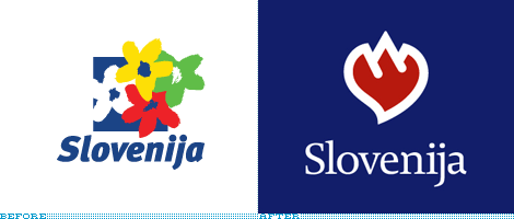
Recently, Slovenia, like many countries and other destinations, decided to undetake a rebranding. Unfortunately, also like many, they decided to make it a competition. Although Fundacija Brumen, the local design organization, protested, Slovenia went forward with separate competitions for the new logo and the new tagline.
Continue reading this entry
DATE: Nov.20.2006POSTED BY: David WeinbergerCATEGORY: Destinations COMMENTS:
TAGS:


Books about logo design, the designers that create them and the meaning of branding.
