
Opinion BY Armin
Something Old, Something New, Something Borrowed, Something Green

Unfortunately — and I mostly say that because it looks like a beautiful country — the only thing I know about Romania is Gheorghe Hagi, who is a very talented futbol player and I remember fondly rooting for Romania in the 1998 World Cup. They had a great team. And color scheme. But one thing I never realized about Romania was just how green it is with abundant forests, and that’s exactly the new hook that its Ministry of Tourism is going for with a new logo unveiled today during the global event Expo 2010 Shanghai China, where more than 190 countries have gathered to put their best face forward. (We actually have another Expo-launched identity coming on Monday). Romania’s new tourism logo and slogan — “Explore the Carpathian Garden” after the Carpathian mountains at the center of the country — were created by the joint partnership between TNS, a global market research firm and THR, a hospitality consultant.
Continue reading this entry

DATE: Jul.30.2010 POSTED BY: Armin
 CATEGORY: Destinations
  COMMENTS:

TAGS: clip art, custom, istockphoto, romania,

INTL. REVIEW BY CLINTON DUNCAN POSTED BY Brand New
All Radiation, No Heart

Sydney is a city of 4.5 million people in Australia, it has a beautiful harbour in the middle, mountains to the west and dozens of beautiful beaches on its eastern coast. Unfortunately a common critique of the city is that these beautiful surroundings mean it spends too much time on leisurely pursuits at the expense of deep thinking, artistic or cultural tendencies. Indeed, leveraging the attractive scenery can only get you so far, and just like the Federal Government’s recent effort at creating Brand Australia, there is now a shiny new “Brand Sydney” to help communicate all that is good and great about this fair city for tourism, investment and major events.
Continue reading this entry

DATE: Jun.14.2010 POSTED BY: Brand New
 CATEGORY: Destinations
  COMMENTS:


INTL. REVIEW BY CLINTON DUNCAN POSTED BY Brand New
Business-to-Business-to-Boomerang

Brand Australia was conceived by the Federal Government of Australia as a four-year program to position Australia internationally as not just a pleasant place to holiday, barbeque shrimp and wrestle crocodiles, but also a nice enough place to perhaps invest a few dollars. And that’s the key to understanding the place this brand is intended to take; it does not replace the tourism brand created by FutureBrand, rather it sits above it as the overarching brand for global citizenship, culture, business and investment. Confusingly, that same tourism brand created by FutureBrand had been in use as the business to business brand under license by Austrade — the government agency responsible for promoting Australia and Australian businesses overseas. Therefore, it’s a before and after, whilst not being a before and after. Still with me?
Continue reading this entry

DATE: May.18.2010 POSTED BY: Brand New
 CATEGORY: Destinations
  COMMENTS:

TAGS:

INTL. REVIEW BY PASCAL LACROIX POSTED BY Brand New
Once in a Belgian Blue Moon

The city of Mechelen (population 80,000) is the tenth largest city of Belgium, located between Brussels and Antwerp. Exactly 175 years ago, this town harboured the first railway station on the European continent. Nowadays, Saturday afternoons could be spent at Mechelen’s Planckendael zoo or its historical market square. You can also find there the Saint Rumblod’s cathedral which is featured on the UNESCO World Heritage list. The nickname for the inhabitants of Mechelen, “the Maneblussers” traces back to the events on the night of 28 January 1687. The local people mistook the reflection of the full moon in the stained glass of the cathedral for a fire, and they frantically started to rush in all available extinguishing equipment, only to discover their silly mistake. The yellow disk in the former logo represents this episode of the city’s history.
Continue reading this entry

DATE: May.11.2010 POSTED BY: Brand New
 CATEGORY: Destinations
  COMMENTS:

TAGS:

Opinion BY Armin
To Regina and Beyond

The only insider information I have about the City of Regina in Canada is that you don’t pronounce it as the proper name of your friend Regina — nope, it’s pronounced like vagina. What? You come up with another word that sounds like that. In absence of some first-hand opinion, that I think some of our Canadian readers might be able to share, here are some facts: According to a 2006 census, Regina is the 16th largest city in Canada with a population of less than 200,000; as the capital of Saskatchewan, Regina is the second largest after Saskatoon, and has a lively business and cultural health. But it had a terrible logo. This past February, the City of Regina introduced a new logo designed by out-of-province McKim Cringan George in Winnipeg.
Continue reading this entry

DATE: Apr.28.2010 POSTED BY: Armin
 CATEGORY: Destinations
  COMMENTS:

TAGS:

Opinion BY Armin
The Dragon’s New Clothes and Tail

It’s funny to recall “design memories” and I never thought I would look back to 2001 with a weird sense of nostalgia when Landor introduced the identity for Brand Hong Kong (BHK), it felt like the culmination of great work after big successes like FedEx, John Deere and BP. At the time, it was one of the most prominent efforts to brand a destination and Landor had done it pretty amazingly. Managed by the Government’s Information Services Department, the goal, then and now, for BHK is simply to establish the city as not only the most cosmopolitan city in Asia but around the world — to be more specific, BHK must communicate “Cosmopolitan, Secure, Dynamic, Diverse, and Connected” as attributes of the city, and “Free, Enterprising, Quality Living, Innovative, and Excellence” as its values. After nine years, the identity has been revised.
Continue reading this entry

DATE: Apr.07.2010 POSTED BY: Armin
 CATEGORY: Destinations
  COMMENTS:

TAGS:

Opinion BY Armin
Egypt, Now Less Arid

One of the destinations I would like to one day visit is Egypt and its surroundings to, at the very least, confirm my suspicions that there is more to Egypt than pyramids and pharaohs. (I know there is more, I’m being sarcastic). A new campaign for the Egyptian Tourist Authority developed by the Cairo office of JWT aims to establish Egypt as a place where there is more than really big tombs. And accompanying this campaign is a new logo.
Continue reading this entry

DATE: Mar.17.2010 POSTED BY: Armin
 CATEGORY: Destinations
  COMMENTS:

TAGS:

Opinion BY Armin
Expedia Gets a Bland Coat of Paint

The mid 1990s was a bad time for travel agents, that’s when Travelocity (1996) and Expedia (1995) first launched, and although it took a few more years before online booking killed the travel agent, the writing was on the wall. I’m a Travelocity Man by default, yet I have dabbled in Expedia a few times, mostly because at some points its booking fee was five dollars less than Travelocity’s, but I think this points to the larger, ongoing rivalry between the two main booking sites — Orbitz and Kayak are fine, but maybe suffer from bell-and-whistle syndrome. Expedia was first launched as a division within Microsoft and it was spun off as Expedia Inc., an independent and publicly traded company in 1999, it was then purchased by Ticketmaster in 2001 and in 2005 it spun off on its own once more. One consistent element among all these changes and success has been the yellow plane that has acted as its logo. Until now.
Continue reading this entry

DATE: Jan.04.2010 POSTED BY: Armin
 CATEGORY: Destinations
  COMMENTS:

TAGS:

Opinion BY Christian Palino
A Blob Walks Out of a Clock Tower in Brisbane
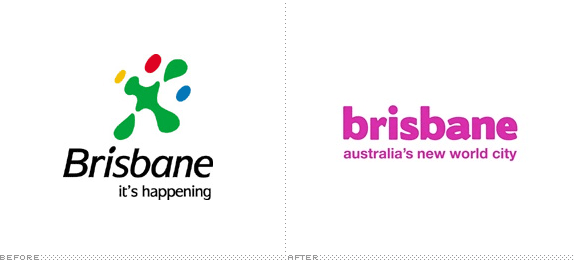
Let me first volunteer that I’ve tried to convince Armin to send us to these destination locations but the only Brisbane I’ve seen is here in California, which wouldn’t make it too thrilling. This particular branding is for Brisbane in Australia — which would be so more exciting — and is developed specifically by Brisbane Marketing, which is a subsidiary of the Brisbane City Council. This identity takes the place of the Brisbane Marketing’s previous mark, but it doesn’t do away with it completely…
Continue reading this entry

DATE: Dec.09.2009 POSTED BY: Christian Palino
 CATEGORY: Destinations
  COMMENTS:

TAGS:

Guest Opinion from Kosal Sen posted BY Brand New
Phail-adelphia

We’ve all had our cases of personal disappointment when a logo redesign fails to properly reflect a brand that we love. It hurts for a while, we complain, sometimes it leads to change (Tropicana), but most of the time, we’re forced to get used to it and move on. This one will be hard to forget. Nothing hits harder than a boring logo of your own beloved city, failing in both concept and execution.
Continue reading this entry

DATE: Dec.08.2009 POSTED BY: Brand New
 CATEGORY: Destinations
  COMMENTS:

TAGS:


