
Opinion BY Armin
The Indianapolis Museum of Art Gets a Break
Originally established in 1883, the Indianapolis Museum of Art (IMA) is one of the largest, and oldest, museums in the United States, with more than 50,000 works of art in its collection housed in a 150-plus-acre area. Various components make up the IMA: There is the Lilly House and Gardens, a 26-acre historic estate and house museum; the 100 Acres: The Virginia B. Fairbanks Art & Nature Park, an art park that includes untamed woodlands, wetlands, meadows and a 35-acre lake; the Toby, a 558-seat theater for film, talks and performances; the Miller House, a mid-century residence designed by Eero Saarinen with interiors by Alexander Girard, located off campus in Columbus; and, finally, the Indianapolis Museum of Art itself, which renders the odd and redundant designation of “Indianapolis Museum of Art IMA.” Clearly, a large organization with a lot of related parts. And to make sense of all of them, IMA worked with Pentagram partner Abbott Miller — an Indiana native, for those looking for authenticity and street cred — to create a new identity.
Continue reading this entry

DATE: Feb.26.2010 POSTED BY: Armin
 CATEGORY: Culture
  COMMENTS:

TAGS:

Guest Opinion by Kosal Sen posted BY Brand New
The Hue Center
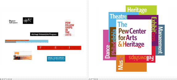
Based in Philadelphia, the Pew Center for Arts & Heritage is a collective of seven grant-making initiatives dedicated to supporting local artists and heritage organizations. Originally, each initiative had its own logo, lacking any consistency with the others. Because of that, there was no indication that it was part of a greater entity. Another problem was the absence of an umbrella logo for the Pew Center. The challenge for London-based johnson banks was to solve a rather specific client brief.
Continue reading this entry

DATE: Jan.29.2010 POSTED BY: Brand New
 CATEGORY: Culture
  COMMENTS:

TAGS:

Opinion BY Sam Becker
THIS AMER-ICAN LIFE
This American Life, the mesmerizing, hour-long NPR radio program and podcast about nothing and everything unveiled their new identity earlier this month. It will soon grace everything from podcast icons to tote bags (and hopefully book spines given the vertical nature of the lockup). The show, which is produced in Chicago and recorded in Manhattan, is hosted by the incomparable Ira Glass.
Continue reading this entry

DATE: Jan.27.2010 POSTED BY: Sam Becker
 CATEGORY: Culture
  COMMENTS:

TAGS:

Opinion BY Armin
The Library of Congress Gets its Wings
It’s quite uplifting, in an Internet kind of way, that one of the most progressive, enriching and engaging content-driven web sites belongs to a 200-year-old American Government institution, the Library of Congress (LOC). In case you have never been, start at the Digital Collections landing page and click, just click — see you back here tomorrow. The LOC, founded in 1800, “is the largest library in the world, with nearly 142 million items on approximately 650 miles of bookshelves. The collections include more than 32 million books and other print materials, 3 million recordings, 12.5 million photographs, 5.3 million maps, 5.6 million pieces of sheet music and 62 million manuscripts.” Housed in Washington, D.C. across three buildings, the LOC is open to the public — 1.6 million annually — making its books available for reading on site only. Needless to say, the LOC is an important cultural institution, and its old logo, depicting the dome of the Thomas Jefferson Building barely did it justice.
Continue reading this entry

DATE: Jan.07.2010 POSTED BY: Armin
 CATEGORY: Culture
  COMMENTS:

TAGS:

intl. review by Clinton Duncan posted BY Brand New
Monospace Theatre
Griffin Theatre Company is a new writing theatre in Sydney, Australia — that is, it focuses on producing newly written, original plays. A risky venture in a world where producers can put the Wizard of Oz on stage Monday and order their yacht on Tuesday. Approaching thirty years in business and looking to refurbish their facilities, the Company decided to rebrand, generate new interest in their brand and loosen the purse strings of donors in these troubled economic times. Turning thirty can be stressful, gone are your twenties, those promise filled days of limitless potential. Being 2009, it means all the 30-year-old brands for the next decade were designed in the 1980s, that terrible decade where good taste hid under a rock, cowering in fear.
Continue reading this entry

DATE: Dec.28.2009 POSTED BY: Brand New
 CATEGORY: Culture
  COMMENTS:

TAGS:

Opinion BY Christian Palino
More Oak, Less Cal
Part of a $58 million dollar renovation, the Oakland Museum of California — which “brings together collections of art, history and natural science under one roof to tell the extraordinary stories of California and its people” — will re-open in May of 2010 with a renovated and expanded building designed by Mark Cavagnero Associates. The initiative, which will create more exhibition space and update the infrastructure to support more new media work, hopes to boost museum participation by 50% and help to revitalize the Oakland cultural scene. A new identity was introduced earlier this month.
Continue reading this entry

DATE: Nov.30.2009 POSTED BY: Christian Palino
 CATEGORY: Culture
  COMMENTS:

TAGS:

Opinion BY Armin
Aol. Generation. Next.
Malpractice in blogging isn’t telling lies or being inflammatory or defamatory. It’s being late. Some blog, somewhere will be there first and drag your late traffic away. It’s not every day that Gawker, the Huffington Post, the New York Times, and Fast Company, among other mainstream news sources cover an identity redesign before we do but such was the case with yesterday’s news of the new identity for AOL designed by every designer’s favorite hate piñata, Wolff Olins. For what it’s worth, I was up at my usual 5:30 am yesterday with this news in my lap and I decided against putting it up immediately, patiently waiting for some additional material solely distributed to our loyal readers. The gamble didn’t quite pay off, at least not yet; I might have something new later in the day, but I know you are all very much ready for this.
Continue reading this entry

DATE: Nov.24.2009 POSTED BY: Armin
 CATEGORY: Culture
  COMMENTS:

TAGS:

Opinion BY Armin
Hey Y’all, A’ol is Coming

So has anyone heard anything about AOL rebranding? I heard some rumors. Alright, alright, yes, I know we are behind. Trying to get y’all some additional stuff that you haven’t seen in any of the other places. Stand by. I know you are so ready to go on this. In the meantime, see if you can spot the AOL cameo on Brand New. Comments will be open soon.

DATE: Nov.24.2009 POSTED BY: Armin
 CATEGORY: Culture
  COMMENTS:

TAGS:

Opinion BY Armin
Odd Building, Odd Logo
So, wow, the Art Gallery of Alberta building in Edmonton, Alberta is weird. I don’t mean to dumb down my critiques with such a thoughtful opening statement but sometimes you just have to go with your gut reactions. Since I’m not an architecture critic I may be missing something from this 41-year-old building designed by Don Bittorf, but the best I can equate it to is this is to Frank Gehry what Arial is to Helvetica. But I’ll better stick to identity criticism. Last week, the Art Gallery of Alberta announced a new logo designed by Edmonton based Vision Creative Inc. to accompany its new acronym, AGA, and the imminent re-opening of the gallery in January of 2010 as it finishes an ambitious, 85,000-square-foot renovation by Los Angeles based Randall Stout Architects.
Continue reading this entry

DATE: Nov.17.2009 POSTED BY: Armin
 CATEGORY: Culture
  COMMENTS:

TAGS:

Opinion BY Armin
An Iconic Lion for an Iconic Institution
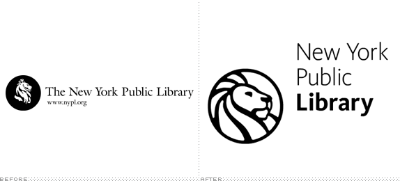
Few places in New York have the undivided reverence of its inhabitants as the Stephen A. Schwarzman Building on 5th Avenue and 42nd Street: The New York Public Library (NYPL). From its grand foyer, to its inspiring reading room, to its secluded microfilm archives, to any of its special collection rooms, nearly everyone who has visited has a favorite space they can quickly bend your ear about. But the NYPL is more than just one building flanked by two massive lions — named Fortitude and Patience — it is a network of 86 physical libraries in the Bronx, Manhattan, and Staten Island as well as an online network housed at the Digital Library that is constantly growing with web friendly content. From signage, to print materials, to web applications the NYPL has had a proper identity implementation over the years, but its previous logo, with its intricate drawing, had its own set of implementation problems and last week the Library introduced a new logo for the first time in at least twenty-five years.
Continue reading this entry

DATE: Nov.16.2009 POSTED BY: Armin
 CATEGORY: Culture
  COMMENTS:

TAGS:


