Opinion BY Armin
Colorful Insurance

Established in 1956 FBTO is one of the largest insurance companies in the Netherlands with more than half a million policy holders. A popular benefit of FBTO is the ability to go straight online and define your insurance policy on the spot — a process that accounts for 60% of FBTO’s business — meaning there is no third party contracting or haggling with insurance salespeople. This month FBTO introduced a new identity designed by Amsterdam-based VBAT and a new online and offline campaign created by agencies Qi and ONLY.
Continue reading this entry

DATE: Jun.30.2011 POSTED BY: Armin
 CATEGORY: Corporate
  COMMENTS:

TAGS: blue, rainbow, sans serif, the netherlands,

A B-Side BY Armin
Global Parts

Established in 2004, Global Parts is a Georgia-based “supplier of brand new repair parts, maintenance items and accessories for the heavy duty truck and trailer industry.” They introduced a new logo this month. Designed in-house the logo is explained thusly: “Out of the 9 trucks represented, the red truck represents our company bringing the product to our consumers, thus empowering them keep their business running throughout the U.S. and the world. The mark is bold enough stand apart, and simple enough to put any product image with it.” Man, how bad was the old logo?!

DATE: Jun.17.2011 POSTED BY: Armin
 CATEGORY: Corporate The B-Side
  COMMENTS:

TAGS: icon, sans serif,

Opinion BY Armin
Milliken Goes Soft

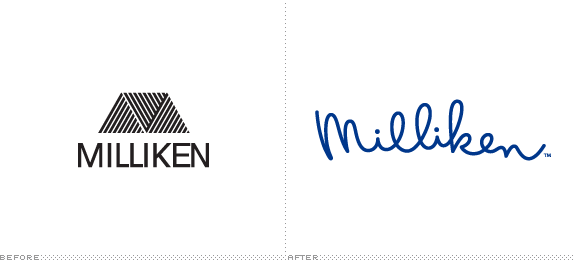
With roots as far back as 1865, Milliken is a South Carolina-based “innovation company that has been exploring, discovering, and creating ways to enhance people’s lives”. What that means is that they develop new products that are hard to categorize in one fell swoop: they manufacture floor coverings, carpet, specialty fabrics, and even chemicals that go into things like crayons. Milliken holds an astounding 2,200 patents and employes 7,000 people — more than a 100 PhD’s among them — and maintains 39 manufacturing facilities across the world. In April Milliken introduced a new identity designed by San Francisco-based SALT Branding that is based on the signature of its late President Roger Milliken, who had taken over the company in 1947 when his father and company founder Seth Milliken passed away.
Continue reading this entry

DATE: Jun.16.2011 POSTED BY: Armin
 CATEGORY: Corporate
  COMMENTS:


Opinion BY Armin
Aricent’s Quiet Swoosh

Established in 2006 with the combination of the former Hughes Software Systems/Flextronics Software Division and frog design (which had been acquired by Flextronics in 2004), Aricent is a “global innovation and technology services company that helps clients to imagine, commercialize, and evolve products and services for the connected world” with more than 10,000 consultants, designers, and engineers at 36 offices around the world. This past May Aricent announced a new brand positioning — “a provider of innovation services for the connected world” — changed its name to Aricent Group to serve as the parent company for Aricent (delivering the “communications technology expertise”) and frog design (delivering the “creative vision and user experience prowess”). The new identity has been designed by New York-based Siegel+Gale.
Continue reading this entry

DATE: Jun.14.2011 POSTED BY: Armin
 CATEGORY: Corporate
  COMMENTS:

TAGS: orange, serif, siegel+gale,

Opinion BY Armin
From Paper to Snooze

A supplier of all kinds of papers, office supplies, and packaging solutions for businesses, Domtar Distribution Group, part of Domtar, was established in 2004 to encompass four different companies — RIS The Paper House, Buntin Reid The Paper House, JBR La Maison du Papier, and The Paper House — that had collectively been providing paper since 1843 in the U.S. and Canada. This past February they announced a name change to Ariva and a new logo. A slightly snoozy video on the home page, bottom left, explains the new name (something about “arriving” although not fully convincing) and gives you a look into the exciting world of paper distribution.
Continue reading this entry

DATE: May.25.2011 POSTED BY: Armin
 CATEGORY: Corporate
  COMMENTS:


A B-Side BY Armin
Sanofi-Aventis

Based in Paris, France, Sanofi-Aventis is a “global healthcare leader” with more than 100,000 employees in 100 countries. They have a broad portfolio of pharmaceutical products that made €30.384 million in sales last year. A new logo, called “Bird of Hope”, was released this month. Here is a long explanation on the logo: “the icon is made of three shapes that make a whole: a planet with the bird of hope in the center. These three shapes structure our ambition, which puts the patient at the center of our activities. The bird illustrates the hope we offer to our patients. The three different shapes show the diversity of our teams, cultures, know-how and locations around the world. This new icon represents the hope that we bring to the approximately 7 billion people around the world; our focus on the patient, our desire to working tirelessly, and our passion and confidence, to enhance life.” You can see an animation of the logo here.

DATE: May.13.2011 POSTED BY: Armin
 CATEGORY: Corporate The B-Side
  COMMENTS:

TAGS: icon, sans serif,

Opinion BY Armin
Manpower Procreates Manpower-ey Logos

Established in 1948, Manpower is one of the largest and most complex staffing agencies in the world, employing 30,000 employees through 3,900 offices in 82 countries that have approximately 500,000 “associates” placed on any given day. At the end of March the company announced a reorganization of its business and introduced ManpowerGroup as the parent company, replacing the lackluster Manpower Inc. With this move ManpowerGroup is also introducing a new mantra, that it is “differentiating and evolving its brand to reflect the new complexity and challenges brought by the Human Age.” You can watch a video that is as exciting as lapel pins on CEO’s suits of what the “Human Age” means here. As part of this evolution, ManpowerGroup has also created logos and names for its four business solutions: ManpowerGroup Solutions, Experis, Manpower, and Right Management. The project was carried out by Richmond, VA-based The Martin Agency.
Continue reading this entry

DATE: May.05.2011 POSTED BY: Armin
 CATEGORY: Corporate
  COMMENTS:

TAGS: icon, manpower, sans serif, the martin agency,

Opinion BY Armin
Star TV, too Hot to Handle

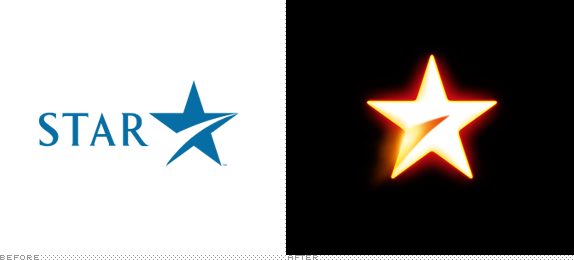
Established in 1991 as one of the first non-government television broadcasters in India and owned by News Corp since 1993, Star TV is a network that includes 33 channels in seven languages broadcast in India and over 58 countries around the world. This month Star TV announced the move of five of its most popular channels to full HD and to celebrate their 20th anniversary they used the occasion to introduce a new corporate logo — literally referred to as “Hot Star” — designed by London-based venturethree.
Continue reading this entry

DATE: Apr.27.2011 POSTED BY: Armin
 CATEGORY: Corporate
  COMMENTS:

TAGS: india, star tv, venturethree,

Opinion BY Armin
Stora Enso Rethinks its Logo

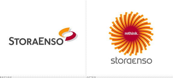
Established in 1998, Stora Enso is a Finnish company based in Helsinki working in the packaging, paper and wood products industry. With 26,000 employees across 85 production facilities around the world, Stora Enso produces “1.8 million tons of paper and board, 1.3 billion square metres of corrugated packaging and 6.4 million cubic metres of sawn wood products” annually. For graphic designers, Stora Enso is a well-known brand as they have some very nice fine coated papers for printing, which were quite popular in the late 1990s and early 2000s, when using imported paper was fancy and doable. This month, Stora Enso has launched a “Rethink” campaign, a refreshed way of looking and acting and, along with it, is a new logo designed by Helsinki-based N2.
Continue reading this entry

DATE: Apr.25.2011 POSTED BY: Armin
 CATEGORY: Corporate
  COMMENTS:

TAGS: finland, icon, n2, sans serif, storaenso,

A B-Side BY Armin
Australian Radio Network

Managing radio stations in Australia and New Zealand, Australian Radio Network (ARN) is the largest radio company in Australasia. Earlier this month it introduced a new logo designed by The Creative Method. Story here.
Thanks to Lee Barnsley for the tip.

DATE: Mar.24.2011 POSTED BY: Armin
 CATEGORY: Corporate The B-Side
  COMMENTS:


