
A B-Side BY Armin
Marketwired
About: (Est. 1994) “Partnering with companies of all sizes — from start-ups to Fortune 500 enterprises — Marketwired is an innovative, social communications company offering best-in-class global news distribution and reporting. Powered by Sysomos, Marketwired’s products also provide state-of-the-art social media monitoring and analytics. This critical business intelligence provides instant and unlimited access to all social media conversations, allowing brands to see what’s happening, why it’s happening, and who’s driving the conversations.”
Design by: N/A.
Ed.’s Notes: Less than a year ago we covered Marketwire’s logo redesign and it received favorable reviews. Sad to see it convert into this monstrosity and lame name. A video introducing the new name below (or after the jump) — try very hard to not want to punch your computer repeatedly while watching it..
Relevant links: Press release (mostly about the name and business strategy).
Continue reading this entry

DATE: Apr.19.2013 POSTED BY: Armin
 CATEGORY: Corporate The B-Side
  COMMENTS:

TAGS: condensed,

A B-Side BY Armin
Blue Ridge Foundation
About: (Est. 1999) “Blue Ridge Foundation was founded by John A. Griffin, President of Blue Ridge Capital, to foster ground-breaking ideas for social change […]. Over our first decade of incubating social innovations, Blue Ridge has helped to build start-up nonprofits from the concept stage; replicated best-in-class organizations by launching their local NYC offices; fostered collective impact efforts across our portfolio; and offered insights to government drawn from the work of our grantees.”
Design by: Hyperakt.
Ed.’s Notes: I like the implied tittle of “I” and “L” in “BLUE”, and nice typography overall. Bigger view of the logo and some applications below (or after the jump).
Relevant links: Hyperakt case study.
Continue reading this entry

DATE: Apr.18.2013 POSTED BY: Armin
 CATEGORY: Corporate The B-Side
  COMMENTS:


Opinion BY Armin
Quirky Community
Established in 2009, Quirky brings inventors’ ideas to life and to market through an open process where community members provide ideas, which are then voted on, and each week the top five are discussed by the Quirky team to see which ones they’ll develop. They have launched over 300 products — from flexible power strips to egg yolk separators — that are sold online and across nearly 200 retail partners. A little over two years ago, Quirky redesigned its logo and last week it announced a new logo and identity designed in-house.
Continue reading this entry

DATE: Apr.15.2013 POSTED BY: Armin
 CATEGORY: Corporate
  COMMENTS:


Opinion BY Armin
Flexible Harsh is the New Sexy Ugly
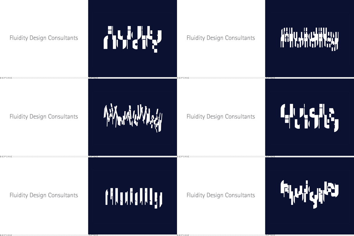
Sticking with a theme early this week, today we are featuring another flexible and (not self- but still) generative identity. Although the company for which it is for does not meet the criteria for the kind of company that typically makes it unto Brand New, I’m always interested in showing approaches to identity that break out from those regularly featured here. Established in 2002, Fluidity is a Los Angeles, CA-based design consultancy that specializes in architectural and landscape integrations of water: fountains, pools, waterfalls, and more. A new, fluid — yeah, I know, I know, easy pun — identity has been designed by Chicago, IL-based thirst.
Continue reading this entry

DATE: Mar.19.2013 POSTED BY: Armin
 CATEGORY: Corporate
  COMMENTS:

TAGS: custom, flexible identity, processing, thirst,

A B-Side BY Armin
Cabot
About: (Est. 1882) “Cabot Corporation is a global specialty chemicals and performance materials company, headquartered in Boston, Massachusetts. The company is the leading producer of rubber and specialty grade carbon black, activated carbon, inkjet colorants, cesium formate drilling fluids, fumed silica, aerogel, and elastomer composites.”
Design by: N/A.
Ed.’s Notes: I feel like we’ve seen this a dozen times for a corporate logo but, hey, it works and it kills a double-swoosh logo. A rather nice brand video below (or after the jump).
Relevant links: Cabot press release.
Select quote: “Cabot’s new corporate logo, developed to support the new brand, connects the company’s past with its future. To honor Cabot’s heritage, the new logo maintains the all-black, all-capital letters of ‘CABOT.’ The new chevron, meanwhile, represents the brand theme of advancing. The red, orange and yellow color palette emphasizes Cabot’s approachable, collaborative spirit, and energetic approach to innovation and customer service. The added dimension and colors highlight the many facets of Cabot’s businesses.”
Continue reading this entry

DATE: Mar.18.2013 POSTED BY: Armin
 CATEGORY: Corporate The B-Side
  COMMENTS:

TAGS: overlay, sans serif, uppercase,

A B-Side BY Armin
Western Union
About: (Est. 1856) “Western Union connects people and businesses around the globe by providing fast, reliable and convenient ways to move money. Our 160-year history and 510,000 Western Union Agent locations in more than 200 countries and territories strengthen our commitment to offering our services in every corner of the globe.”
Design by: N/A.
Ed.’s Notes: Monogram view below. There is something interesting about this or at least there is some potential there for the WU monogram to be interesting.
Relevant links: N/A.

DATE: Mar.08.2013 POSTED BY: Armin
 CATEGORY: Corporate The B-Side
  COMMENTS:

TAGS: black, monogram, sans serif, uppercase, yellow,

A B-Side BY Armin
White Knight Laundry
About: (Est. 1904) White Knight Laundry offers domestic laundry services, business and industrial laundry and linen hire operating both in the B2B sector — industry, hotels, restaurants, education and healthcare — as well as serving individual households throughout the South and Southeast of England. They hold a Royal Warrant, meaning they wash the Queen’s undies. (Or not, not sure).
Design by: Coley Porter Bell.
Ed.’s Notes: Haven’t seen a photo-based logo in a while. This is fun. Bigger view below (or after the jump).
Relevant links: N/A.
Provided quote: “White Knight holds the Royal Warrant. This informed the design of the new logo which is based on pieces of White Knight’s linen, folded origami-style, to create a knight’s helmet. It is set against a regal purple background, with lettering in a crisp white Century Gothic. Importantly, it has been created in such a way that it can be consistently reproduced across a very wide range of applications, materials and media.”
Continue reading this entry

DATE: Mar.05.2013 POSTED BY: Armin
 CATEGORY: Corporate The B-Side
  COMMENTS:


Opinion BY Armin
Concentric Philanthropy
Established in 1999 by a group of power players, chief among them actor Paul Newman, the Committee Encouraging Corporate Philanthropy (CECP) brings together senior executives from the world’s leading companies to steer them towards meaningful, high-quality philanthropy. To date, CECP includes “more than 180 CEO members, representing 150 major corporations and over $10 billion in annual corporate giving.” This list alone, of CEO members, is probably worth more in pixels than what’s in your bank account right now. CECP recently introduced a new identity designed by Futurebrand.
Continue reading this entry

DATE: Feb.28.2013 POSTED BY: Armin
 CATEGORY: Corporate
  COMMENTS:

TAGS: blue, futurebrand, geometric, monogram,

A B-Side BY Armin
Egon Zehnder
About: (Est. 1964) Egon Zehnder is a leading privately owned executive search and management consulting firm with over 420 consultants in 66 offices across 40 offices globally. Founded in 1964, Egon Zehnder consultants work as trusted advisors to the world’s foremost executives and organizations in solving their most complex leadership problems.”
Design by: Lippincott.
Ed.’s Notes: Nice typography and simple alteration to the “g” to create an ownable wordmark. Bigger view of the logo below (or after the jump).
Relevant links: Lippincott case study.
Continue reading this entry

DATE: Feb.15.2013 POSTED BY: Armin
 CATEGORY: Corporate The B-Side
  COMMENTS:

TAGS: custom, sans serif,

Opinion BY Armin
Futurebrand’s Future Looks Fuzzy
Established in 1999, Futurebrand is a global brand consultancy — “built on an inimitable focus on innovation and the future” for added pizzaz in their own description — with 26 offices in 18 countries and is part of McCann Worldgroup. Most recently Futurebrand redesigned the American Airlines and Fiji Airways identities and were in charge of deploying the Look of the Games at the London Olympics. They first gained attention in 2003 when they redesigned the UPS logo. This week they introduced a new identity for themselves along with new positioning, “We are the creative future company.”
Continue reading this entry

DATE: Feb.13.2013 POSTED BY: Armin
 CATEGORY: Corporate
  COMMENTS:

TAGS: futurebrand, icon, pixelated, slab serif,


