
Opinion BY Armin
Eau de Golden Ratio
Originally a small prescription pharmacy that started in 1977 in the city of Curitiba, Paraná in Brazil, O Boticário has evolved into a producer of various beauty products like fragrances, soap, body care and make-up, and now holds the claim of being the largest chain in the world in this sector, with 2,500 stores in Brazil alone, 70 across 15 other world cities, and presence in multiple sales points like department stores. To handle the growth of this consumer-facing brand, a new corporate entity has been created, Grupo Boticário, with an identity designed by the Brazil office of Futurebrand.
Continue reading this entry

DATE: May.10.2010 POSTED BY: Armin
 CATEGORY: Corporate
  COMMENTS:

TAGS: 4-color, brazil, futurebrand, lowercase, retail, sans serif,

Opinion BY Armin
AECOM’s Standout “E”

With 45,000 employees around the world, AECOM provides a wide range of services including architecture, building engineering, and transportation among others. It is a Fortune 500 company with revenues in the billions-of-dollars realm. Towards the end of the year in 2009, they introduced a new brand positioning and identity created by Landor.
Continue reading this entry

DATE: May.03.2010 POSTED BY: Armin
 CATEGORY: Corporate
  COMMENTS:

TAGS:

Opinion BY Armin
How do I Circle Thee? Let me Circle the Ways…
What started as a company producing “decorative laminates” in 1959 in Portugal, Sonae is now one of the countries largest corporations with almost 40,000 employees that work in a mind-numbing range of sectors across various Sonae-owned customer-facing operations: from food retail, to pharmacies, to clothing, to consumer electronics, to managing shopping centers, to telecommunications, to real estate. Basically, it’s hard to throw a stone in Portugal and not hit something owned or operated by Sonae. This past February it launched a new identity created by Lisboa-based Ivity Brand Corp.
Continue reading this entry

DATE: Apr.30.2010 POSTED BY: Armin
 CATEGORY: Corporate
  COMMENTS:


Opinion BY Armin
Land O’Lame

What do butter and pet food have in common? Other than a number of mystery ingredients, in this case, they have in common that two of the most popular brands for each of those products — Land O’Lakes butter and Purina — are owned by the same corporation, Land O’Lakes, Inc., a 9,000 employee, member-owned co-op with more than 4,000 members established in 1921. Beyond the well-known consumer products, Land O’Lakes — I was tempted to abbreviate it as LOL but that would just be too distracting — is “the third-largest farm seed business and #1 distributor of crop protection products in the U.S.” as well as providing business development services to its members, and other businesses like transportation. Needless to say, it has an impact in the dairy and agricultural industries. Earlier in 2009, Land O’Lakes introduced a new corporate identity designed by Olson.
Continue reading this entry

DATE: Jan.21.2010 POSTED BY: Armin
 CATEGORY: Corporate
  COMMENTS:

TAGS:

Opinion BY Armin
Watson, Towers Watson
With a combined 14,000 employees in offices around the world, Towers Watson is the newly minted “professional services” firm created by the merger of the 5-year-old Watson Wyatt Worlwide and 76-year-old Towers Perrin, officially established earlier this month. Towers Watson offers services in Benefits (retirement, health and group benefits), Risk and Financial Services (insurance consolation, investments, risk management), and Talent and Rewards (executive compensation, employee rewards), all of it a nice presented package that is actually easy to understand. With a new name that literally merges the two companies, Interbrand was given the assignment to create the new visual identity.
Continue reading this entry

DATE: Jan.20.2010 POSTED BY: Armin
 CATEGORY: Corporate
  COMMENTS:

TAGS:

Opinion BY Armin
Pfizer Moves Pforward
When we talk about “one of the biggest companies in the world” or “one of the leaders in their industry” or any other claim to the top spot in anything here in Brand New it’s all relatively, well, relative. Especially when you compare anything to Pfizer, the leading-number-one-biggest-you-name-it player in the pharmaceutical industry. According to their 2008 financial report, the revenue for that year was $48.3 billion. They also produce two of the most popular and well known pills in the market: Lipitor and Viagra, among many others. Needless to say anything further, Pfizer is big. Last week, rather quietly, Pfizer launched a new web site and introduced a revision to its 18-year-old oval logo, which was designed in 1991 by Enterprise IG (now The Brand Union). The new logo and comprehensive identity program has been designed by Siegel+Gale.
Continue reading this entry

DATE: Nov.04.2009 POSTED BY: Armin
 CATEGORY: Corporate
  COMMENTS:

TAGS:

Opinion BY Armin
Magenta Star
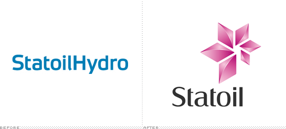
In 2007, the 35-year-old Norwegian company Statoil merged with the oil and gas division of the 102-year-old Norsk Hydro, to form StatoilHydro, an energy and oil company with presence in 40 countries focusing on the production of oil as well as the consumer distribution of oil through various gas stations — with different brand names, some of them still named Statoil — around the world. Today, as it prepares to become a stronger global player, StatoilHydro officially went back to the Statoil name and adopted its new identity designed by Scandinavian Design Group. I emphasized “officially,” because the logo and name changed had actually been announced back in April of this year but the web site had not yet implemented the new logo.
Continue reading this entry

DATE: Nov.02.2009 POSTED BY: Armin
 CATEGORY: Corporate
  COMMENTS:

TAGS:

Opinion BY Armin
Flight of the Payrolls

If you are a small or medium sized business one of the least fun parts of running said business are probably scary administrative tasks like human resources, payroll, employee benefits and health plans. For those who just don’t want to deal with it, there are Professional Employer Organizations (PEOs) that can be contracted to run these tasks. Among the most popular of these PEOs is TriNet, a California based company established in 1988, that recently acquired another PEO, Gevity, to become the second largest provider. Last month, TriNet introduced a new identity.
Continue reading this entry

DATE: Oct.13.2009 POSTED BY: Armin
 CATEGORY: Corporate
  COMMENTS:

TAGS:

Opinion BY Armin
A Burst of Charity

Launched in 1999, JustGiving is a London-based for-profit orgnization that enables charities and individuals to help raise money in an unparalleled way by making the process easy and transparent for the givers and the givees. According to its About page, JustGiving has helped raise more than £450 million (US$735 million) for over 8,000 member charities. As a for-profit organization, JustGiving charges a 5% fee of every donation, which has caused some criticism, but JustGiving’s explanation, from what I understand (or not) from their fee structure, seems fair. This past June, JustGiving introduced a revamped web site and a new logo.
Continue reading this entry

DATE: Aug.26.2009 POSTED BY: Armin
 CATEGORY: Corporate
  COMMENTS:

TAGS:

Opinion BY Armin
Gimme an “m,” now Gimme an “m,” now …

From very modest beginnings in 1902 by Edwin Thomas Meredith with the publication of Successful Farming, Meredith Corporation is now the “leading media and marketing company serving American women” with more than 20 subscription magazines — like Ready Made, Better Homes and Gardens, Fitness, and (my favorite) Wood — as well as 12 local broadcast stations from Atlanta, GA to Portland, OR across Fox, NBC and CBS, plus a booming marketing and strategy consulting business that takes advantage of all these channels. (How awesome and convenient that the founder’s last name is the first name of a woman? You can’t really ask for a better twist). With an absurd, old logo the need for a new identity is pretty obvious.
Continue reading this entry

DATE: Aug.24.2009 POSTED BY: Armin
 CATEGORY: Corporate
  COMMENTS:

TAGS:


