A B-Side BY Armin
Help Remedies

Established in 2008, Help Remedies is a pharmaceutical company that produces and retails straightforward, well, remedies. Originally designed by Little Fury, the look of the packaging became pretty iconic for its simplicity. Pearlfisher has updated the look. “We have refined the identity and color-coded the embossed pill shape to make the overall brand architecture more visually strong and to give the brand better stand-out and immediacy of recognition. The design evolution dials up Help’s equities, creating an ownable secondary language through the pill iconography, that will be used across further brand touchpoints and communications.” See the full packaging line below (or after the jump).
Continue reading this entry

DATE: Oct.27.2011 POSTED BY: Armin
 CATEGORY: Consumer products The B-Side
  COMMENTS:

TAGS: packaging, pearlfisher, serif,

Opinion BY Armin
Redefining Sharp

Founded in 1939, Gerber is a “global supplier of personal outdoor, tactical and industrial gear”. What that means is that they sell the meanest, coolest, machoest knives, axes, parangs, and all other kinds of cutting, prodding, slicing, destroying stuff. In other words it’s the bizarro consumer product of the other Gerber. Also, if you caught the premiere of The Walking Dead — sucks for you if you didn’t — that big bag of machetes and knives they find? Courtesy of Gerber, thank you. Gerber’s new identity, packaging, and advertising have been designed by Portland, OR-based Mutt Industries.
Continue reading this entry

DATE: Oct.21.2011 POSTED BY: Armin
 CATEGORY: Consumer products
  COMMENTS:

TAGS: orange, packaging, sans serif,

Opinion BY John J Custer
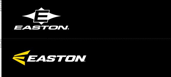
Hit that E

Easton-Bell Sports has just over 80 years of experience in the sporting goods market and has established itself as a recognizable and reliable brand and name. The company mainly focuses on protective head gear for baseball, softball, hockey, lacrosse and cycling. Under the Easton-Bell Sports name they manufacture and sell the popular Giro helmets and cycling accessories, the Riddell football helmets and hats, and the Bell motorcycling products. They also have their own branded products under the name Easton for lacrosse, hockey, baseball, and softball — in the past several months, Easton-Bell Sports has rolled out a newly updated mark that extends into these line of products.
Continue reading this entry

DATE: Oct.11.2011 POSTED BY: John J Custer
 CATEGORY: Consumer products
  COMMENTS:

TAGS: italic, sans serif, sports, yellow,

Opinion BY Armin
Warburtons’ Complete Package

Established in 1876, Warburtons is a producer of bakery products, from your everyday sliced bread to hot dog buns to pancakes to crumpets. Now, still a Warburton-family-owned business, Warburtons employs 5,000 people working at 14 bakeries and 15 depots across the UK, producing over two million bakery products every day and, according to Nielson Data, it is the “second biggest grocery brand” in the UK. Warburtons’ new logo was introduced back in late 2010 but the complete brand rollout has taken most of 2011 to implement. The whole project was designed by London-based Smith & Milton.
Continue reading this entry

DATE: Sep.13.2011 POSTED BY: Armin
 CATEGORY: Consumer products
  COMMENTS:


Follow-Up BY Armin
Follow-Up: Cheer

In early August we reported on the third design of Cheer detergent in the last four years and it was the one that got the most response. The Cincinnati office of Landor was responsible for the latest design and they have supplied a few more images.
Continue reading this entry

DATE: Sep.07.2011 POSTED BY: Armin
 CATEGORY: Consumer products
  COMMENTS:

TAGS:

A B-Side BY Armin
Hatuey

Originally brewed in Cuba in 1927, Hatuey is currently produced by Bacardi. This summer it introduced the beer in the American market. Design by Spring Design Partners. Another image below (or after the jump).


DATE: Aug.29.2011 POSTED BY: Armin
 CATEGORY: Consumer products The B-Side
  COMMENTS:


Opinion BY Armin
Massive Diet Coke

First made available in 1982, Diet Coke is currently the No. 3 soft drink in the world, according to its producer, The Coca-Cola Company. Diet Coke was originally the first brand other than Coca-Cola itself to carry the giant’s name. Today, of course, there is like a dozen Coca-Cola This or Coca-Cola That. This coming September, to celebrate Coca-Cola’s 125th anniversary, the company will be introducing a limited-edition design of Diet Coke that will be on shelves for an as of yet undisclosed period of time. Could be three months, could be three decades. Adweek first broke the story. The design is by Turner Duckworth.
Continue reading this entry

DATE: Aug.29.2011 POSTED BY: Armin
 CATEGORY: Consumer products
  COMMENTS:

TAGS: coca-cola, packaging, turner duckworth,

A B-Side BY Armin
JayneMax

JayneMax is a collection of luxury handbags growing in popularity, they made a cameo in Ugly Betty, and have opened more than a dozen stores recently. New logo designed by Brand Navigation.

DATE: Aug.19.2011 POSTED BY: Armin
 CATEGORY: Consumer products The B-Side
  COMMENTS:

TAGS: blue, sans serif, serif,

A B-Side BY Armin
Bot Water

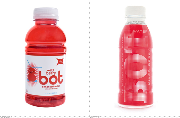
Introduced in 2007 as a kid’s beverage, bot is a line of “enhanced, flavored water.” The beverages have now been rebooted for an adult costumer base. The redesign was done by Boulder, CO-based TDA_Boulder. Detail of the new bottles below (or after the jump).
Continue reading this entry

DATE: Aug.17.2011 POSTED BY: Armin
 CATEGORY: Consumer products The B-Side
  COMMENTS:

TAGS: packaging,

A B-Side BY Armin
Hero MotoCorp

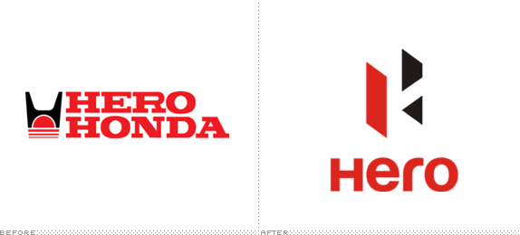
Established in 1984 as a partnership between Japan’s Honda and India’s Hero Group, Hero Honda has grown to be the largest manufacturer and seller of motorcycles in India. This month, with Hero taking over the whole business, the company was renamed Hero MotoCorp. The new logo has been designed by Wolff Olins. Story here.

DATE: Aug.15.2011 POSTED BY: Armin
 CATEGORY: Consumer products The B-Side
  COMMENTS:

TAGS: india, sans serif, wolff olins,


